- Published on
How to Create A Form With Tailwind CSS?
- What is Tailwind CSS?
- The description of Form ui component
- Why use Tailwind CSS to create a Form ui component?
- The preview of Form ui component
- The source code of Form ui component
- How to create a Form with Tailwind CSS?
- Step 1: Create a basic HTML structure
- Step 2: Add Tailwind CSS classes
- Step 3: Customize the form
- Step 4: Add responsive classes
- Step 5: Add validation
- Conclusion
What is Tailwind CSS?
Tailwind CSS is a utility-first CSS framework that provides a set of pre-defined CSS classes to create responsive and customizable UI components. It allows developers to quickly build UI components without writing custom CSS.
The description of Form ui component
A form is a UI component that allows users to input data and submit it to a server. It is a common UI component used in web applications to collect user information, such as login forms, registration forms, and contact forms.
Why use Tailwind CSS to create a Form ui component?
Tailwind CSS provides a set of pre-defined CSS classes that can be used to create a form UI component quickly. It eliminates the need for writing custom CSS, which can save time and effort. Additionally, Tailwind CSS is highly customizable, which means that developers can easily modify the appearance of the form to match the design requirements.
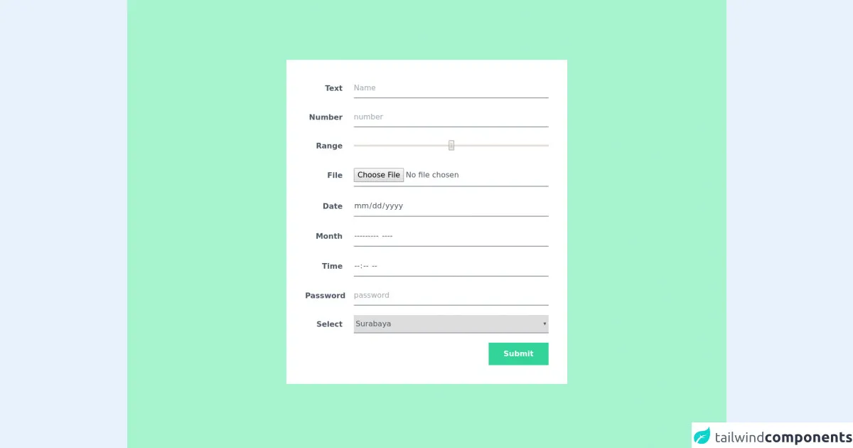
The preview of Form ui component
To create a form UI component with Tailwind CSS, we can use the pre-defined CSS classes to style the form elements. Here is a preview of what the form UI component will look like:
Free download of the Form's source code
The source code of Form ui component
To create a form UI component with Tailwind CSS, we can use the following HTML code:
<div class="bg-green-200 py-32 px-10 min-h-screen ">
  <!--   tip; mx-auto -- jagab ilusti keskele  -->
  <div class="bg-white p-10 md:w-3/4 lg:w-1/2 mx-auto">

    <form action="">

      <!--       flex - asjad korvuti, nb! flex-1 - element kogu ylejaanud laius -->
      <div class="flex items-center mb-5">
        <!--         tip - here neede inline-block , but why? -->
        <label for="name" class="inline-block w-20 mr-6 text-right
                                 font-bold text-gray-600">Text</label>
        <input type="text" id="name" name="name" placeholder="Name"
               class="flex-1 py-2 border-b-2 border-gray-400 focus:border-green-400
                      text-gray-600 placeholder-gray-400
                      outline-none">
      </div>

      <div class="flex items-center mb-5">
        <!--         tip - here neede inline-block , but why? -->
        <label for="number" class="inline-block w-20 mr-6 text-right
                                 font-bold text-gray-600">Number</label>
        <input type="number" id="number" name="number" placeholder="number"
               class="flex-1 py-2 border-b-2 border-gray-400 focus:border-green-400
                      text-gray-600 placeholder-gray-400
                      outline-none">
      </div>

      <div class="flex items-center mb-5">
        <!--         tip - here neede inline-block , but why? -->
        <label for="number" class="inline-block w-20 mr-6 text-right
                                 font-bold text-gray-600">Range</label>
        <input type="range" id="range" name="range" placeholder="range"
               class="flex-1 py-2 border-b-2 border-gray-400 focus:border-green-400
                      text-gray-600 placeholder-gray-400
                      outline-none">
      </div>

      <div class="flex items-center mb-5">
        <!--         tip - here neede inline-block , but why? -->
        <label for="number" class="inline-block w-20 mr-6 text-right
                                 font-bold text-gray-600">File</label>
        <input type="file" id="file" name="file" placeholder="file"
               class="flex-1 py-2 border-b-2 border-gray-400 focus:border-green-400
                      text-gray-600 placeholder-gray-400
                      outline-none">
      </div>

      <div class="flex items-center mb-5">
        <!--         tip - here neede inline-block , but why? -->
        <label for="number" class="inline-block w-20 mr-6 text-right
                                 font-bold text-gray-600">Date</label>
        <input type="date" id="date" name="date" placeholder="date"
               class="flex-1 py-2 border-b-2 border-gray-400 focus:border-green-400
                      text-gray-600 placeholder-gray-400
                      outline-none">
      </div>

      <div class="flex items-center mb-5">
        <!--         tip - here neede inline-block , but why? -->
        <label for="number" class="inline-block w-20 mr-6 text-right
                                 font-bold text-gray-600">Month</label>
        <input type="month" id="month" name="month" placeholder="month"
               class="flex-1 py-2 border-b-2 border-gray-400 focus:border-green-400
                      text-gray-600 placeholder-gray-400
                      outline-none">
      </div>

      <div class="flex items-center mb-5">
        <!--         tip - here neede inline-block , but why? -->
        <label for="number" class="inline-block w-20 mr-6 text-right
                                 font-bold text-gray-600">Time</label>
        <input type="time" id="time" name="time" placeholder="time"
               class="flex-1 py-2 border-b-2 border-gray-400 focus:border-green-400
                      text-gray-600 placeholder-gray-400
                      outline-none">
      </div>

      <div class="flex items-center mb-5">
        <!--         tip - here neede inline-block , but why? -->
        <label for="number" class="inline-block w-20 mr-6 text-right
                                 font-bold text-gray-600">Password</label>
        <input type="password" id="password" name="password" placeholder="password"
               class="flex-1 py-2 border-b-2 border-gray-400 focus:border-green-400
                      text-gray-600 placeholder-gray-400
                      outline-none">
      </div>

      <div class="flex items-center mb-5">
        <!--         tip - here neede inline-block , but why? -->
        <label for="number" class="inline-block w-20 mr-6 text-right
                                 font-bold text-gray-600">Select</label>
        <select class="flex-1 py-2 border-b-2 border-gray-400 focus:border-green-400
                      text-gray-600 placeholder-gray-400
                      outline-none">
            <option>Surabaya</option>
            <option>Jakarta</option>
            <option>bandung</option>
            <option>Tangerang</option>
        </select>
      </div>

      <div class="text-right">
        <button class="py-3 px-8 bg-green-400 text-white font-bold">Submit</button>
      </div>

    </form>
  </div>
</div>
This code defines a basic form with input fields for name, email, and message. We have used the pre-defined Tailwind CSS classes to style the form elements.
How to create a Form with Tailwind CSS?
To create a form UI component with Tailwind CSS, follow these steps:
Step 1: Create a basic HTML structure
Start by creating a basic HTML structure for the form. This should include the form tag and input fields for the data you want to collect. For example:
<form>
  <label for="name">Name:</label>
  <input type="text" id="name" name="name">

  <label for="email">Email:</label>
  <input type="email" id="email" name="email">

  <label for="message">Message:</label>
  <textarea id="message" name="message"></textarea>

  <button type="submit">Submit</button>
</form>
Step 2: Add Tailwind CSS classes
Next, we can add Tailwind CSS classes to the form elements to style them. For example, we can add the following classes to the input fields:
<input type="text" id="name" name="name" class="border rounded-lg py-2 px-3">
<input type="email" id="email" name="email" class="border rounded-lg py-2 px-3">
<textarea id="message" name="message" class="border rounded-lg py-2 px-3"></textarea>
These classes add a border, rounded corners, and padding to the input fields, making them look more visually appealing.
Step 3: Customize the form
Tailwind CSS provides a wide range of classes that can be used to customize the appearance of the form. For example, we can change the background color of the form by adding the bg-gray-100 class to the form tag:
<form class="bg-gray-100">
We can also change the font size of the form labels by adding the text-lg class:
<label for="name" class="text-lg">Name:</label>
Step 4: Add responsive classes
Tailwind CSS provides responsive classes that can be used to adjust the appearance of the form based on the screen size. For example, we can add the md:w-1/2 class to the input fields to make them take up half of the screen width on medium-sized screens:
<input type="text" id="name" name="name" class="border rounded-lg py-2 px-3 md:w-1/2">
<input type="email" id="email" name="email" class="border rounded-lg py-2 px-3 md:w-1/2">
Step 5: Add validation
Finally, we can add validation to the form by using JavaScript. For example, we can add a required attribute to the input fields to make them required:
<input type="text" id="name" name="name" class="border rounded-lg py-2 px-3 md:w-1/2" required>
<input type="email" id="email" name="email" class="border rounded-lg py-2 px-3 md:w-1/2" required>
Conclusion
Creating a form UI component with Tailwind CSS is a quick and easy process. By using the pre-defined CSS classes, developers can create visually appealing and responsive forms without writing custom CSS. Additionally, Tailwind CSS provides a wide range of customization options, making it easy to match the form to the design requirements.