- Published on
Learn How To Build A Form With Tailwind CSS from the Pros
- What is Tailwind CSS?
- The description of Form UI component
- Why use Tailwind CSS to create a Form UI component?
- The preview of Form UI component
- The source code of Form UI component
- How to create a Form with Tailwind CSS?
- Step 1: Create the HTML structure
- Step 2: Add custom styles
- Step 3: Use the form UI component
- Conclusion
Are you tired of writing CSS from scratch every time you need to create a form UI component for your website? Tailwind CSS is here to help you! In this article, we will show you how to build a form UI component with Tailwind CSS, step by step.
What is Tailwind CSS?
Tailwind CSS is a utility-first CSS framework that allows you to quickly create custom designs without writing CSS from scratch. It provides a set of pre-defined CSS classes that you can use to style your HTML elements. With Tailwind CSS, you can create responsive and mobile-first designs easily.
The description of Form UI component
A form UI component is a set of HTML elements that allow users to input data and submit it to a server. A typical form UI component includes input fields, checkboxes, radio buttons, dropdowns, and buttons.
Why use Tailwind CSS to create a Form UI component?
Tailwind CSS provides a set of pre-defined CSS classes that you can use to style your form UI component without writing CSS from scratch. This saves you a lot of time and effort. Moreover, Tailwind CSS is mobile-first, which means that your form UI component will look great on all devices.
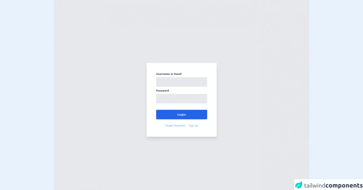
The preview of Form UI component
To give you an idea of what we will be building, here is a preview of the form UI component we will create:
Free download of the Form's source code
The source code of Form UI component
Here is the HTML code for the form UI component we will create:
<div class="flex flex-col items-center justify-center w-screen h-screen bg-gray-200 text-gray-700">
	<form class="flex flex-col bg-white rounded shadow-lg p-12 mt-12" action="">
		<label class="font-semibold text-xs" for="usernameField">Username or Email</label>
		<input class="flex items-center h-12 px-4 w-64 bg-gray-200 mt-2 rounded focus:outline-none focus:ring-2" type="text">
		<label class="font-semibold text-xs mt-3" for="passwordField">Password</label>
		<input class="flex items-center h-12 px-4 w-64 bg-gray-200 mt-2 rounded focus:outline-none focus:ring-2"type="password">
		<button class="flex items-center justify-center h-12 px-6 w-64 bg-blue-600 mt-8 rounded font-semibold text-sm text-blue-100 hover:bg-blue-700">Login</button>
		<div class="flex mt-6 justify-center text-xs">
			<a class="text-blue-400 hover:text-blue-500" href="#">Forgot Password</a>
			<span class="mx-2 text-gray-300">/</span>
			<a class="text-blue-400 hover:text-blue-500" href="#">Sign Up</a>
		</div>
	</form>
	<!-- Component End  -->

</div>
How to create a Form with Tailwind CSS?
Now that you have an idea of what we will be building, let's get started!
Step 1: Create the HTML structure
The first step is to create the HTML structure for the form. Here is the HTML code for our form:
<form class="bg-white shadow-md rounded px-8 pt-6 pb-8 mb-4">
  <div class="mb-4">
    <label class="block text-gray-700 font-bold mb-2" for="username">
      Username
    </label>
    <input
      class="shadow appearance-none border rounded w-full py-2 px-3 text-gray-700 leading-tight focus:outline-none focus:shadow-outline"
      id="username"
      type="text"
      placeholder="Username"
    />
  </div>
  <div class="mb-6">
    <label class="block text-gray-700 font-bold mb-2" for="password">
      Password
    </label>
    <input
      class="shadow appearance-none border rounded w-full py-2 px-3 text-gray-700 mb-3 leading-tight focus:outline-none focus:shadow-outline"
      id="password"
      type="password"
      placeholder="******************"
    />
  </div>
  <div class="flex items-center justify-between">
    <button
      class="bg-blue-500 hover:bg-blue-700 text-white font-bold py-2 px-4 rounded focus:outline-none focus:shadow-outline"
      type="button"
    >
      Sign In
    </button>
    <a
      class="inline-block align-baseline font-bold text-sm text-blue-500 hover:text-blue-800"
      href="#"
    >
      Forgot Password?
    </a>
  </div>
</form>
In this HTML code, we have used Tailwind CSS classes to style the form elements. We have used the bg-white, shadow-md, rounded, px-8, pt-6, pb-8, and mb-4 classes to style the form container. We have used the mb-4 and mb-6 classes to add margins between the form elements. We have used the block, text-gray-700, font-bold, and mb-2 classes to style the labels. We have used the shadow, appearance-none, border, rounded, w-full, py-2, px-3, text-gray-700, leading-tight, focus:outline-none, and focus:shadow-outline classes to style the input fields. We have used the flex, items-center, and justify-between classes to align the button and the link.
Step 2: Add custom styles
Now that we have created the HTML structure for the form, we can add custom styles to make it look more appealing. Here is the CSS code for our form:
input[type="text"]:focus,
input[type="password"]:focus {
  border-color: #4dc0b5;
  box-shadow: 0 0 0 0.2rem rgba(76, 192, 181, 0.25);
}
In this CSS code, we have used the :focus pseudo-class to add a border and a box-shadow to the input fields when they are focused.
Step 3: Use the form UI component
Now that we have created the form UI component, we can use it in our website. Here is an example of how to use the form UI component:
<div class="container mx-auto">
  <div class="w-full max-w-xs mx-auto">
    <form class="bg-white shadow-md rounded px-8 pt-6 pb-8 mb-4">
      <div class="mb-4">
        <label class="block text-gray-700 font-bold mb-2" for="username">
          Username
        </label>
        <input
          class="shadow appearance-none border rounded w-full py-2 px-3 text-gray-700 leading-tight focus:outline-none focus:shadow-outline"
          id="username"
          type="text"
          placeholder="Username"
        />
      </div>
      <div class="mb-6">
        <label class="block text-gray-700 font-bold mb-2" for="password">
          Password
        </label>
        <input
          class="shadow appearance-none border rounded w-full py-2 px-3 text-gray-700 mb-3 leading-tight focus:outline-none focus:shadow-outline"
          id="password"
          type="password"
          placeholder="******************"
        />
      </div>
      <div class="flex items-center justify-between">
        <button
          class="bg-blue-500 hover:bg-blue-700 text-white font-bold py-2 px-4 rounded focus:outline-none focus:shadow-outline"
          type="button"
        >
          Sign In
        </button>
        <a
          class="inline-block align-baseline font-bold text-sm text-blue-500 hover:text-blue-800"
          href="#"
        >
          Forgot Password?
        </a>
      </div>
    </form>
  </div>
</div>
In this example, we have used the form UI component inside a container with a maximum width of xs. We have used the container, mx-auto, w-full, and max-w-xs classes to center the form UI component on the page.
Conclusion
In this article, we have shown you how to build a form UI component with Tailwind CSS. We have explained why you should use Tailwind CSS to create form UI components and provided a preview and source code for the form UI component we created. We have also shown you how to create a form UI component with Tailwind CSS step by step. We hope that this article has been helpful to you and that you will use Tailwind CSS to create beautiful form UI components for your website.