- Published on
Ways To Make A Form With Tailwind CSS In 60 Minutes
- What is Tailwind CSS?
- The description of form ui component
- Why use Tailwind CSS to create a form ui component?
- The preview of form ui component.
- The source code of form ui component.
- How to create a form with Tailwind CSS?
- Step 1: Set up the HTML structure
- Step 2: Add Tailwind CSS classes
- Step 3: Customize the form
- Conclusion
As a FrontEnd technology blogger, it is important to stay up-to-date with the latest trends and tools in the industry. One such tool that has gained popularity in recent times is Tailwind CSS. In this article, we will explore the ways to make a form with Tailwind CSS in 60 minutes.
What is Tailwind CSS?
Tailwind CSS is a utility-first CSS framework that allows developers to create custom designs quickly. It provides a set of pre-defined classes that can be used to style HTML elements. Tailwind CSS is known for its flexibility, ease of use, and customization options.
The description of form ui component
A form UI component is a user interface element that allows users to input data. Forms are an essential part of any website or application as they enable users to interact with the website or application. A form UI component typically consists of input fields, labels, buttons, and other elements that help users input data.
Why use Tailwind CSS to create a form ui component?
Tailwind CSS provides a set of pre-defined classes that can be used to style form elements quickly. It eliminates the need for writing custom CSS code, which can be time-consuming. Tailwind CSS also provides a responsive design system, which means that forms created using Tailwind CSS will look great on all devices.
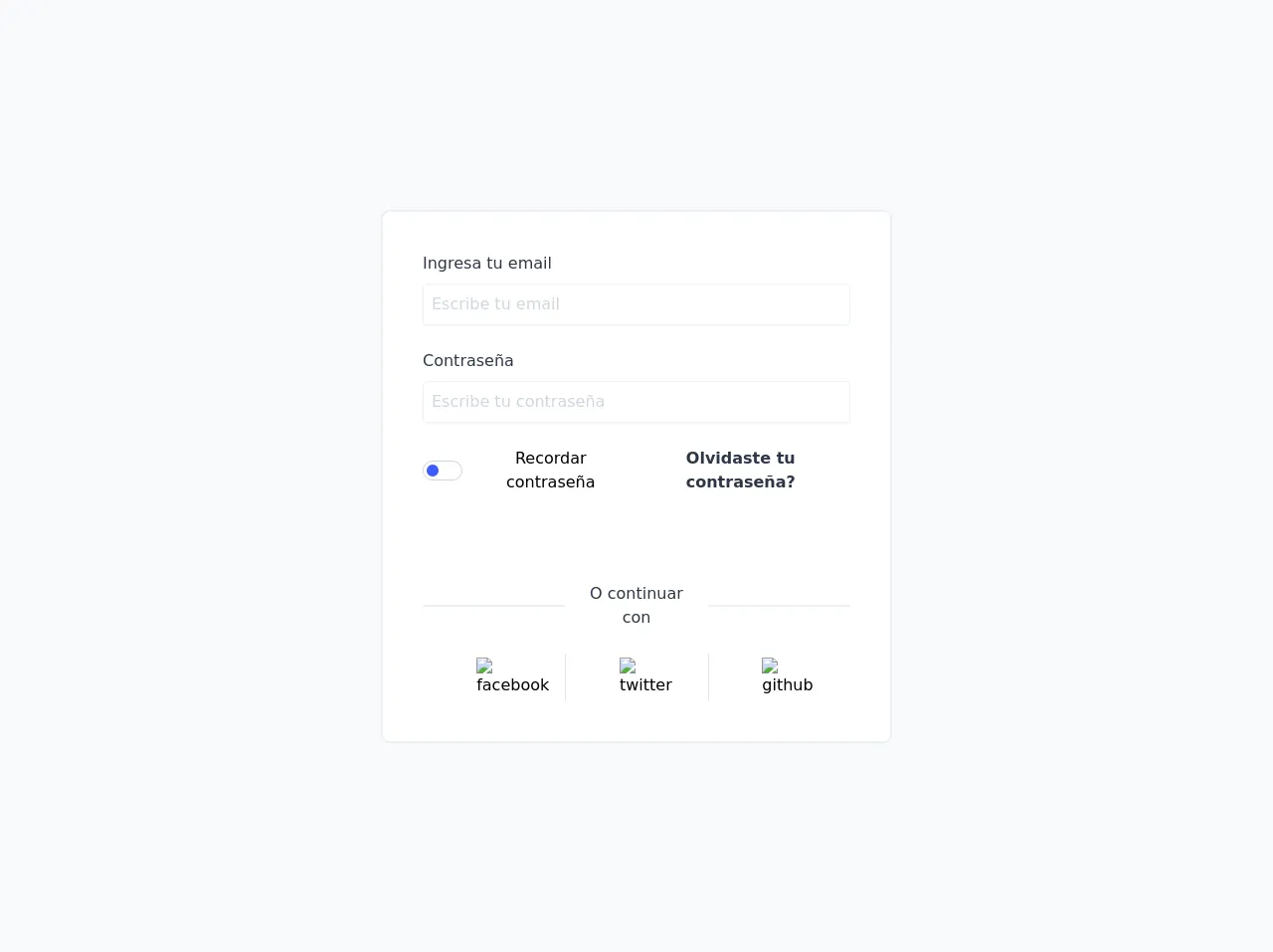
The preview of form ui component.
Creating a form with Tailwind CSS is easy and straightforward. Here is a preview of what the form UI component will look like:
Free download of the form's source code
The source code of form ui component.
To create a form with Tailwind CSS, you need to write HTML code and use Tailwind CSS classes to style the elements. Here is the source code for the form UI component:
<!DOCTYPE html>
<html lang="es">
   <head>
      <meta charset="UTF-8" />
      <meta name="viewport" content="width=device-width, initial-scale=1.0" />
      <link rel="stylesheet" href="form-1.css" />
      <link rel="stylesheet" href="../../css/estilos.css" />
      <title>Formulario - 1</title>
     <style>
     	:root {
   --color-btn: #3d5afe;
   --bk-btn: #ffffff;
   --border: 1px solid #cbd5e0;
}

* {
   margin: 0;
   padding: 0;
   box-sizing: border-box;
}

.switch {
   padding: 3px;
   width: 40px;
   height: 20px;
   background-color: var(--bk-btn);
   border: var(--border);
   border-radius: 20px;
}

#switch:checked ~ .switch::before {
   transition: 0.3;
   transform: translateX(20px);
}

.switch::before {
   content: '';
   display: block;
   height: 12px;
   width: 12px;
   border-radius: 50%;
   background-color: var(--color-btn);
   transition: 0.3s;
   transform: translateX(0);
}

img {
   width: 35px;
   margin: 0 auto;
}

     </style>
   </head>
   <body>
      <div
         class="bg-gray-100 w-screen h-screen flex justify-center items-center"
      >
         <form
            action=""
            class="max-w-lg border border-gray-200 shadow-xs mx-auto rounded-lg p-10 bg-white text-center space-y-6 flex-grow"
         >
            <div class="flex flex-col">
               <label
                  for="email"
                  class="self-start mb-2 font-medium text-gray-800"
                  >Ingresa tu email</label
               >
               <input
                  type="text"
                  id="email"
                  placeholder="Escribe tu email"
                  class="outline-none px-2 py-2 border shadow-sm placeholder-gray-500 opacity-50 rounded"
                  autocomplete="off"
               />
            </div>
            <div class="flex flex-col">
               <label
                  for="pass"
                  class="self-start mb-2 font-medium text-gray-800"
                  >Contraseña</label
               >
               <input
                  type="text"
                  id="pass"
                  placeholder="Escribe tu contraseña"
                  class="outline-none px-2 py-2 border shadow-sm placeholder-gray-500 opacity-50 rounded"
                  autocomplete="off"
               />
            </div>
            <div class="flex justify-between">
               <span class="flex items-center">
                  <div class="btn-status">
                     <input
                        type="checkbox"
                        name="checkbox"
                        id="switch"
                        class="hidden"
                     />
                     <label for="switch" class="switch block mr-2"></label>
                  </div>
                  <span>Recordar contraseña</span>
               </span>
               <span class="text-indigo-A300 font-semibold text-gray-800"
                  >Olvidaste tu contraseña?</span
               >
            </div>
            <button
               class="w-full bg-indigo-A300 py-2 rounded text-white font-semibold"
            >
               Iniciar sesión
            </button>
            <div class="flex items-center text-gray-800">
               <span class="block border border-gray-200 w-1/3 mr-2"></span>O
               continuar con<span
                  class="block border border-gray-200 w-1/3 ml-2"
               ></span>
            </div>
            <div
               class="flex justify-around text-center divide-x divide-gray-300"
            >
               <a
                  href="http://facebook.com"
                  target="blank"
                  class="w-1/3 p-1 cursor-pointer"
                  ><img
                     src="../../img/facebook logo 2019.svg"
                     alt="facebook"
                     class=""
               /></a>
               <a
                  href="http://twitter.com"
                  target="blank"
                  class="w-1/3 p-1 cursor-pointer"
                  ><img src="../../img/twitter.svg" alt="twitter" class=""
               /></a>
               <a
                  href="https://github.com/"
                  target="blank"
                  class="w-1/3 p-1 cursor-pointer"
                  ><img src="../../img/github-icon.svg" alt="github" class=""
               /></a>
            </div>
         </form>
      </div>

      <script>
         const btn = document.querySelector('.switch');
         btn.addEventListener('click', () => {
            if (document.getElementById('switch').checked) {
               btn.style.setProperty('--color-btn', '#3d5afe');
               btn.style.setProperty('--bk-btn', '#FFFFFF');
               btn.style.setProperty('--border', '1px solid #CBD5E0');
            } else {
               btn.style.setProperty('--color-btn', '#FFFFFF');
               btn.style.setProperty('--bk-btn', '#3d5afe');
               btn.style.setProperty('--border', '#FFFFFF');
            }
         });
      </script>
   </body>
</html>
How to create a form with Tailwind CSS?
Now that we have seen the preview and source code for the form UI component let's dive into how to create a form with Tailwind CSS.
Step 1: Set up the HTML structure
The first step is to set up the HTML structure for the form. The HTML structure should include input fields, labels, and buttons. Here is an example of the HTML structure:
<form class="bg-white shadow-md rounded px-8 pt-6 pb-8 mb-4">
  <div class="mb-4">
    <label class="block text-gray-700 font-bold mb-2" for="username">
      Username
    </label>
    <input class="shadow appearance-none border rounded w-full py-2 px-3 text-gray-700 leading-tight focus:outline-none focus:shadow-outline" id="username" type="text" placeholder="Username">
  </div>
  <div class="mb-6">
    <label class="block text-gray-700 font-bold mb-2" for="password">
      Password
    </label>
    <input class="shadow appearance-none border border-red-500 rounded w-full py-2 px-3 text-gray-700 mb-3 leading-tight focus:outline-none focus:shadow-outline" id="password" type="password" placeholder="******************">
    <p class="text-red-500 text-xs italic">Please choose a password.</p>
  </div>
  <div class="flex items-center justify-between">
    <button class="bg-blue-500 hover:bg-blue-700 text-white font-bold py-2 px-4 rounded focus:outline-none focus:shadow-outline" type="button">
      Sign In
    </button>
    <a class="inline-block align-baseline font-bold text-sm text-blue-500 hover:text-blue-800" href="#">
      Forgot Password?
    </a>
  </div>
</form>
Step 2: Add Tailwind CSS classes
The next step is to add Tailwind CSS classes to the HTML elements. Tailwind CSS provides a set of pre-defined classes that can be used to style form elements quickly. Here is an example of the HTML code with Tailwind CSS classes:
<form class="bg-white shadow-md rounded px-8 pt-6 pb-8 mb-4">
  <div class="mb-4">
    <label class="block text-gray-700 font-bold mb-2" for="username">
      Username
    </label>
    <input class="shadow appearance-none border rounded w-full py-2 px-3 text-gray-700 leading-tight focus:outline-none focus:shadow-outline" id="username" type="text" placeholder="Username">
  </div>
  <div class="mb-6">
    <label class="block text-gray-700 font-bold mb-2" for="password">
      Password
    </label>
    <input class="shadow appearance-none border border-red-500 rounded w-full py-2 px-3 text-gray-700 mb-3 leading-tight focus:outline-none focus:shadow-outline" id="password" type="password" placeholder="******************">
    <p class="text-red-500 text-xs italic">Please choose a password.</p>
  </div>
  <div class="flex items-center justify-between">
    <button class="bg-blue-500 hover:bg-blue-700 text-white font-bold py-2 px-4 rounded focus:outline-none focus:shadow-outline" type="button">
      Sign In
    </button>
    <a class="inline-block align-baseline font-bold text-sm text-blue-500 hover:text-blue-800" href="#">
      Forgot Password?
    </a>
  </div>
</form>
Step 3: Customize the form
The final step is to customize the form to match your website or application's design. Tailwind CSS provides a set of customization options that allow you to change the color, font, and other design elements of the form. Here is an example of the customized form:
<form class="bg-white shadow-md rounded px-8 pt-6 pb-8 mb-4">
  <div class="mb-4">
    <label class="block text-gray-700 font-bold mb-2" for="username">
      Username
    </label>
    <input class="shadow appearance-none border rounded w-full py-2 px-3 text-gray-700 leading-tight focus:outline-none focus:shadow-outline" id="username" type="text" placeholder="Username">
  </div>
  <div class="mb-6">
    <label class="block text-gray-700 font-bold mb-2" for="password">
      Password
    </label>
    <input class="shadow appearance-none border border-red-500 rounded w-full py-2 px-3 text-gray-700 mb-3 leading-tight focus:outline-none focus:shadow-outline" id="password" type="password" placeholder="******************">
    <p class="text-red-500 text-xs italic">Please choose a password.</p>
  </div>
  <div class="flex items-center justify-between">
    <button class="bg-green-500 hover:bg-green-700 text-white font-bold py-2 px-4 rounded focus:outline-none focus:shadow-outline" type="button">
      Sign In
    </button>
    <a class="inline-block align-baseline font-bold text-sm text-blue-500 hover:text-blue-800" href="#">
      Forgot Password?
    </a>
  </div>
</form>
Conclusion
In conclusion, Tailwind CSS is a powerful tool that can be used to create forms quickly and easily. By following the steps outlined in this article, you can create a form UI component in 60 minutes or less. With Tailwind CSS, you can customize the form to match your website or application's design, making it a valuable tool for any FrontEnd developer.