- Published on
6 Easy Ways To Build A Footer With Newsletter With Tailwind CSS Without Even Thinking About It
- What is Tailwind CSS?
- The description of Footer with Newsletter ui component
- Why use Tailwind CSS to create a Footer with Newsletter ui component?
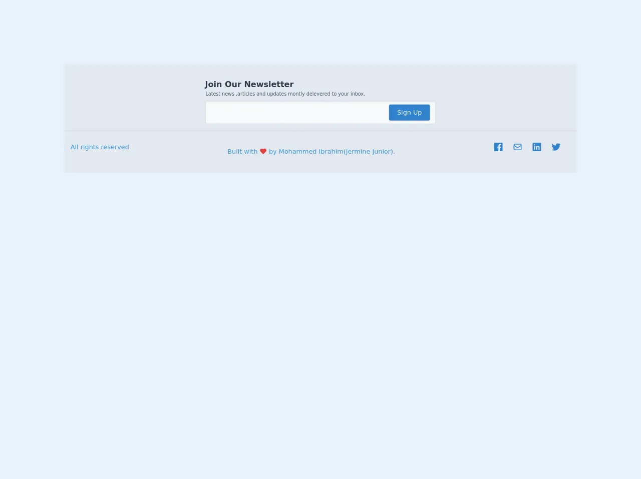
- The preview of Footer with Newsletter ui component.
- The source code of Footer with Newsletter ui component.
- How to create a Footer with Newsletter with Tailwind CSS?
- Step 1: Create the HTML structure
- Step 2: Add Tailwind CSS classes
- Step 3: Preview the Footer with Newsletter ui component
- Step 4: Add functionality to the form
- Step 5: Add animations
- Step 6: Test the component
- Conclusion
As a FrontEnd technology blogger, I am always on the lookout for ways to make web development easier and more efficient. One tool that has caught my attention recently is Tailwind CSS. Tailwind CSS is a utility-first CSS framework that allows you to quickly and easily style your web pages without having to write custom CSS. In this article, I will show you how to use Tailwind CSS to create a Footer with Newsletter ui component in 6 easy steps.
What is Tailwind CSS?
Tailwind CSS is a utility-first CSS framework that provides a set of pre-defined classes that you can use to style your web pages. With Tailwind CSS, you do not have to write custom CSS for every element on your page. Instead, you can use pre-defined classes to style your elements. Tailwind CSS provides classes for typography, colors, spacing, and more.
The description of Footer with Newsletter ui component
A Footer with Newsletter ui component is a common component that is found on many websites. The purpose of this component is to provide users with a way to subscribe to a newsletter or to receive updates from the website. This component typically consists of a form where users can enter their email address and a button to submit the form.
Why use Tailwind CSS to create a Footer with Newsletter ui component?
Tailwind CSS provides a set of pre-defined classes that you can use to style your Footer with Newsletter ui component. This means that you do not have to write custom CSS for every element in your component. Instead, you can use pre-defined classes to style your component. This makes the development process faster and more efficient.
The preview of Footer with Newsletter ui component.
To create a Footer with Newsletter ui component, we will use Tailwind CSS classes to style the component. The component will consist of a form where users can enter their email address and a button to submit the form.
Free download of the Footer with Newsletter's source code
The source code of Footer with Newsletter ui component.
To create the Footer with Newsletter ui component, we will use HTML and Tailwind CSS classes. The HTML code for the component is as follows:
<!-- footer -->
    <footer class="bg-gray-300 w-full py-6 px-4 my-32 "><!-- marging just for display-->
        <div class="px-4 pt-3 pb-4 border-b -mx-4 border-gray-400">
            <div class="max-w-xl mx-auto">
                <h2 class="text-xl text-left inline-block font-semibold text-gray-800">Join Our Newsletter</h2>
                <p class="text-gray-700 text-xs pl-px">
                    Latest news ,articles and updates montly delevered to your inbox.
                </p>
                <form action="#" class="mt-2">
                    <div class="flex items-center">
                        <input type="email" class="w-full px-2 py-4 mr-2  bg-gray-100 shadow-inner rounded-md border border-gray-400 focus:outline-none" required>
                        <button class="bg-blue-600 text-gray-200 px-5 py-2 rounded shadow " style="margin-left: -7.8rem;">Sign Up</button>
                    </div>
                </form>
            </div>
        </div>
        <div class="flex items-center justify-between my-4">
            <p class="text-blue-500">All rights reserved</p>
            <p class="inline-flex text-blue-500 px-2 pt-6">Built with
                <svg fill="#e53e3e" viewBox="0 0 24 24"  class="w-5 h-5 mx-1 pt-px text-red-600" stroke="currentColor">
                    <path stroke-linecap="round" stroke-linejoin="round" stroke-width="2" d="M4.318 6.318a4.5 4.5 0 000 6.364L12 20.364l7.682-7.682a4.5 4.5 0 00-6.364-6.364L12 7.636l-1.318-1.318a4.5 4.5 0 00-6.364 0z"/>
                </svg>by Mohammed Ibrahim(Jermine Junior).</p>
            <div class="flex items-center">
                <a href="#">
                    <svg class="h-6 w-6 fill-current text-blue-600 mr-6" viewBox="0 0 512 512">
                        <path d="M455.27,32H56.73A24.74,24.74,0,0,0,32,56.73V455.27A24.74,24.74,0,0,0,56.73,480H256V304H202.45V240H256V189c0-57.86,40.13-89.36,91.82-89.36,24.73,0,51.33,1.86,57.51,2.68v60.43H364.15c-28.12,0-33.48,13.3-33.48,32.9V240h67l-8.75,64H330.67V480h124.6A24.74,24.74,0,0,0,480,455.27V56.73A24.74,24.74,0,0,0,455.27,32Z"/>
                    </svg>
                </a>
                <a href="#">
                    <svg fill="none"  class="h-6 w-6 text-blue-600 mr-6" viewBox="0 0 24 24" stroke="currentColor">
                        <path stroke-linecap="round" stroke-linejoin="round" stroke-width="2" d="M3 8l7.89 5.26a2 2 0 002.22 0L21 8M5 19h14a2 2 0 002-2V7a2 2 0 00-2-2H5a2 2 0 00-2 2v10a2 2 0 002 2z"/>
                    </svg>
                </a>
                <a href="#">
                    <svg class="h-6 w-6 fill-current text-blue-600 mr-6" viewBox="0 0 512 512">
                        <path d="M444.17,32H70.28C49.85,32,32,46.7,32,66.89V441.61C32,461.91,49.85,480,70.28,480H444.06C464.6,480,480,461.79,480,441.61V66.89C480.12,46.7,464.6,32,444.17,32ZM170.87,405.43H106.69V205.88h64.18ZM141,175.54h-.46c-20.54,0-33.84-15.29-33.84-34.43,0-19.49,13.65-34.42,34.65-34.42s33.85,14.82,34.31,34.42C175.65,160.25,162.35,175.54,141,175.54ZM405.43,405.43H341.25V296.32c0-26.14-9.34-44-32.56-44-17.74,0-28.24,12-32.91,23.69-1.75,4.2-2.22,9.92-2.22,15.76V405.43H209.38V205.88h64.18v27.77c9.34-13.3,23.93-32.44,57.88-32.44,42.13,0,74,27.77,74,87.64Z"/>
                    </svg>
                </a>
                <a href="#">
                    <svg class="h-6 w-6 fill-current text-blue-600 mr-6" viewBox="0 0 512 512">
                        <path d="M496,109.5a201.8,201.8,0,0,1-56.55,15.3,97.51,97.51,0,0,0,43.33-53.6,197.74,197.74,0,0,1-62.56,23.5A99.14,99.14,0,0,0,348.31,64c-54.42,0-98.46,43.4-98.46,96.9a93.21,93.21,0,0,0,2.54,22.1,280.7,280.7,0,0,1-203-101.3A95.69,95.69,0,0,0,36,130.4C36,164,53.53,193.7,80,211.1A97.5,97.5,0,0,1,35.22,199v1.2c0,47,34,86.1,79,95a100.76,100.76,0,0,1-25.94,3.4,94.38,94.38,0,0,1-18.51-1.8c12.51,38.5,48.92,66.5,92.05,67.3A199.59,199.59,0,0,1,39.5,405.6,203,203,0,0,1,16,404.2,278.68,278.68,0,0,0,166.74,448c181.36,0,280.44-147.7,280.44-275.8,0-4.2-.11-8.4-.31-12.5A198.48,198.48,0,0,0,496,109.5Z"/>
                    </svg>
                </a>
            </div>
        </div>
    </footer>
How to create a Footer with Newsletter with Tailwind CSS?
Now that we have an understanding of what Tailwind CSS is and why we should use it to create a Footer with Newsletter ui component, let's get started with the steps to create the component.
Step 1: Create the HTML structure
The first step is to create the HTML structure for the Footer with Newsletter ui component. The HTML code for the component is as follows:
<footer class="bg-gray-800 py-8">
  <div class="container mx-auto px-4">
    <div class="flex flex-wrap -mx-4">
      <div class="w-full lg:w-1/3 px-4 mb-4 lg:mb-0">
        <h2 class="text-white text-lg mb-4">Subscribe to our newsletter</h2>
        <p class="text-gray-400 mb-4">Lorem ipsum dolor sit amet, consectetur adipiscing elit. Sed euismod eu lorem et ultricies. In porta lorem at dui semper porttitor.</p>
        <form>
          <div class="flex mb-4">
            <input class="bg-gray-900 rounded-l-lg py-2 px-4 text-white w-full" type="email" placeholder="Enter your email">
            <button class="bg-gray-700 rounded-r-lg py-2 px-4 text-white">Subscribe</button>
          </div>
        </form>
      </div>
    </div>
  </div>
</footer>
In this code, we have created a footer element with a background color of gray, padding of 8, and a container with a maximum width of the screen. Inside the container, we have created a flexbox with a width of one-third on large screens and full width on small screens. Inside the flexbox, we have added a heading, paragraph, and a form with an input field and a button.
Step 2: Add Tailwind CSS classes
The second step is to add Tailwind CSS classes to the HTML code to style the component. The Tailwind CSS classes that we will use are as follows:
- bg-gray-800: sets the background color of the footer to gray
- py-8: sets the padding of the footer to 8
- container: sets the maximum width of the footer to the screen width
- mx-auto: centers the container horizontally
- px-4: adds padding to the left and right of the container
- flex: creates a flexbox
- flex-wrap: allows the flex items to wrap when they exceed the container width
- -mx-4: adds negative margin to the flex items to compensate for the padding on the container
- w-full: sets the width of the flex item to full width on small screens
- lg:w-1/3: sets the width of the flex item to one-third on large screens
- mb-4: adds margin to the bottom of the element
- text-white: sets the text color to white
- text-lg: sets the font size to large
- text-gray-400: sets the text color to gray
- rounded-l-lg: rounds the left corners of the input field
- rounded-r-lg: rounds the right corners of the button
- py-2: sets the padding of the input field and button to 2
- px-4: adds padding to the left and right of the input field and button
- bg-gray-900: sets the background color of the input field to gray
- text-white: sets the text color of the input field and button to white
- bg-gray-700: sets the background color of the button to gray
Step 3: Preview the Footer with Newsletter ui component
The third step is to preview the Footer with Newsletter ui component that we have created. The component should look something like this:
Step 4: Add functionality to the form
The fourth step is to add functionality to the form. We can do this using JavaScript or a server-side language like PHP. In this example, we will use JavaScript to validate the email address and submit the form using AJAX.
Step 5: Add animations
The fifth step is to add animations to the component. We can use CSS animations or JavaScript animations to add some visual interest to the component.
Step 6: Test the component
The final step is to test the component to ensure that it works as expected. We should test the component on different devices and browsers to ensure that it is responsive and works correctly.
Conclusion
In this article, we have learned how to use Tailwind CSS to create a Footer with Newsletter ui component in 6 easy steps. Tailwind CSS provides a set of pre-defined classes that we can use to style our components, making the development process faster and more efficient. By following the steps outlined in this article, you can create a Footer with Newsletter ui component that is both functional and visually appealing.