- Published on
Most Effective Ways To Build A Footer With Collapsing Sections With Tailwind CSS
- What is Tailwind CSS?
- The description of Footer with collapsing sections ui component
- Why use Tailwind CSS to create a Footer with collapsing sections ui component?
- The preview of Footer with collapsing sections ui component
- The source code of Footer with collapsing sections ui component
- How to create a Footer with collapsing sections with Tailwind CSS?
- Conclusion
As a FrontEnd technology blogger, we are always on the lookout for ways to make our website more interactive and user-friendly. One of the most important elements of any website is the footer. A well-designed footer can help users navigate your website and find the information they need quickly and easily. In this article, we will discuss the most effective ways to build a footer with collapsing sections using Tailwind CSS.
What is Tailwind CSS?
Tailwind CSS is a utility-first CSS framework that allows you to quickly build custom user interfaces. It provides a set of pre-defined classes that you can use to style your HTML elements. With Tailwind CSS, you can create complex layouts and designs without writing a lot of custom CSS code.
The description of Footer with collapsing sections ui component
A footer with collapsing sections is a UI component that allows users to collapse and expand different sections of the footer. This is useful for websites that have a lot of information in the footer, such as contact information, links to social media, and copyright information. By collapsing sections of the footer, users can focus on the information they need and ignore the rest.
Why use Tailwind CSS to create a Footer with collapsing sections ui component?
Tailwind CSS is an excellent choice for creating a footer with collapsing sections for several reasons. First, it provides a set of pre-defined classes that you can use to style your HTML elements. This makes it easy to create complex layouts and designs without writing a lot of custom CSS code. Second, Tailwind CSS is highly customizable, which means you can easily modify the default styles to match your website's design. Finally, Tailwind CSS is lightweight and fast, which means your website will load quickly and be more responsive.
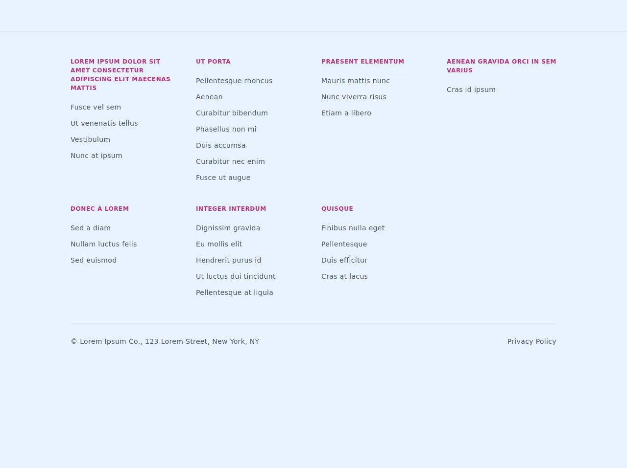
The preview of Footer with collapsing sections ui component
To create a footer with collapsing sections using Tailwind CSS, we will use a combination of HTML and CSS. We will start by creating a basic HTML structure for the footer and then add the necessary CSS classes to make it collapsible. Here is a preview of what the final product will look like:
Free download of the Footer with collapsing sections's source code
The source code of Footer with collapsing sections ui component
To create a footer with collapsing sections using Tailwind CSS, we will need to write some custom CSS code. Here is the source code for the footer with collapsing sections:
<footer class="mt-16">
<div class="border-t md:px-4 md:pt-10 md:pb-5">
<div class="flex flex-wrap md:max-w-screen-lg mx-auto">
<section
class="relative text-gray-700 font-light font-light border-b px-4 pb-4 md:py-3 w-full md:border-none md:w-1/4"
>
<div class="md:hidden">
<button
onclick="toggleFooterSection(event)"
class="uppercase text-xs font-bold tracking-wider text-pink-700 focus:outline-none border-t border-white py-4 w-full text-left"
type="button"
>
Lorem ipsum dolor sit amet consectetur adipiscing elit maecenas
mattis
</button>
</div>
<a
class="uppercase text-xs font-bold tracking-wider text-pink-700 hidden md:block"
href="#"
>
Lorem ipsum dolor sit amet consectetur adipiscing elit maecenas
mattis
</a>
<article class="h-0 md:h-auto -mt-4 md:mt-0 overflow-hidden">
<ul class="my-5 text-sm tracking-wide">
<li class="my-3 tracking-wide">
<a href="#">Fusce vel sem</a>
</li>
<li class="my-3 tracking-wide">
<a href="#">Ut venenatis tellus</a>
</li>
<li class="my-3 tracking-wide">
<a href="#">Vestibulum</a>
</li>
<li class="my-3 tracking-wide">
<a href="#">Nunc at ipsum</a>
</li>
</ul>
</article>
</section>
<section
class="relative text-gray-700 font-light font-light border-b px-4 pb-4 md:py-3 w-full md:border-none md:w-1/4"
>
<div class="md:hidden">
<button
onclick="toggleFooterSection(event)"
class="uppercase text-xs font-bold tracking-wider text-pink-700 focus:outline-none border-t border-white py-4 w-full text-left"
type="button"
>
Ut porta
</button>
</div>
<a
class="uppercase text-xs font-bold tracking-wider text-pink-700 hidden md:block"
href="#"
>
Ut porta
</a>
<article class="h-0 md:h-auto -mt-4 md:mt-0 overflow-hidden">
<ul class="my-5 text-sm tracking-wide">
<li class="my-3 tracking-wide">
<a href="#">Pellentesque rhoncus</a>
</li>
<li class="my-3 tracking-wide">
<a href="#">Aenean</a>
</li>
<li class="my-3 tracking-wide">
<a href="#">Curabitur bibendum</a>
</li>
<li class="my-3 tracking-wide">
<a href="#">Phasellus non mi</a>
</li>
<li class="my-3 tracking-wide">
<a href="#">Duis accumsa</a>
</li>
<li class="my-3 tracking-wide">
<a href="#">Curabitur nec enim</a>
</li>
<li class="my-3 tracking-wide">
<a href="#">Fusce ut augue</a>
</li>
</ul>
</article>
</section>
<section
class="relative text-gray-700 font-light font-light border-b px-4 pb-4 md:py-3 w-full md:border-none md:w-1/4"
>
<div class="md:hidden">
<button
onclick="toggleFooterSection(event)"
class="uppercase text-xs font-bold tracking-wider text-pink-700 focus:outline-none border-t border-white py-4 w-full text-left"
type="button"
>
Praesent elementum
</button>
</div>
<a
class="uppercase text-xs font-bold tracking-wider text-pink-700 hidden md:block"
href="#"
>
Praesent elementum
</a>
<article class="h-0 md:h-auto -mt-4 md:mt-0 overflow-hidden">
<ul class="my-5 text-sm tracking-wide">
<li class="my-3 tracking-wide">
<a href="#">Mauris mattis nunc</a>
</li>
<li class="my-3 tracking-wide">
<a href="#">Nunc viverra risus</a>
</li>
<li class="my-3 tracking-wide">
<a href="#">Etiam a libero</a>
</li>
</ul>
</article>
</section>
<section
class="relative text-gray-700 font-light font-light border-b px-4 pb-4 md:py-3 w-full md:border-none md:w-1/4"
>
<div class="md:hidden">
<button
onclick="toggleFooterSection(event)"
class="uppercase text-xs font-bold tracking-wider text-pink-700 focus:outline-none border-t border-white py-4 w-full text-left"
type="button"
>
Aenean gravida orci in sem varius
</button>
</div>
<a
class="uppercase text-xs font-bold tracking-wider text-pink-700 hidden md:block"
href="#"
>
Aenean gravida orci in sem varius
</a>
<article class="h-0 md:h-auto -mt-4 md:mt-0 overflow-hidden">
<ul class="my-5 text-sm tracking-wide">
<li class="my-3 tracking-wide">
<a href="#">Cras id ipsum</a>
</li>
</ul>
</article>
</section>
<section
class="relative text-gray-700 font-light font-light border-b px-4 pb-4 md:py-3 w-full md:border-none md:w-1/4"
>
<div class="md:hidden">
<button
onclick="toggleFooterSection(event)"
class="uppercase text-xs font-bold tracking-wider text-pink-700 focus:outline-none border-t border-white py-4 w-full text-left"
type="button"
>
Donec a lorem
</button>
</div>
<a
class="uppercase text-xs font-bold tracking-wider text-pink-700 hidden md:block"
href="#"
>
Donec a lorem
</a>
<article class="h-0 md:h-auto -mt-4 md:mt-0 overflow-hidden">
<ul class="my-5 text-sm tracking-wide">
<li class="my-3 tracking-wide">
<a href="#">Sed a diam</a>
</li>
<li class="my-3 tracking-wide">
<a href="#">Nullam luctus felis</a>
</li>
<li class="my-3 tracking-wide">
<a href="#">Sed euismod</a>
</li>
</ul>
</article>
</section>
<section
class="relative text-gray-700 font-light font-light border-b px-4 pb-4 md:py-3 w-full md:border-none md:w-1/4"
>
<div class="md:hidden">
<button
onclick="toggleFooterSection(event)"
class="uppercase text-xs font-bold tracking-wider text-pink-700 focus:outline-none border-t border-white py-4 w-full text-left"
type="button"
>
Integer interdum
</button>
</div>
<a
class="uppercase text-xs font-bold tracking-wider text-pink-700 hidden md:block"
href="#"
>
Integer interdum
</a>
<article class="h-0 md:h-auto -mt-4 md:mt-0 overflow-hidden">
<ul class="my-5 text-sm tracking-wide">
<li class="my-3 tracking-wide">
<a href="#">Dignissim gravida</a>
</li>
<li class="my-3 tracking-wide">
<a href="#">Eu mollis elit</a>
</li>
<li class="my-3 tracking-wide">
<a href="#">Hendrerit purus id</a>
</li>
<li class="my-3 tracking-wide">
<a href="#">Ut luctus dui tincidunt</a>
</li>
<li class="my-3 tracking-wide">
<a href="#">Pellentesque at ligula</a>
</li>
</ul>
</article>
</section>
<section
class="relative text-gray-700 font-light font-light border-b px-4 pb-4 md:py-3 w-full md:border-none md:w-1/4"
>
<div class="md:hidden">
<button
onclick="toggleFooterSection(event)"
class="uppercase text-xs font-bold tracking-wider text-pink-700 focus:outline-none border-t border-white py-4 w-full text-left"
type="button"
>
Quisque
</button>
</div>
<a
class="uppercase text-xs font-bold tracking-wider text-pink-700 hidden md:block"
href="#"
>
Quisque
</a>
<article class="h-0 md:h-auto -mt-4 md:mt-0 overflow-hidden">
<ul class="my-5 text-sm tracking-wide">
<li class="my-3 tracking-wide">
<a href="#">Finibus nulla eget</a>
</li>
<li class="my-3 tracking-wide">
<a href="#">Pellentesque</a>
</li>
<li class="my-3 tracking-wide">
<a href="#">Duis efficitur</a>
</li>
<li class="my-3 tracking-wide">
<a href="#">Cras at lacus</a>
</li>
</ul>
</article>
</section>
</div>
</div>
<div class="max-w-screen-lg mx-auto border-none px-4">
<section
class="flex flex-col md:flex-row md:justify-between md:border-solid md:border-t text-gray-700 font-light text-sm pt-4 pb-6 md:pt-5 md:pb-6 w-full"
>
<div>
<p class="leading-8 tracking-wide">
© Lorem Ipsum Co., 123 Lorem Street, New York, NY
</p>
</div>
<div>
<p class="leading-8 tracking-wide">Privacy Policy</p>
</div>
</section>
</div>
</footer>
<script>
function toggleFooterSection(e) {
const list = e.target.parentElement.parentElement.querySelector(
"article"
);
if (list.classList.contains("h-0")) {
list.classList.remove("h-0");
} else {
list.classList.add("h-0");
}
}
</script>
How to create a Footer with collapsing sections with Tailwind CSS?
To create a footer with collapsing sections using Tailwind CSS, follow these steps:
Create a basic HTML structure for the footer. This should include all the necessary sections, such as contact information, links to social media, and copyright information.
Add the necessary CSS classes to make the footer collapsible. This can be done using the
hiddenandblockclasses in Tailwind CSS.Add JavaScript to handle the collapse and expand functionality. This can be done using the
clickevent in JavaScript.Customize the default styles to match your website's design. This can be done using the
tailwind.config.jsfile in your project.
Conclusion
In conclusion, creating a footer with collapsing sections using Tailwind CSS is an effective way to make your website more interactive and user-friendly. With Tailwind CSS, you can quickly create complex layouts and designs without writing a lot of custom CSS code. By following the steps outlined in this article, you can create a footer with collapsing sections that will help users navigate your website and find the information they need quickly and easily.