- Published on
3 Things You Must Know To Make A Footer With Tailwind CSS
- What is Tailwind CSS?
- The description of Footer ui component
- Why use Tailwind CSS to create a Footer ui component?
- The preview of Footer ui component
- The source code of Footer ui component
- How to create a Footer with Tailwind CSS?
- 1. Use the flexbox utility classes
- 2. Use the text and font utility classes
- 3. Use the border and padding utility classes
- Conclusion
What is Tailwind CSS?
Tailwind CSS is a utility-first CSS framework that allows you to quickly build custom user interfaces. It provides a set of pre-defined classes that you can use to style your HTML elements without writing any CSS code. Tailwind CSS is highly customizable and allows you to create unique designs that match your brand.
The description of Footer ui component
The footer is an essential part of any website. It is usually located at the bottom of the page and contains information such as copyright notices, links to social media, and contact information. A well-designed footer can enhance the user experience and provide a professional look to your website.
Why use Tailwind CSS to create a Footer ui component?
Tailwind CSS makes it easy to create a footer ui component that is both functional and visually appealing. With Tailwind CSS, you can quickly add responsive design elements to your footer, such as columns and grids, that will adjust to different screen sizes. Additionally, Tailwind CSS provides a wide range of pre-defined classes that you can use to style your footer without writing any custom CSS code.
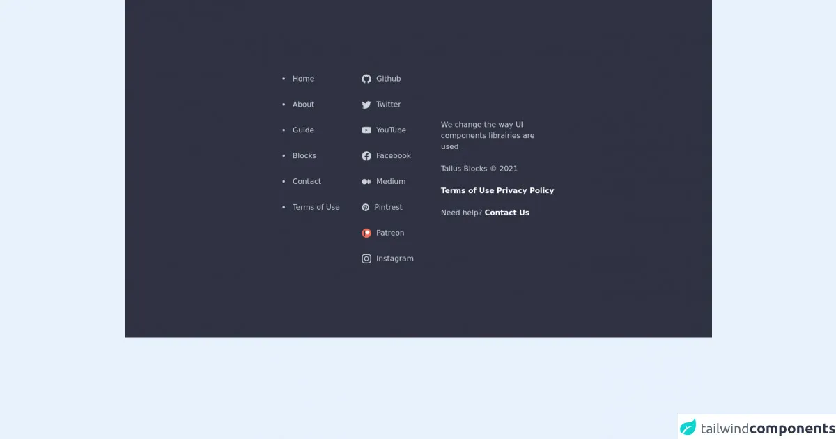
The preview of Footer ui component
To create a footer ui component with Tailwind CSS, you can use a combination of HTML and Tailwind CSS classes. Here is a preview of what the final product will look like:
Free download of the Footer's source code
The source code of Footer ui component
To create the footer ui component, you will need to add the following code to your HTML file:
<footer class="relative py-20 flex flex-col items-center bg-cyan-900 overflow-hidden md:py-40">
<div class="relative z-[1] container m-auto px-6 md:px-12">
<div class="m-auto md:w-10/12 lg:w-8/12 xl:w-6/12">
<div class="flex flex-wrap items-center justify-between md:flex-nowrap">
<div class="w-full space-x-12 flex justify-center text-gray-300 sm:w-7/12 md:justify-start">
<ul class="list-disc list-inside space-y-8">
<li><a href="#" class="hover:text-sky-400 transition">Home</a></li>
<li><a href="#" class="hover:text-sky-400 transition">About</a></li>
<li><a href="#" class="hover:text-sky-400 transition">Guide</a></li>
<li><a href="#" class="hover:text-sky-400 transition">Blocks</a></li>
<li><a href="#" class="hover:text-sky-400 transition">Contact</a></li>
<li><a href="#" class="hover:text-sky-400 transition">Terms of Use</a></li>
</ul>
<ul role="list" class="space-y-8">
<li>
<a href="#" class="flex items-center space-x-3 hover:text-sky-400 transition">
<svg xmlns="http://www.w3.org/2000/svg" fill="currentColor" class="w-5" viewBox="0 0 16 16">
<path d="M8 0C3.58 0 0 3.58 0 8c0 3.54 2.29 6.53 5.47 7.59.4.07.55-.17.55-.38 0-.19-.01-.82-.01-1.49-2.01.37-2.53-.49-2.69-.94-.09-.23-.48-.94-.82-1.13-.28-.15-.68-.52-.01-.53.63-.01 1.08.58 1.23.82.72 1.21 1.87.87 2.33.66.07-.52.28-.87.51-1.07-1.78-.2-3.64-.89-3.64-3.95 0-.87.31-1.59.82-2.15-.08-.2-.36-1.02.08-2.12 0 0 .67-.21 2.2.82.64-.18 1.32-.27 2-.27.68 0 1.36.09 2 .27 1.53-1.04 2.2-.82 2.2-.82.44 1.1.16 1.92.08 2.12.51.56.82 1.27.82 2.15 0 3.07-1.87 3.75-3.65 3.95.29.25.54.73.54 1.48 0 1.07-.01 1.93-.01 2.2 0 .21.15.46.55.38A8.012 8.012 0 0 0 16 8c0-4.42-3.58-8-8-8z"/>
</svg>
<span>Github</span>
</a>
</li>
<li>
<a href="#" class="flex items-center space-x-3 hover:text-sky-400 transition">
<svg xmlns="http://www.w3.org/2000/svg" fill="currentColor" class="w-5" viewBox="0 0 16 16">
<path d="M5.026 15c6.038 0 9.341-5.003 9.341-9.334 0-.14 0-.282-.006-.422A6.685 6.685 0 0 0 16 3.542a6.658 6.658 0 0 1-1.889.518 3.301 3.301 0 0 0 1.447-1.817 6.533 6.533 0 0 1-2.087.793A3.286 3.286 0 0 0 7.875 6.03a9.325 9.325 0 0 1-6.767-3.429 3.289 3.289 0 0 0 1.018 4.382A3.323 3.323 0 0 1 .64 6.575v.045a3.288 3.288 0 0 0 2.632 3.218 3.203 3.203 0 0 1-.865.115 3.23 3.23 0 0 1-.614-.057 3.283 3.283 0 0 0 3.067 2.277A6.588 6.588 0 0 1 .78 13.58a6.32 6.32 0 0 1-.78-.045A9.344 9.344 0 0 0 5.026 15z"/>
</svg>
<span>Twitter</span>
</a>
</li>
<li>
<a href="#" class="flex items-center space-x-3 hover:text-sky-400 transition">
<svg xmlns="http://www.w3.org/2000/svg" fill="currentColor" class="w-5" viewBox="0 0 16 16">
<path d="M8.051 1.999h.089c.822.003 4.987.033 6.11.335a2.01 2.01 0 0 1 1.415 1.42c.101.38.172.883.22 1.402l.01.104.022.26.008.104c.065.914.073 1.77.074 1.957v.075c-.001.194-.01 1.108-.082 2.06l-.008.105-.009.104c-.05.572-.124 1.14-.235 1.558a2.007 2.007 0 0 1-1.415 1.42c-1.16.312-5.569.334-6.18.335h-.142c-.309 0-1.587-.006-2.927-.052l-.17-.006-.087-.004-.171-.007-.171-.007c-1.11-.049-2.167-.128-2.654-.26a2.007 2.007 0 0 1-1.415-1.419c-.111-.417-.185-.986-.235-1.558L.09 9.82l-.008-.104A31.4 31.4 0 0 1 0 7.68v-.123c.002-.215.01-.958.064-1.778l.007-.103.003-.052.008-.104.022-.26.01-.104c.048-.519.119-1.023.22-1.402a2.007 2.007 0 0 1 1.415-1.42c.487-.13 1.544-.21 2.654-.26l.17-.007.172-.006.086-.003.171-.007A99.788 99.788 0 0 1 7.858 2h.193zM6.4 5.209v4.818l4.157-2.408L6.4 5.209z"/>
</svg>
<span>YouTube</span>
</a>
</li>
<li>
<a href="#" class="flex items-center space-x-3 hover:text-sky-400 transition">
<svg xmlns="http://www.w3.org/2000/svg" fill="currentColor" class="w-5" viewBox="0 0 16 16">
<path d="M16 8.049c0-4.446-3.582-8.05-8-8.05C3.58 0-.002 3.603-.002 8.05c0 4.017 2.926 7.347 6.75 7.951v-5.625h-2.03V8.05H6.75V6.275c0-2.017 1.195-3.131 3.022-3.131.876 0 1.791.157 1.791.157v1.98h-1.009c-.993 0-1.303.621-1.303 1.258v1.51h2.218l-.354 2.326H9.25V16c3.824-.604 6.75-3.934 6.75-7.951z"/>
</svg>
<span>Facebook</span>
</a>
</li>
<li>
<a href="#" class="flex items-center space-x-3 hover:text-sky-400 transition">
<svg xmlns="http://www.w3.org/2000/svg" fill="currentColor" class="w-5" viewBox="0 0 16 16">
<path d="M9.025 8c0 2.485-2.02 4.5-4.513 4.5A4.506 4.506 0 0 1 0 8c0-2.486 2.02-4.5 4.512-4.5A4.506 4.506 0 0 1 9.025 8zm4.95 0c0 2.34-1.01 4.236-2.256 4.236-1.246 0-2.256-1.897-2.256-4.236 0-2.34 1.01-4.236 2.256-4.236 1.246 0 2.256 1.897 2.256 4.236zM16 8c0 2.096-.355 3.795-.794 3.795-.438 0-.793-1.7-.793-3.795 0-2.096.355-3.795.794-3.795.438 0 .793 1.699.793 3.795z"/>
</svg>
<span>Medium</span>
</a>
</li>
<li>
<a href="#" class="flex items-center space-x-3 hover:text-sky-400 transition">
<svg xmlns="http://www.w3.org/2000/svg" width="16" height="16" fill="currentColor" class="5" viewBox="0 0 16 16">
<path d="M8 0a8 8 0 0 0-2.915 15.452c-.07-.633-.134-1.606.027-2.297.146-.625.938-3.977.938-3.977s-.239-.479-.239-1.187c0-1.113.645-1.943 1.448-1.943.682 0 1.012.512 1.012 1.127 0 .686-.437 1.712-.663 2.663-.188.796.4 1.446 1.185 1.446 1.422 0 2.515-1.5 2.515-3.664 0-1.915-1.377-3.254-3.342-3.254-2.276 0-3.612 1.707-3.612 3.471 0 .688.265 1.425.595 1.826a.24.24 0 0 1 .056.23c-.061.252-.196.796-.222.907-.035.146-.116.177-.268.107-1-.465-1.624-1.926-1.624-3.1 0-2.523 1.834-4.84 5.286-4.84 2.775 0 4.932 1.977 4.932 4.62 0 2.757-1.739 4.976-4.151 4.976-.811 0-1.573-.421-1.834-.919l-.498 1.902c-.181.695-.669 1.566-.995 2.097A8 8 0 1 0 8 0z"/>
</svg>
<span>Pintrest</span>
</a>
</li>
<li>
<a href="#" class="flex items-center space-x-3 hover:text-sky-400 transition">
<img class="w-5 h-5" src="https://c5.patreon.com/external/favicon/favicon.ico?v=69kMELnXkB" alt="patreon icon">
<span>Patreon</span>
</a>
</li>
<li>
<a href="#" class="flex items-center space-x-3 hover:text-sky-400 transition">
<svg xmlns="http://www.w3.org/2000/svg" fill="currentColor" class="w-5" viewBox="0 0 16 16">
<path d="M8 0C5.829 0 5.556.01 4.703.048 3.85.088 3.269.222 2.76.42a3.917 3.917 0 0 0-1.417.923A3.927 3.927 0 0 0 .42 2.76C.222 3.268.087 3.85.048 4.7.01 5.555 0 5.827 0 8.001c0 2.172.01 2.444.048 3.297.04.852.174 1.433.372 1.942.205.526.478.972.923 1.417.444.445.89.719 1.416.923.51.198 1.09.333 1.942.372C5.555 15.99 5.827 16 8 16s2.444-.01 3.298-.048c.851-.04 1.434-.174 1.943-.372a3.916 3.916 0 0 0 1.416-.923c.445-.445.718-.891.923-1.417.197-.509.332-1.09.372-1.942C15.99 10.445 16 10.173 16 8s-.01-2.445-.048-3.299c-.04-.851-.175-1.433-.372-1.941a3.926 3.926 0 0 0-.923-1.417A3.911 3.911 0 0 0 13.24.42c-.51-.198-1.092-.333-1.943-.372C10.443.01 10.172 0 7.998 0h.003zm-.717 1.442h.718c2.136 0 2.389.007 3.232.046.78.035 1.204.166 1.486.275.373.145.64.319.92.599.28.28.453.546.598.92.11.281.24.705.275 1.485.039.843.047 1.096.047 3.231s-.008 2.389-.047 3.232c-.035.78-.166 1.203-.275 1.485a2.47 2.47 0 0 1-.599.919c-.28.28-.546.453-.92.598-.28.11-.704.24-1.485.276-.843.038-1.096.047-3.232.047s-2.39-.009-3.233-.047c-.78-.036-1.203-.166-1.485-.276a2.478 2.478 0 0 1-.92-.598 2.48 2.48 0 0 1-.6-.92c-.109-.281-.24-.705-.275-1.485-.038-.843-.046-1.096-.046-3.233 0-2.136.008-2.388.046-3.231.036-.78.166-1.204.276-1.486.145-.373.319-.64.599-.92.28-.28.546-.453.92-.598.282-.11.705-.24 1.485-.276.738-.034 1.024-.044 2.515-.045v.002zm4.988 1.328a.96.96 0 1 0 0 1.92.96.96 0 0 0 0-1.92zm-4.27 1.122a4.109 4.109 0 1 0 0 8.217 4.109 4.109 0 0 0 0-8.217zm0 1.441a2.667 2.667 0 1 1 0 5.334 2.667 2.667 0 0 1 0-5.334z"/>
</svg>
<span>Instagram</span>
</a>
</li>
</ul>
</div>
<div class="w-10/12 m-auto mt-16 space-y-6 text-center sm:text-left sm:w-5/12 sm:mt-auto">
<span class="block text-gray-300">We change the way UI components librairies are used</span>
<span class="block text-gray-300">Tailus Blocks © 2021</span>
<span class="flex justify-between text-white">
<a href="#" class="font-semibold">Terms of Use </a>
<a href="#" class="font-semibold"> Privacy Policy</a>
</span>
<span class="block text-gray-300">Need help? <a href="#" class="font-semibold text-white"> Contact Us</a></span>
</div>
</div>
</div>
</div>
<div aria-hidden="true" class="absolute h-full inset-0 flex items-center">
<div aria-hidden="true" class="bg-layers bg-scale w-56 h-56 m-auto blur-xl bg-gradient-to-r from-cyan-400 via-blue-500 to-purple-600 rounded-full md:w-[30rem] md:h-[30rem] md:blur-3xl"></div>
</div>
<div aria-hidden="true" class="absolute inset-0 w-full h-full bg-[#020314] opacity-80"></div>
</footer>
<!--
Add to your stylesheet
.bg-layers {
-webkit-animation: filter-animation 4s infinite;
animation: filter-animation 4s infinite;
}
.bg-scale {
-webkit-animation: filter-animation 8s infinite;
animation: filter-scale 8s infinite;
}
@-webkit-keyframes filter-animation {
0% {
-webkit-filter: hue-rotate(0deg);
}
50% {
-webkit-filter: hue-rotate(45deg);
}
100% {
-webkit-filter: hue-rotate(0deg);
}
}
@keyframes filter-animation {
0% {
filter: hue-rotate(0deg);
}
50% {
filter: hue-rotate(45deg);
}
100% {
filter: hue-rotate(0deg);
}
}
@keyframes filter-scale {
0% {
transform:scale(1);
}
50% {
transform:scale(1.4);
}
100% {
transform:scale(.8);
}
}
-->
How to create a Footer with Tailwind CSS?
Here are the three things you need to know to create a footer with Tailwind CSS:
1. Use the flexbox utility classes
Tailwind CSS provides a set of utility classes that make it easy to create flexible layouts using the flexbox model. To create a footer with multiple columns, you can use the flexbox utility classes to define the layout. Here is an example:
<footer class="flex flex-wrap justify-center">
  <div class="w-full md:w-1/3 px-4">
    <!-- Column 1 content -->
  </div>
  <div class="w-full md:w-1/3 px-4">
    <!-- Column 2 content -->
  </div>
  <div class="w-full md:w-1/3 px-4">
    <!-- Column 3 content -->
  </div>
</footer>
In this example, we are using the flex and flex-wrap classes to create a flexible layout that will wrap the columns on smaller screens. We are also using the justify-center class to center the columns horizontally.
2. Use the text and font utility classes
Tailwind CSS provides a set of utility classes that make it easy to style text and fonts. To style the text in your footer, you can use the text utility classes to adjust the size, color, and alignment of the text. Here is an example:
<footer>
  <p class="text-sm text-gray-500 text-center">Copyright © 2021 My Website</p>
</footer>
In this example, we are using the text-sm class to set the font size to small, the text-gray-500 class to set the text color to gray, and the text-center class to center the text horizontally.
3. Use the border and padding utility classes
Tailwind CSS provides a set of utility classes that make it easy to add borders and padding to your elements. To add a border and padding to your footer, you can use the border and padding utility classes. Here is an example:
<footer class="border-t border-gray-200 py-4">
  <!-- Footer content -->
</footer>
In this example, we are using the border-t class to add a border to the top of the footer, the border-gray-200 class to set the border color to gray, and the py-4 class to add padding to the top and bottom of the footer.
Conclusion
Creating a footer with Tailwind CSS is easy and requires only a few lines of code. By using the flexbox, text, font, border, and padding utility classes, you can quickly create a footer that is both functional and visually appealing. With Tailwind CSS, you can customize your footer to match your brand and create a unique user experience for your website visitors.