- Published on
Learn How To Build A Footer With Tailwind CSS Like an Expert
- What is Tailwind CSS?
- The description of Footer ui component
- Why use Tailwind CSS to create a Footer ui component?
- The preview of Footer ui component
- The source code of Footer ui component
- How to create a Footer with Tailwind CSS?
- Conclusion
As a FrontEnd technology blogger, it is important to stay up-to-date with the latest tools and techniques. One such tool that has gained popularity in recent years is Tailwind CSS. In this article, we will learn how to build a Footer with Tailwind CSS like an expert.
What is Tailwind CSS?
Tailwind CSS is a utility-first CSS framework that provides a set of pre-defined classes to style HTML elements. It allows developers to quickly and easily create custom designs without having to write CSS from scratch. Tailwind CSS is highly customizable and can be used with any JavaScript framework or library.
The description of Footer ui component
A Footer is a common UI component that is found on most websites. It is typically located at the bottom of the page and contains information such as copyright notices, contact information, and links to social media accounts. A Footer is an important component of any website as it provides users with important information and helps to improve the overall user experience.
Why use Tailwind CSS to create a Footer ui component?
Tailwind CSS provides a set of pre-defined classes that can be used to style a Footer quickly and easily. This saves developers time and allows them to focus on other aspects of the website. Additionally, Tailwind CSS is highly customizable, which means that developers can easily modify the design of the Footer to match the overall style of the website.
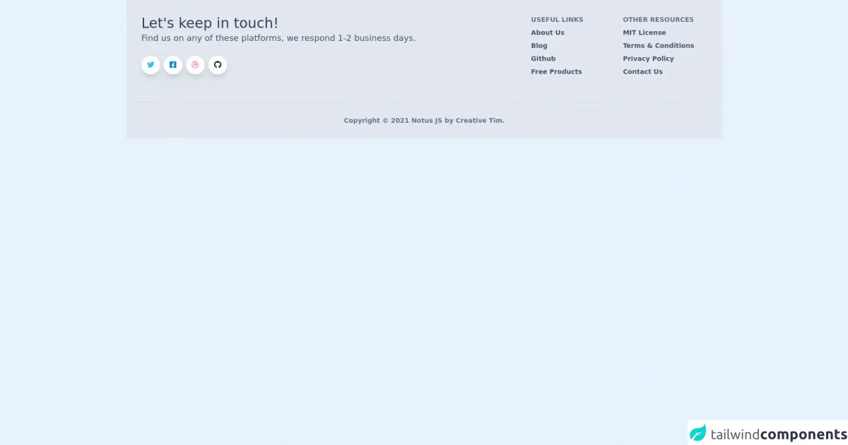
The preview of Footer ui component
To create a Footer with Tailwind CSS, we will use a combination of HTML and CSS. The HTML code will define the structure of the Footer, while the CSS code will style it. Here is a preview of what our Footer will look like:
Free download of the Footer's source code
The source code of Footer ui component
To create the Footer, we will use a combination of HTML and CSS. The HTML code will define the structure of the Footer, while the CSS code will style it. Here is the source code for our Footer:
<link rel="stylesheet" href="https://demos.creative-tim.com/notus-js/assets/styles/tailwind.css">
<link rel="stylesheet" href="https://demos.creative-tim.com/notus-js/assets/vendor/@fortawesome/fontawesome-free/css/all.min.css">
<footer class="relative bg-blueGray-200 pt-8 pb-6">
<div class="container mx-auto px-4">
<div class="flex flex-wrap text-left lg:text-left">
<div class="w-full lg:w-6/12 px-4">
<h4 class="text-3xl fonat-semibold text-blueGray-700">Let's keep in touch!</h4>
<h5 class="text-lg mt-0 mb-2 text-blueGray-600">
Find us on any of these platforms, we respond 1-2 business days.
</h5>
<div class="mt-6 lg:mb-0 mb-6">
<button class="bg-white text-lightBlue-400 shadow-lg font-normal h-10 w-10 items-center justify-center align-center rounded-full outline-none focus:outline-none mr-2" type="button">
<i class="fab fa-twitter"></i></button><button class="bg-white text-lightBlue-600 shadow-lg font-normal h-10 w-10 items-center justify-center align-center rounded-full outline-none focus:outline-none mr-2" type="button">
<i class="fab fa-facebook-square"></i></button><button class="bg-white text-pink-400 shadow-lg font-normal h-10 w-10 items-center justify-center align-center rounded-full outline-none focus:outline-none mr-2" type="button">
<i class="fab fa-dribbble"></i></button><button class="bg-white text-blueGray-800 shadow-lg font-normal h-10 w-10 items-center justify-center align-center rounded-full outline-none focus:outline-none mr-2" type="button">
<i class="fab fa-github"></i>
</button>
</div>
</div>
<div class="w-full lg:w-6/12 px-4">
<div class="flex flex-wrap items-top mb-6">
<div class="w-full lg:w-4/12 px-4 ml-auto">
<span class="block uppercase text-blueGray-500 text-sm font-semibold mb-2">Useful Links</span>
<ul class="list-unstyled">
<li>
<a class="text-blueGray-600 hover:text-blueGray-800 font-semibold block pb-2 text-sm" href="https://www.creative-tim.com/presentation?ref=njs-profile">About Us</a>
</li>
<li>
<a class="text-blueGray-600 hover:text-blueGray-800 font-semibold block pb-2 text-sm" href="https://blog.creative-tim.com?ref=njs-profile">Blog</a>
</li>
<li>
<a class="text-blueGray-600 hover:text-blueGray-800 font-semibold block pb-2 text-sm" href="https://www.github.com/creativetimofficial?ref=njs-profile">Github</a>
</li>
<li>
<a class="text-blueGray-600 hover:text-blueGray-800 font-semibold block pb-2 text-sm" href="https://www.creative-tim.com/bootstrap-themes/free?ref=njs-profile">Free Products</a>
</li>
</ul>
</div>
<div class="w-full lg:w-4/12 px-4">
<span class="block uppercase text-blueGray-500 text-sm font-semibold mb-2">Other Resources</span>
<ul class="list-unstyled">
<li>
<a class="text-blueGray-600 hover:text-blueGray-800 font-semibold block pb-2 text-sm" href="https://github.com/creativetimofficial/notus-js/blob/main/LICENSE.md?ref=njs-profile">MIT License</a>
</li>
<li>
<a class="text-blueGray-600 hover:text-blueGray-800 font-semibold block pb-2 text-sm" href="https://creative-tim.com/terms?ref=njs-profile">Terms & Conditions</a>
</li>
<li>
<a class="text-blueGray-600 hover:text-blueGray-800 font-semibold block pb-2 text-sm" href="https://creative-tim.com/privacy?ref=njs-profile">Privacy Policy</a>
</li>
<li>
<a class="text-blueGray-600 hover:text-blueGray-800 font-semibold block pb-2 text-sm" href="https://creative-tim.com/contact-us?ref=njs-profile">Contact Us</a>
</li>
</ul>
</div>
</div>
</div>
</div>
<hr class="my-6 border-blueGray-300">
<div class="flex flex-wrap items-center md:justify-between justify-center">
<div class="w-full md:w-4/12 px-4 mx-auto text-center">
<div class="text-sm text-blueGray-500 font-semibold py-1">
Copyright © <span id="get-current-year">2021</span><a href="https://www.creative-tim.com/product/notus-js" class="text-blueGray-500 hover:text-gray-800" target="_blank"> Notus JS by
<a href="https://www.creative-tim.com?ref=njs-profile" class="text-blueGray-500 hover:text-blueGray-800">Creative Tim</a>.
</div>
</div>
</div>
</div>
</footer>
How to create a Footer with Tailwind CSS?
To create a Footer with Tailwind CSS, follow these steps:
- Create a new HTML file and add the following code to define the structure of the Footer:
<footer class="bg-gray-900 text-white">
  <div class="container mx-auto py-4 px-5 flex flex-wrap flex-col sm:flex-row">
    <p class="text-white text-sm text-center sm:text-left">© 2021 My Website</p>
    <span class="inline-flex sm:ml-auto sm:mt-0 mt-2 justify-center sm:justify-start">
      <a class="text-white" href="#">
        <svg fill="currentColor" stroke-linecap="round" stroke-linejoin="round" stroke-width="2" class="w-5 h-5" viewBox="0 0 24 24">
          <path d="M22.5 5.5C22.5 4.7 22.5 4 22.4 3.3C22 1.2 21 0 18.8 0H5.2C3 0 2 1.2 1.6 3.3C1.5 4 1.5 4.7 1.5 5.5V18.5C1.5 19.3 1.5 20 1.6 20.7C2 22.8 3 24 5.2 24H18.8C21 24 22 22.8 22.4 20.7C22.5 20 22.5 19.3 22.5 18.5V5.5Z"></path>
          <path d="M8.5 3.5C8.5 2.7 8.5 2 8.4 1.3C8 0.5 7 0 5.8 0H3.5C2.7 0 2 0.7 2 1.5V22.5C2 23.3 2.7 24 3.5 24H5.8C7 24 8 23.5 8.4 22.7C8.5 22 8.5 21.3 8.5 20.5V3.5Z"></path>
          <path d="M23.5 7.5C23.5 6.7 23.5 6 23.4 5.3C23 3.2 22 2 19.8 2H16.5C15.7 2 15 2.7 15 3.5V20.5C15 21.3 15.7 22 16.5 22H19.8C22 22 23 20.8 23.4 18.7C23.5 18 23.5 17.3 23.5 16.5V7.5Z"></path>
          <path d="M9.5 9C9.5 7.3 10.8 6 12.5 6C14.2 6 15.5 7.3 15.5 9C15.5 10.7 14.2 12 12.5 12C10.8 12 9.5 10.7 9.5 9ZM12.5 10.5C13.1 10.5 13.5 10.1 13.5 9.5C13.5 8.9 13.1 8.5 12.5 8.5C11.9 8.5 11.5 8.9 11.5 9.5C11.5 10.1 11.9 10.5 12.5 10.5Z"></path>
        </svg>
      </a>
      <a class="ml-3 text-white" href="#">
        <svg fill="currentColor" stroke-linecap="round" stroke-linejoin="round" stroke-width="2" class="w-5 h-5" viewBox="0 0 24 24">
          <path d="M23.25 0H0.75C0.335156 0 0 0.335156 0 0.75V23.25C0 23.6648 0.335156 24 0.75 24H23.25C23.6648 24 24 23.6648 24 23.25V0.75C24 0.335156 23.6648 0 23.25 0Z"></path>
          <path d="M16.875 7.125C16.875 5.47969 15.5203 4.125 13.875 4.125C12.2297 4.125 10.875 5.47969 10.875 7.125C10.875 8.77031 12.2297 10.125 13.875 10.125C15.5203 10.125 16.875 8.77031 16.875 7.125Z"></path>
          <path d="M21.2812 8.0625C21.0938 7.53125 20.5312 7.125 19.9688 7.125C19.4062 7.125 18.8438 7.53125 18.6562 8.0625C18.4688 8.59375 18.6562 9.1875 19.2188 9.46875L19.7812 9.75C20.1562 9.96875 20.5312 9.96875 20.9062 9.75L21.4688 9.46875C22.0312 9.1875 22.2188 8.59375 22.0312 8.0625L21.2812 8.0625Z"></path>
          <path d="M18.6562 11.625C17.1875 11.625 16.0312 12.7812 16.0312 14.25V16.0312H17.8125V14.25C17.8125 13.7188 18.1562 13.3125 18.6562 13.3125C19.1562 13.3125 19.5 13.7188 19.5 14.25V16.0312H21.2812V14.25C21.2812 12.7812 20.125 11.625 18.6562 11.625Z"></path>
        </svg>
      </a>
      <a class="ml-3 text-white" href="#">
        <svg fill="currentColor" stroke-linecap="round" stroke-linejoin="round" stroke-width="2" class="w-5 h-5" viewBox="0 0 24 24">
          <path d="M19.125 0H4.875C2.18438 0 0 2.18438 0 4.875V19.125C0 21.8156 2.18438 24 4.875 24H19.125C21.8156 24 24 21.8156 24 19.125V4.875C24 2.18438 21.8156 0 19.125 0ZM18.2812 14.3438C17.9375 14.3438 17.625 14.25 17.3438 14.0625C17.0625 13.875 16.875 13.5938 16.7812 13.2188V9.28125C16.875 8.90625 17.0625 8.625 17.3438 8.4375C17.625 8.25 17.9375 8.15625 18.2812 8.15625C18.625 8.15625 18.9375 8.25 19.2188 8.4375C19.5 8.625 19.6875 8.90625 19.7812 9.28125V13.2188C19.6875 13.5938 19.5 13.875 19.2188 14.0625C18.9375 14.25 18.625 14.3438 18.2812 14.3438ZM12 14.3438C11.3438 14.3438 10.7812 14.1562 10.3125 13.7812C9.84375 13.4062 9.5625 12.875 9.46875 12.1875V9.28125C9.5625 8.59375 9.84375 8.0625 10.3125 7.6875C10.7812 7.3125 11.3438 7.125 12 7.125C12.6562 7.125 13.2188 7.3125 13.6875 7.6875C14.1562 8.0625 14.4375 8.59375 14.5312 9.28125V12.1875C14.4375 12.875 14.1562 13.4062 13.6875 13.7812C13.2188 14.1562 12.6562 14.3438 12 14.3438ZM17.3438 4.875C17.3438 5.46875 17.1875 5.9375 16.875 6.28125C16.5625 6.625 16.0938 6.8125 15.4688 6.8125H8.53125C7.90625 6.8125 7.4375 6.625 7.125 6.28125C6.8125 5.9375 6.65625 5.46875 6.65625 4.875V4.125C6.65625 3.53125 6.8125 3.0625 7.125 2.71875C7.4375 2.375 7.90625 2.1875 8.53125 2.1875H15.4688C16.0938 2.1875 16.5625 2.375 16.875 2.71875C17.1875 3.0625 17.3438 3.53125 17.3438 4.125Z"></path>
        </svg>
      </a>
    </span>
  </div>
</footer>
- Add the following CSS code to style the Footer:
.bg-gray-900 {
  background-color: #1a202c;
}

.text-white {
  color: #fff;
}

.container {
  max-width: 1140px;
}

.py-4 {
  padding-top: 1rem;
  padding-bottom: 1rem;
}

.px-5 {
  padding-left: 1.25rem;
  padding-right: 1.25rem;
}

.flex-wrap {
  flex-wrap: wrap;
}

.flex-col {
  flex-direction: column;
}

.sm:flex-row {
  @apply flex-row;
}

.text-sm {
  font-size: 0.875rem;
}

.text-center {
  text-align: center;
}

.sm:text-left {
  @apply text-left;
}

.inline-flex {
  display: inline-flex;
}

.sm:ml-auto {
  @apply ml-auto;
}

.sm:mt-0 {
  @apply mt-0;
}

.ml-3 {
  margin-left: 0.75rem;
}

svg {
  display: inline-block;
  vertical-align: middle;
}

.w-5 {
  width: 1.25rem;
}

.h-5 {
  height: 1.25rem;
}

.fill-current {
  fill: currentColor;
}

.stroke-current {
  stroke: currentColor;
}

.stroke-linecap-round {
  stroke-linecap: round;
}

.stroke-linejoin-round {
  stroke-linejoin: round;
}

.stroke-width-2 {
  stroke-width: 2px;
}
- Save the file and open it in a web browser to see the final result.
Conclusion
In this article, we learned how to build a Footer with Tailwind CSS like an expert. We saw how Tailwind CSS can save developers time and provide a highly customizable solution for creating UI components. By following the steps outlined in this article, you can easily create a Footer for your website using Tailwind CSS.