- Published on
Imagine You Build A Dashboard And Cards With Tailwind CSS Like An Expert. Follow These 6 Steps To Get There
- What is Tailwind CSS?
- The description of dashboard and cards UI component
- Why use Tailwind CSS to create a dashboard and cards UI component?
- The preview of dashboard and cards UI component.
- The source code of dashboard and cards UI component.
- How to create a dashboard and cards with Tailwind CSS?
- Step 1: Set up your project
- Step 2: Create the HTML structure
- Step 3: Add Tailwind CSS classes
- Step 4: Customize the design
- Step 5: Add responsiveness
- Step 6: Test and refine
- Conclusion
As a FrontEnd technology blogger, it's important to stay up to date with the latest CSS frameworks. One of the most popular frameworks today is Tailwind CSS. Tailwind CSS is a utility-first CSS framework that allows you to quickly and easily create custom designs for your website. In this article, we'll walk you through the process of creating a dashboard and cards UI component with Tailwind CSS.
What is Tailwind CSS?
Tailwind CSS is a utility-first CSS framework that provides pre-defined classes to help you quickly create custom designs. Instead of writing custom CSS, you can use Tailwind CSS classes to style your HTML elements. Tailwind CSS is highly customizable and allows you to create unique designs without writing a single line of CSS.
The description of dashboard and cards UI component
A dashboard is a web page that displays important information in a concise and easy-to-read format. A card is a UI component that displays information in a compact and organized manner. Together, a dashboard and cards UI component can provide users with a quick and easy way to access important information.
Why use Tailwind CSS to create a dashboard and cards UI component?
Tailwind CSS provides pre-defined classes that make it easy to create a dashboard and cards UI component. With Tailwind CSS, you can quickly style your HTML elements without writing custom CSS. Tailwind CSS also provides responsive design classes, which makes it easy to create a design that works on all screen sizes.
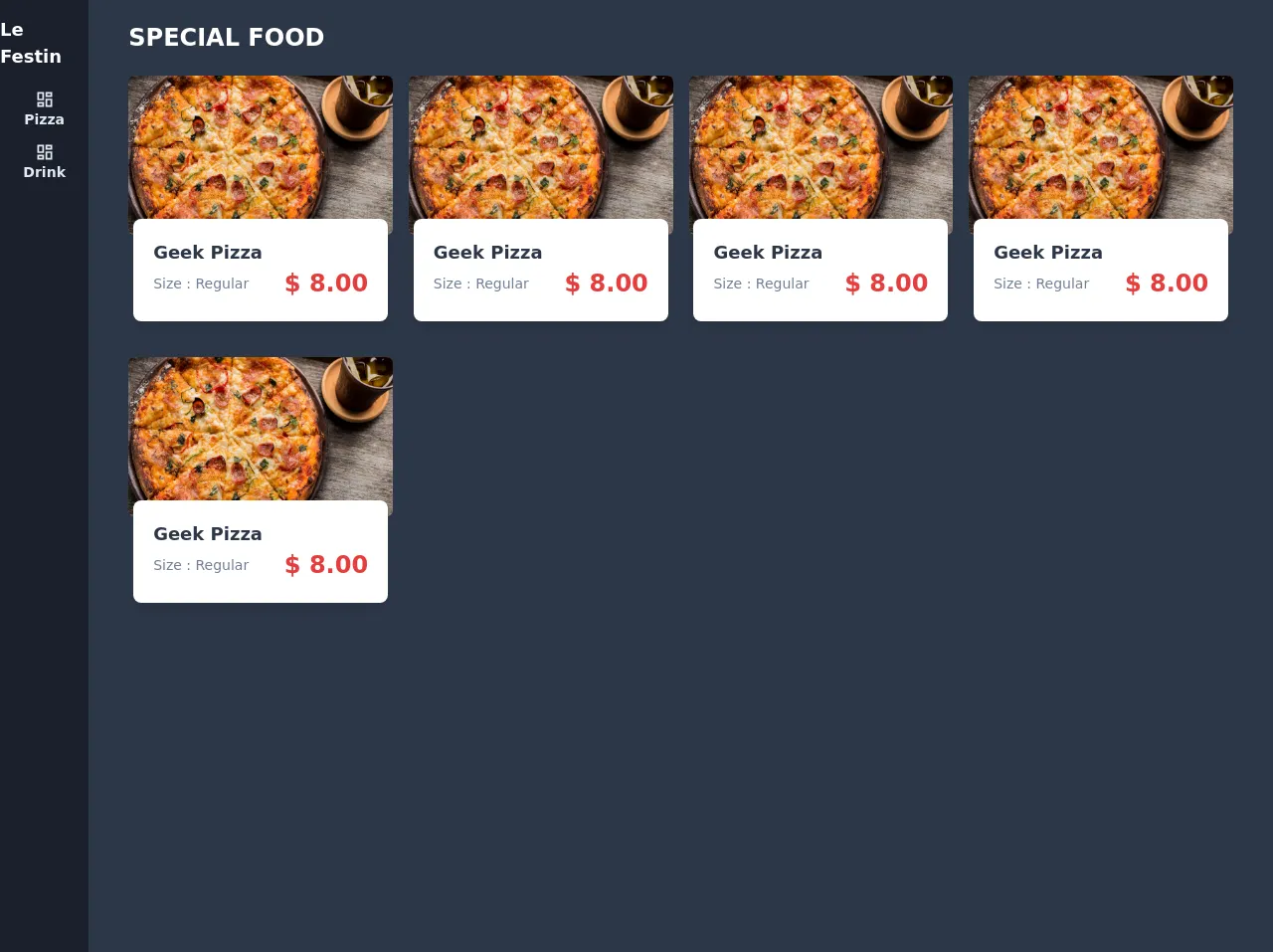
The preview of dashboard and cards UI component.
To create a dashboard and cards UI component with Tailwind CSS, we'll need to use a combination of HTML and Tailwind CSS classes. Here's a preview of what our dashboard and cards UI component will look like:
Free download of the dashboard and cards's source code
The source code of dashboard and cards UI component.
To create our dashboard and cards UI component, we'll need to use the following HTML and Tailwind CSS classes:
<div class="h-screen w-full flex bg-gray-800">
      <nav class="w-24 flex flex-col items-center bg-gray-900 py-4">
        <div class="text-lg font-semibold text-white">Le Festin</div>
        <!-- nav content -->
        <ul class="mt-2 text-gray-300 font-semibold">
          <li class="mt-3 t">
            <a href="#" class="flex flex-col items-center text-sm capitalize">
              <svg class="fill-current h-5 w-5" viewBox="0 0 24 24">
                <path
                  d="M19 5v2h-4V5h4M9 5v6H5V5h4m10 8v6h-4v-6h4M9
                    17v2H5v-2h4M21 3h-8v6h8V3M11 3H3v10h8V3m10
                    8h-8v10h8V11m-10 4H3v6h8v-6z"
                ></path>
              </svg>
              <span>pizza</span>
            </a>
          </li>
          <li class="mt-3 t">
            <a href="#" class="flex flex-col items-center text-sm capitalize">
              <svg class="fill-current h-5 w-5" viewBox="0 0 24 24">
                <path
                  d="M19 5v2h-4V5h4M9 5v6H5V5h4m10 8v6h-4v-6h4M9
                    17v2H5v-2h4M21 3h-8v6h8V3M11 3H3v10h8V3m10
                    8h-8v10h8V11m-10 4H3v6h8v-6z"
                ></path>
              </svg>
              <span>Drink</span>
            </a>
          </li>
        </ul>
      </nav>
      <!-- main -->
      <main class="w-full overflow-y-auto">
        <div class="px-10 mt-5">
          <span class="uppercase font-bold text-2xl text-white"
            >special food</span
          >
        </div>
        <div class="px-10 grid grid-cols-4 gap-4">
          <div
            class="col-span-4 sm:col-span-4 md:col-span-2 lg:col-span-1 xl:col-span-1 flex flex-col items-center"
          >
            <div class="bg-white rounded-lg mt-5">
              <img
                src="https://source.unsplash.com/MNtag_eXMKw/1600x900"
                class="h-40 rounded-md"
                alt=""
              />
            </div>
            <div class="bg-white shadow-lg rounded-lg -mt-4 w-64">
              <div class="py-5 px-5">
                <span class="font-bold text-gray-800 text-lg">Geek Pizza</span>
                <div class="flex items-center justify-between">
                  <div class="text-sm text-gray-600 font-light">
                    Size : Regular
                  </div>
                  <div class="text-2xl text-red-600 font-bold">
                    $ 8.00
                  </div>
                </div>
              </div>
            </div>
          </div>
          <!-- end cols -->
        </div>
      </main>
    </div>
How to create a dashboard and cards with Tailwind CSS?
Now that we've seen what our dashboard and cards UI component will look like, let's dive into the steps to create it.
Step 1: Set up your project
The first step is to set up your project. You can either download the Tailwind CSS files or use a CDN. If you're using a CDN, add the following code to the head of your HTML file:
<link rel="stylesheet" href="https://cdn.jsdelivr.net/npm/[email protected]/dist/tailwind.min.css">
Step 2: Create the HTML structure
Next, we'll create the HTML structure for our dashboard and cards UI component. Here's the HTML code:
<div class="container mx-auto">
  <div class="grid grid-cols-1 md:grid-cols-2 lg:grid-cols-3 gap-4">
    <div class="bg-white rounded-lg shadow-lg p-6">
      <h2 class="text-lg font-medium mb-4">Card 1</h2>
      <p class="text-gray-600">Lorem ipsum dolor sit amet, consectetur adipiscing elit. Sed feugiat, elit vel tincidunt bibendum, arcu velit consectetur sapien, nec malesuada mauris odio vel mauris.</p>
    </div>
    <div class="bg-white rounded-lg shadow-lg p-6">
      <h2 class="text-lg font-medium mb-4">Card 2</h2>
      <p class="text-gray-600">Lorem ipsum dolor sit amet, consectetur adipiscing elit. Sed feugiat, elit vel tincidunt bibendum, arcu velit consectetur sapien, nec malesuada mauris odio vel mauris.</p>
    </div>
    <div class="bg-white rounded-lg shadow-lg p-6">
      <h2 class="text-lg font-medium mb-4">Card 3</h2>
      <p class="text-gray-600">Lorem ipsum dolor sit amet, consectetur adipiscing elit. Sed feugiat, elit vel tincidunt bibendum, arcu velit consectetur sapien, nec malesuada mauris odio vel mauris.</p>
    </div>
  </div>
</div>
Step 3: Add Tailwind CSS classes
Now that we have our HTML structure, we can start adding Tailwind CSS classes to style our dashboard and cards UI component. Here are the Tailwind CSS classes we'll use:
container mx-auto: This centers the content on the page.grid grid-cols-1 md:grid-cols-2 lg:grid-cols-3 gap-4: This creates a grid layout with one column on small screens, two columns on medium screens, and three columns on large screens. Thegap-4class adds a 1rem gap between each card.bg-white: This sets the background color of the card to white.rounded-lg: This adds rounded corners to the card.shadow-lg: This adds a drop shadow to the card.p-6: This adds padding to the card.text-lg font-medium mb-4: This styles the card title with a larger font size, bold font weight, and margin bottom.text-gray-600: This styles the card content with a gray text color.
Step 4: Customize the design
Tailwind CSS provides a wide range of classes that you can use to customize the design of your dashboard and cards UI component. Here are a few examples:
bg-blue-500: This sets the background color of the card to blue.text-white: This sets the text color of the card to white.hover:bg-blue-600: This changes the background color of the card to a darker shade of blue when the user hovers over it.border-2 border-blue-500: This adds a blue border to the card.
Step 5: Add responsiveness
Tailwind CSS provides responsive design classes that allow you to create a design that works on all screen sizes. Here are a few examples:
md:grid-cols-2: This sets the number of columns to 2 on medium screens and above.lg:grid-cols-3: This sets the number of columns to 3 on large screens and above.sm:text-center: This centers the text on small screens and above.md:text-left: This aligns the text to the left on medium screens and above.
Step 6: Test and refine
Once you've created your dashboard and cards UI component, it's important to test it on different screen sizes and refine the design as needed. You can use the DevTools in your web browser to test the design on different screen sizes and make adjustments as needed.
Conclusion
Creating a dashboard and cards UI component with Tailwind CSS is easy and efficient. By using pre-defined classes, you can quickly create a custom design without writing custom CSS. With Tailwind CSS's responsive design classes, you can create a design that works on all screen sizes. We hope this article has helped you learn how to create a dashboard and cards UI component with Tailwind CSS.