- Published on
Here Are 6 Ways To Make A Floating Form Labels With Tailwind CSS
- What is Tailwind CSS?
- The description of Floating Form Labels ui component
- Why use Tailwind CSS to create a Floating Form Labels ui component?
- The preview of Floating Form Labels ui component.
- The source code of Floating Form Labels ui component.
- How to create a Floating Form Labels with Tailwind CSS?
- 1. Using the placeholder-opacity class
- 2. Using the placeholder-scale class
- 3. Using the placeholder-translate class
- 4. Using the placeholder-underline class
- 5. Using the placeholder-shrink class
- 6. Using the placeholder-color class
- Conclusion
In the world of web development, creating a user interface that is both functional and aesthetically pleasing is a top priority. One of the key components of a good user interface is the form input field. A floating form label is a popular UI component that can help improve the user experience when filling out forms. In this article, we will explore six ways to create a floating form label with Tailwind CSS.
What is Tailwind CSS?
Tailwind CSS is a utility-first CSS framework that provides a set of pre-defined classes that can be used to style HTML elements. Unlike traditional CSS frameworks that rely on pre-designed components, Tailwind CSS allows developers to create custom designs by combining pre-defined classes. This makes it easy to create unique and responsive designs without having to write custom CSS.
The description of Floating Form Labels ui component
A floating form label is a UI component that displays the label for a form input field above the field when the user focuses on it. This is in contrast to traditional form labels that are displayed next to the input field. Floating form labels are a popular UI component because they save space and provide a more modern look and feel.
Why use Tailwind CSS to create a Floating Form Labels ui component?
Tailwind CSS provides a set of pre-defined classes that can be used to create a floating form label with ease. This means that developers can create a floating form label without having to write custom CSS. Additionally, Tailwind CSS is highly customizable, which means that developers can easily modify the appearance of the floating form label to match the design of their website or application.
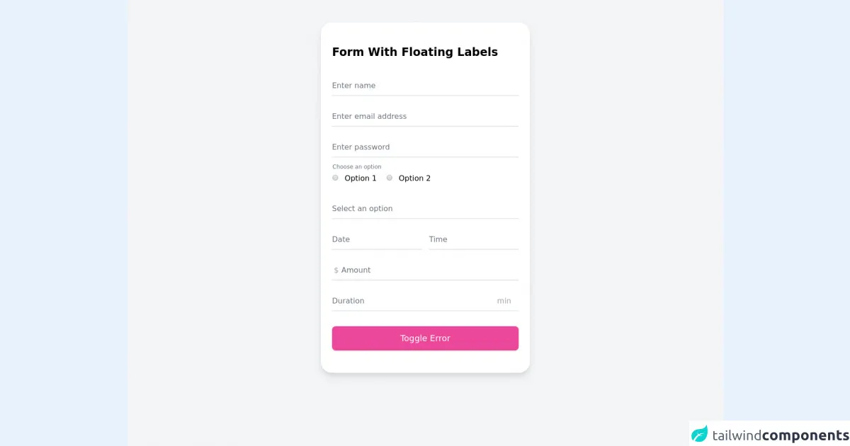
The preview of Floating Form Labels ui component.
Creating a floating form label with Tailwind CSS is easy. Here is a preview of what the final product will look like:
Free download of the Floating Form Labels's source code
The source code of Floating Form Labels ui component.
To create a floating form label with Tailwind CSS, we will use a combination of HTML and CSS. Here is the source code:
<!-- Code on GiHub: https://github.com/vitalikda/form-floating-labels-tailwindcss -->
<style>
  .-z-1 {
    z-index: -1;
  }

  .origin-0 {
    transform-origin: 0%;
  }

  input:focus ~ label,
  input:not(:placeholder-shown) ~ label,
  textarea:focus ~ label,
  textarea:not(:placeholder-shown) ~ label,
  select:focus ~ label,
  select:not([value='']):valid ~ label {
    /* @apply transform; scale-75; -translate-y-6; */
    --tw-translate-x: 0;
    --tw-translate-y: 0;
    --tw-rotate: 0;
    --tw-skew-x: 0;
    --tw-skew-y: 0;
    transform: translateX(var(--tw-translate-x)) translateY(var(--tw-translate-y)) rotate(var(--tw-rotate))
      skewX(var(--tw-skew-x)) skewY(var(--tw-skew-y)) scaleX(var(--tw-scale-x)) scaleY(var(--tw-scale-y));
    --tw-scale-x: 0.75;
    --tw-scale-y: 0.75;
    --tw-translate-y: -1.5rem;
  }

  input:focus ~ label,
  select:focus ~ label {
    /* @apply text-black; left-0; */
    --tw-text-opacity: 1;
    color: rgba(0, 0, 0, var(--tw-text-opacity));
    left: 0px;
  }
</style>

<div class="min-h-screen bg-gray-100 p-0 sm:p-12">
  <div class="mx-auto max-w-md px-6 py-12 bg-white border-0 shadow-lg sm:rounded-3xl">
    <h1 class="text-2xl font-bold mb-8">Form With Floating Labels</h1>
    <form id="form" novalidate>
      <div class="relative z-0 w-full mb-5">
        <input
          type="text"
          name="name"
          placeholder=" "
          required
          class="pt-3 pb-2 block w-full px-0 mt-0 bg-transparent border-0 border-b-2 appearance-none focus:outline-none focus:ring-0 focus:border-black border-gray-200"
        />
        <label for="name" class="absolute duration-300 top-3 -z-1 origin-0 text-gray-500">Enter name</label>
        <span class="text-sm text-red-600 hidden" id="error">Name is required</span>
      </div>

      <div class="relative z-0 w-full mb-5">
        <input
          type="email"
          name="email"
          placeholder=" "
          class="pt-3 pb-2 block w-full px-0 mt-0 bg-transparent border-0 border-b-2 appearance-none focus:outline-none focus:ring-0 focus:border-black border-gray-200"
        />
        <label for="email" class="absolute duration-300 top-3 -z-1 origin-0 text-gray-500">Enter email address</label>
        <span class="text-sm text-red-600 hidden" id="error">Email address is required</span>
      </div>

      <div class="relative z-0 w-full mb-5">
        <input
          type="password"
          name="password"
          placeholder=" "
          class="pt-3 pb-2 block w-full px-0 mt-0 bg-transparent border-0 border-b-2 appearance-none focus:outline-none focus:ring-0 focus:border-black border-gray-200"
        />
        <label for="password" class="absolute duration-300 top-3 -z-1 origin-0 text-gray-500">Enter password</label>
        <span class="text-sm text-red-600 hidden" id="error">Password is required</span>
      </div>

      <fieldset class="relative z-0 w-full p-px mb-5">
        <legend class="absolute text-gray-500 transform scale-75 -top-3 origin-0">Choose an option</legend>
        <div class="block pt-3 pb-2 space-x-4">
          <label>
            <input
              type="radio"
              name="radio"
              value="1"
              class="mr-2 text-black border-2 border-gray-300 focus:border-gray-300 focus:ring-black"
            />
            Option 1
          </label>
          <label>
            <input
              type="radio"
              name="radio"
              value="2"
              class="mr-2 text-black border-2 border-gray-300 focus:border-gray-300 focus:ring-black"
            />
            Option 2
          </label>
        </div>
        <span class="text-sm text-red-600 hidden" id="error">Option has to be selected</span>
      </fieldset>

      <div class="relative z-0 w-full mb-5">
        <select
          name="select"
          value=""
          onclick="this.setAttribute('value', this.value);"
          class="pt-3 pb-2 block w-full px-0 mt-0 bg-transparent border-0 border-b-2 appearance-none z-1 focus:outline-none focus:ring-0 focus:border-black border-gray-200"
        >
          <option value="" selected disabled hidden></option>
          <option value="1">Option 1</option>
          <option value="2">Option 2</option>
          <option value="3">Option 3</option>
          <option value="4">Option 4</option>
          <option value="5">Option 5</option>
        </select>
        <label for="select" class="absolute duration-300 top-3 -z-1 origin-0 text-gray-500">Select an option</label>
        <span class="text-sm text-red-600 hidden" id="error">Option has to be selected</span>
      </div>

      <div class="flex flex-row space-x-4">
        <div class="relative z-0 w-full mb-5">
          <input
            type="text"
            name="date"
            placeholder=" "
            onclick="this.setAttribute('type', 'date');"
            class="pt-3 pb-2 block w-full px-0 mt-0 bg-transparent border-0 border-b-2 appearance-none focus:outline-none focus:ring-0 focus:border-black border-gray-200"
          />
          <label for="date" class="absolute duration-300 top-3 -z-1 origin-0 text-gray-500">Date</label>
          <span class="text-sm text-red-600 hidden" id="error">Date is required</span>
        </div>
        <div class="relative z-0 w-full">
          <input
            type="text"
            name="time"
            placeholder=" "
            onclick="this.setAttribute('type', 'time');"
            class="pt-3 pb-2 block w-full px-0 mt-0 bg-transparent border-0 border-b-2 appearance-none focus:outline-none focus:ring-0 focus:border-black border-gray-200"
          />
          <label for="time" class="absolute duration-300 top-3 -z-1 origin-0 text-gray-500">Time</label>
          <span class="text-sm text-red-600 hidden" id="error">Time is required</span>
        </div>
      </div>

      <div class="relative z-0 w-full mb-5">
        <input
          type="number"
          name="money"
          placeholder=" "
          class="pt-3 pb-2 pl-5 block w-full px-0 mt-0 bg-transparent border-0 border-b-2 appearance-none focus:outline-none focus:ring-0 focus:border-black border-gray-200"
        />
        <div class="absolute top-0 left-0 mt-3 ml-1 text-gray-400">$</div>
        <label for="money" class="absolute duration-300 top-3 left-5 -z-1 origin-0 text-gray-500">Amount</label>
        <span class="text-sm text-red-600 hidden" id="error">Amount is required</span>
      </div>

      <div class="relative z-0 w-full mb-5">
        <input
          type="text"
          name="duration"
          placeholder=" "
          class="pt-3 pb-2 pr-12 block w-full px-0 mt-0 bg-transparent border-0 border-b-2 appearance-none focus:outline-none focus:ring-0 focus:border-black border-gray-200"
        />
        <div class="absolute top-0 right-0 mt-3 mr-4 text-gray-400">min</div>
        <label for="duration" class="absolute duration-300 top-3 -z-1 origin-0 text-gray-500">Duration</label>
        <span class="text-sm text-red-600 hidden" id="error">Duration is required</span>
      </div>

      <button
        id="button"
        type="button"
        class="w-full px-6 py-3 mt-3 text-lg text-white transition-all duration-150 ease-linear rounded-lg shadow outline-none bg-pink-500 hover:bg-pink-600 hover:shadow-lg focus:outline-none"
      >
        Toggle Error
      </button>
    </form>
  </div>
</div>

<script>
  'use strict'

  document.getElementById('button').addEventListener('click', toggleError)
  const errMessages = document.querySelectorAll('#error')

  function toggleError() {
    // Show error message
    errMessages.forEach((el) => {
      el.classList.toggle('hidden')
    })

    // Highlight input and label with red
    const allBorders = document.querySelectorAll('.border-gray-200')
    const allTexts = document.querySelectorAll('.text-gray-500')
    allBorders.forEach((el) => {
      el.classList.toggle('border-red-600')
    })
    allTexts.forEach((el) => {
      el.classList.toggle('text-red-600')
    })
  }
</script>
How to create a Floating Form Labels with Tailwind CSS?
Now that we have seen a preview of what the final product will look like and have the source code, let's dive into the six ways to create a floating form label with Tailwind CSS.
1. Using the placeholder-opacity class
The placeholder-opacity class can be used to change the opacity of the label when the input field is focused. Here is an example:
<div class="relative">
  <input type="text" class="w-full px-3 py-2 border-2 border-gray-300 rounded-md focus:outline-none focus:border-blue-500" placeholder=" " />
  <label class="absolute top-0 left-0 px-3 py-2 text-gray-500 transition-all duration-300 ease-in-out origin-0 transform scale-100 pointer-events-none placeholder-opacity-0 focus:placeholder-opacity-100">Full Name</label>
</div>
In this example, we have added the placeholder-opacity-0 class to the label to make it transparent by default. When the input field is focused, the focus:placeholder-opacity-100 class is added to the label, which makes it fully opaque.
2. Using the placeholder-scale class
The placeholder-scale class can be used to scale the label when the input field is focused. Here is an example:
<div class="relative">
  <input type="text" class="w-full px-3 py-2 border-2 border-gray-300 rounded-md focus:outline-none focus:border-blue-500" placeholder=" " />
  <label class="absolute top-0 left-0 px-3 py-2 text-gray-500 transition-all duration-300 ease-in-out origin-0 transform scale-100 pointer-events-none placeholder-scale-90 focus:placeholder-scale-100">Full Name</label>
</div>
In this example, we have added the placeholder-scale-90 class to the label to make it slightly smaller by default. When the input field is focused, the focus:placeholder-scale-100 class is added to the label, which makes it return to its original size.
3. Using the placeholder-translate class
The placeholder-translate class can be used to translate the label when the input field is focused. Here is an example:
<div class="relative">
  <input type="text" class="w-full px-3 py-2 border-2 border-gray-300 rounded-md focus:outline-none focus:border-blue-500" placeholder=" " />
  <label class="absolute top-0 left-0 px-3 py-2 text-gray-500 transition-all duration-300 ease-in-out origin-0 transform translate-y-2 pointer-events-none placeholder-translate-0 focus:placeholder-translate-y-0">Full Name</label>
</div>
In this example, we have added the placeholder-translate-y-2 class to the label to move it down by 2 pixels by default. When the input field is focused, the focus:placeholder-translate-y-0 class is added to the label, which makes it return to its original position.
4. Using the placeholder-underline class
The placeholder-underline class can be used to add an underline to the label when the input field is focused. Here is an example:
<div class="relative">
  <input type="text" class="w-full px-3 py-2 border-2 border-gray-300 rounded-md focus:outline-none focus:border-blue-500" placeholder=" " />
  <label class="absolute top-0 left-0 px-3 py-2 text-gray-500 transition-all duration-300 ease-in-out origin-0 transform translate-y-2 pointer-events-none placeholder-underline placeholder-underline-gray-400 focus:placeholder-underline-blue-500">Full Name</label>
</div>
In this example, we have added the placeholder-underline class to the label to add an underline by default. When the input field is focused, the focus:placeholder-underline-blue-500 class is added to the label, which changes the color of the underline.
5. Using the placeholder-shrink class
The placeholder-shrink class can be used to shrink the label when the input field is focused. Here is an example:
<div class="relative">
  <input type="text" class="w-full px-3 py-2 border-2 border-gray-300 rounded-md focus:outline-none focus:border-blue-500" placeholder=" " />
  <label class="absolute top-0 left-0 px-3 py-2 text-gray-500 transition-all duration-300 ease-in-out origin-0 transform translate-y-2 pointer-events-none placeholder-shrink focus:placeholder-shrink-0">Full Name</label>
</div>
In this example, we have added the placeholder-shrink class to the label to make it smaller by default. When the input field is focused, the focus:placeholder-shrink-0 class is added to the label, which makes it return to its original size.
6. Using the placeholder-color class
The placeholder-color class can be used to change the color of the label when the input field is focused. Here is an example:
<div class="relative">
  <input type="text" class="w-full px-3 py-2 border-2 border-gray-300 rounded-md focus:outline-none focus:border-blue-500" placeholder=" " />
  <label class="absolute top-0 left-0 px-3 py-2 text-gray-500 transition-all duration-300 ease-in-out origin-0 transform translate-y-2 pointer-events-none placeholder-color-gray-400 focus:placeholder-color-blue-500">Full Name</label>
</div>
In this example, we have added the placeholder-color-gray-400 class to the label to make it gray by default. When the input field is focused, the focus:placeholder-color-blue-500 class is added to the label, which changes the color of the label to blue.
Conclusion
In this article, we have explored six ways to create a floating form label with Tailwind CSS. By using Tailwind CSS, developers can easily create a modern and responsive user interface without having to write custom CSS. By incorporating these techniques, developers can create a floating form label that is both functional and aesthetically pleasing.