- Published on
Surprisingly Effective Ways To Make A Floating Bottom Navigation With Tailwind CSS
- What is Tailwind CSS?
- The description of Floating Bottom Navigation ui component
- Why use Tailwind CSS to create a Floating Bottom Navigation ui component?
- The preview of Floating Bottom Navigation ui component
- The source code of Floating Bottom Navigation ui component
- How to create a Floating Bottom Navigation with Tailwind CSS?
- Step 1: Create a new HTML file and add the above HTML code
- Step 2: Link the Tailwind CSS stylesheet to your HTML file
- Step 3: Customize the styles of the navigation bar using Tailwind CSS classes
- Step 4: Add functionality to the navigation items using JavaScript
- Conclusion
As a FrontEnd technology blogger, you are always looking for ways to create beautiful and functional user interfaces. One of the most popular UI components is the Floating Bottom Navigation. In this article, we will explore how to create a Floating Bottom Navigation using Tailwind CSS.
What is Tailwind CSS?
Tailwind CSS is a utility-first CSS framework that provides a set of pre-defined classes to help you quickly build custom user interfaces. It allows you to create complex layouts and styles without writing custom CSS. Tailwind CSS is gaining popularity among developers due to its simplicity and flexibility.
The description of Floating Bottom Navigation ui component
A Floating Bottom Navigation is a UI component that is commonly used in mobile applications. It is a navigation bar that is positioned at the bottom of the screen and "floats" above the content. It provides quick access to the main sections of the application and is easy to use with one hand.
Why use Tailwind CSS to create a Floating Bottom Navigation ui component?
Tailwind CSS provides a set of pre-defined classes that can be used to create a Floating Bottom Navigation quickly. It also allows you to customize the styles of the component using its utility classes. This makes it easy to create a unique and functional Floating Bottom Navigation that matches the design of your application.
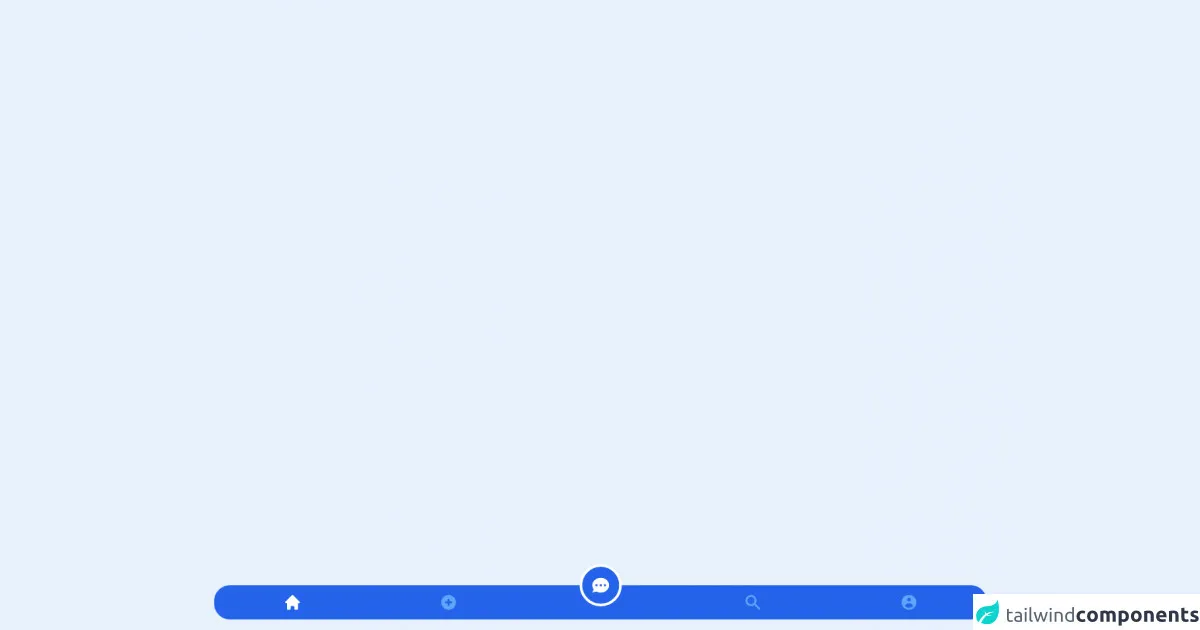
The preview of Floating Bottom Navigation ui component
To create a Floating Bottom Navigation using Tailwind CSS, we will use the following classes: fixed, bottom-0, w-full, bg-white, shadow, flex, justify-around, and items-center. These classes will position the navigation bar at the bottom of the screen, make it full-width, and give it a white background with a shadow effect. The flex, justify-around, and items-center classes will align the navigation items in the center.
Free download of the Floating Bottom Navigation's source code
The source code of Floating Bottom Navigation ui component
To create a Floating Bottom Navigation using Tailwind CSS, we will use the following HTML code:
<nav class="fixed bottom-0 w-full bg-white shadow flex justify-around items-center">
  <a href="#" class="text-gray-600 hover:text-gray-900">
    <i class="fas fa-home fa-lg"></i>
    <p class="text-xs">Home</p>
  </a>
  <a href="#" class="text-gray-600 hover:text-gray-900">
    <i class="fas fa-search fa-lg"></i>
    <p class="text-xs">Search</p>
  </a>
  <a href="#" class="text-gray-600 hover:text-gray-900">
    <i class="fas fa-bell fa-lg"></i>
    <p class="text-xs">Notifications</p>
  </a>
  <a href="#" class="text-gray-600 hover:text-gray-900">
    <i class="fas fa-user fa-lg"></i>
    <p class="text-xs">Profile</p>
  </a>
</nav>
This code will create a navigation bar with four items: Home, Search, Notifications, and Profile. Each item consists of an icon and a label. The text-gray-600 and hover:text-gray-900 classes will change the color of the text when the item is hovered over.
<div class="fixed bottom-4 left-1/2 transform -translate-x-1/2 inline-flex left-0 mx-auto justify-between bg-blue-600 w-11/12 rounded-3xl">
      <a
        aria-current="page"
        class="inline-flex flex-col items-center text-xs font-medium py-3 px-4 text-white flex-grow"
        href="#"
      >
        <svg
          class="w-7 h-7"
          fill="currentColor"
          viewBox="0 0 20 20"
          xmlns="http://www.w3.org/2000/svg"
        >
          <path d="M10.707 2.293a1 1 0 00-1.414 0l-7 7a1 1 0 001.414 1.414L4 10.414V17a1 1 0 001 1h2a1 1 0 001-1v-2a1 1 0 011-1h2a1 1 0 011 1v2a1 1 0 001 1h2a1 1 0 001-1v-6.586l.293.293a1 1 0 001.414-1.414l-7-7z"></path>
        </svg>
        <span class="sr-only">Home</span>
      </a>
      <a
        class="inline-flex flex-col items-center text-xs font-medium text-blue-400 py-3 px-4 flex-grow"
        href="#"
      >
        <svg
          class="w-7 h-7"
          fill="currentColor"
          viewBox="0 0 20 20"
          xmlns="http://www.w3.org/2000/svg"
        >
          <path
            fill-rule="evenodd"
            d="M10 18a8 8 0 100-16 8 8 0 000 16zm1-11a1 1 0 10-2 0v2H7a1 1 0 100 2h2v2a1 1 0 102 0v-2h2a1 1 0 100-2h-2V7z"
            clip-rule="evenodd"
          ></path>
        </svg>
      </a>
      <span class="sr-only">Upload</span>
      <button class="relative inline-flex flex-col items-center text-xs font-medium text-white py-3 px-6 flex-grow">
        <div class="absolute bottom-5 p-3 rounded-full border-4 border-white bg-blue-600">
          <svg
            class="w-8 h-8"
            fill="currentColor"
            viewBox="0 0 20 20"
            xmlns="http://www.w3.org/2000/svg"
          >
            <path
              fill-rule="evenodd"
              d="M18 10c0 3.866-3.582 7-8 7a8.841 8.841 0 01-4.083-.98L2 17l1.338-3.123C2.493 12.767 2 11.434 2 10c0-3.866 3.582-7 8-7s8 3.134 8 7zM7 9H5v2h2V9zm8 0h-2v2h2V9zM9 9h2v2H9V9z"
              clip-rule="evenodd"
            ></path>
          </svg>
        </div>
        <span class="sr-only">Chat</span>
      </button>
      <a
        class="inline-flex flex-col items-center text-xs font-medium text-blue-400 py-3 px-4 flex-grow"
        href="#"
      >
        <svg
          class="w-7 h-7"
          fill="currentColor"
          viewBox="0 0 20 20"
          xmlns="http://www.w3.org/2000/svg"
        >
          <path
            fill-rule="evenodd"
            d="M8 4a4 4 0 100 8 4 4 0 000-8zM2 8a6 6 0 1110.89 3.476l4.817 4.817a1 1 0 01-1.414 1.414l-4.816-4.816A6 6 0 012 8z"
            clip-rule="evenodd"
          ></path>
        </svg>
        <span class="sr-only">Search</span>
      </a>
      <a
        class="inline-flex flex-col items-center text-xs font-medium text-blue-400 py-3 px-4 flex-grow"
        href="#"
      >
        <svg
          class="w-7 h-7"
          fill="currentColor"
          viewBox="0 0 20 20"
          xmlns="http://www.w3.org/2000/svg"
        >
          <path
            fill-rule="evenodd"
            d="M18 10a8 8 0 11-16 0 8 8 0 0116 0zm-6-3a2 2 0 11-4 0 2 2 0 014 0zm-2 4a5 5 0 00-4.546 2.916A5.986 5.986 0 0010 16a5.986 5.986 0 004.546-2.084A5 5 0 0010 11z"
            clip-rule="evenodd"
          ></path>
        </svg>
        <span class="sr-only">Profile</span>
      </a>
    </div>
How to create a Floating Bottom Navigation with Tailwind CSS?
To create a Floating Bottom Navigation using Tailwind CSS, follow these steps:
- Create a new HTML file and add the above HTML code.
- Link the Tailwind CSS stylesheet to your HTML file.
- Customize the styles of the navigation bar using Tailwind CSS classes.
- Add functionality to the navigation items using JavaScript.
Let's take a closer look at each step.
Step 1: Create a new HTML file and add the above HTML code
Create a new HTML file and add the above HTML code to it. Save the file and open it in your web browser. You should see a navigation bar with four items at the bottom of the screen.
Step 2: Link the Tailwind CSS stylesheet to your HTML file
To use Tailwind CSS, you need to link its stylesheet to your HTML file. You can download the stylesheet from the official website or use a CDN. Here's an example of how to link the stylesheet using a CDN:
<link href="https://cdn.jsdelivr.net/npm/[email protected]/dist/tailwind.min.css" rel="stylesheet">
Add this code to the head section of your HTML file.
Step 3: Customize the styles of the navigation bar using Tailwind CSS classes
To customize the styles of the navigation bar, you can use Tailwind CSS classes. For example, you can change the background color of the navigation bar to blue by adding the bg-blue-500 class to the nav element:
<nav class="fixed bottom-0 w-full bg-blue-500 shadow flex justify-around items-center">
You can also change the font size of the labels by adding the text-sm class to the p element:
<p class="text-sm">Home</p>
Step 4: Add functionality to the navigation items using JavaScript
To add functionality to the navigation items, you can use JavaScript. For example, you can add an event listener to each item that opens a different page when clicked:
<a href="#" class="text-gray-600 hover:text-gray-900" onclick="openPage('home')">
  <i class="fas fa-home fa-lg"></i>
  <p class="text-xs">Home</p>
</a>
function openPage(pageName) {
  // code to open the page
}
Conclusion
In this article, we explored how to create a Floating Bottom Navigation using Tailwind CSS. We learned that Tailwind CSS provides a set of pre-defined classes that can be used to create complex user interfaces quickly. We also learned that the Floating Bottom Navigation is a popular UI component that is commonly used in mobile applications. By following the steps outlined in this article, you can create a unique and functional Floating Bottom Navigation that matches the design of your application.