- Published on
Ways To Build A Fix Header With Tailwind CSS In 60 Minutes
- What is Tailwind CSS?
- The description of fix header ui component
- Why use Tailwind CSS to create a fix header ui component?
- The preview of fix header ui component.
- The source code of fix header ui component.
- How to create a fix header with Tailwind CSS?
- Conclusion
If you're a FrontEnd developer, you know how important it is to have a responsive website that looks great on all devices. One of the most important components of a responsive website is a fix header. In this article, we'll show you how to build a fix header with Tailwind CSS in just 60 minutes.
What is Tailwind CSS?
Tailwind CSS is a utility-first CSS framework that makes it easy to create responsive designs quickly. It provides a set of pre-defined CSS classes that you can use to style your HTML elements. With Tailwind CSS, you can create complex layouts and designs without writing any custom CSS.
The description of fix header ui component
A fix header is a user interface component that stays fixed at the top of the screen as the user scrolls down the page. It's a common design pattern that's used on many websites to provide easy access to navigation and other important information.
Why use Tailwind CSS to create a fix header ui component?
Tailwind CSS makes it easy to create a fix header ui component because it provides pre-defined CSS classes that you can use to style your HTML elements. This means you don't have to write any custom CSS, which saves you time and makes your code more maintainable.
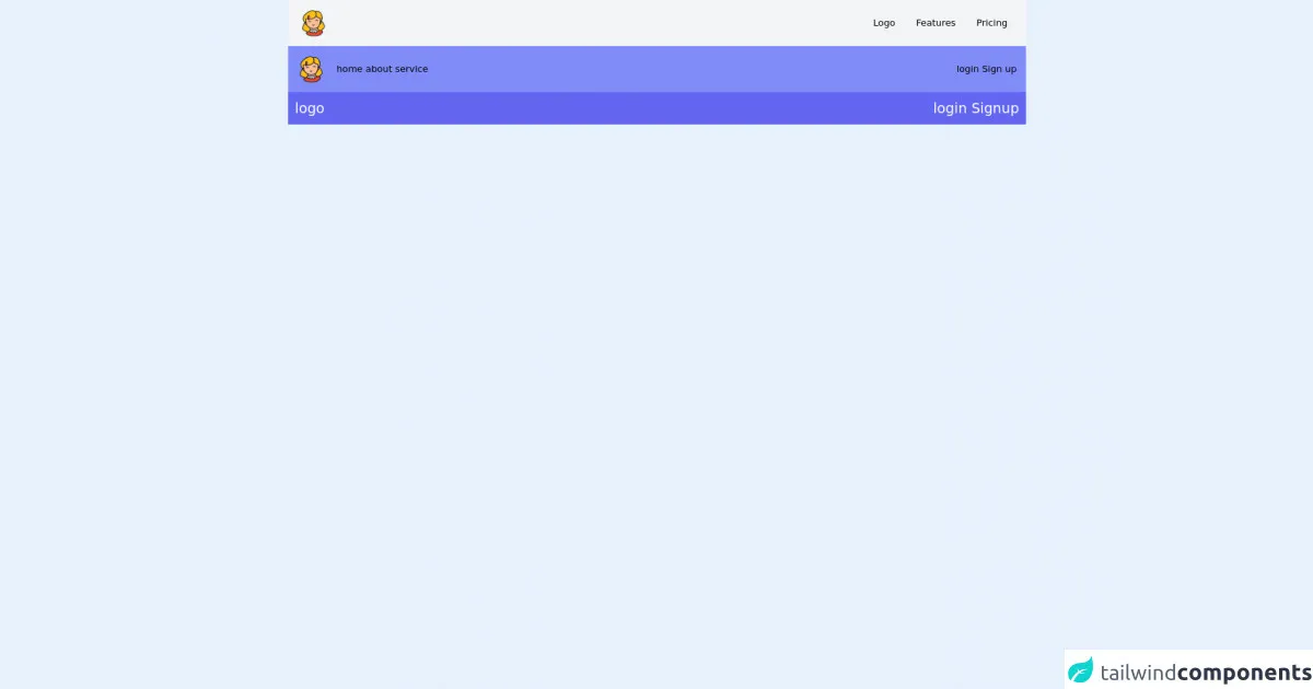
The preview of fix header ui component.
To create a fix header with Tailwind CSS, you'll need to use the fixed and top classes. These classes will ensure that the header stays fixed at the top of the screen as the user scrolls down the page. You can also use other Tailwind CSS classes to style the header, such as bg-white for the background color and text-gray-800 for the text color.
Free download of the fix header's source code
The source code of fix header ui component.
To create a fix header with Tailwind CSS, you can use the following HTML code:
<header class="fixed top-0 w-full bg-white text-gray-800">
  <nav class="mx-auto px-4 sm:px-6 lg:px-8">
    <div class="flex items-center justify-between h-16">
      <div class="flex items-center">
        <a href="#" class="flex-shrink-0">
          <img class="h-8 w-8" src="https://tailwindui.com/img/logos/workflow-mark-indigo-600.svg" alt="Workflow logo">
        </a>
        <div class="hidden md:block">
          <div class="ml-10 flex items-baseline space-x-4">
            <a href="#" class="px-3 py-2 rounded-md text-sm font-medium text-gray-900 bg-gray-100 hover:text-gray-900 hover:bg-gray-200">Home</a>

            <a href="#" class="px-3 py-2 rounded-md text-sm font-medium text-gray-700 hover:text-gray-900 hover:bg-gray-50">About</a>

            <a href="#" class="px-3 py-2 rounded-md text-sm font-medium text-gray-700 hover:text-gray-900 hover:bg-gray-50">Contact</a>
          </div>
        </div>
      </div>
      <div class="-mr-2 flex md:hidden">
        <button type="button" class="inline-flex items-center justify-center p-2 rounded-md text-gray-400 hover:text-gray-500 hover:bg-gray-100 focus:outline-none focus:bg-gray-100 focus:text-gray-500 transition duration-150 ease-in-out" aria-label="Main menu" aria-expanded="false">
          <svg class="block h-6 w-6" stroke="currentColor" fill="none" viewBox="0 0 24 24">
            <path stroke-linecap="round" stroke-linejoin="round" stroke-width="2" d="M4 6h16M4 12h16M4 18h16"></path>
          </svg>
          <svg class="hidden h-6 w-6" stroke="currentColor" fill="none" viewBox="0 0 24 24">
            <path stroke-linecap="round" stroke-linejoin="round" stroke-width="2" d="M6 18L18 6M6 6l12 12"></path>
          </svg>
        </button>
      </div>
    </div>
  </nav>
</header>
This code will create a fix header with a logo and a navigation menu. You can customize the code to fit your needs by changing the text and colors.
<nav class=" flex px-5 py-4 bg-gray-100 justify-between">

    <!-- left side -->
    <div class="flex items-center space-x-3">
        <img class="pr-5 " src="https://img.icons8.com/doodle/48/000000/girl.png" />

    </div>

    <!-- right side -->
    <div class="flex items-center space-x-3">
        <a class="block p-3">Logo</a>
        <a class="block p-3">Features</a>
        <a class="block p-3">Pricing</a>
    </div>
</nav>


<!-- ####################################       2                  ########################## -->

<nav class="bg-indigo-400 px-4 p-4">
    <div class="flex items-center justify-between">

        <div class="flex items-center">
            <div>
                <img src="https://img.icons8.com/doodle/48/000000/girl.png" />
            </div>

            <div class="pl-5">
                <a href="">home</a>
                <a href="">about</a>
                <a href="">service</a>
            </div>
        </div>
        <div>
            <a href="">login</a>
            <a href="">Sign up</a>
        </div>

    </div>
    </div>
    </div>
</nav>


<!-- ########################    3 ############################## -->


<nav class="bg-indigo-500 p-3 ">


    <div class="flex justify-between text-2xl text-white">
        <div>logo</div>
        <div>
            <a href="">login</a>
            <a href="">Signup</a>
        </div>
    </div>
</nav>
How to create a fix header with Tailwind CSS?
To create a fix header with Tailwind CSS, follow these steps:
- Create a new HTML file and add the above HTML code to the file.
- Add the Tailwind CSS CDN to your HTML file. You can find the CDN link on the Tailwind CSS website.
- Save the file and open it in your web browser.
That's it! You now have a fix header on your website that will stay fixed at the top of the screen as the user scrolls down the page.
Conclusion
In this article, we showed you how to build a fix header with Tailwind CSS in just 60 minutes. We explained what Tailwind CSS is, why you should use it to create a fix header ui component, and provided a preview and source code for the fix header. We hope this article helps you create a responsive website with a fix header that looks great on all devices.