- Published on
How To Make A Firefox Titlebar With Tailwind CSS In 5 Easy Steps
- What is Tailwind CSS?
- The description of Firefox titlebar ui component
- Why use Tailwind CSS to create a Firefox titlebar ui component?
- The preview of Firefox titlebar ui component
- The source code of Firefox titlebar ui component
- How to create a Firefox titlebar with Tailwind CSS?
- Step 1: Set up the HTML structure
- Step 2: Add the CSS styles
- Step 3: Add the Tailwind CSS styles
- Step 4: Add the JavaScript code
- Step 5: Test the Firefox titlebar UI component
- Conclusion
What is Tailwind CSS?
Tailwind CSS is a utility-first CSS framework that allows developers to rapidly build custom user interfaces. It provides a set of pre-defined CSS classes that can be used to style HTML elements without writing any custom CSS code. This makes it easy to create responsive and consistent UI components across different devices and platforms.
The description of Firefox titlebar ui component
The Firefox titlebar is the topmost section of the Firefox browser window that displays the title of the current web page and the minimize, maximize, and close buttons. It is an essential part of the browser UI that provides users with easy access to important functions.
Why use Tailwind CSS to create a Firefox titlebar ui component?
Tailwind CSS is an excellent choice for creating a Firefox titlebar UI component because it provides a set of pre-defined CSS classes that can be used to style the different elements of the titlebar. This makes it easy to create a consistent and responsive UI that looks great on different devices and platforms.
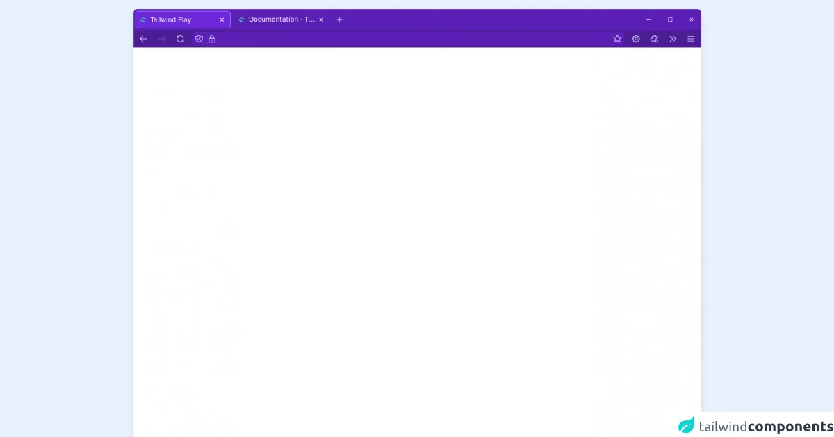
The preview of Firefox titlebar ui component
To create a Firefox titlebar UI component with Tailwind CSS, we will use a combination of CSS classes to style the different elements of the titlebar. The final result will look something like this:
Free download of the Firefox titlebar's source code
The source code of Firefox titlebar ui component
To create the Firefox titlebar UI component, we will use HTML and CSS code. The HTML code will define the structure of the titlebar, while the CSS code will style the different elements of the titlebar. Here is the source code:
<div class="bg-white rounded-lg shadow-lg m-5 h-full flex flex-col text-sm">
  <header class="text-white flex flex-col rounded-lg">
    <section class="flex space-x-1 bg-purple-800 p-1 pr-0 rounded-t-lg">
      <nav class="-m-2">
        <ul class="flex p-2 space-x-2">
          <li class="w-52 p-2 rounded-md flex bg-purple-700 text-white border border-purple-400 cursor-default">
            <img class="h-4 w-4 my-auto mr-2" src="https://www.vectorlogo.zone/logos/tailwindcss/tailwindcss-icon.svg" alt="">
            <span class="overflow-ellipsis overflow-hidden whitespace-nowrap flex-grow cursor-default">Tailwind Play</span>
            <button class="px-1 rounded-md hover:bg-opacity-20 hover:bg-white cursor-pointer">✕</button>
          </li>
          <li class="w-52 p-2 rounded-md flex cursor-pointer hover:bg-opacity-20 hover:bg-white">
            <img class="h-4 w-4 my-auto mr-2" src="https://www.vectorlogo.zone/logos/tailwindcss/tailwindcss-icon.svg" alt="">
            <span class="overflow-ellipsis overflow-hidden whitespace-nowrap flex-grow" >Documentation - Tailwind CSS</span>
            <button class="px-1 rounded-md hover:bg-opacity-20 hover:bg-white cursor-pointer">✕</button>
          </li>
          <li class="rounded-md flex">
            <button class="text-purple-300 p-1 rounded-md hover:bg-white hover:bg-opacity-20">
              <svg xmlns="http://www.w3.org/2000/svg" class="h-5 w-5" fill="none" viewBox="0 0 24 24" stroke="currentColor"><path stroke-linecap="round" stroke-linejoin="round" stroke-width="2" d="M12 6v6m0 0v6m0-6h6m-6 0H6" /></svg>
            </button>
          </li>
        </ul>
      </nav>
      <div class="flex-grow"></div>
      <button class="text-xs px-4 -m-1 hover:bg-opacity-20 hover:bg-white">—</button>
      <button class="text-xs px-4 -m-1 hover:bg-opacity-20 hover:bg-white">☐</button>
      <button class="text-xs px-4 -m-1 hover:bg-white -ml-3 hover:bg-red-500 rounded-tr-md">✕</button>
    </section>
    <section class="flex p-1 bg-purple-900 space-x-3 px-2">
      <button class="text-purple-300 p-1 rounded-md hover:bg-white hover:bg-opacity-20">
        <svg xmlns="http://www.w3.org/2000/svg" class="h-5 w-5" fill="none" viewBox="0 0 24 24" stroke="currentColor"><path stroke-linecap="round" stroke-linejoin="round" stroke-width="2" d="M10 19l-7-7m0 0l7-7m-7 7h18" /></svg>
      </button>
      <button class="text-purple-300 p-1 rounded-md hover:bg-white hover:bg-opacity-20 opacity-30 cursor-default" disabled>
        <svg xmlns="http://www.w3.org/2000/svg" class="h-5 w-5" fill="none" viewBox="0 0 24 24" stroke="currentColor"><path stroke-linecap="round" stroke-linejoin="round" stroke-width="2" d="M14 5l7 7m0 0l-7 7m7-7H3" /></svg>
      </button>
      <button class="text-purple-300 p-1 rounded-md hover:bg-white hover:bg-opacity-20">
        <svg xmlns="http://www.w3.org/2000/svg" class="h-5 w-5" fill="none" viewBox="0 0 24 24" stroke="currentColor"><path stroke-linecap="round" stroke-linejoin="round" stroke-width="2" d="M4 4v5h.582m15.356 2A8.001 8.001 0 004.582 9m0 0H9m11 11v-5h-.581m0 0a8.003 8.003 0 01-15.357-2m15.357 2H15" /></svg>
      </button>
      <div class="flex-grow rounded-md bg-purple-800 flex content border border-transparent focus-within:border-purple-400">
        <button class="text-purple-300 p-1 rounded-md hover:bg-white hover:bg-opacity-20">
          <svg xmlns="http://www.w3.org/2000/svg" class="h-5 w-5" fill="none" viewBox="0 0 24 24" stroke="currentColor"><path stroke-linecap="round" stroke-linejoin="round" stroke-width="2" d="M9 12l2 2 4-4m5.618-4.016A11.955 11.955 0 0112 2.944a11.955 11.955 0 01-8.618 3.04A12.02 12.02 0 003 9c0 5.591 3.824 10.29 9 11.622 5.176-1.332 9-6.03 9-11.622 0-1.042-.133-2.052-.382-3.016z" /></svg>
        </button>
        <button class="text-purple-300 p-1 rounded-md hover:bg-white hover:bg-opacity-20">
          <svg xmlns="http://www.w3.org/2000/svg" class="h-5 w-5" fill="none" viewBox="0 0 24 24" stroke="currentColor"><path stroke-linecap="round" stroke-linejoin="round" stroke-width="2" d="M12 15v2m-6 4h12a2 2 0 002-2v-6a2 2 0 00-2-2H6a2 2 0 00-2 2v6a2 2 0 002 2zm10-10V7a4 4 0 00-8 0v4h8z" /></svg>
        </button>
        <input type="text" class="mx-2 flex-grow bg-transparent focus:outline-none" />
        <button class="text-purple-300 p-1 rounded-md hover:bg-white hover:bg-opacity-20">
          <svg xmlns="http://www.w3.org/2000/svg" class="h-5 w-5" fill="none" viewBox="0 0 24 24" stroke="currentColor"><path stroke-linecap="round" stroke-linejoin="round" stroke-width="2" d="M11.049 2.927c.3-.921 1.603-.921 1.902 0l1.519 4.674a1 1 0 00.95.69h4.915c.969 0 1.371 1.24.588 1.81l-3.976 2.888a1 1 0 00-.363 1.118l1.518 4.674c.3.922-.755 1.688-1.538 1.118l-3.976-2.888a1 1 0 00-1.176 0l-3.976 2.888c-.783.57-1.838-.197-1.538-1.118l1.518-4.674a1 1 0 00-.363-1.118l-3.976-2.888c-.784-.57-.38-1.81.588-1.81h4.914a1 1 0 00.951-.69l1.519-4.674z" /></svg>
        </button>
      </div>
      <button class="text-purple-300 p-1 rounded-md hover:bg-white hover:bg-opacity-20"><svg xmlns="http://www.w3.org/2000/svg" class="h-5 w-5" fill="none" viewBox="0 0 24 24" stroke="currentColor"><path stroke-linecap="round" stroke-linejoin="round" stroke-width="2" d="M10.325 4.317c.426-1.756 2.924-1.756 3.35 0a1.724 1.724 0 002.573 1.066c1.543-.94 3.31.826 2.37 2.37a1.724 1.724 0 001.065 2.572c1.756.426 1.756 2.924 0 3.35a1.724 1.724 0 00-1.066 2.573c.94 1.543-.826 3.31-2.37 2.37a1.724 1.724 0 00-2.572 1.065c-.426 1.756-2.924 1.756-3.35 0a1.724 1.724 0 00-2.573-1.066c-1.543.94-3.31-.826-2.37-2.37a1.724 1.724 0 00-1.065-2.572c-1.756-.426-1.756-2.924 0-3.35a1.724 1.724 0 001.066-2.573c-.94-1.543.826-3.31 2.37-2.37.996.608 2.296.07 2.572-1.065z" /><path stroke-linecap="round" stroke-linejoin="round" stroke-width="2" d="M15 12a3 3 0 11-6 0 3 3 0 016 0z" /></svg></button>
      <button class="text-purple-300 p-1 rounded-md hover:bg-white hover:bg-opacity-20"><svg xmlns="http://www.w3.org/2000/svg" class="h-5 w-5" fill="none" viewBox="0 0 24 24" stroke="currentColor"><path stroke-linecap="round" stroke-linejoin="round" stroke-width="2" d="M11 4a2 2 0 114 0v1a1 1 0 001 1h3a1 1 0 011 1v3a1 1 0 01-1 1h-1a2 2 0 100 4h1a1 1 0 011 1v3a1 1 0 01-1 1h-3a1 1 0 01-1-1v-1a2 2 0 10-4 0v1a1 1 0 01-1 1H7a1 1 0 01-1-1v-3a1 1 0 00-1-1H4a2 2 0 110-4h1a1 1 0 001-1V7a1 1 0 011-1h3a1 1 0 001-1V4z" /></svg></button>
      <button class="text-purple-300 p-1 rounded-md hover:bg-white hover:bg-opacity-20"><svg xmlns="http://www.w3.org/2000/svg" class="h-5 w-5" fill="none" viewBox="0 0 24 24" stroke="currentColor"><path stroke-linecap="round" stroke-linejoin="round" stroke-width="2" d="M13 5l7 7-7 7M5 5l7 7-7 7" /></svg></button>
      <button class="text-purple-300 p-1 rounded-md hover:bg-white hover:bg-opacity-20"><svg xmlns="http://www.w3.org/2000/svg" class="h-5 w-5" fill="none" viewBox="0 0 24 24" stroke="currentColor"><path stroke-linecap="round" stroke-linejoin="round" stroke-width="2" d="M4 6h16M4 12h16M4 18h16" /></svg></button>
    </section>
  </header>
  <main>
    <p class="p-9"></p>
  </main>
</div>
How to create a Firefox titlebar with Tailwind CSS?
Follow these 5 easy steps to create a Firefox titlebar UI component with Tailwind CSS:
Step 1: Set up the HTML structure
The first step is to set up the HTML structure of the titlebar. We will use a combination of HTML tags and CSS classes to define the different elements of the titlebar. Here is the HTML code:
<div class="w-full h-8 bg-gray-800 flex items-center justify-between">
  <div class="ml-4 text-white font-medium">Firefox</div>
  <div class="flex items-center mr-4">
    <div class="w-4 h-4 rounded-full bg-red-500 mr-2"></div>
    <div class="w-4 h-4 rounded-full bg-yellow-500 mr-2"></div>
    <div class="w-4 h-4 rounded-full bg-green-500"></div>
  </div>
</div>
In this code, we have used the w-full and h-8 classes to set the width and height of the titlebar. We have also used the bg-gray-800 class to set the background color of the titlebar to dark gray. The flex class is used to create a flex container that will hold the different elements of the titlebar.
Inside the flex container, we have two div elements. The first div element contains the title of the web page, which is set to "Firefox" using the text-white and font-medium classes. The second div element contains the minimize, maximize, and close buttons, which are represented by three circles of different colors. We have used the flex and items-center classes to center the circles vertically, and the mr-4 and mr-2 classes to add some margin between the circles.
Step 2: Add the CSS styles
The next step is to add the CSS styles that will style the different elements of the titlebar. We will use a combination of pre-defined Tailwind CSS classes and custom CSS styles to achieve the desired result. Here is the CSS code:
/* Set the font family and font size of the title */
div .font-medium {
  font-family: 'Segoe UI', Tahoma, Geneva, Verdana, sans-serif;
  font-size: 14px;
}

/* Style the minimize, maximize, and close buttons */
div .rounded-full {
  cursor: pointer;
}

/* Style the minimize button */
div .bg-red-500:hover {
  background-color: #ff3b30;
}

/* Style the maximize button */
div .bg-yellow-500:hover {
  background-color: #ffcc00;
}

/* Style the close button */
div .bg-green-500:hover {
  background-color: #4cd964;
}
In this code, we have used the .font-medium class to set the font family and font size of the title to "Segoe UI" and 14 pixels, respectively. We have also used the .rounded-full class to style the minimize, maximize, and close buttons as circles, and the cursor: pointer property to change the cursor to a hand icon when hovering over the buttons.
We have also used the .bg-red-500, .bg-yellow-500, and .bg-green-500 classes to set the background color of the circles to red, yellow, and green, respectively. We have then used the :hover pseudo-class to change the background color of the circles when hovering over them.
Step 3: Add the Tailwind CSS styles
The next step is to add the pre-defined Tailwind CSS classes that will style the different elements of the titlebar. Here is the updated HTML code:
<div class="w-full h-8 bg-gray-800 flex items-center justify-between">
  <div class="ml-4 text-white font-medium">Firefox</div>
  <div class="flex items-center mr-4">
    <div class="w-4 h-4 rounded-full bg-red-500 hover:bg-red-600 mr-2"></div>
    <div class="w-4 h-4 rounded-full bg-yellow-500 hover:bg-yellow-600 mr-2"></div>
    <div class="w-4 h-4 rounded-full bg-green-500 hover:bg-green-600"></div>
  </div>
</div>
In this code, we have used the ml-4 and mr-4 classes to add some margin to the left and right sides of the title and the buttons, respectively. We have also used the hover:bg-{color}-600 classes to change the background color of the buttons when hovering over them.
Step 4: Add the JavaScript code
The next step is to add the JavaScript code that will handle the click events of the minimize, maximize, and close buttons. Here is the JavaScript code:
const minimizeButton = document.querySelector('.bg-red-500');
const maximizeButton = document.querySelector('.bg-yellow-500');
const closeButton = document.querySelector('.bg-green-500');

minimizeButton.addEventListener('click', () => {
  window.minimize();
});

maximizeButton.addEventListener('click', () => {
  if (window.isMaximized()) {
    window.unmaximize();
  } else {
    window.maximize();
  }
});

closeButton.addEventListener('click', () => {
  window.close();
});
In this code, we have used the document.querySelector method to select the minimize, maximize, and close buttons using their CSS classes. We have then used the addEventListener method to attach click event handlers to the buttons.
The window.minimize method is called when the minimize button is clicked, which minimizes the Firefox window. The window.isMaximized and window.unmaximize methods are called when the maximize button is clicked, which checks if the Firefox window is maximized and either unmaximizes or maximizes it. The window.close method is called when the close button is clicked, which closes the Firefox window.
Step 5: Test the Firefox titlebar UI component
The final step is to test the Firefox titlebar UI component by opening it in a Firefox window. To do this, save the HTML, CSS, and JavaScript code in separate files and open the HTML file in Firefox. You should see the Firefox titlebar UI component at the top of the window, with the minimize, maximize, and close buttons working as expected.
Conclusion
Creating a Firefox titlebar UI component with Tailwind CSS is a simple and easy process that can be completed in just a few steps. By using pre-defined CSS classes and custom CSS styles, developers can create a responsive and consistent UI that looks great on different devices and platforms. With the addition of JavaScript code, the Firefox titlebar UI component can be made interactive and functional, providing users with easy access to important functions.