- Published on
6 Incredibly Easy Ways To Build A Firebase Dashboard Layout With Tailwind CSS Better While Spending Less
- What is Tailwind CSS?
- The description of Firebase Dashboard Layout UI component
- Why use Tailwind CSS to create a Firebase Dashboard Layout UI component?
- The preview of Firebase Dashboard Layout UI component
- The source code of Firebase Dashboard Layout UI component
- How to create a Firebase Dashboard Layout with Tailwind CSS?
- Step 1: Install Tailwind CSS
- Step 2: Create a new HTML file
- Step 3: Customize the layout
- Step 4: Add data and statistics
- Step 5: Add interactivity
- Conclusion
As a FrontEnd technology blogger, you must have heard of Tailwind CSS, a utility-first CSS framework that helps you create responsive and customizable UI components. In this article, we will explore how to create a Firebase Dashboard Layout UI component with Tailwind CSS and why it is a great choice for this project.
What is Tailwind CSS?
Tailwind CSS is a utility-first CSS framework that provides a set of pre-defined CSS classes that you can use to create responsive and customizable UI components. It is designed to help you write less CSS code and focus on the design of your application. With Tailwind CSS, you can create complex layouts and styles with ease.
The description of Firebase Dashboard Layout UI component
Firebase Dashboard Layout is a UI component that displays the data and statistics of your Firebase project. It provides an overview of the project's performance, usage, and other important metrics. The Firebase Dashboard Layout UI component is an essential part of any Firebase project, and it should be easy to use and visually appealing.
Why use Tailwind CSS to create a Firebase Dashboard Layout UI component?
Tailwind CSS is a great choice for creating a Firebase Dashboard Layout UI component because it provides a set of pre-defined CSS classes that you can use to create responsive and customizable UI components. With Tailwind CSS, you can easily create complex layouts and styles without having to write a lot of CSS code. This saves you time and makes your code more maintainable.
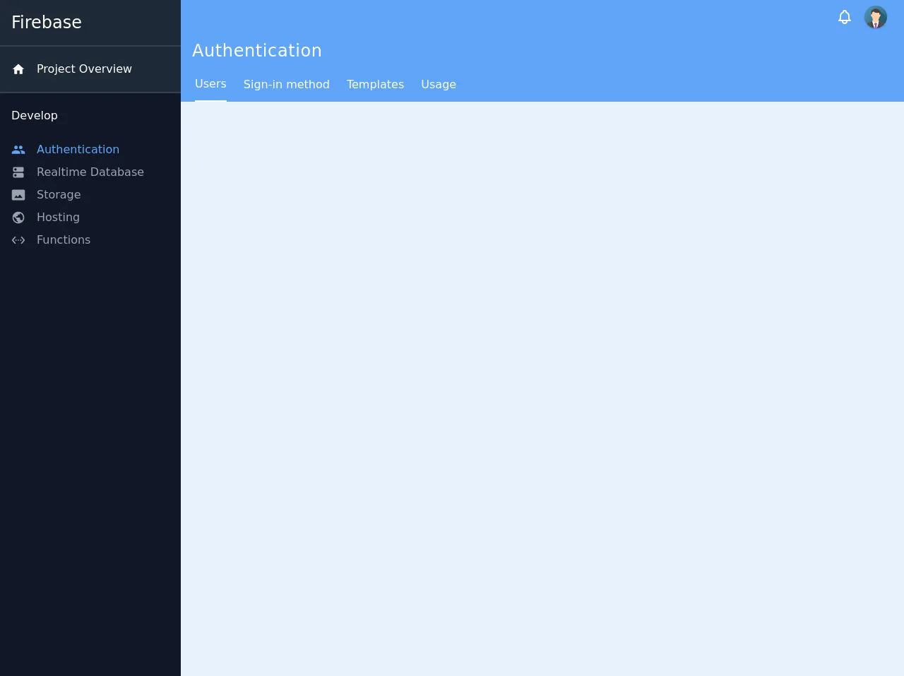
The preview of Firebase Dashboard Layout UI component
Free download of the Firebase Dashboard Layout's source code
The source code of Firebase Dashboard Layout UI component
<div class="flex min-h-screen">
  <nav class="w-64 flex-shrink-0">
    <div class="flex-auto bg-gray-900 h-full">
      <div class="flex flex-col overflow-y-auto">
        <ul class="relative m-0 p-0 list-none h-full">
          <li class="text-white text-2xl p-4 w-full flex relative shadow-sm justify-start bg-gray-800 border-b-2 border-gray-700">
            Firebase
          </li>
          <li class="text-white p-4 w-full flex relative shadow-sm justify-start bg-gray-800 border-b-2 border-gray-700">
            <div class="mr-4 flex-shrink-0 my-auto">
              <svg class="fill-current w-5 h-5" focusable="false" viewBox="0 0 24 24" aria-hidden="true"><path d="M10 20v-6h4v6h5v-8h3L12 3 2 12h3v8z"></path></svg>
            </div>
            <div class="flex-auto my-1">
              <span>Project Overview</span>
            </div>
          </li>
          <li class="p-4 w-full flex relative shadow-sm">
            <div class="flex-auto my-1">
              <span class="text-white font-medium">Develop</span>
            </div>
          </li>

          <div class="text-blue-400 flex relative px-4 hover:bg-gray-700 cursor-pointer">
            <div class="mr-4 my-auto">
              <svg class="fill-current h-5 w-5" focusable="false" viewBox="0 0 24 24" aria-hidden="true"><path d="M16 11c1.66 0 2.99-1.34 2.99-3S17.66 5 16 5c-1.66 0-3 1.34-3 3s1.34 3 3 3zm-8 0c1.66 0 2.99-1.34 2.99-3S9.66 5 8 5C6.34 5 5 6.34 5 8s1.34 3 3 3zm0 2c-2.33 0-7 1.17-7 3.5V19h14v-2.5c0-2.33-4.67-3.5-7-3.5zm8 0c-.29 0-.62.02-.97.05 1.16.84 1.97 1.97 1.97 3.45V19h6v-2.5c0-2.33-4.67-3.5-7-3.5z"></path></svg>
            </div>
            <div class="flex-auto my-1">
              <span>Authentication</span>
            </div>
          </div>

          <div class="text-gray-400 flex relative px-4 hover:bg-gray-700 cursor-pointer">
            <div class="mr-4 my-auto">
              <svg class="fill-current h-5 w-5" focusable="false" viewBox="0 0 24 24" aria-hidden="true"><path d="M19 13H5c-1.1 0-2 .9-2 2v4c0 1.1.9 2 2 2h14c1.1 0 2-.9 2-2v-4c0-1.1-.9-2-2-2zM7 19c-1.1 0-2-.9-2-2s.9-2 2-2 2 .9 2 2-.9 2-2 2zM19 3H5c-1.1 0-2 .9-2 2v4c0 1.1.9 2 2 2h14c1.1 0 2-.9 2-2V5c0-1.1-.9-2-2-2zM7 9c-1.1 0-2-.9-2-2s.9-2 2-2 2 .9 2 2-.9 2-2 2z"></path></svg>
            </div>
            <div class="flex-auto my-1">
              <span>Realtime Database</span>
            </div>
          </div>

          <div class="text-gray-400 flex relative px-4 hover:bg-gray-700 cursor-pointer">
            <div class="mr-4 my-auto">
              <svg class="fill-current h-5 w-5" focusable="false" viewBox="0 0 24 24" aria-hidden="true"><path d="M21 3H3C2 3 1 4 1 5v14c0 1.1.9 2 2 2h18c1 0 2-1 2-2V5c0-1-1-2-2-2zM5 17l3.5-4.5 2.5 3.01L14.5 11l4.5 6H5z"></path></svg>            </div>
            <div class="flex-auto my-1">
              <span>Storage</span>
            </div>
          </div>

          <div class="text-gray-400 flex relative px-4 hover:bg-gray-700 cursor-pointer">
            <div class="mr-4 my-auto">
              <svg class="fill-current h-5 w-5" focusable="false" viewBox="0 0 24 24" aria-hidden="true"><path d="M12 2C6.48 2 2 6.48 2 12s4.48 10 10 10 10-4.48 10-10S17.52 2 12 2zm-1 17.93c-3.95-.49-7-3.85-7-7.93 0-.62.08-1.21.21-1.79L9 15v1c0 1.1.9 2 2 2v1.93zm6.9-2.54c-.26-.81-1-1.39-1.9-1.39h-1v-3c0-.55-.45-1-1-1H8v-2h2c.55 0 1-.45 1-1V7h2c1.1 0 2-.9 2-2v-.41c2.93 1.19 5 4.06 5 7.41 0 2.08-.8 3.97-2.1 5.39z"></path></svg>            </div>
            <div class="flex-auto my-1">
              <span>Hosting</span>
            </div>
          </div>

          <div class="text-gray-400 flex relative px-4 hover:bg-gray-700 cursor-pointer">
            <div class="mr-4 my-auto">
              <svg class="fill-current h-5 w-5" focusable="false" viewBox="0 0 24 24" aria-hidden="true"><path d="M7.77 6.76L6.23 5.48.82 12l5.41 6.52 1.54-1.28L3.42 12l4.35-5.24zM7 13h2v-2H7v2zm10-2h-2v2h2v-2zm-6 2h2v-2h-2v2zm6.77-7.52l-1.54 1.28L20.58 12l-4.35 5.24 1.54 1.28L23.18 12l-5.41-6.52z"></path></svg>
            </div>
            <div class="flex-auto my-1">
              <span>Functions</span>
            </div>
          </div>
        </ul>
      </div>
    </div>
  </nav>

  <div class="flex flex-col w-full">
    <header class="text-white bg-blue-400 sticky left-auto top-0 right-0">
      <div class="h-12 px-6 flex relative items-center justify-end">
        <button class="flex mx-4 text-white hover:text-gray-200 focus:outline-none">
         <svg class="h-6 w-6" viewBox="0 0 24 24" fill="none" xmlns="http://www.w3.org/2000/svg">
            <path d="M15 17H20L18.5951 15.5951C18.2141 15.2141 18 14.6973 18 14.1585V11C18 8.38757 16.3304 6.16509 14 5.34142V5C14 3.89543 13.1046 3 12 3C10.8954 3 10 3.89543 10 5V5.34142C7.66962 6.16509 6 8.38757 6 11V14.1585C6 14.6973 5.78595 15.2141 5.40493 15.5951L4 17H9M15 17V18C15 19.6569 13.6569 21 12 21C10.3431 21 9 19.6569 9 18V17M15 17H9" stroke="currentColor" stroke-width="2" stroke-linecap="round" stroke-linejoin="round">
            </path>
         </svg>
        </button>

        <button class="relative block h-8 w-8 rounded-full overflow-hidden shadow focus:outline-none">
          <img class="h-full w-full object-cover" src="https://www.w3schools.com/howto/img_avatar.png" alt="Avatar">
        </button>
      </div>
    </header>

    <div class="text-white bg-blue-400 flex flex-shrink-0 flex-col">
      <div class="flex relative items-center p-4 h-12">
        <span class="text-2xl tracking-wide">Authentication</span>
      </div>
    </div>

    <div class="text-white bg-blue-400 flex w-full">
      <div class="flex overflow-hidden h-12 ml-2">
        <button class="mx-3 border-b-2 border-white">
          <span>Users</span>
        </button>

        <button class="mx-3 hover:border-b-2 border-white">
          <span>Sign-in method</span>
        </button>

        <button class="mx-3 hover:border-b-2 border-white">
          <span>Templates</span>
        </button>

        <button class="mx-3 hover:border-b-2 border-white">
          <span>Usage</span>
        </button>
      </div>
    </div>
  </div>
</div>
How to create a Firebase Dashboard Layout with Tailwind CSS?
Now that we have discussed why Tailwind CSS is a great choice for creating a Firebase Dashboard Layout UI component, let's take a look at how to create one.
Step 1: Install Tailwind CSS
The first step is to install Tailwind CSS. You can install it using npm or yarn. Here's how to install it using npm:
npm install tailwindcss
Step 2: Create a new HTML file
Create a new HTML file and add the following code:
<!DOCTYPE html>
<html lang="en">
  <head>
    <meta charset="UTF-8" />
    <meta name="viewport" content="width=device-width, initial-scale=1.0" />
    <title>Firebase Dashboard Layout</title>
    <link rel="stylesheet" href="https://cdn.jsdelivr.net/npm/[email protected]/dist/tailwind.min.css" />
  </head>
  <body>
    <div class="container mx-auto">
      <h1 class="text-2xl font-bold mb-4">Firebase Dashboard Layout</h1>
      <div class="grid grid-cols-1 md:grid-cols-2 lg:grid-cols-3 gap-4">
        <div class="bg-white p-4 rounded-lg shadow-md">
          <h2 class="text-lg font-bold mb-2">Users</h2>
          <p class="text-gray-500">Total users: 100</p>
        </div>
        <div class="bg-white p-4 rounded-lg shadow-md">
          <h2 class="text-lg font-bold mb-2">Sessions</h2>
          <p class="text-gray-500">Total sessions: 500</p>
        </div>
        <div class="bg-white p-4 rounded-lg shadow-md">
          <h2 class="text-lg font-bold mb-2">Revenue</h2>
          <p class="text-gray-500">$10,000</p>
        </div>
        <div class="bg-white p-4 rounded-lg shadow-md">
          <h2 class="text-lg font-bold mb-2">Crashes</h2>
          <p class="text-gray-500">Total crashes: 10</p>
        </div>
        <div class="bg-white p-4 rounded-lg shadow-md">
          <h2 class="text-lg font-bold mb-2">Retention</h2>
          <p class="text-gray-500">Retention rate: 70%</p>
        </div>
        <div class="bg-white p-4 rounded-lg shadow-md">
          <h2 class="text-lg font-bold mb-2">Engagement</h2>
          <p class="text-gray-500">Average session duration: 5 minutes</p>
        </div>
      </div>
    </div>
  </body>
</html>
Step 3: Customize the layout
You can customize the layout by modifying the CSS classes. For example, you can change the background color, font size, and spacing. Here are some examples:
<div class="bg-blue-500 p-4 rounded-lg shadow-md">
  <h2 class="text-lg font-bold mb-2 text-white">Users</h2>
  <p class="text-gray-200">Total users: 100</p>
</div>
<div class="bg-white p-4 rounded-lg shadow-md border border-gray-200">
  <h2 class="text-lg font-bold mb-2">Users</h2>
  <p class="text-gray-500">Total users: 100</p>
</div>
Step 4: Add data and statistics
You can add data and statistics by modifying the HTML code. For example, you can add a chart or a table. Here's an example:
<div class="bg-white p-4 rounded-lg shadow-md">
  <h2 class="text-lg font-bold mb-2">Users</h2>
  <canvas id="users-chart"></canvas>
</div>
Step 5: Add interactivity
You can add interactivity by using JavaScript. For example, you can add a click event to a button. Here's an example:
<button class="bg-blue-500 text-white px-4 py-2 rounded-lg shadow-md" onclick="alert('Hello, world!')">Click me</button>
Conclusion
In this article, we have explored how to create a Firebase Dashboard Layout UI component with Tailwind CSS. We have discussed why Tailwind CSS is a great choice for this project and how to create a responsive and customizable layout with ease. With Tailwind CSS, you can create complex UI components quickly and easily, saving you time and making your code more maintainable.