- Published on
How To Make A Filter With Tailwind CSS In 6 Easy Steps?
- What is Tailwind CSS?
- The description of Filter ui component
- Why use Tailwind CSS to create a Filter ui component?
- The preview of Filter ui component
- The source code of Filter ui component
- How to create a Filter with Tailwind CSS?
- Step 1: Set up a new HTML file
- Step 2: Add Tailwind CSS to the project
- Step 3: Create the filter component
- Step 4: Customize the design
- Step 5: Add JavaScript functionality
- Step 6: Test and refine the filter component
- Conclusion
What is Tailwind CSS?
Tailwind CSS is a utility-first CSS framework that provides a set of pre-defined classes to help developers quickly build user interfaces. It is highly customizable and allows developers to create complex designs with ease.
The description of Filter ui component
A filter is a user interface component that allows users to narrow down a large set of data or content based on specific criteria. It is commonly used in e-commerce websites, search engines, and data-driven applications.
Why use Tailwind CSS to create a Filter ui component?
Tailwind CSS provides a set of pre-defined classes that can be used to create a filter component quickly. It also allows developers to customize the design of the filter component to match the overall look and feel of the website or application.
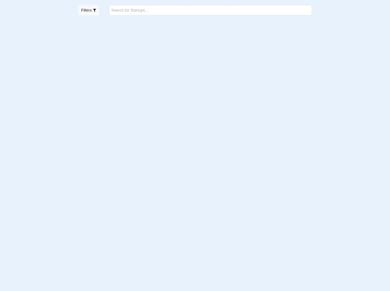
The preview of Filter ui component
To create a filter component with Tailwind CSS, we will use a combination of form elements such as checkboxes, radio buttons, and select dropdowns. The final design of the filter component will depend on the specific requirements of the website or application.
Free download of the Filter's source code
The source code of Filter ui component
The source code for the filter component will depend on the specific requirements of the website or application. However, we can use the following HTML and CSS code as a starting point.
<head>
<link href="https://fonts.googleapis.com/css?family=Inter:400,500,600,700&display=swap" rel="stylesheet">
<link href="https://unpkg.com/tailwindcss@^1.0/dist/tailwind.min.css" rel="stylesheet">
<link href="./assets/css/filterlist.css" rel="stylesheet">
<script src="https://cdn.jsdelivr.net/gh/alpinejs/[email protected]/dist/alpine.js" defer></script>
<link rel="stylesheet" href="https://cdnjs.cloudflare.com/ajax/libs/font-awesome/4.7.0/css/font-awesome.min.css">
<link rel="stylesheet" href="https://maxcdn.bootstrapcdn.com/bootstrap/4.0.0/css/bootstrap.min.css" integrity="sha384-Gn5384xqQ1aoWXA+058RXPxPg6fy4IWvTNh0E263XmFcJlSAwiGgFAW/dAiS6JXm" crossorigin="anonymous">
<script src="https://code.jquery.com/jquery-3.2.1.slim.min.js" integrity="sha384-KJ3o2DKtIkvYIK3UENzmM7KCkRr/rE9/Qpg6aAZGJwFDMVNA/GpGFF93hXpG5KkN" crossorigin="anonymous"></script>
<script src="https://cdnjs.cloudflare.com/ajax/libs/popper.js/1.12.9/umd/popper.min.js" integrity="sha384-ApNbgh9B+Y1QKtv3Rn7W3mgPxhU9K/ScQsAP7hUibX39j7fakFPskvXusvfa0b4Q" crossorigin="anonymous"></script>
<script src="https://maxcdn.bootstrapcdn.com/bootstrap/4.0.0/js/bootstrap.min.js" integrity="sha384-JZR6Spejh4U02d8jOt6vLEHfe/JQGiRRSQQxSfFWpi1MquVdAyjUar5+76PVCmYl" crossorigin="anonymous"></script>
<script src="https://cdnjs.cloudflare.com/ajax/libs/bootstrap-datepicker/1.5.0/js/bootstrap-datepicker.js"></script>
<link href="https://cdnjs.cloudflare.com/ajax/libs/bootstrap-datepicker/1.5.0/css/bootstrap-datepicker.css" rel="stylesheet">
</head>
<body class="bg-gray-200">
<div class="bg-grey col-12 mt-3 align-middle justify-content-center flex" >
<button type="button" class="btn btn-light mr-10 shadow-sm" data-toggle="collapse" data-target="#filters">Filters <i class="fa fa-filter"></i></button>
<input type="text" class="col-8 border-2 p-2" placeholder="Search for Startups..." id="search-filter">
</div>
<div id="filters" class="collapse">
<hr class="solid col-9 mx-auto">
<div class="d-md-flex d-lg-flex d-xl-flex justify-content-around col-9 mx-auto">
<div class="col-lg-4 col-xl-3 col-md-6">
<article class="filter-group">
<header class="card-header">
<h6 class="title">Domain </h6>
</header>
<div class="filter-content" id="collapse_aside1" style="">
<div class="card-body"> <label class="custom-control"> <input type="checkbox" checked="" class="custom-control-input">
<div class="custom-control-label"> E-commerce </div>
</label> <label class="custom-control"> <input type="checkbox" checked="" class="custom-control-input">
<div class="custom-control-label"> Education </div>
</label> <label class="custom-control"> <input type="checkbox" checked="" class="custom-control-input">
<div class="custom-control-label"> Aggriculture</div>
</label> <label class="custom-control"> <input type="checkbox" checked="" class="custom-control-input">
<div class="custom-control-label"> Service</div>
</label> </div>
</div>
</article>
<article class="filter-group">
<header class="card-header">
<h6 class="title"> Team Size </h6>
</header>
<div class="filter-content" id="collapse_aside3" style="">
<div class="card-body">
<label class="checkbox-btn"> <input type="checkbox" name="team" onclick="onlyOne(this)"> <span class="btn btn-light"> 1 - 10 </span> </label>
<label class="checkbox-btn"> <input type="checkbox" name="team" onclick="onlyOne(this)"> <span class="btn btn-light"> 10 - 25 </span> </label>
<label class="checkbox-btn"> <input type="checkbox" name="team" onclick="onlyOne(this)"> <span class="btn btn-light"> 25 - 50 </span> </label>
<label class="checkbox-btn"> <input type="checkbox" name="team" onclick="onlyOne(this)"> <span class="btn btn-light"> 50 - 100 </span> </label>
<label class="checkbox-btn"> <input type="checkbox" name="team" onclick="onlyOne(this)"> <span class="btn btn-light"> greater than 100 </span> </label>
</div>
</div>
</article>
</div>
<div class ="col-lg-4 col-xl-3 col-md-6">
<article class="filter-group">
<header class="card-header">
<h6 class="title">Assistance Required </h6>
</header>
<div class="filter-content" id="collapse_aside1" style="">
<div class="card-body"> <label class="custom-control"> <input type="checkbox" checked="" class="custom-control-input">
<div class="custom-control-label"> Under 50,000 ₹ </div>
</label> <label class="custom-control"> <input type="checkbox" checked="" class="custom-control-input">
<div class="custom-control-label"> 50,000 - 1 L ₹ </div>
</label> <label class="custom-control"> <input type="checkbox" checked="" class="custom-control-input">
<div class="custom-control-label"> 1 L - 5 L ₹</div>
</label> <label class="custom-control"> <input type="checkbox" checked="" class="custom-control-input">
<div class="custom-control-label"> More than 5 L ₹</div>
</label> </div>
</div>
</article>
<article class="filter-group">
<header class="card-header">
<h6 class="title"> Year </h6>
</header>
<div class="filter-content" id="collapse_aside1" style=" height: fit-content;">
<input class="date-own form-control mb-10 overscroll-auto" style="" type="text">
<script type="text/javascript">
$('.date-own').datepicker({
minViewMode: 2,
format: 'yyyy'
});
</script>
</div>
</article>
</div>
<div class ="col-lg-4 col-xl-3 col-md-6">
<article class="filter-group">
<header class="card-header">
<h6 class="title">Stage </h6>
</header>
<div class="filter-content" id="collapse_aside4" style="">
<div class="card-body"> <label class="custom-control"> <input type="checkbox" checked="" class="custom-control-input">
<div class="custom-control-label"> Completed </div>
</label> <label class="custom-control"> <input type="checkbox" checked="" class="custom-control-input">
<div class="custom-control-label"> Processing </div>
</label> <label class="custom-control"> <input type="checkbox" checked="" class="custom-control-input">
<div class="custom-control-label"> Pending</div>
</label> <label class="custom-control"> <input type="checkbox" checked="" class="custom-control-input">
<div class="custom-control-label"> Something else</div>
</label> </div>
</div>
</article>
<a href="#" class="btn btn-medium button mt-6 mb-12 md:mb-0 md:mt-10 inline-block text-white bg-red-500 hover:bg-red-600 rounded-lg shadow mx-auto" data-abc="true" data-toggle="collapse" data-target="#filters">Apply Now</a>
</div>
</div>
</div>
</div>
</div>
</div>
</div>
</div>
</div>
</body>
How to create a Filter with Tailwind CSS?
Step 1: Set up a new HTML file
Create a new HTML file and add the necessary HTML boilerplate code.
<!DOCTYPE html>
<html lang="en">
<head>
    <meta charset="UTF-8">
    <meta name="viewport" content="width=device-width, initial-scale=1.0">
    <title>Filter Component</title>
</head>
<body>

</body>
</html>
Step 2: Add Tailwind CSS to the project
Add Tailwind CSS to the project by either downloading the CSS file or linking to the CDN.
<link rel="stylesheet" href="https://cdn.jsdelivr.net/npm/tailwindcss@latest/dist/tailwind.min.css">
Step 3: Create the filter component
Create the filter component by using a combination of form elements such as checkboxes, radio buttons, and select dropdowns.
<div class="w-full max-w-xs mx-auto">
    <form>
        <div class="mb-4">
            <h2 class="text-lg font-medium mb-2">Color</h2>
            <div class="flex flex-wrap -mx-2">
                <div class="w-1/2 px-2">
                    <label class="inline-flex items-center">
                        <input type="checkbox" class="form-checkbox text-blue-500" checked>
                        <span class="ml-2">Blue</span>
                    </label>
                </div>
                <div class="w-1/2 px-2">
                    <label class="inline-flex items-center">
                        <input type="checkbox" class="form-checkbox text-red-500">
                        <span class="ml-2">Red</span>
                    </label>
                </div>
            </div>
        </div>
        <div class="mb-4">
            <h2 class="text-lg font-medium mb-2">Size</h2>
            <div class="flex flex-wrap -mx-2">
                <div class="w-1/2 px-2">
                    <label class="inline-flex items-center">
                        <input type="radio" class="form-radio text-blue-500" name="size" value="small" checked>
                        <span class="ml-2">Small</span>
                    </label>
                </div>
                <div class="w-1/2 px-2">
                    <label class="inline-flex items-center">
                        <input type="radio" class="form-radio text-blue-500" name="size" value="large">
                        <span class="ml-2">Large</span>
                    </label>
                </div>
            </div>
        </div>
        <div class="mb-4">
            <h2 class="text-lg font-medium mb-2">Price</h2>
            <div class="flex flex-wrap -mx-2">
                <div class="w-full px-2">
                    <select class="form-select w-full">
                        <option>Any</option>
                        <option>$10</option>
                        <option>$20</option>
                        <option>$30</option>
                    </select>
                </div>
            </div>
        </div>
        <button class="bg-blue-500 hover:bg-blue-700 text-white font-bold py-2 px-4 rounded">
            Apply
        </button>
    </form>
</div>
Step 4: Customize the design
Customize the design of the filter component by using Tailwind CSS classes. For example, we can change the font size, color, and padding of the headings.
<div class="w-full max-w-xs mx-auto">
    <form>
        <div class="mb-4">
            <h2 class="text-lg font-medium text-gray-700 mb-2">Color</h2>
            <div class="flex flex-wrap -mx-2">
                <div class="w-1/2 px-2">
                    <label class="inline-flex items-center">
                        <input type="checkbox" class="form-checkbox text-blue-500" checked>
                        <span class="ml-2 text-gray-600">Blue</span>
                    </label>
                </div>
                <div class="w-1/2 px-2">
                    <label class="inline-flex items-center">
                        <input type="checkbox" class="form-checkbox text-red-500">
                        <span class="ml-2 text-gray-600">Red</span>
                    </label>
                </div>
            </div>
        </div>
        <div class="mb-4">
            <h2 class="text-lg font-medium text-gray-700 mb-2">Size</h2>
            <div class="flex flex-wrap -mx-2">
                <div class="w-1/2 px-2">
                    <label class="inline-flex items-center">
                        <input type="radio" class="form-radio text-blue-500" name="size" value="small" checked>
                        <span class="ml-2 text-gray-600">Small</span>
                    </label>
                </div>
                <div class="w-1/2 px-2">
                    <label class="inline-flex items-center">
                        <input type="radio" class="form-radio text-blue-500" name="size" value="large">
                        <span class="ml-2 text-gray-600">Large</span>
                    </label>
                </div>
            </div>
        </div>
        <div class="mb-4">
            <h2 class="text-lg font-medium text-gray-700 mb-2">Price</h2>
            <div class="flex flex-wrap -mx-2">
                <div class="w-full px-2">
                    <select class="form-select w-full">
                        <option>Any</option>
                        <option>$10</option>
                        <option>$20</option>
                        <option>$30</option>
                    </select>
                </div>
            </div>
        </div>
        <button class="bg-blue-500 hover:bg-blue-700 text-white font-bold py-2 px-4 rounded">
            Apply
        </button>
    </form>
</div>
Step 5: Add JavaScript functionality
Add JavaScript functionality to the filter component to handle user interactions and filter the data or content based on the selected criteria.
<script>
    const form = document.querySelector('form');
    const blueCheckbox = form.querySelector('#blue-checkbox');
    const redCheckbox = form.querySelector('#red-checkbox');
    const smallRadio = form.querySelector('#small-radio');
    const largeRadio = form.querySelector('#large-radio');
    const priceSelect = form.querySelector('#price-select');

    form.addEventListener('submit', (event) => {
        event.preventDefault();
        // Filter the data or content based on the selected criteria
    });
</script>
Step 6: Test and refine the filter component
Test the filter component and refine the design and functionality based on user feedback and testing results.
Conclusion
Creating a filter component with Tailwind CSS is a simple and efficient way to provide users with a powerful tool to narrow down a large set of data or content. By following the six easy steps outlined in this article, developers can quickly create a customized filter component that matches the overall look and feel of their website or application.