- Published on
How To Build A Responsive Multi File Upload With Drop-on And Preview With Tailwind CSS From Scratch
- What is Tailwind CSS?
- The description of Responsive Multi File Upload with drop-on and preview ui component
- Why use Tailwind CSS to create a Responsive Multi File Upload with drop-on and preview ui component?
- The preview of Responsive Multi File Upload with drop-on and preview ui component
- The source code of Responsive Multi File Upload with drop-on and preview ui component
- How to create a Responsive Multi File Upload with drop-on and preview with Tailwind CSS?
- Step 1: Set up the HTML structure
- Step 2: Add Tailwind CSS classes
- Step 3: Add JavaScript code
- Step 4: Style the component
- Conclusion
What is Tailwind CSS?
Tailwind CSS is a utility-first CSS framework that allows you to quickly build custom designs without writing any CSS. It provides a set of pre-defined classes that you can use to style your HTML elements. With Tailwind CSS, you can easily create responsive layouts, typography, and components.
The description of Responsive Multi File Upload with drop-on and preview ui component
The Responsive Multi File Upload with drop-on and preview ui component is a user interface element that allows users to upload multiple files at once. It also provides a preview of the uploaded files before submitting the form. This component is useful for any application that requires users to upload multiple files, such as a photo gallery or a document management system.
Why use Tailwind CSS to create a Responsive Multi File Upload with drop-on and preview ui component?
Tailwind CSS provides a set of pre-defined classes that you can use to style your HTML elements. This makes it easy to create custom designs without writing any CSS. In addition, Tailwind CSS is a mobile-first framework, which means that it is designed to work well on all devices, including mobile devices. This makes it an ideal choice for creating a responsive multi-file upload with drop-on and preview ui component.
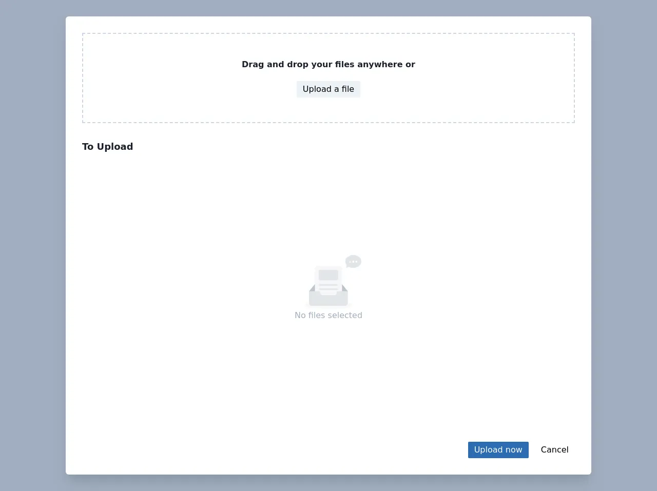
The preview of Responsive Multi File Upload with drop-on and preview ui component
Free download of the Responsive Multi File Upload with drop-on and preview's source code
The source code of Responsive Multi File Upload with drop-on and preview ui component
<div class="bg-gray-500 h-screen w-screen sm:px-8 md:px-16 sm:py-8">
<main class="container mx-auto max-w-screen-lg h-full">
<!-- file upload modal -->
<article aria-label="File Upload Modal" class="relative h-full flex flex-col bg-white shadow-xl rounded-md" ondrop="dropHandler(event);" ondragover="dragOverHandler(event);" ondragleave="dragLeaveHandler(event);" ondragenter="dragEnterHandler(event);">
<!-- overlay -->
<div id="overlay" class="w-full h-full absolute top-0 left-0 pointer-events-none z-50 flex flex-col items-center justify-center rounded-md">
<i>
<svg class="fill-current w-12 h-12 mb-3 text-blue-700" xmlns="http://www.w3.org/2000/svg" width="24" height="24" viewBox="0 0 24 24">
<path d="M19.479 10.092c-.212-3.951-3.473-7.092-7.479-7.092-4.005 0-7.267 3.141-7.479 7.092-2.57.463-4.521 2.706-4.521 5.408 0 3.037 2.463 5.5 5.5 5.5h13c3.037 0 5.5-2.463 5.5-5.5 0-2.702-1.951-4.945-4.521-5.408zm-7.479-1.092l4 4h-3v4h-2v-4h-3l4-4z" />
</svg>
</i>
<p class="text-lg text-blue-700">Drop files to upload</p>
</div>
<!-- scroll area -->
<section class="h-full overflow-auto p-8 w-full h-full flex flex-col">
<header class="border-dashed border-2 border-gray-400 py-12 flex flex-col justify-center items-center">
<p class="mb-3 font-semibold text-gray-900 flex flex-wrap justify-center">
<span>Drag and drop your</span> <span>files anywhere or</span>
</p>
<input id="hidden-input" type="file" multiple class="hidden" />
<button id="button" class="mt-2 rounded-sm px-3 py-1 bg-gray-200 hover:bg-gray-300 focus:shadow-outline focus:outline-none">
Upload a file
</button>
</header>
<h1 class="pt-8 pb-3 font-semibold sm:text-lg text-gray-900">
To Upload
</h1>
<ul id="gallery" class="flex flex-1 flex-wrap -m-1">
<li id="empty" class="h-full w-full text-center flex flex-col items-center justify-center items-center">
<img class="mx-auto w-32" src="https://user-images.githubusercontent.com/507615/54591670-ac0a0180-4a65-11e9-846c-e55ffce0fe7b.png" alt="no data" />
<span class="text-small text-gray-500">No files selected</span>
</li>
</ul>
</section>
<!-- sticky footer -->
<footer class="flex justify-end px-8 pb-8 pt-4">
<button id="submit" class="rounded-sm px-3 py-1 bg-blue-700 hover:bg-blue-500 text-white focus:shadow-outline focus:outline-none">
Upload now
</button>
<button id="cancel" class="ml-3 rounded-sm px-3 py-1 hover:bg-gray-300 focus:shadow-outline focus:outline-none">
Cancel
</button>
</footer>
</article>
</main>
</div>
<!-- using two similar templates for simplicity in js code -->
<template id="file-template">
<li class="block p-1 w-1/2 sm:w-1/3 md:w-1/4 lg:w-1/6 xl:w-1/8 h-24">
<article tabindex="0" class="group w-full h-full rounded-md focus:outline-none focus:shadow-outline elative bg-gray-100 cursor-pointer relative shadow-sm">
<img alt="upload preview" class="img-preview hidden w-full h-full sticky object-cover rounded-md bg-fixed" />
<section class="flex flex-col rounded-md text-xs break-words w-full h-full z-20 absolute top-0 py-2 px-3">
<h1 class="flex-1 group-hover:text-blue-800"></h1>
<div class="flex">
<span class="p-1 text-blue-800">
<i>
<svg class="fill-current w-4 h-4 ml-auto pt-1" xmlns="http://www.w3.org/2000/svg" width="24" height="24" viewBox="0 0 24 24">
<path d="M15 2v5h5v15h-16v-20h11zm1-2h-14v24h20v-18l-6-6z" />
</svg>
</i>
</span>
<p class="p-1 size text-xs text-gray-700"></p>
<button class="delete ml-auto focus:outline-none hover:bg-gray-300 p-1 rounded-md text-gray-800">
<svg class="pointer-events-none fill-current w-4 h-4 ml-auto" xmlns="http://www.w3.org/2000/svg" width="24" height="24" viewBox="0 0 24 24">
<path class="pointer-events-none" d="M3 6l3 18h12l3-18h-18zm19-4v2h-20v-2h5.711c.9 0 1.631-1.099 1.631-2h5.316c0 .901.73 2 1.631 2h5.711z" />
</svg>
</button>
</div>
</section>
</article>
</li>
</template>
<template id="image-template">
<li class="block p-1 w-1/2 sm:w-1/3 md:w-1/4 lg:w-1/6 xl:w-1/8 h-24">
<article tabindex="0" class="group hasImage w-full h-full rounded-md focus:outline-none focus:shadow-outline bg-gray-100 cursor-pointer relative text-transparent hover:text-white shadow-sm">
<img alt="upload preview" class="img-preview w-full h-full sticky object-cover rounded-md bg-fixed" />
<section class="flex flex-col rounded-md text-xs break-words w-full h-full z-20 absolute top-0 py-2 px-3">
<h1 class="flex-1"></h1>
<div class="flex">
<span class="p-1">
<i>
<svg class="fill-current w-4 h-4 ml-auto pt-" xmlns="http://www.w3.org/2000/svg" width="24" height="24" viewBox="0 0 24 24">
<path d="M5 8.5c0-.828.672-1.5 1.5-1.5s1.5.672 1.5 1.5c0 .829-.672 1.5-1.5 1.5s-1.5-.671-1.5-1.5zm9 .5l-2.519 4-2.481-1.96-4 5.96h14l-5-8zm8-4v14h-20v-14h20zm2-2h-24v18h24v-18z" />
</svg>
</i>
</span>
<p class="p-1 size text-xs"></p>
<button class="delete ml-auto focus:outline-none hover:bg-gray-300 p-1 rounded-md">
<svg class="pointer-events-none fill-current w-4 h-4 ml-auto" xmlns="http://www.w3.org/2000/svg" width="24" height="24" viewBox="0 0 24 24">
<path class="pointer-events-none" d="M3 6l3 18h12l3-18h-18zm19-4v2h-20v-2h5.711c.9 0 1.631-1.099 1.631-2h5.316c0 .901.73 2 1.631 2h5.711z" />
</svg>
</button>
</div>
</section>
</article>
</li>
</template>
<script>
const fileTempl = document.getElementById("file-template"),
imageTempl = document.getElementById("image-template"),
empty = document.getElementById("empty");
// use to store pre selected files
let FILES = {};
// check if file is of type image and prepend the initialied
// template to the target element
function addFile(target, file) {
const isImage = file.type.match("image.*"),
objectURL = URL.createObjectURL(file);
const clone = isImage
? imageTempl.content.cloneNode(true)
: fileTempl.content.cloneNode(true);
clone.querySelector("h1").textContent = file.name;
clone.querySelector("li").id = objectURL;
clone.querySelector(".delete").dataset.target = objectURL;
clone.querySelector(".size").textContent =
file.size > 1024
? file.size > 1048576
? Math.round(file.size / 1048576) + "mb"
: Math.round(file.size / 1024) + "kb"
: file.size + "b";
isImage &&
Object.assign(clone.querySelector("img"), {
src: objectURL,
alt: file.name
});
empty.classList.add("hidden");
target.prepend(clone);
FILES[objectURL] = file;
}
const gallery = document.getElementById("gallery"),
overlay = document.getElementById("overlay");
// click the hidden input of type file if the visible button is clicked
// and capture the selected files
const hidden = document.getElementById("hidden-input");
document.getElementById("button").onclick = () => hidden.click();
hidden.onchange = (e) => {
for (const file of e.target.files) {
addFile(gallery, file);
}
};
// use to check if a file is being dragged
const hasFiles = ({ dataTransfer: { types = [] } }) =>
types.indexOf("Files") > -1;
// use to drag dragenter and dragleave events.
// this is to know if the outermost parent is dragged over
// without issues due to drag events on its children
let counter = 0;
// reset counter and append file to gallery when file is dropped
function dropHandler(ev) {
ev.preventDefault();
for (const file of ev.dataTransfer.files) {
addFile(gallery, file);
overlay.classList.remove("draggedover");
counter = 0;
}
}
// only react to actual files being dragged
function dragEnterHandler(e) {
e.preventDefault();
if (!hasFiles(e)) {
return;
}
++counter && overlay.classList.add("draggedover");
}
function dragLeaveHandler(e) {
1 > --counter && overlay.classList.remove("draggedover");
}
function dragOverHandler(e) {
if (hasFiles(e)) {
e.preventDefault();
}
}
// event delegation to caputre delete events
// fron the waste buckets in the file preview cards
gallery.onclick = ({ target }) => {
if (target.classList.contains("delete")) {
const ou = target.dataset.target;
document.getElementById(ou).remove(ou);
gallery.children.length === 1 && empty.classList.remove("hidden");
delete FILES[ou];
}
};
// print all selected files
document.getElementById("submit").onclick = () => {
alert(`Submitted Files:\n${JSON.stringify(FILES)}`);
console.log(FILES);
};
// clear entire selection
document.getElementById("cancel").onclick = () => {
while (gallery.children.length > 0) {
gallery.lastChild.remove();
}
FILES = {};
empty.classList.remove("hidden");
gallery.append(empty);
};
</script>
<style>
.hasImage:hover section {
background-color: rgba(5, 5, 5, 0.4);
}
.hasImage:hover button:hover {
background: rgba(5, 5, 5, 0.45);
}
#overlay p,
i {
opacity: 0;
}
#overlay.draggedover {
background-color: rgba(255, 255, 255, 0.7);
}
#overlay.draggedover p,
#overlay.draggedover i {
opacity: 1;
}
.group:hover .group-hover\:text-blue-800 {
color: #2b6cb0;
}
</style>
How to create a Responsive Multi File Upload with drop-on and preview with Tailwind CSS?
To create a Responsive Multi File Upload with drop-on and preview ui component with Tailwind CSS, follow these steps:
Step 1: Set up the HTML structure
The first step is to set up the HTML structure for the component. Here is an example:
<div class="flex flex-col items-center justify-center bg-gray-100 h-screen">
  <form class="w-full max-w-lg">
    <div class="flex flex-wrap -mx-3 mb-6">
      <div class="w-full px-3 mb-6 md:mb-0">
        <label class="block uppercase tracking-wide text-gray-700 text-xs font-bold mb-2" for="grid-first-name">
          Select files
        </label>
        <div class="flex items-center justify-center bg-grey-lighter">
          <label class="w-full flex flex-col items-center px-4 py-6 bg-white text-blue rounded-lg shadow-lg tracking-wide uppercase border border-blue cursor-pointer hover:bg-blue hover:text-white">
            <svg class="w-8 h-8" fill="currentColor" xmlns="http://www.w3.org/2000/svg" viewBox="0 0 20 20"><path d="M10 12a2 2 0 100-4 2 2 0 000 4z"/><path fill-rule="evenodd" d="M15.555 5.445A5 5 0 005.833 4H3a2 2 0 00-2 2v10a2 2 0 002 2h14a2 2 0 002-2V7.167a5 5 0 00-1.445-1.722l-2.445-2.445zM5.833 6a3 3 0 110 6 3 3 0 010-6zm8.293 6.707a1 1 0 00-1.414-1.414L11 13.586V9a1 1 0 00-2 0v4.586l-1.707-1.707a1 1 0 10-1.414 1.414l3 3a1 1 0 001.414 0l3-3a1 1 0 000-1.414z" clip-rule="evenodd"/></svg>
            <span class="mt-2 text-base leading-normal">Select files</span>
            <input type='file' class="hidden" multiple />
          </label>
        </div>
      </div>
      <div class="w-full px-3 mb-6 md:mb-0">
        <div class="flex flex-wrap -mx-3 mb-6">
          <div class="w-full px-3 mb-6 md:mb-0">
            <label class="block uppercase tracking-wide text-gray-700 text-xs font-bold mb-2" for="grid-first-name">
              Preview
            </label>
            <div class="flex flex-wrap -mx-3 mb-6">
              <div class="w-full px-3 mb-6 md:mb-0">
                <div class="flex flex-wrap -mx-3 mb-6">
                  <div class="w-full px-3 mb-6 md:mb-0">
                    <div class="relative">
                      <div class="h-48 rounded-lg bg-gray-100 flex justify-center items-center text-gray-400">
                        <span class="text-center">No files selected</span>
                      </div>
                      <div class="border-dashed border-2 border-gray-400 h-full w-full absolute top-0 left-0"></div>
                    </div>
                  </div>
                </div>
              </div>
            </div>
          </div>
        </div>
      </div>
    </div>
  </form>
</div>
Step 2: Add Tailwind CSS classes
The next step is to add Tailwind CSS classes to the HTML elements to style them. Here is an example:
<div class="flex flex-col items-center justify-center bg-gray-100 h-screen">
  <form class="w-full max-w-lg">
    <div class="flex flex-wrap -mx-3 mb-6">
      <div class="w-full px-3 mb-6 md:mb-0">
        <label class="block uppercase tracking-wide text-gray-700 text-xs font-bold mb-2" for="grid-first-name">
          Select files
        </label>
        <div class="flex items-center justify-center bg-grey-lighter">
          <label class="w-full flex flex-col items-center px-4 py-6 bg-white text-blue rounded-lg shadow-lg tracking-wide uppercase border border-blue cursor-pointer hover:bg-blue hover:text-white">
            <svg class="w-8 h-8" fill="currentColor" xmlns="http://www.w3.org/2000/svg" viewBox="0 0 20 20"><path d="M10 12a2 2 0 100-4 2 2 0 000 4z"/><path fill-rule="evenodd" d="M15.555 5.445A5 5 0 005.833 4H3a2 2 0 00-2 2v10a2 2 0 002 2h14a2 2 0 002-2V7.167a5 5 0 00-1.445-1.722l-2.445-2.445zM5.833 6a3 3 0 110 6 3 3 0 010-6zm8.293 6.707a1 1 0 00-1.414-1.414L11 13.586V9a1 1 0 00-2 0v4.586l-1.707-1.707a1 1 0 10-1.414 1.414l3 3a1 1 0 001.414 0l3-3a1 1 0 000-1.414z" clip-rule="evenodd"/></svg>
            <span class="mt-2 text-base leading-normal">Select files</span>
            <input type='file' class="hidden" multiple />
          </label>
        </div>
      </div>
      <div class="w-full px-3 mb-6 md:mb-0">
        <div class="flex flex-wrap -mx-3 mb-6">
          <div class="w-full px-3 mb-6 md:mb-0">
            <label class="block uppercase tracking-wide text-gray-700 text-xs font-bold mb-2" for="grid-first-name">
              Preview
            </label>
            <div class="flex flex-wrap -mx-3 mb-6">
              <div class="w-full px-3 mb-6 md:mb-0">
                <div class="flex flex-wrap -mx-3 mb-6">
                  <div class="w-full px-3 mb-6 md:mb-0">
                    <div class="relative">
                      <div class="h-48 rounded-lg bg-gray-100 flex justify-center items-center text-gray-400">
                        <span class="text-center">No files selected</span>
                      </div>
                      <div class="border-dashed border-2 border-gray-400 h-full w-full absolute top-0 left-0"></div>
                    </div>
                  </div>
                </div>
              </div>
            </div>
          </div>
        </div>
      </div>
    </div>
  </form>
</div>
Step 3: Add JavaScript code
The final step is to add JavaScript code to handle the file upload and preview. Here is an example:
const fileInput = document.querySelector('input[type="file"]');
const previewContainer = document.querySelector('.preview-container');
const previewImage = previewContainer.querySelector('.preview-image');
const previewText = previewContainer.querySelector('.preview-text');

fileInput.addEventListener('change', function() {
  const file = this.files[0];

  if (file) {
    const reader = new FileReader();

    previewText.style.display = 'none';
    previewImage.style.display = 'block';

    reader.addEventListener('load', function() {
      previewImage.setAttribute('src', this.result);
    });

    reader.readAsDataURL(file);
  } else {
    previewText.style.display = null;
    previewImage.style.display = null;
    previewImage.setAttribute('src', '');
  }
});
Step 4: Style the component
To style the component, you can use the pre-defined Tailwind CSS classes or create your own custom classes. Here is an example:
.preview-container {
  position: relative;
  width: 100%;
  height: 300px;
  border: 2px dashed #ccc;
  display: flex;
  justify-content: center;
  align-items: center;
}

.preview-image {
  position: absolute;
  top: 0;
  left: 0;
  width: 100%;
  height: 100%;
  object-fit: cover;
  display: none;
}

.preview-text {
  font-size: 24px;
  font-weight: bold;
  color: #ccc;
}
Conclusion
In this article, we have learned how to create a Responsive Multi File Upload with drop-on and preview ui component using Tailwind CSS. With Tailwind CSS, you can easily create custom designs without writing any CSS. The component we created is useful for any application that requires users to upload multiple files, such as a photo gallery or a document management system.