- Published on
Learn How To Build A Feed Grid With Tailwind CSS from the Pros
- What is Tailwind CSS?
- The description of Feed Grid ui component
- Why use Tailwind CSS to create a Feed Grid ui component?
- The preview of Feed Grid ui component
- The source code of Feed Grid ui component
- How to create a Feed Grid with Tailwind CSS?
- Step 1: Set up your HTML structure
- Step 2: Style your grid items
- Step 3: Add images and text
- Step 4: Add responsiveness
- Conclusion
Are you looking for a way to create a beautiful and functional feed grid for your website or application? Look no further than Tailwind CSS, a utility-first CSS framework that can help you create stunning UI components quickly and easily.
In this article, we'll show you how to build a feed grid with Tailwind CSS, including the benefits of using this framework, a preview of the component, and the source code you'll need to get started.
What is Tailwind CSS?
Tailwind CSS is a CSS framework that provides a set of pre-defined utility classes that can be used to style your HTML elements. Unlike other CSS frameworks, Tailwind CSS doesn't come with pre-built components, but instead provides you with a set of building blocks that you can use to create your own custom components.
This approach gives you more flexibility and control over your design, while still allowing you to create beautiful and responsive UI components quickly and easily.
The description of Feed Grid ui component
A feed grid is a UI component that displays a collection of items in a grid layout, typically with images and text. This component is commonly used in social media platforms, news websites, and e-commerce sites to display a list of products.
The feed grid component is a great way to showcase your content in an organized and visually appealing way, making it easier for users to browse and interact with your site.
Why use Tailwind CSS to create a Feed Grid ui component?
Tailwind CSS is a great choice for creating a feed grid UI component for several reasons:
Flexibility: Tailwind CSS provides a wide range of utility classes that can be used to create custom designs and layouts, giving you more control over your component's appearance and behavior.
Responsive: Tailwind CSS is designed to be responsive by default, making it easy to create a feed grid that looks great on any device.
Easy to use: Tailwind CSS is easy to learn and use, even for beginners. With its intuitive naming convention and helpful documentation, you can quickly create complex UI components without writing a lot of custom CSS.
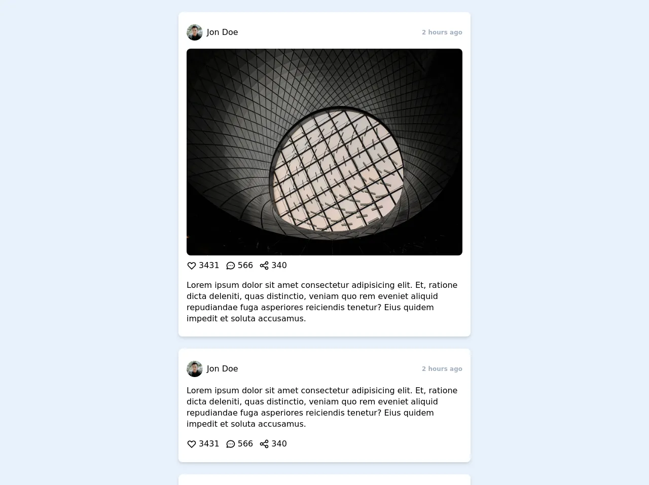
The preview of Feed Grid ui component
To give you an idea of what a feed grid UI component looks like, here's a preview of what we'll be building:
Free download of the Feed Grid's source code
The source code of Feed Grid ui component
Here's the source code you'll need to create a feed grid UI component with Tailwind CSS:
<div class="grid grid-cols-1 gap-6 my-6 px-4 md:px-6 lg:px-8">
    <div class="max-w-xl mx-auto px-4 py-4 bg-white shadow-md rounded-lg">
      <div class="py-2 flex flex-row items-center justify-between">
        <div class="flex flex-row items-center">
          <a href="#" class="flex flex-row items-center focus:outline-none focus:shadow-outline rounded-lg">
            <img class="rounded-full h-8 w-8 object-cover" src="https://images.unsplash.com/photo-1520065786657-b71a007dd8a5?ixlib=rb-1.2.1&ixid=eyJhcHBfaWQiOjEyMDd9&auto=format&fit=facearea&facepad=4&w=256&h=256&q=80" alt="">
            <p class="ml-2 text-base font-medium">Jon Doe</p>
          </a>
        </div>
        <div class="flex flex-row items-center">
          <p class="text-xs font-semibold text-gray-500">2 hours ago</p>
        </div>
      </div>
      <div class="mt-2">
        <img class="object-cover w-full rounded-lg" src="https://images.unsplash.com/photo-1586398710270-760041494553?ixlib=rb-1.2.1&ixid=eyJhcHBfaWQiOjEyMDd9&auto=format&fit=crop&w=1280&q=80" alt="">
        <div class="py-2 flex flex-row items-center">
          <button class="flex flex-row items-center focus:outline-none focus:shadow-outline rounded-lg">
            <svg fill="none" stroke="currentColor" stroke-linecap="round" stroke-linejoin="round" stroke-width="2" viewBox="0 0 24 24" class="w-5 h-5"><path d="M4.318 6.318a4.5 4.5 0 000 6.364L12 20.364l7.682-7.682a4.5 4.5 0 00-6.364-6.364L12 7.636l-1.318-1.318a4.5 4.5 0 00-6.364 0z"></path></svg>
            <span class="ml-1">3431</span>
          </button>
          <button class="flex flex-row items-center focus:outline-none focus:shadow-outline rounded-lg ml-3">
            <svg fill="none" stroke="currentColor" stroke-linecap="round" stroke-linejoin="round" stroke-width="2" viewBox="0 0 24 24" class="w-5 h-5"><path d="M8 12h.01M12 12h.01M16 12h.01M21 12c0 4.418-4.03 8-9 8a9.863 9.863 0 01-4.255-.949L3 20l1.395-3.72C3.512 15.042 3 13.574 3 12c0-4.418 4.03-8 9-8s9 3.582 9 8z"></path></svg>
            <span class="ml-1">566</span>
          </button>
          <button class="flex flex-row items-center focus:outline-none focus:shadow-outline rounded-lg ml-3">
            <svg fill="none" stroke="currentColor" stroke-linecap="round" stroke-linejoin="round" stroke-width="2" viewBox="0 0 24 24" class="w-5 h-5"><path d="M8.684 13.342C8.886 12.938 9 12.482 9 12c0-.482-.114-.938-.316-1.342m0 2.684a3 3 0 110-2.684m0 2.684l6.632 3.316m-6.632-6l6.632-3.316m0 0a3 3 0 105.367-2.684 3 3 0 00-5.367 2.684zm0 9.316a3 3 0 105.368 2.684 3 3 0 00-5.368-2.684z"></path></svg>
            <span class="ml-1">340</span>
          </button>
        </div>
      </div>
      <div class="py-2">
        <p class="leading-snug">Lorem ipsum dolor sit amet consectetur adipisicing elit. Et, ratione dicta deleniti, quas distinctio, veniam quo rem eveniet aliquid repudiandae fuga asperiores reiciendis tenetur? Eius quidem impedit et soluta accusamus.</p>
      </div>
    </div>

    <div class="max-w-xl mx-auto px-4 py-4 bg-white shadow-md rounded-lg">
      <div class="py-2 flex flex-row items-center justify-between">
        <div class="flex flex-row items-center">
          <a href="#" class="flex flex-row items-center focus:outline-none focus:shadow-outline rounded-lg">
            <img class="rounded-full h-8 w-8 object-cover" src="https://images.unsplash.com/photo-1520065786657-b71a007dd8a5?ixlib=rb-1.2.1&ixid=eyJhcHBfaWQiOjEyMDd9&auto=format&fit=facearea&facepad=4&w=256&h=256&q=80" alt="">
            <p class="ml-2 text-base font-medium">Jon Doe</p>
          </a>
        </div>
        <div class="flex flex-row items-center">
          <p class="text-xs font-semibold text-gray-500">2 hours ago</p>
        </div>
      </div>
      <div class="py-2">
        <p class="leading-snug">Lorem ipsum dolor sit amet consectetur adipisicing elit. Et, ratione dicta deleniti, quas distinctio, veniam quo rem eveniet aliquid repudiandae fuga asperiores reiciendis tenetur? Eius quidem impedit et soluta accusamus.</p>
      </div>
      <div>
        <div class="py-2 flex flex-row items-center">
          <button class="flex flex-row items-center focus:outline-none focus:shadow-outline rounded-lg">
            <svg fill="none" stroke="currentColor" stroke-linecap="round" stroke-linejoin="round" stroke-width="2" viewBox="0 0 24 24" class="w-5 h-5"><path d="M4.318 6.318a4.5 4.5 0 000 6.364L12 20.364l7.682-7.682a4.5 4.5 0 00-6.364-6.364L12 7.636l-1.318-1.318a4.5 4.5 0 00-6.364 0z"></path></svg>
            <span class="ml-1">3431</span>
          </button>
          <button class="flex flex-row items-center focus:outline-none focus:shadow-outline rounded-lg ml-3">
            <svg fill="none" stroke="currentColor" stroke-linecap="round" stroke-linejoin="round" stroke-width="2" viewBox="0 0 24 24" class="w-5 h-5"><path d="M8 12h.01M12 12h.01M16 12h.01M21 12c0 4.418-4.03 8-9 8a9.863 9.863 0 01-4.255-.949L3 20l1.395-3.72C3.512 15.042 3 13.574 3 12c0-4.418 4.03-8 9-8s9 3.582 9 8z"></path></svg>
            <span class="ml-1">566</span>
          </button>
          <button class="flex flex-row items-center focus:outline-none focus:shadow-outline rounded-lg ml-3">
            <svg fill="none" stroke="currentColor" stroke-linecap="round" stroke-linejoin="round" stroke-width="2" viewBox="0 0 24 24" class="w-5 h-5"><path d="M8.684 13.342C8.886 12.938 9 12.482 9 12c0-.482-.114-.938-.316-1.342m0 2.684a3 3 0 110-2.684m0 2.684l6.632 3.316m-6.632-6l6.632-3.316m0 0a3 3 0 105.367-2.684 3 3 0 00-5.367 2.684zm0 9.316a3 3 0 105.368 2.684 3 3 0 00-5.368-2.684z"></path></svg>
            <span class="ml-1">340</span>
          </button>
        </div>
      </div>
    </div>

    <div class="max-w-xl mx-auto px-4 py-4 bg-white shadow-md rounded-lg">
      <div class="py-2 flex flex-row items-center justify-between">
        <div class="flex flex-row items-center">
          <a href="#" class="flex flex-row items-center focus:outline-none focus:shadow-outline rounded-lg">
            <img class="rounded-full h-8 w-8 object-cover" src="https://images.unsplash.com/photo-1520065786657-b71a007dd8a5?ixlib=rb-1.2.1&ixid=eyJhcHBfaWQiOjEyMDd9&auto=format&fit=facearea&facepad=4&w=256&h=256&q=80" alt="">
            <p class="ml-2 text-base font-medium">Jon Doe</p>
          </a>
        </div>
        <div class="flex flex-row items-center">
          <p class="text-xs font-semibold text-gray-500">2 hours ago</p>
        </div>
      </div>
      <div class="mt-2">
        <img class="object-cover w-full rounded-lg" src="https://images.unsplash.com/photo-1586398710270-760041494553?ixlib=rb-1.2.1&ixid=eyJhcHBfaWQiOjEyMDd9&auto=format&fit=crop&w=1280&q=80" alt="">
        <div class="py-2 flex flex-row items-center">
          <button class="flex flex-row items-center focus:outline-none focus:shadow-outline rounded-lg">
            <svg fill="none" stroke="currentColor" stroke-linecap="round" stroke-linejoin="round" stroke-width="2" viewBox="0 0 24 24" class="w-5 h-5"><path d="M4.318 6.318a4.5 4.5 0 000 6.364L12 20.364l7.682-7.682a4.5 4.5 0 00-6.364-6.364L12 7.636l-1.318-1.318a4.5 4.5 0 00-6.364 0z"></path></svg>
            <span class="ml-1">3431</span>
          </button>
          <button class="flex flex-row items-center focus:outline-none focus:shadow-outline rounded-lg ml-3">
            <svg fill="none" stroke="currentColor" stroke-linecap="round" stroke-linejoin="round" stroke-width="2" viewBox="0 0 24 24" class="w-5 h-5"><path d="M8 12h.01M12 12h.01M16 12h.01M21 12c0 4.418-4.03 8-9 8a9.863 9.863 0 01-4.255-.949L3 20l1.395-3.72C3.512 15.042 3 13.574 3 12c0-4.418 4.03-8 9-8s9 3.582 9 8z"></path></svg>
            <span class="ml-1">566</span>
          </button>
          <button class="flex flex-row items-center focus:outline-none focus:shadow-outline rounded-lg ml-3">
            <svg fill="none" stroke="currentColor" stroke-linecap="round" stroke-linejoin="round" stroke-width="2" viewBox="0 0 24 24" class="w-5 h-5"><path d="M8.684 13.342C8.886 12.938 9 12.482 9 12c0-.482-.114-.938-.316-1.342m0 2.684a3 3 0 110-2.684m0 2.684l6.632 3.316m-6.632-6l6.632-3.316m0 0a3 3 0 105.367-2.684 3 3 0 00-5.367 2.684zm0 9.316a3 3 0 105.368 2.684 3 3 0 00-5.368-2.684z"></path></svg>
            <span class="ml-1">340</span>
          </button>
        </div>
      </div>
    </div>
  </div>
How to create a Feed Grid with Tailwind CSS?
Now that you know why Tailwind CSS is a great choice for creating a feed grid UI component, let's dive into the steps you'll need to follow to create your own.
Step 1: Set up your HTML structure
The first step is to set up your HTML structure. You'll need to create a container element that will hold your grid items, and then create individual grid items for each item in your feed.
Here's an example HTML structure:
<div class="feed-grid">
  <div class="feed-item">
    <!-- Grid item content goes here -->
  </div>
  <div class="feed-item">
    <!-- Grid item content goes here -->
  </div>
  <div class="feed-item">
    <!-- Grid item content goes here -->
  </div>
  <!-- Add more grid items as needed -->
</div>
Step 2: Style your grid items
Next, you'll need to style your grid items using Tailwind CSS utility classes. You can use classes like bg-white, rounded-lg, and shadow-md to give your items a clean and modern look.
Here's an example of how you might style your grid items:
<div class="feed-grid">
  <div class="feed-item bg-white rounded-lg shadow-md">
    <!-- Grid item content goes here -->
  </div>
  <div class="feed-item bg-white rounded-lg shadow-md">
    <!-- Grid item content goes here -->
  </div>
  <div class="feed-item bg-white rounded-lg shadow-md">
    <!-- Grid item content goes here -->
  </div>
  <!-- Add more grid items as needed -->
</div>
Step 3: Add images and text
Next, you'll need to add images and text to your grid items. You can use the w-full and h-48 classes to set the width and height of your images, and the text-lg and font-bold classes to style your text.
Here's an example of how you might add images and text to your grid items:
<div class="feed-grid">
  <div class="feed-item bg-white rounded-lg shadow-md">
    <img src="https://via.placeholder.com/640x480" alt="Placeholder image" class="w-full h-48 object-cover rounded-t-lg">
    <div class="p-4">
      <h2 class="text-lg font-bold">Item title</h2>
      <p class="text-gray-700">Lorem ipsum dolor sit amet, consectetur adipiscing elit. Sed euismod euismod libero, eu bibendum felis lacinia sed.</p>
    </div>
  </div>
  <!-- Add more grid items as needed -->
</div>
Step 4: Add responsiveness
Finally, you'll need to add responsiveness to your feed grid. You can use Tailwind CSS's responsive utility classes to adjust the layout and appearance of your grid items based on the screen size.
Here's an example of how you might add responsiveness to your feed grid:
<div class="feed-grid grid grid-cols-1 md:grid-cols-2 lg:grid-cols-3 gap-4">
  <div class="feed-item bg-white rounded-lg shadow-md">
    <!-- Grid item content goes here -->
  </div>
  <div class="feed-item bg-white rounded-lg shadow-md">
    <!-- Grid item content goes here -->
  </div>
  <div class="feed-item bg-white rounded-lg shadow-md">
    <!-- Grid item content goes here -->
  </div>
  <!-- Add more grid items as needed -->
</div>
In this example, we're using the grid-cols-1, md:grid-cols-2, and lg:grid-cols-3 classes to set the number of columns in our grid based on the screen size. We're also using the gap-4 class to add some spacing between our grid items.
Conclusion
In this article, we've shown you how to create a feed grid UI component using Tailwind CSS. With its flexible and responsive utility classes, Tailwind CSS makes it easy to create beautiful and functional UI components quickly and easily.
By following the steps outlined in this article, you can create your own feed grid and customize it to fit your specific needs. So why not give it a try and see what you can create with Tailwind CSS?