- Published on
Imagine You Build A Feature Section With Tailwind CSS Like An Expert. Follow These 6 Steps To Get There

- What is Tailwind CSS?
- The description of Feature section ui component
- Why use Tailwind CSS to create a Feature section ui component?
- The preview of Feature section ui component.
- The source code of Feature section ui component.
- How to create a Feature section with Tailwind CSS?
- Step 1: Set up your project
- Step 2: Create the HTML structure
- Step 3: Style the cards
- Step 4: Add images to the cards
- Step 5: Customize the colors
- Step 6: Add animations
- Conclusion
As a FrontEnd technology blogger, you might have heard of Tailwind CSS. It is a utility-first CSS framework that provides you with a set of pre-defined classes to create your UI components. In this article, we are going to explore how to build a Feature section UI component with Tailwind CSS.
What is Tailwind CSS?
Tailwind CSS is a utility-first CSS framework that provides you with a set of pre-defined classes to create your UI components. It is designed to be highly customizable, so you can easily create your own classes and styles.
The description of Feature section ui component
A Feature section is a UI component that showcases the main features or benefits of a product or service. It usually consists of a set of cards or panels, each highlighting a different feature.
Why use Tailwind CSS to create a Feature section ui component?
Tailwind CSS provides you with a set of pre-defined classes that you can use to create your Feature section UI component. This saves you a lot of time and effort, as you don't have to write custom CSS for each component.
The preview of Feature section ui component.
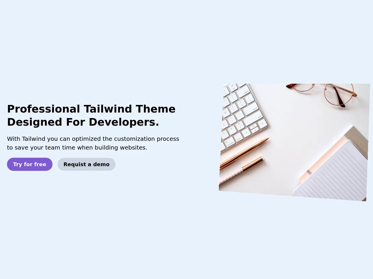
Here is a preview of what our Feature section UI component will look like:
Free download of the Feature section's source code
The source code of Feature section ui component.
Here is the source code for our Feature section UI component:
<div class="py-16">
  <div class="container m-auto px-6">

   <div class="lg:flex justify-between items-center">
       <div class="lg:w-6/12 lg:p-0 p-7">
          <h1 class="text-4xl font-bold leading-tight mb-5 capitalize">  Professional Tailwind theme designed for developers. </h1>
          <p class="text-xl">  With Tailwind you can optimized the customization process to save your team time when building websites. </p>

          <div class="py-5">
               <a href="#" class="text-white rounded-full py-2 px-5 text-lg font-semibold bg-purple-600 inline-block border border-purple-600 mr-3">Try for free</a>
               <a href="#" class="text-black rounded-full py-2 px-5 text-lg font-semibold bg-gray-400 inline-block border hover:bg-white hover:text-black">Requist a demo</a>
          </div>

        </div>
        <div class="lg:w-5/12 order-2">
          <img src="https://images.unsplash.com/photo-1542435503-956c469947f6?ixlib=rb-1.2.1&ixid=eyJhcHBfaWQiOjEyMDd9&auto=format&fit=crop&w=967&q=80"
          style="transform: scale(1) perspective(1040px) rotateY(-11deg) rotateX(2deg) rotate(2deg);" alt="" class="rounded">
        </div>
    </div>

  </div>
</div>
How to create a Feature section with Tailwind CSS?
Now, let's dive into the steps to create a Feature section with Tailwind CSS.
Step 1: Set up your project
The first step is to set up your project. You can either use a CDN to include Tailwind CSS in your project or install it using a package manager like npm or yarn. For this tutorial, we will use the CDN method.
<head>
  <link rel="stylesheet" href="https://cdn.jsdelivr.net/npm/[email protected]/dist/tailwind.min.css">
</head>
Step 2: Create the HTML structure
Next, we need to create the HTML structure for our Feature section. We will use a div element with a class of grid to create a grid layout for our cards.
<div class="grid grid-cols-1 md:grid-cols-2 lg:grid-cols-3 gap-4">
  <div class="bg-white rounded-lg shadow-lg overflow-hidden">
    <div class="p-4">
      <h3 class="font-bold text-xl mb-2">Feature 1</h3>
      <p class="text-gray-700 leading-tight">Lorem ipsum dolor sit amet, consectetur adipiscing elit. Sed do eiusmod tempor incididunt ut labore et dolore magna aliqua.</p>
    </div>
  </div>
  <div class="bg-white rounded-lg shadow-lg overflow-hidden">
    <div class="p-4">
      <h3 class="font-bold text-xl mb-2">Feature 2</h3>
      <p class="text-gray-700 leading-tight">Lorem ipsum dolor sit amet, consectetur adipiscing elit. Sed do eiusmod tempor incididunt ut labore et dolore magna aliqua.</p>
    </div>
  </div>
  <div class="bg-white rounded-lg shadow-lg overflow-hidden">
    <div class="p-4">
      <h3 class="font-bold text-xl mb-2">Feature 3</h3>
      <p class="text-gray-700 leading-tight">Lorem ipsum dolor sit amet, consectetur adipiscing elit. Sed do eiusmod tempor incididunt ut labore et dolore magna aliqua.</p>
    </div>
  </div>
</div>
Step 3: Style the cards
Now, we need to style the cards. We will use the pre-defined classes provided by Tailwind CSS to style our cards.
.bg-white {
  background-color: #ffffff;
}

.rounded-lg {
  border-radius: 0.5rem;
}

.shadow-lg {
  box-shadow: 0 10px 15px -3px rgba(0, 0, 0, 0.1), 0 4px 6px -2px rgba(0, 0, 0, 0.05);
}

.overflow-hidden {
  overflow: hidden;
}

.p-4 {
  padding: 1rem;
}

.font-bold {
  font-weight: 700;
}

.text-xl {
  font-size: 1.25rem;
}

.mb-2 {
  margin-bottom: 0.5rem;
}

.text-gray-700 {
  color: #4a5568;
}

.leading-tight {
  line-height: 1.25;
}

.grid-cols-1 {
  grid-template-columns: repeat(1, minmax(0, 1fr));
}

.md\:grid-cols-2 {
  grid-template-columns: repeat(2, minmax(0, 1fr));
}

.lg\:grid-cols-3 {
  grid-template-columns: repeat(3, minmax(0, 1fr));
}

.gap-4 {
  gap: 1rem;
}
Step 4: Add images to the cards
If you want to add images to your cards, you can use the bg-cover and bg-center classes to position and scale your images.
<div class="bg-cover bg-center h-64" style="background-image: url('https://via.placeholder.com/800x600')"></div>
Step 5: Customize the colors
You can customize the colors of your Feature section by modifying the colors object in your tailwind.config.js file.
module.exports = {
  theme: {
    extend: {
      colors: {
        primary: '#ff0000',
        secondary: '#00ff00',
        tertiary: '#0000ff',
      },
    },
  },
  variants: {},
  plugins: [],
};
Step 6: Add animations
You can add animations to your Feature section by using the animate class and the pre-defined animations provided by Tailwind CSS.
<div class="bg-white rounded-lg shadow-lg overflow-hidden animate-pulse">
  <div class="p-4">
    <h3 class="font-bold text-xl mb-2">Feature 1</h3>
    <p class="text-gray-700 leading-tight">Lorem ipsum dolor sit amet, consectetur adipiscing elit. Sed do eiusmod tempor incididunt ut labore et dolore magna aliqua.</p>
  </div>
</div>
Conclusion
In this article, we have explored how to build a Feature section UI component with Tailwind CSS. We have learned how to set up our project, create the HTML structure, style the cards, add images, customize the colors, and add animations. With these steps, you can create your own Feature section UI component like an expert.