- Published on
Best Ways To Create A Feature Component With Tailwind CSS
- What is Tailwind CSS?
- The description of Feature Component ui component
- Why use Tailwind CSS to create a Feature Component ui component?
- The preview of Feature Component ui component
- The source code of Feature Component ui component
- How to create a Feature Component with Tailwind CSS?
- Conclusion
As a FrontEnd technology blogger, you must have heard of Tailwind CSS, a utility-first CSS framework that allows you to quickly build custom designs without writing any CSS. In this article, we will discuss the best ways to create a feature component with Tailwind CSS.
What is Tailwind CSS?
Tailwind CSS is a utility-first CSS framework that provides pre-defined CSS classes to create custom designs. It is a low-level CSS framework that allows you to build custom designs without writing any CSS. Tailwind CSS is designed to be highly customizable and easy to use.
The description of Feature Component ui component
A feature component is a UI component that highlights the main features of a product or service. It is usually placed on the homepage or landing page of a website. A feature component can be created using images, icons, and text to highlight the key features of a product or service.
Why use Tailwind CSS to create a Feature Component ui component?
Tailwind CSS provides pre-defined CSS classes that can be used to create a feature component quickly. It also allows you to customize the design of the feature component easily. Tailwind CSS is highly responsive, which means that the feature component will look great on all devices.
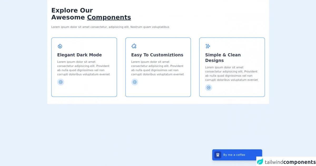
The preview of Feature Component ui component
A feature component can be created using images, icons, and text to highlight the key features of a product or service. Here is a preview of what a feature component can look like:
Free download of the Feature Component's source code
The source code of Feature Component ui component
The source code of a feature component can be created using HTML and CSS. Here is an example of what the HTML and CSS code for a feature component might look like:
<section class="bg-white dark:bg-gray-900">
    <div class="container px-6 py-10 mx-auto">
        <h1 class="text-3xl font-semibold text-gray-800 capitalize lg:text-4xl dark:text-white">explore our <br> awesome <span class="underline decoration-blue-500">Components</span></h1>

        <p class="mt-4 text-gray-500 xl:mt-6 dark:text-gray-300">
            Lorem ipsum dolor sit amet consectetur, adipisicing elit. Nostrum quam voluptatibus
        </p>

        <div class="grid grid-cols-1 gap-8 mt-8 xl:mt-12 xl:gap-12 md:grid-cols-2 xl:grid-cols-3">
            <div class="p-8 space-y-3 border-2 border-blue-400 dark:border-blue-300 rounded-xl">
                <span class="inline-block text-blue-500 dark:text-blue-400">
                    <svg xmlns="http://www.w3.org/2000/svg" class="w-8 h-8" fill="none" viewBox="0 0 24 24" stroke="currentColor">
                        <path stroke-linecap="round" stroke-linejoin="round" stroke-width="2" d="M17.657 18.657A8 8 0 016.343 7.343S7 9 9 10c0-2 .5-5 2.986-7C14 5 16.09 5.777 17.656 7.343A7.975 7.975 0 0120 13a7.975 7.975 0 01-2.343 5.657z" />
                        <path stroke-linecap="round" stroke-linejoin="round" stroke-width="2" d="M9.879 16.121A3 3 0 1012.015 11L11 14H9c0 .768.293 1.536.879 2.121z" />
                    </svg>
                </span>

                <h1 class="text-2xl font-semibold text-gray-700 capitalize dark:text-white">elegant Dark Mode</h1>

                <p class="text-gray-500 dark:text-gray-300">
                    Lorem ipsum dolor sit amet consectetur adipisicing elit. Provident ab nulla quod dignissimos vel non corrupti doloribus voluptatum eveniet
                </p>

                <a href="#" class="inline-flex p-2 text-blue-500 capitalize transition-colors duration-200 transform bg-blue-100 rounded-full dark:bg-blue-500 dark:text-white hover:underline hover:text-blue-600 dark:hover:text-blue-500">
                    <svg xmlns="http://www.w3.org/2000/svg" class="w-6 h-6" fill="none" viewBox="0 0 24 24" stroke="currentColor">
                        <path stroke-linecap="round" stroke-linejoin="round" stroke-width="2" d="M13 9l3 3m0 0l-3 3m3-3H8m13 0a9 9 0 11-18 0 9 9 0 0118 0z" />
                    </svg>
                </a>
            </div>

            <div class="p-8 space-y-3 border-2 border-blue-400 dark:border-blue-300 rounded-xl">
                <span class="inline-block text-blue-500 dark:text-blue-400">
                    <svg xmlns="http://www.w3.org/2000/svg" class="w-8 h-8" fill="none" viewBox="0 0 24 24" stroke="currentColor">
                        <path stroke-linecap="round" stroke-linejoin="round" stroke-width="2" d="M11 4a2 2 0 114 0v1a1 1 0 001 1h3a1 1 0 011 1v3a1 1 0 01-1 1h-1a2 2 0 100 4h1a1 1 0 011 1v3a1 1 0 01-1 1h-3a1 1 0 01-1-1v-1a2 2 0 10-4 0v1a1 1 0 01-1 1H7a1 1 0 01-1-1v-3a1 1 0 00-1-1H4a2 2 0 110-4h1a1 1 0 001-1V7a1 1 0 011-1h3a1 1 0 001-1V4z" />
                    </svg>
                </span>

                <h1 class="text-2xl font-semibold text-gray-700 capitalize dark:text-white">Easy to customiztions</h1>

                <p class="text-gray-500 dark:text-gray-300">
                    Lorem ipsum dolor sit amet consectetur adipisicing elit. Provident ab nulla quod dignissimos vel non corrupti doloribus voluptatum eveniet
                </p>

                <a href="#" class="inline-flex p-2 text-blue-500 capitalize transition-colors duration-200 transform bg-blue-100 rounded-full dark:bg-blue-500 dark:text-white hover:underline hover:text-blue-600 dark:hover:text-blue-500">
                    <svg xmlns="http://www.w3.org/2000/svg" class="w-6 h-6" fill="none" viewBox="0 0 24 24" stroke="currentColor">
                        <path stroke-linecap="round" stroke-linejoin="round" stroke-width="2" d="M13 9l3 3m0 0l-3 3m3-3H8m13 0a9 9 0 11-18 0 9 9 0 0118 0z" />
                    </svg>
                </a>
            </div>

            <div class="p-8 space-y-3 border-2 border-blue-400 dark:border-blue-300 rounded-xl">
                <span class="inline-block text-blue-500 dark:text-blue-400">
                    <svg xmlns="http://www.w3.org/2000/svg" class="w-8 h-8" fill="none" viewBox="0 0 24 24" stroke="currentColor">
                        <path stroke-linecap="round" stroke-linejoin="round" stroke-width="2" d="M5 3v4M3 5h4M6 17v4m-2-2h4m5-16l2.286 6.857L21 12l-5.714 2.143L13 21l-2.286-6.857L5 12l5.714-2.143L13 3z" />
                    </svg>
                </span>

                <h1 class="text-2xl font-semibold text-gray-700 capitalize dark:text-white">Simple & clean designs</h1>

                <p class="text-gray-500 dark:text-gray-300">
                    Lorem ipsum dolor sit amet consectetur adipisicing elit. Provident ab nulla quod dignissimos vel non corrupti doloribus voluptatum eveniet
                </p>

                <a href="#" class="inline-flex p-2 text-blue-500 capitalize transition-colors duration-200 transform bg-blue-100 rounded-full dark:bg-blue-500 dark:text-white hover:underline hover:text-blue-600 dark:hover:text-blue-500">
                    <svg xmlns="http://www.w3.org/2000/svg" class="w-6 h-6" fill="none" viewBox="0 0 24 24" stroke="currentColor">
                        <path stroke-linecap="round" stroke-linejoin="round" stroke-width="2" d="M13 9l3 3m0 0l-3 3m3-3H8m13 0a9 9 0 11-18 0 9 9 0 0118 0z" />
                    </svg>
                </a>
            </div>
        </div>
    </div>
</section>

<div class="fixed inset-x-0 lg:inset-x-auto bottom-6 lg:right-8 xl:right-10 xl:bottom-8">
    <div class="lg:w-72 px-6 lg:px-0">
        <div class="p-2 bg-blue-600 rounded-lg shadow-lg sm:p-3">
            <div class="flex flex-wrap items-center justify-between">
                <a target="_blank" href="https://www.buymeacoffee.com/khatabwedaa" class="flex items-center flex-1 w-0">
                    <span class="flex p-2 bg-blue-800 rounded-lg">
                        <svg class="h-6 w-6 text-white" viewBox="0 0 24 24" fill="none" xmlns="http://www.w3.org/2000/svg">
                            <path d="M5.12954 3.00772C5.48563 2.38457 6.14831 2 6.86603 2H17.134C17.8517 2 18.5144 2.38457 18.8704 3.00772L20.0133 5.00772C20.6612 6.14163 20.0618 7.51107 18.9235 7.89532C18.9276 7.97661 18.9269 8.0591 18.9209 8.14249L18.0638 20.1425C17.989 21.1891 17.1181 22 16.0689 22H7.9311C6.88182 22 6.01094 21.1891 5.93618 20.1425L5.07904 8.14249C5.07308 8.0591 5.07231 7.97661 5.07645 7.89531C3.93813 7.51105 3.33874 6.14162 3.98668 5.00772L5.12954 3.00772ZM7.07396 8L7.28824 11H16.7117L16.926 8H7.07396ZM7.71681 17L7.9311 20H16.0689L16.2831 17H7.71681ZM18.2768 6L17.134 4L6.86603 4L5.72317 6H18.2768Z" fill="currentColor"></path>
                        </svg>

                    </span>

                    <p class="ml-3 font-medium tracking-wide text-white truncate">
                        By me a coffee
                    </p>
                </a>
            </div>
        </div>
    </div>
</div>
How to create a Feature Component with Tailwind CSS?
To create a feature component with Tailwind CSS, follow these steps:
- Start by creating a new HTML file and adding the necessary HTML tags.
- Add the necessary CSS files to your HTML file.
- Create a container for your feature component.
- Add images, icons, and text to your feature component.
- Use Tailwind CSS classes to style your feature component.
Here is an example of what the HTML and CSS code for a feature component might look like:
<div class="container mx-auto py-12">
  <div class="flex flex-wrap -mx-4">
    <div class="w-full md:w-1/2 lg:w-1/3 px-4 mb-8">
      <div class="bg-white shadow-lg rounded-lg overflow-hidden">
        <div class="bg-gray-200 h-48 md:h-56 lg:h-64">
          <img src="https://via.placeholder.com/640x480.png" alt="Feature Image" class="w-full h-full object-cover">
        </div>
        <div class="p-4">
          <h2 class="text-xl font-bold mb-2">Feature Title</h2>
          <p class="text-gray-700 leading-relaxed mb-6">Lorem ipsum dolor sit amet, consectetur adipiscing elit, sed do eiusmod tempor incididunt ut labore et dolore magna aliqua.</p>
          <a href="#" class="text-indigo-500 inline-flex items-center">Learn More
            <svg class="w-4 h-4 ml-2" viewBox="0 0 24 24" stroke="currentColor" stroke-width="2" fill="none" stroke-linecap="round" stroke-linejoin="round">
              <path d="M5 12h14"></path>
              <path d="M12 5l7 7-7 7"></path>
            </svg>
          </a>
        </div>
      </div>
    </div>
  </div>
</div>
In this example, we have used Tailwind CSS classes to style the feature component. We have used the container, mx-auto, py-12, flex, flex-wrap, w-full, md:w-1/2, lg:w-1/3, px-4, mb-8, bg-white, shadow-lg, rounded-lg, overflow-hidden, bg-gray-200, h-48, md:h-56, lg:h-64, text-xl, font-bold, text-gray-700, leading-relaxed, text-indigo-500, inline-flex, items-center, and svg classes to create the feature component.
Conclusion
Tailwind CSS is a great tool for creating feature components quickly and easily. It provides pre-defined CSS classes that can be used to create custom designs without writing any CSS. By following the steps outlined in this article, you can create a feature component with Tailwind CSS in no time.