- Published on
Here Are 6 Ways To Make A Favourites Bar With Tailwind CSS
- What is Tailwind CSS?
- The description of Favourites Bar ui component
- Why use Tailwind CSS to create a Favourites Bar ui component?
- The preview of Favourites Bar ui component
- The source code of Favourites Bar ui component
- How to create a Favourites Bar with Tailwind CSS?
- Step 1: Set up the HTML structure
- Step 2: Style the Favourites Bar
- Step 3: Customize the Favourites Bar
- Conclusion
As a FrontEnd technology blogger, it's important to stay up-to-date with the latest tools and frameworks. One of the most popular CSS frameworks is Tailwind CSS. In this article, we'll explore how to create a Favourites Bar ui component with Tailwind CSS.
What is Tailwind CSS?
Tailwind CSS is a utility-first CSS framework that provides a set of pre-defined classes to style your HTML elements. It allows you to create custom designs quickly and efficiently without writing any CSS code. With Tailwind CSS, you can easily create responsive designs, customize your own color palette, and much more.
The description of Favourites Bar ui component
A Favourites Bar is a user interface component that allows users to save their favorite links for quick access. It's typically located at the top of the page and can be customized to match the website's design.
Why use Tailwind CSS to create a Favourites Bar ui component?
Tailwind CSS provides a set of pre-defined classes that can be used to create a Favourites Bar ui component quickly and efficiently. It also allows you to customize the design using your own color palette and typography.
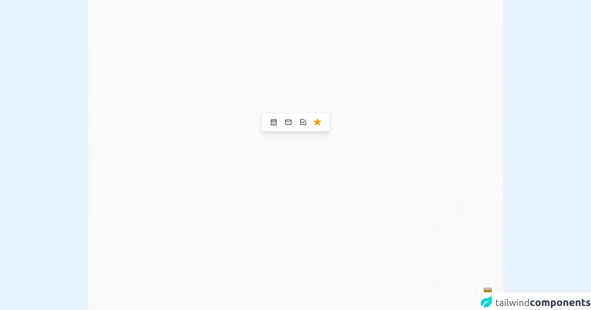
The preview of Favourites Bar ui component
To create a Favourites Bar ui component, we'll use Tailwind CSS classes to style the HTML elements. Here's a preview of what the Favourites Bar ui component will look like:
Free download of the Favourites Bar's source code
The source code of Favourites Bar ui component
Here's the HTML and CSS code to create the Favourites Bar ui component:
<div class="min-w-screen min-h-screen bg-gray-50 flex items-center justify-center px-5 pt-5 pb-56">
    <div class="bg-white rounded shadow-lg border border-gray-200 py-2 px-5" x-data="{favourites:favourites()}">
        <!-- Loop Favourites -->
        <template x-for="(item, index) in favourites.saved()" :key="index">
            <span class="inline-block align-top text-center mr-2">
                <a :href="item.href" class="text-gray-700 hover:text-indigo-500 focus:text-indigo-500 leading-10 text-2xl inline-block w-8 h-10 focus:outline-none" :title="item.title">
                    <i class="mdi" :class="'mdi-'+item.icon"></i>
                </a>
            </span>
        </template>
        <!-- Search Favourites -->
        <span class="inline-block align-top relative" @click.away="favourites.showSearch=false">
            <!-- Favourites Button -->
            <button class="text-yellow-500 hover:text-yellow-400 leading-10 text-3xl focus:outline-none text-left w-8 h-10" @click.prevent="favourites.showSearch=!favourites.showSearch;$nextTick(()=>setTimeout(function(){if(favourites.showSearch)$refs.searchField.focus()},200))">
                <i class="mdi mdi-star"></i>
            </button>
            <!-- Favourites Dropdown -->
            <div class="bg-white text-gray-700 shadow-md rounded border border-gray-200 text-sm absolute mt-12 -ml-2 md:-mr-3 top-0 left-0 min-w-full w-56 z-30" x-show="favourites.showSearch" style="display: none;" x-transition:enter="transition ease duration-300 transform" x-transition:enter-start="opacity-0 translate-y-2" x-transition:enter-end="opacity-100 translate-y-0" x-transition:leave="transition ease duration-300 transform" x-transition:leave-start="opacity-100 translate-y-0" x-transition:leave-end="opacity-0 translate-y-4">
                <span class="absolute top-0 left-0 w-3 h-3 bg-white border border-gray-200 transform rotate-45 -mt-1 ml-4"></span>
                <div class="bg-white overflow-auto rounded w-full relative z-10">
                    <!-- Search Input Field -->
                    <div class="p-1">
                        <input type="text" class="form-input block w-full px-3 h-10 leading-10 border-2 border-indigo-500 focus:border-primary-500 rounded outline-none" placeholder="Start typing..." x-ref="searchField" x-model="favourites.search">
                    </div>
                    <!-- Filtered Options -->
                    <ul x-show="favourites.filteredOptions().length">
                        <!-- Loop Filtered Options -->
                        <template x-for="(option,index) in favourites.filteredOptions()">
                            <li>
                                <a href="javascript:void(0);" class="flex hover:bg-gray-200 w-full h-10 leading-none items-center focus:outline-none focus:bg-gray-200">
                                    <span class="block w-10 text-center text-xl">
                                        <i class="mdi" :class="'mdi-'+option.icon"></i>
                                    </span>
                                    <span class="block flex-1 truncate" x-text="option.title"></span>
                                    <span class="block w-10 text-center text-2xl" :class="{'text-yellow-500':option.saved}" @click.prevent="favourites.addToFavorites(option.index)">
                                        <i class="mdi mdi-star-outline"></i>
                                    </span>
                                </a>
                            </li>
                        </template>
                    </ul>
                </div>
            </div>
        </span>
    </div>
</div>

<!-- BUY ME A BEER AND HELP SUPPORT OPEN-SOURCE RESOURCES -->
<div class="flex items-end justify-end fixed bottom-0 right-0 mb-4 mr-4 z-10">
    <div>
        <a title="Buy me a beer" href="https://www.buymeacoffee.com/scottwindon" target="_blank" class="block w-16 h-16 rounded-full transition-all shadow hover:shadow-lg transform hover:scale-110 hover:rotate-12">
            <img class="object-cover object-center w-full h-full rounded-full" src="https://i.pinimg.com/originals/60/fd/e8/60fde811b6be57094e0abc69d9c2622a.jpg"/>
        </a>
    </div>
</div>

<style>@import url('https://cdnjs.cloudflare.com/ajax/libs/MaterialDesign-Webfont/5.3.45/css/materialdesignicons.min.css');</style>
<script src="https://cdn.jsdelivr.net/npm/[email protected]/dist/alpine.min.js"></script>
<script>
let favourites = function() {
    return {
        search: "",
        showSearch: false,
        options: [
          {
              title: 'Calender',
              icon: 'calendar-month-outline',
              href: 'javascript:void(0);',
              saved: true
          },
          {
              title: 'Chart',
              icon: 'cart-outline',
              href: 'javascript:void(0);'
          },
          {
              title: 'Chat',
              icon: 'comment-multiple-outline',
              href: 'javascript:void(0);'
          },
          {
              title: 'Inbox',
              icon: 'email-outline',
              href: 'javascript:void(0);',
              saved: true
          },
          {
              title: 'Photos',
              icon: 'camera-outline',
              href: 'javascript:void(0);'
          },
          {
              title: 'Todo',
              icon: 'checkbox-marked-outline',
              href: 'javascript:void(0);',
              saved: true
          },
        ],
        saved: function() {
            return this.options.filter((option, index) => {
                option.index = index;
                return option.saved ? true : false;
            });
        },
        filteredOptions() {
            return !this.search.length ? [] : this.options.filter((option, index) => {
                option.index = index;
                return option.title.toLowerCase().includes(this.search.toLowerCase());
            });
        },
        addToFavorites(index) {
            this.options[index].saved = !this.options[index].saved;
        }
    }
}
</script>
How to create a Favourites Bar with Tailwind CSS?
Now, let's dive into the steps to create a Favourites Bar ui component with Tailwind CSS.
Step 1: Set up the HTML structure
The first step is to set up the HTML structure for the Favourites Bar ui component. We'll use an unordered list to create the links. Here's the HTML code:
<div class="bg-gray-800">
  <ul class="flex justify-center space-x-4">
    <li>
      <a href="#" class="text-white font-medium hover:text-gray-300">Link 1</a>
    </li>
    <li>
      <a href="#" class="text-white font-medium hover:text-gray-300">Link 2</a>
    </li>
    <li>
      <a href="#" class="text-white font-medium hover:text-gray-300">Link 3</a>
    </li>
    <li>
      <a href="#" class="text-white font-medium hover:text-gray-300">Link 4</a>
    </li>
  </ul>
</div>
In this code, we've created a div element with a background color of gray. Inside the div, we've created an unordered list with four list items, each containing an anchor tag with a white font color and a medium font weight. We've also added a hover effect that changes the font color to gray.
Step 2: Style the Favourites Bar
Now that we have the HTML structure in place, we can start styling the Favourites Bar ui component using Tailwind CSS classes. Here's the CSS code:
/* Set the font family and font size */
body {
  font-family: 'Open Sans', sans-serif;
  font-size: 16px;
}

/* Set the background color of the body */
.bg-gray-800 {
  background-color: #1f2937;
}

/* Style the unordered list */
ul {
  list-style: none;
}

/* Style the list items */
li {
  margin: 0;
}

/* Style the anchor tags */
a {
  text-decoration: none;
}

/* Set the padding and margin for the links */
a {
  padding: 10px 20px;
  margin: 10px;
}

/* Set the border radius and border color for the links */
a {
  border-radius: 4px;
  border: 1px solid #4b5563;
}

/* Set the hover effect for the links */
a:hover {
  color: #d1d5db;
  border-color: #d1d5db;
}
In this code, we've set the font family and font size for the body element. We've also added a background color to the bg-gray-800 class. We've styled the unordered list, list items, and anchor tags to remove any default styling. We've also set the padding, margin, border radius, and border color for the links. Finally, we've added a hover effect to change the font color and border color when the user hovers over the link.
Step 3: Customize the Favourites Bar
Tailwind CSS allows you to customize the design of the Favourites Bar ui component using your own color palette and typography. Here's an example of how you can customize the Favourites Bar:
/* Set the font family and font size */
body {
  font-family: 'Open Sans', sans-serif;
  font-size: 16px;
}

/* Set the background color of the body */
.bg-gray-800 {
  background-color: #1f2937;
}

/* Style the unordered list */
ul {
  list-style: none;
}

/* Style the list items */
li {
  margin: 0;
}

/* Style the anchor tags */
a {
  text-decoration: none;
}

/* Set the padding and margin for the links */
a {
  padding: 10px 20px;
  margin: 10px;
}

/* Set the border radius and border color for the links */
a {
  border-radius: 4px;
  border: 1px solid #4b5563;
}

/* Set the hover effect for the links */
a:hover {
  color: #d1d5db;
  border-color: #d1d5db;
}

/* Customize the Favourites Bar */
a {
  background-color: #4c51bf;
  color: #fff;
}

a:hover {
  background-color: #1d4ed8;
}
In this code, we've customized the background color and font color for the links. We've also changed the hover effect to use a darker shade of blue.
Conclusion
In this article, we've explored how to create a Favourites Bar ui component with Tailwind CSS. We've discussed the benefits of using Tailwind CSS, provided a preview of the Favourites Bar ui component, and shared the HTML and CSS code to create the component. We've also provided steps to customize the Favourites Bar ui component using your own color palette and typography. With these tips, you can create a beautiful and functional Favourites Bar for your website.