- Published on
Create A FAQ With Tailwind CSS Like A Pro With The Help Of These 6 Tips
- What is Tailwind CSS?
- The description of FAQ ui component
- Why use Tailwind CSS to create a FAQ ui component?
- The preview of FAQ ui component
- The source code of FAQ ui component
- How to create a FAQ with Tailwind CSS?
- 1. Define the HTML structure
- 2. Use the hidden class to hide the answers
- 3. Use the bg-gray-100 class to style the question background
- 4. Use the text-gray-800 class to style the question text
- 5. Use the border-b class to add a border to the question
- 6. Use the transition class to animate the answer
- Conclusion
What is Tailwind CSS?
Tailwind CSS is a utility-first CSS framework that allows developers to rapidly build custom user interfaces. It provides a set of pre-defined CSS classes that can be used to style HTML elements. With Tailwind CSS, developers can easily create complex layouts and responsive designs without writing custom CSS.
The description of FAQ ui component
A frequently asked questions (FAQ) section is a common component of many websites. It provides users with answers to common questions about a product or service. The FAQ section typically consists of a list of questions and answers that are displayed in an accordion-style format. When a user clicks on a question, the answer expands below it.
Why use Tailwind CSS to create a FAQ ui component?
Tailwind CSS is an excellent choice for creating a FAQ section because it provides a set of pre-defined utility classes that can be used to style the component. This makes it easy to create an accordion-style FAQ section that is both responsive and visually appealing.
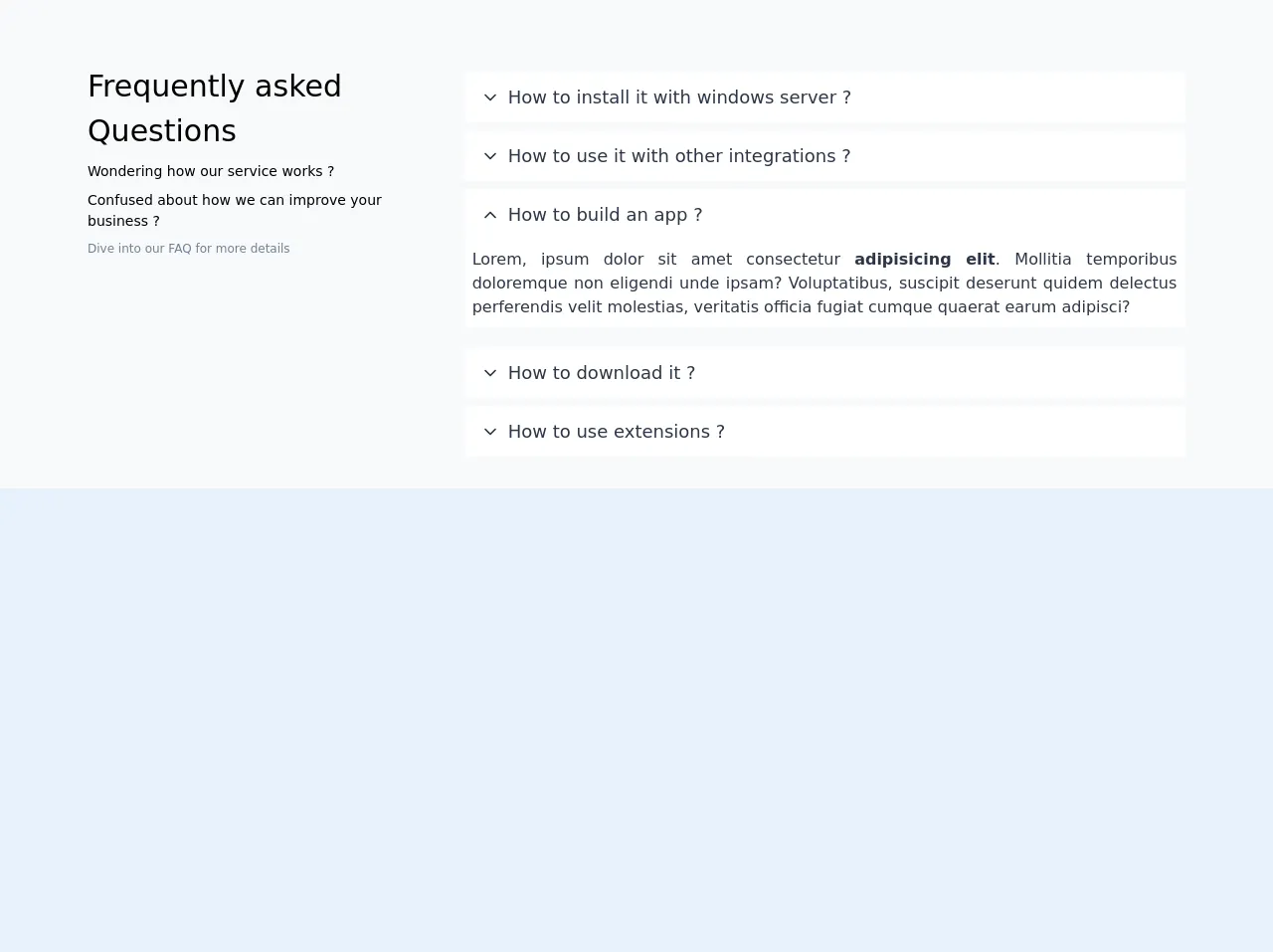
The preview of FAQ ui component
To create a FAQ section with Tailwind CSS, we will use a combination of HTML and CSS. The HTML will define the structure of the FAQ section, while the CSS will be used to style it.
Free download of the FAQ's source code
The source code of FAQ ui component
To create a FAQ section with Tailwind CSS, we will need to write some HTML and CSS code. The HTML will define the structure of the FAQ section, while the CSS will be used to style it.
<div class="bg-gray-100 pt-10">
    <div class="mx-auto max-w-6xl">
        <div class="p-2 bg-gray-100 rounded">
            <div class="flex flex-col md:flex-row">
                <div class="md:w-1/3 p-4 text-sm">
                    <div class="text-3xl">Frequently asked <span class="font-medium">Questions</span></div>
                    <div class="my-2">Wondering how our service works ?</div>
                    <div class="mb-2">Confused about how we can improve your business ?</div>
                    <div class="text-xs text-gray-600">Dive into our FAQ for more details</div>
                </div>
                <div class="md:w-2/3">
                    <div class="p-4">
                        <div class="mb-2">
                            <div class="font-medium rounded-sm text-lg px-2 py-3 flex text-gray-800 flex-row-reverse mt-2 cursor-pointer text-black bg-white hover:bg-white">
                                <div class="flex-auto">How to install it with windows server ?</div>
                                <div class="px-2 mt-1">
                                    <div style="">
                                        <svg xmlns="http://www.w3.org/2000/svg" width="100%" height="100%" fill="none" viewBox="0 0 24 24" stroke="currentColor" stroke-width="2" stroke-linecap="round" stroke-linejoin="round" class="feather feather-chevron-down w-5 h-5">
                                            <polyline points="6 9 12 15 18 9"></polyline>
                                        </svg>
                                    </div>
                                </div>
                            </div>
                        </div>
                        <div class="mb-2">
                            <div class="font-medium rounded-sm text-lg px-2 py-3 flex text-gray-800 flex-row-reverse mt-2 cursor-pointer text-black bg-white hover:bg-white">
                                <div class="flex-auto">How to use it with other integrations ?</div>
                                <div class="px-2 mt-1">
                                    <div style="">
                                        <svg xmlns="http://www.w3.org/2000/svg" width="100%" height="100%" fill="none" viewBox="0 0 24 24" stroke="currentColor" stroke-width="2" stroke-linecap="round" stroke-linejoin="round" class="feather feather-chevron-down w-5 h-5">
                                            <polyline points="6 9 12 15 18 9"></polyline>
                                        </svg>
                                    </div>
                                </div>
                            </div>
                        </div>
                        <div class="mb-2">
                            <div class="font-medium rounded-sm text-lg px-2 py-3 flex text-gray-800 flex-row-reverse mt-2 cursor-pointer text-black bg-white hover:bg-white">
                                <div class="flex-auto">How to build an app ?</div>
                                <div class="px-2 mt-1">
                                    <div style="">
                                        <svg xmlns="http://www.w3.org/2000/svg" width="100%" height="100%" fill="none" viewBox="0 0 24 24" stroke="currentColor" stroke-width="2" stroke-linecap="round" stroke-linejoin="round" class="feather feather-chevron-up w-5 h-5">
                                            <polyline points="18 15 12 9 6 15"></polyline>
                                        </svg>
                                    </div>
                                </div>
                            </div>
                            <div class="p-2 text-justify text-left text-gray-800 mb-5 bg-white" style="">Lorem, ipsum dolor sit amet consectetur <span class="font-bold">adipisicing elit</span>. Mollitia temporibus doloremque non eligendi unde ipsam? Voluptatibus, suscipit deserunt quidem delectus perferendis velit molestias, veritatis officia fugiat cumque quaerat earum adipisci?</div>
                        </div>
                        <div class="mb-2">
                            <div class="font-medium rounded-sm text-lg px-2 py-3 flex text-gray-800 flex-row-reverse mt-2 cursor-pointer text-black bg-white hover:bg-white">
                                <div class="flex-auto">How to download it ?</div>
                                <div class="px-2 mt-1">
                                    <div style="">
                                        <svg xmlns="http://www.w3.org/2000/svg" width="100%" height="100%" fill="none" viewBox="0 0 24 24" stroke="currentColor" stroke-width="2" stroke-linecap="round" stroke-linejoin="round" class="feather feather-chevron-down w-5 h-5">
                                            <polyline points="6 9 12 15 18 9"></polyline>
                                        </svg>
                                    </div>
                                </div>
                            </div>
                        </div>
                        <div class="mb-2">
                            <div class="font-medium rounded-sm text-lg px-2 py-3 flex text-gray-800 flex-row-reverse mt-2 cursor-pointer text-black bg-white hover:bg-white">
                                <div class="flex-auto">How to use extensions ?</div>
                                <div class="px-2 mt-1">
                                    <div style="">
                                        <svg xmlns="http://www.w3.org/2000/svg" width="100%" height="100%" fill="none" viewBox="0 0 24 24" stroke="currentColor" stroke-width="2" stroke-linecap="round" stroke-linejoin="round" class="feather feather-chevron-down w-5 h-5">
                                            <polyline points="6 9 12 15 18 9"></polyline>
                                        </svg>
                                    </div>
                                </div>
                            </div>
                        </div>
                    </div>
                </div>
            </div>
        </div>
    </div>
</div>
How to create a FAQ with Tailwind CSS?
Here are six tips for creating a FAQ section with Tailwind CSS:
1. Define the HTML structure
The first step in creating a FAQ section with Tailwind CSS is to define the HTML structure. The FAQ section typically consists of a list of questions and answers that are displayed in an accordion-style format. Each question should be wrapped in a <div> element, and each answer should be wrapped in a <div> element that is nested inside the question <div>.
2. Use the hidden class to hide the answers
To create an accordion-style FAQ section, we will use the hidden class to hide the answers by default. When a user clicks on a question, we will use JavaScript to toggle the hidden class on the corresponding answer <div>.
3. Use the bg-gray-100 class to style the question background
To style the background of the question <div>, we will use the bg-gray-100 class. This will give the question a light gray background color.
4. Use the text-gray-800 class to style the question text
To style the text of the question, we will use the text-gray-800 class. This will give the question text a dark gray color.
5. Use the border-b class to add a border to the question
To add a border to the bottom of the question <div>, we will use the border-b class. This will give the question a subtle border that separates it from the answer.
6. Use the transition class to animate the answer
To animate the answer when it is expanded, we will use the transition class. This will give the answer a smooth transition when it is expanded or collapsed.
Conclusion
Creating a FAQ section with Tailwind CSS is a straightforward process that can be accomplished with just a few lines of HTML and CSS code. By following the six tips outlined in this article, you can create a responsive and visually appealing FAQ section that will provide users with the information they need.