- Published on
Most Effective Ways To Create A Fancy Buttons With Tailwind CSS
- What is Tailwind CSS?
- The description of Fancy Buttons ui component
- Why use Tailwind CSS to create a Fancy Buttons ui component?
- The preview of Fancy Buttons ui component
- The source code of Fancy Buttons ui component
- How to create a Fancy Buttons with Tailwind CSS?
- Conclusion
What is Tailwind CSS?
Tailwind CSS is a utility-first CSS framework that allows developers to build custom designs quickly. It provides a set of pre-defined CSS classes that can be used to create complex layouts and designs. Tailwind CSS is easy to use and can be customized to fit any project's needs.
The description of Fancy Buttons ui component
Fancy Buttons are an essential UI component for any website or application. They are used to trigger actions, navigate to different pages, or perform other functions. A Fancy Button is a button that has a unique design, such as a gradient background or a shadow effect. It can be customized to fit the design of any website or application.
Why use Tailwind CSS to create a Fancy Buttons ui component?
Tailwind CSS is an excellent choice for creating Fancy Buttons because it provides a set of pre-defined classes that can be used to create complex designs quickly. It allows developers to focus on the design rather than writing custom CSS code. Additionally, Tailwind CSS is easy to customize, so developers can create unique designs that fit their project's needs.
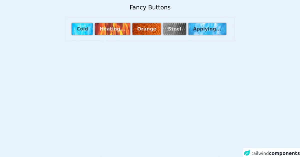
The preview of Fancy Buttons ui component
Creating a Fancy Button with Tailwind CSS is easy. You can use pre-defined classes to add various effects and styles to your button. For example, you can add a gradient background, a shadow effect, or a rounded border. Here is an example of what a Fancy Button created with Tailwind CSS could look like:
Free download of the Fancy Buttons's source code
The source code of Fancy Buttons ui component
To create a Fancy Button with Tailwind CSS, you can use pre-defined classes or create custom classes. Here is an example of how to create a Fancy Button using pre-defined classes:
<style>
@keyframes hue {
  0% {filter:hue-rotate(0deg);}
  100% {filter:hue-rotate(80deg);}
}

@keyframes translate {
  0% {transform:translate(0,0%);}
  100% {transform:translate(0,-75%);}
}

.active img {
  animation:hue 1.3s infinite linear alternate;
}

.loading img{
  animation:translate 1.3s linear infinite alternate;
  opacity:0.8;
  filter:contrast(200%);
  box-shadow:none !important;
}

.button:hover img{
  transform:translate(0px ,-20px);
  /* filter:brightness(120%); */
}
.button{
  box-shadow:0px 0px 3px 1px gray;
}
.button:active{
  transform:scale(0.95);
  box-shadow:none !important;
}
.button img{
  filter:brightness(110%);
  transition:all 0.2s;
}

body{
    background:white;
}
</style>
<h1 class="text-xl mx-auto w-max my-5">Fancy Buttons</h1>


<div class="main w-max border flex p-5 mx-auto">
  <div class="button mr-2 select-none cursor-pointer w-max relative rounded-sm">
        <div class="pic overflow-hidden rounded-sm absolute w-full h-full">
          <img class="h-44 w-60" src="https://i.ibb.co/SJxDmYd/image.jpg">
        </div>
        <div class="text text-gray-600 top-0 font-bold relative p-2 px-4">Cold</div>
  </div>
<!-- button end -->
  <div class="button loading mr-2 select-none cursor-pointer w-max relative rounded-sm">
        <div class="pic overflow-hidden rounded-sm absolute w-full h-full">
          <img class="h-44 w-60" src="https://i.ibb.co/LNmvXC8/image-1.jpg">
        </div>
        <div class="text text-gray-200 top-0 font-bold relative p-2 px-4">Heating...</div>
  </div>
<!-- button end -->
  <div class="button mr-2 select-none cursor-pointer w-max relative rounded-sm">
        <div class="pic overflow-hidden rounded-sm absolute w-full h-full">
          <img class="h-44 w-60" src="https://i.ibb.co/mvcDDhM/image-3.jpg">
        </div>
        <div class="text text-gray-200 top-0 font-bold relative p-2 px-4">Orange</div>
  </div>
<!-- button end -->
  <div class="button mr-2 select-none cursor-pointer w-max relative rounded-sm">
        <div class="pic overflow-hidden rounded-sm absolute w-full h-full">
          <img class="h-44 w-60" src="https://i.ibb.co/0Cx0GRg/image-5.jpg">
        </div>
        <div class="text text-gray-200 top-0 font-bold relative p-2 px-4">Steel</div>
  </div>
<!-- button end -->
  <div class="button loading mr-2 select-none cursor-pointer w-max relative rounded-sm">
        <div class="pic overflow-hidden rounded-sm absolute w-full h-full">
          <img class="h-44 w-60" src="https://i.ibb.co/SJxDmYd/image.jpg">
        </div>
        <div class="text text-gray-700 top-0 font-bold relative p-2 px-4">Applying...</div>
  </div>
<!-- button end -->
<!-- use loading and active class in button root -->


</div>
How to create a Fancy Buttons with Tailwind CSS?
To create a Fancy Button with Tailwind CSS, follow these steps:
- Create a new HTML file and add a button element.
- Add the "bg-gradient-to-r" class to the button element to create a gradient background.
- Add the "shadow-lg" class to the button element to create a shadow effect.
- Add the "rounded-full" class to the button element to create a rounded border.
- Add the "text-white" class to the button element to set the text color to white.
- Add the "px-4 py-2" class to the button element to set the padding.
- Customize the button by adding or removing classes as needed.
Here is an example of the HTML code for a Fancy Button:
<button class="bg-gradient-to-r from-purple-400 to-pink-500 shadow-lg rounded-full text-white px-4 py-2">
    Click Me
</button>
In this example, we used the "from-purple-400" and "to-pink-500" classes to create a gradient background. We also used the "shadow-lg" class to create a shadow effect, the "rounded-full" class to create a rounded border, and the "text-white" class to set the text color to white. Finally, we added the "px-4 py-2" class to set the padding.
Conclusion
Fancy Buttons are an essential UI component for any website or application. They can be used to trigger actions, navigate to different pages, or perform other functions. With Tailwind CSS, creating Fancy Buttons is easy and customizable. By using pre-defined classes or creating custom classes, developers can create unique designs that fit their project's needs.