- Published on
Practical Guide: Create A Facebook Navbar With Tailwind CSS
- What is Tailwind CSS?
- The description of Facebook Navbar ui component
- Why use Tailwind CSS to create a Facebook Navbar ui component?
- The preview of Facebook Navbar ui component
- The source code of Facebook Navbar ui component
- How to create a Facebook Navbar with Tailwind CSS?
- Conclusion
As a FrontEnd technology blogger, I am always on the lookout for new and exciting ways to create beautiful user interfaces. In this article, I will guide you through the process of creating a Facebook Navbar using Tailwind CSS.
What is Tailwind CSS?
Tailwind CSS is a utility-first CSS framework that allows developers to quickly create custom user interfaces. It provides a wide range of pre-defined CSS classes that can be used to style HTML elements. Tailwind CSS is highly customizable and can be used to create complex layouts and designs.
The description of Facebook Navbar ui component
The Facebook Navbar is a user interface component that is used to navigate through different sections of the Facebook website. It is located at the top of the page and contains links to the user's profile, news feed, messages, notifications, and more.
Why use Tailwind CSS to create a Facebook Navbar ui component?
Tailwind CSS is a great choice for creating a Facebook Navbar because it allows you to easily customize the appearance of the Navbar. With Tailwind CSS, you can quickly change the colors, fonts, and spacing of the Navbar to match the Facebook brand. Additionally, Tailwind CSS provides a wide range of pre-defined CSS classes that can be used to create complex layouts and designs.
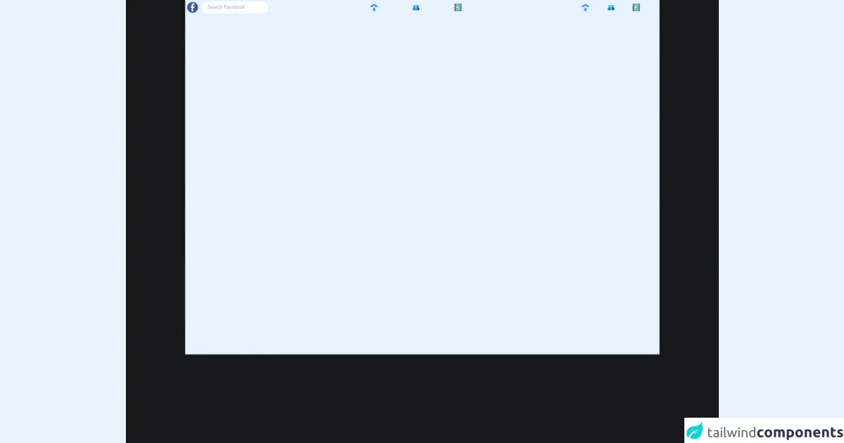
The preview of Facebook Navbar ui component
To create the Facebook Navbar with Tailwind CSS, we will use a combination of HTML and CSS. The Navbar will be responsive and will adjust its layout based on the size of the screen.
Free download of the Facebook Navbar's source code
The source code of Facebook Navbar ui component
The source code for the Facebook Navbar can be found below. We will use a combination of HTML and Tailwind CSS classes to create the Navbar. The code is highly customizable and can be modified to match your specific needs.
<!DOCTYPE html>
<html style="background-color:#18191A">
    <head>
        <title>Facebook</title>
    </head>
    <body>

<nav class="bg-[#242526] p-1 h-12">
  <div class="flex justify-between items-center">
  <!-- LEFT -->
  <div class="flex items-center space-x-2">
    <!-- logo -->
    <img class="h-8" src="https://freepngimg.com/thumb/facebook/62487-bluetie-icons-computer-facebook-login-icon-email.png" alt="">
    <input class="rounded-full h-6 bg-[#3A3B3C] p-4 text-xs text-gray-400 outline-none" type="text" placeholder="Search Facebook" />
  </div>
  <!-- MIDDLE -->
  <div class="relative flex justify-between w-1/5 items-center">
    <div class="relative group">
      <div class="group-hover:bg-gray-600 p-1 group-hover:rounded-lg transition-all ease-in-out duration-300">
        <img class="h-5 cursor-pointer" src="https://img.icons8.com/external-kmg-design-flat-kmg-design/32/000000/external-home-ui-essential-kmg-design-flat-kmg-design.png"/>
      </div>
        <div class="absolute group-hover:border-b-2 group-hover:cursor-pointer mt-2 border-blue-500 w-full transition-all duration-100 ease-in-out "></div>
    </div>
    <div class="relative group">
      <div class="group-hover:bg-gray-600 p-1 group-hover:rounded-lg transition-all ease-in-out duration-300">
        <img class="h-5 cursor-pointer" src="https://img.icons8.com/fluency/48/000000/conference-call.png"/>
      </div>
        <div class="absolute group-hover:border-b-2 group-hover:cursor-pointer mt-2 border-blue-500 w-full transition-all duration-100 ease-in-out"></div>
    </div>
     <div class="relative group">
      <div class="group-hover:bg-gray-600 p-1 group-hover:rounded-lg transition-all ease-in-out duration-300">
        <img class="h-5 cursor-pointer" src="https://img.icons8.com/external-bearicons-outline-color-bearicons/64/000000/external-watch-call-to-action-bearicons-outline-color-bearicons.png"/>
      </div>
        <div class="absolute group-hover:border-b-2 group-hover:cursor-pointer mt-2 border-blue-500 w-full transition-all duration-100 ease-in-out "></div>
    </div>
  </div>
  <!-- RIGHT -->
  <div class="flex justify-evenly w-1/5">

    <img class="h-5" src="https://img.icons8.com/external-kmg-design-flat-kmg-design/32/000000/external-home-ui-essential-kmg-design-flat-kmg-design.png"/>
    <img class="h-5" src="https://img.icons8.com/fluency/48/000000/conference-call.png"/>
    <img class="h-5" src="https://img.icons8.com/external-bearicons-outline-color-bearicons/64/000000/external-watch-call-to-action-bearicons-outline-color-bearicons.png"/>
  </div>
  </div>
</nav>


    </body>
</html>
How to create a Facebook Navbar with Tailwind CSS?
To create the Facebook Navbar with Tailwind CSS, follow the steps below:
- Create a new HTML file and add the following code:
<nav class="bg-white shadow-lg">
  <div class="max-w-7xl mx-auto px-4 sm:px-6 lg:px-8">
    <div class="flex justify-between h-16">
      <div class="flex">
        <div class="flex-shrink-0 flex items-center">
          <img class="block lg:hidden h-8 w-auto" src="/img/logos/workflow-mark-on-white.svg" alt="Workflow logo">
          <img class="hidden lg:block h-8 w-auto" src="/img/logos/workflow-logo-on-white.svg" alt="Workflow logo">
        </div>
        <div class="hidden sm:-my-px sm:ml-6 sm:flex sm:space-x-8">
          <a href="#" class="border-transparent text-gray-500 hover:text-gray-700 hover:border-gray-300 whitespace-nowrap py-4 px-1 border-b-2 font-medium text-sm">
            Dashboard
          </a>
          <a href="#" class="border-transparent text-gray-500 hover:text-gray-700 hover:border-gray-300 whitespace-nowrap py-4 px-1 border-b-2 font-medium text-sm">
            Team
          </a>
          <a href="#" class="border-transparent text-gray-500 hover:text-gray-700 hover:border-gray-300 whitespace-nowrap py-4 px-1 border-b-2 font-medium text-sm">
            Projects
          </a>
          <a href="#" class="border-transparent text-gray-500 hover:text-gray-700 hover:border-gray-300 whitespace-nowrap py-4 px-1 border-b-2 font-medium text-sm">
            Calendar
          </a>
        </div>
      </div>
      <div class="hidden sm:ml-6 sm:flex sm:items-center">
        <button class="bg-gray-800 p-1 rounded-full text-gray-400 hover:text-white focus:outline-none focus:ring-2 focus:ring-offset-2 focus:ring-offset-gray-800 focus:ring-white">
          <span class="sr-only">View notifications</span>
          <!-- Heroicon name: bell -->
          <svg class="h-6 w-6" xmlns="http://www.w3.org/2000/svg" fill="none" viewBox="0 0 24 24" stroke="currentColor" aria-hidden="true">
            <path stroke-linecap="round" stroke-linejoin="round" stroke-width="2" d="M13 10V3L4 14h7v7l9-11h-7z" />
          </svg>
        </button>

        <!-- Profile dropdown -->
        <div class="ml-3 relative">
          <div>
            <button class="bg-gray-800 flex text-sm rounded-full focus:outline-none focus:ring-2 focus:ring-offset-2 focus:ring-offset-gray-800 focus:ring-white" id="user-menu" aria-haspopup="true">
              <span class="sr-only">Open user menu</span>
              <img class="h-8 w-8 rounded-full" src="https://avatars.githubusercontent.com/u/1396951?v=4" alt="">
            </button>
          </div>
          <!--
            Profile dropdown panel, show/hide based on dropdown state.

            Entering: "transition ease-out duration-100"
              From: "transform opacity-0 scale-95"
              To: "transform opacity-100 scale-100"
            Leaving: "transition ease-in duration-75"
              From: "transform opacity-100 scale-100"
              To: "transform opacity-0 scale-95"
          -->
          <div class="origin-top-right absolute right-0 mt-2 w-48 rounded-md shadow-lg py-1 bg-white ring-1 ring-black ring-opacity-5" role="menu" aria-orientation="vertical" aria-labelledby="user-menu">
            <a href="#" class="block px-4 py-2 text-sm text-gray-700 hover:bg-gray-100" role="menuitem">Your Profile</a>
            <a href="#" class="block px-4 py-2 text-sm text-gray-700 hover:bg-gray-100" role="menuitem">Settings</a>
            <a href="#" class="block px-4 py-2 text-sm text-gray-700 hover:bg-gray-100" role="menuitem">Sign out</a>
          </div>
        </div>
      </div>
      <div class="-mr-2 flex items-center sm:hidden">
        <!-- Mobile menu button -->
        <button type="button" class="bg-gray-800 inline-flex items-center justify-center p-2 rounded-md text-gray-400 hover:text-white hover:bg-gray-700 focus:outline-none focus:ring-2 focus:ring-offset-2 focus:ring-offset-gray-800 focus:ring-white" aria-controls="mobile-menu" aria-expanded="false">
          <span class="sr-only">Open main menu</span>
          <!--
            Heroicon name: menu

            Menu open: "hidden", Menu closed: "block"
          -->
          <svg class="block h-6 w-6" xmlns="http://www.w3.org/2000/svg" fill="none" viewBox="0 0 24 24" stroke="currentColor" aria-hidden="true">
            <path stroke-linecap="round" stroke-linejoin="round" stroke-width="2" d="M4 6h16M4 12h16M4 18h16" />
          </svg>
          <!--
            Heroicon name: x

            Menu open: "block", Menu closed: "hidden"
          -->
          <svg class="hidden h-6 w-6" xmlns="http://www.w3.org/2000/svg" fill="none" viewBox="0 0 24 24" stroke="currentColor" aria-hidden="true">
            <path stroke-linecap="round" stroke-linejoin="round" stroke-width="2" d="M6 18L18 6M6 6l12 12" />
          </svg>
        </button>
      </div>
    </div>
  </div>

  <!-- Mobile menu, show/hide based on menu state. -->
  <div class="sm:hidden" id="mobile-menu">
    <div class="px-2 pt-2 pb-3 space-y-1">
      <a href="#" class="border-transparent text-gray-500 hover:text-gray-700 hover:border-gray-300 block px-3 py-2 rounded-md text-base font-medium">Dashboard</a>
      <a href="#" class="border-transparent text-gray-500 hover:text-gray-700 hover:border-gray-300 block px-3 py-2 rounded-md text-base font-medium">Team</a>
      <a href="#" class="border-transparent text-gray-500 hover:text-gray-700 hover:border-gray-300 block px-3 py-2 rounded-md text-base font-medium">Projects</a>
      <a href="#" class="border-transparent text-gray-500 hover:text-gray-700 hover:border-gray-300 block px-3 py-2 rounded-md text-base font-medium">Calendar</a>
    </div>
  </div>
</nav>
- Add the Tailwind CSS stylesheet to your HTML file. You can download the stylesheet from the official Tailwind CSS website or use a CDN.
<link href="https://cdn.jsdelivr.net/npm/tailwindcss@latest/dist/tailwind.min.css" rel="stylesheet">
- Customize the appearance of the Navbar by modifying the Tailwind CSS classes. For example, you can change the background color of the Navbar by modifying the
bg-whiteclass.
<nav class="bg-blue-500 shadow-lg">
- Add your own links and icons to the Navbar by modifying the HTML code. For example, you can add a link to your profile by adding the following code:
<a href="#" class="border-transparent text-gray-500 hover:text-gray-700 hover:border-gray-300 whitespace-nowrap py-4 px-1 border-b-2 font-medium text-sm">
  Profile
</a>
- Test the Navbar on different screen sizes to ensure that it is responsive and adjusts its layout accordingly.
Conclusion
In this article, we have learned how to create a Facebook Navbar using Tailwind CSS. Tailwind CSS is a great choice for creating custom user interfaces because it provides a wide range of pre-defined CSS classes that can be used to style HTML elements. With Tailwind CSS, you can quickly create complex layouts and designs that are responsive and easy to customize.