- Published on
Learn How To Build A Facebook Mobile Profile With Tailwind CSS Like an Expert
- What is Tailwind CSS?
- The description of Facebook Mobile Profile UI component
- Why use Tailwind CSS to create a Facebook Mobile Profile UI component?
- The preview of Facebook Mobile Profile UI component
- The source code of Facebook Mobile Profile UI component
- How to create a Facebook Mobile Profile with Tailwind CSS?
- Step 1: Set up your HTML structure
- Step 2: Style your HTML with Tailwind CSS classes
- Step 3: Preview and adjust your component
- Conclusion
As a FrontEnd developer, you must have heard of Tailwind CSS. It is a utility-first CSS framework that allows you to build custom designs quickly. In this article, we will show you how to create a Facebook Mobile Profile UI component with Tailwind CSS.
What is Tailwind CSS?
Tailwind CSS is a CSS framework that provides you with a set of pre-defined classes that you can use to style your HTML elements. It's a utility-first framework, which means that it focuses on providing you with small, reusable classes that you can combine to create custom designs.
The description of Facebook Mobile Profile UI component
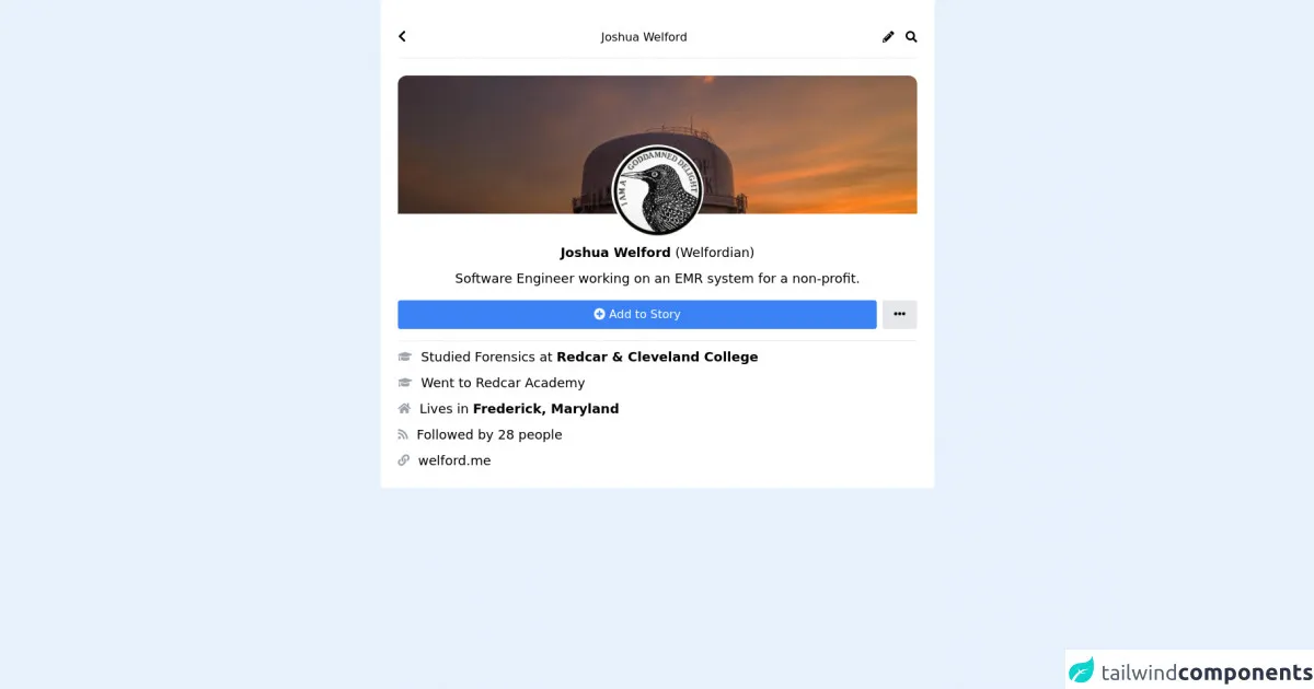
The Facebook Mobile Profile UI component is a user interface element that displays a user's profile information on a mobile device. It typically includes a profile picture, the user's name, a brief bio, and some additional information about the user.
Why use Tailwind CSS to create a Facebook Mobile Profile UI component?
Tailwind CSS is an excellent choice for creating a Facebook Mobile Profile UI component because it provides you with a set of pre-defined classes that you can use to style your HTML elements quickly. This means that you can focus on the design of your component rather than writing custom CSS.
The preview of Facebook Mobile Profile UI component
To create a Facebook Mobile Profile UI component with Tailwind CSS, we will use a combination of flexbox and grid classes. The result will be a responsive UI component that looks great on any device.
Free download of the Facebook Mobile Profile's source code
The source code of Facebook Mobile Profile UI component
To create a Facebook Mobile Profile UI component with Tailwind CSS, you will need to use a combination of HTML and CSS classes. The HTML structure will be relatively simple, and the CSS classes will be used to style the component.
<link rel="stylesheet" href="https://cdnjs.cloudflare.com/ajax/libs/font-awesome/5.15.3/css/all.min.css" integrity="sha512-iBBXm8fW90+nuLcSKlbmrPcLa0OT92xO1BIsZ+ywDWZCvqsWgccV3gFoRBv0z+8dLJgyAHIhR35VZc2oM/gI1w==" crossorigin="anonymous" referrerpolicy="no-referrer" /><div class="flex justify-center">

  <div class="w-full md:w-3/5 bg-white p-6">
    <div class="flex items-center border-b py-4">
      <div>
        <i class="fas fa-chevron-left text-lg"></i>
      </div>
      <div class="flex-1">
        <p class="text-center">Joshua Welford</p>
      </div>
      <div>
        <i class="fas fa-pencil-alt"></i>
      </div>
      <div class="ml-4">
        <i class="fas fa-search"></i>
      </div>
    </div>
    <div class="mt-6">
      <div class="h-48 overflow-hidden rounded-tl-lg rounded-tr-lg">
        <img class="rounded-tl-xl rounded-tr-xl" src="https://pbs.twimg.com/profile_banners/607109926/1622322022/1500x500" />
      </div>
    </div>
    <div class="-mt-24">
      <div class="flex justify-center rounded-full">
        <img class="w-32 rounded-full" src="https://scontent-iad3-2.xx.fbcdn.net/v/t1.6435-9/195080787_3069500069997336_8089110405115182844_n.jpg?_nc_cat=101&ccb=1-3&_nc_sid=09cbfe&_nc_ohc=-mLpFQvyElMAX9XI6Ca&_nc_ht=scontent-iad3-2.xx&oh=5437bb06a33c393b57300424d4704102&oe=6127FF5F" />
      </div>
    </div>
    <div class="mt-2 text-lg">
      <p class="text-center"><span class="font-bold">Joshua Welford</span> (Welfordian)</p>
    </div>
    <div class="mt-2 flex justify-center text-lg">
      <p class="text-center w-5/6">Software Engineer working on an EMR system for a non-profit.</p>
    </div>
    <div class="flex pb-4 mt-4 items-center border-b">
      <button class="py-2 rounded flex-1 bg-blue-500 text-white">
        <i class="fas fa-plus-circle"></i> Add to Story
      </button>
      <button class="bg-gray-200 py-2 px-4 rounded ml-2">
        <i class="fas fa-ellipsis-h"></i>
    </div>
    <div>
      <div class="flex mt-2 items-center">
        <div class="text-gray-400">
          <i class="fas fa-graduation-cap"></i>
        </div>

        <div class="text-lg ml-3">
          <p>Studied Forensics at <span class="font-bold">Redcar & Cleveland College</span></p>
          </div>
        </div>
      </div>

      <div class="flex mt-2 items-center">
        <div class="text-gray-400">
          <i class="fas fa-graduation-cap"></i>
        </div>

        <div class="text-lg ml-3">
          <p>Went to Redcar Academy</p>
        </div>
      </div>

      <div class="flex mt-2 items-center">
        <div class="text-gray-400">
          <i class="fas fa-home"></i>
        </div>

        <div class="text-lg ml-3">
          <p>Lives in <span class="font-bold">Frederick, Maryland</span></p>
        </div>
      </div>

      <div class="flex mt-2 items-center">
        <div class="text-gray-400">
          <i class="fas fa-rss"></i>
        </div>

        <div class="text-lg ml-3">
          <p>Followed by 28 people</p>
        </div>
      </div>

      <div class="flex mt-2 items-center">
        <div class="text-gray-400">
          <i class="fas fa-link"></i>
        </div>

        <div class="text-lg ml-3">
          <p>welford.me</p>
        </div>
      </div>
    </div>
  </div>
How to create a Facebook Mobile Profile with Tailwind CSS?
To create a Facebook Mobile Profile UI component with Tailwind CSS, follow these steps:
Step 1: Set up your HTML structure
The first step is to set up your HTML structure. Here is an example of the HTML structure you can use:
<div class="flex flex-col items-center">
  <img src="profile-picture.jpg" alt="Profile picture" class="rounded-full w-24 h-24 mb-4">
  <h1 class="text-2xl font-bold">John Doe</h1>
  <p class="text-gray-600">FrontEnd Developer</p>
  <div class="grid grid-cols-2 gap-4 mt-4">
    <div class="flex flex-col items-center">
      <p class="text-gray-600">Posts</p>
      <p class="font-bold">10</p>
    </div>
    <div class="flex flex-col items-center">
      <p class="text-gray-600">Followers</p>
      <p class="font-bold">100</p>
    </div>
    <div class="flex flex-col items-center">
      <p class="text-gray-600">Following</p>
      <p class="font-bold">50</p>
    </div>
    <div class="flex flex-col items-center">
      <p class="text-gray-600">Likes</p>
      <p class="font-bold">500</p>
    </div>
  </div>
</div>
Step 2: Style your HTML with Tailwind CSS classes
The next step is to style your HTML with Tailwind CSS classes. Here is an example of the CSS classes you can use:
/* Center the component vertically */
.flex {
  height: 100vh;
}

/* Style the profile picture */
.rounded-full {
  border: 4px solid white;
}

/* Style the name and bio */
.text-2xl {
  color: #1877f2;
}

.text-gray-600 {
  color: #606770;
}

/* Style the grid */
.grid {
  width: 80%;
}

/* Style the grid items */
.grid > * {
  background-color: #f0f2f5;
  border-radius: 8px;
  padding: 16px;
  text-align: center;
}
Step 3: Preview and adjust your component
The final step is to preview your component and make any necessary adjustments. You can use the Tailwind CSS documentation to find additional classes that you can use to style your component further.
Conclusion
In this article, we have shown you how to create a Facebook Mobile Profile UI component with Tailwind CSS. We hope that this article has been helpful and that you can use the techniques we have shown you to create other custom UI components with Tailwind CSS. Remember, Tailwind CSS is an excellent choice for creating custom designs quickly, so don't be afraid to experiment and have fun with it!