- Published on
6 Critical Skills To Make A Facebook Comments Column With Tailwind CSS Remarkably Well
- What is Tailwind CSS?
- The description of Facebook comments column UI component
- Why use Tailwind CSS to create a Facebook comments column UI component?
- The preview of Facebook comments column UI component
- The source code of Facebook comments column UI component
- How to create a Facebook comments column with Tailwind CSS?
- Step 1: Set up your HTML structure
- Step 2: Style your HTML elements with Tailwind CSS
- Step 3: Add styles for each comment element
- Step 4: Add responsive styles
- Conclusion
As a FrontEnd technology blogger, you might have heard of Tailwind CSS. It is a utility-first CSS framework that helps you build custom designs quickly. In this article, we will discuss how to use Tailwind CSS to create a Facebook comments column UI component.
What is Tailwind CSS?
Tailwind CSS is a utility-first CSS framework that allows you to create custom designs quickly. It provides a set of pre-defined classes that you can use to style your HTML elements. With Tailwind CSS, you can create complex layouts and designs without writing any CSS code.
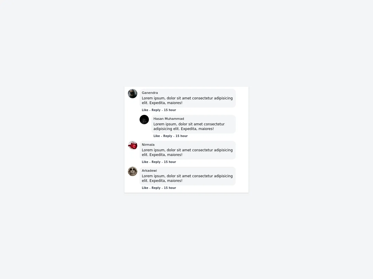
The description of Facebook comments column UI component
The Facebook comments column UI component is a common feature on many websites. It allows users to leave comments and engage with other users. The comments column usually includes the user's profile picture, name, comment, and the time the comment was posted.
Why use Tailwind CSS to create a Facebook comments column UI component?
Tailwind CSS provides a set of pre-defined classes that you can use to style your HTML elements. This makes it easy to create complex layouts and designs without writing any CSS code. With Tailwind CSS, you can create a Facebook comments column UI component quickly and efficiently.
The preview of Facebook comments column UI component
To create a Facebook comments column UI component, we will use Tailwind CSS. The comments column will include the user's profile picture, name, comment, and the time the comment was posted.
Free download of the Facebook comments column's source code
The source code of Facebook comments column UI component
To create a Facebook comments column UI component, we will use HTML and Tailwind CSS. The HTML code will include the user's profile picture, name, comment, and the time the comment was posted.
<script src="https://cdn.jsdelivr.net/gh/alpinejs/[email protected]/dist/alpine.min.js" defer></script>
<div x-data="{ open1: false, open2: false }">
  <div class="h-screen bg-gray-100 flex justify-center items-center">
    <div class="bg-white w-full sm:max-w-7xl md:w-1/3 h-auto shadow px-3 py-2 flex flex-col space-y-2">

      <div class="flex items-center space-x-2">
        <div class="group relative flex flex-shrink-0 self-start cursor-pointer">
          <img
            x-on:mouseover="open1 = true" x-on:mouseleave="open1 = false"
           src="https://images.unsplash.com/photo-1507965613665-5fbb4cbb8399?ixid=MXwxMjA3fDB8MHx0b3BpYy1mZWVkfDQzfHRvd0paRnNrcEdnfHxlbnwwfHx8&ixlib=rb-1.2.1&auto=format&fit=crop&w=500&q=60" alt="" class="h-8 w-8 object-fill rounded-full">
          <div x-cloak x-show.transition.origin.bottom="open1" x-on:mouseover="open1 = true" x-on:mouseleave="open1 = false" class="absolute mt-8 bg-white px-4 py-4 w-72 shadow rounded cursor-default z-10">
            <div class="flex space-x-3">
              <div class="flex flex-shrink-0">
                <img src="https://images.unsplash.com/photo-1507965613665-5fbb4cbb8399?ixid=MXwxMjA3fDB8MHx0b3BpYy1mZWVkfDQzfHRvd0paRnNrcEdnfHxlbnwwfHx8&ixlib=rb-1.2.1&auto=format&fit=crop&w=500&q=60" alt="" class="h-16 w-16 object-fill rounded-full">
              </div>
              <div class="flex flex-col space-y-2">
                <div class="font-semibold">
                  <a href="#" class="hover:underline">
                    Ganendra
                  </a>
                </div>
                <div class="flex justify-start items-center space-x-2">
                  <div>
                    <svg class="w-4 h-6" fill="currentColor" viewBox="0 0 20 20" xmlns="http://www.w3.org/2000/svg"><path d="M9 6a3 3 0 11-6 0 3 3 0 016 0zM17 6a3 3 0 11-6 0 3 3 0 016 0zM12.93 17c.046-.327.07-.66.07-1a6.97 6.97 0 00-1.5-4.33A5 5 0 0119 16v1h-6.07zM6 11a5 5 0 015 5v1H1v-1a5 5 0 015-5z"></path></svg>
                  </div>
                  <div class="w-auto text-sm leading-none">
                    <small>
                      1 mutual friends including: <a href="#" class="font-semibold hover:underline">Mulyadi</a>
                    </small>
                  </div>
                </div>
                <div class="flex justify-start items-center space-x-2">
                  <div>
                    <svg class="w-4 h-6" fill="currentColor" viewBox="0 0 20 20" xmlns="http://www.w3.org/2000/svg"><path fill-rule="evenodd" d="M5.05 4.05a7 7 0 119.9 9.9L10 18.9l-4.95-4.95a7 7 0 010-9.9zM10 11a2 2 0 100-4 2 2 0 000 4z" clip-rule="evenodd"></path></svg>
                  </div>
                  <div class="w-auto text-sm leading-none">
                    <small>
                      From <a href="#" class="font-semibold">Bandung</a>
                    </small>
                  </div>
                </div>
              </div>
            </div>
            <div class="flex space-x-1 mt-2">
              <div class="w-1/2">
                <a href="#" class="text-xs text-blue-600 hover:bg-opacity-60 font-semibold flex items-center justify-center px-3 py-2 bg-blue-300 bg-opacity-50 rounded-lg">
                  <div class="mr-1">
                    <svg class="w-4 h-4" fill="currentColor" viewBox="0 0 20 20" xmlns="http://www.w3.org/2000/svg"><path d="M8 9a3 3 0 100-6 3 3 0 000 6zM8 11a6 6 0 016 6H2a6 6 0 016-6zM16 7a1 1 0 10-2 0v1h-1a1 1 0 100 2h1v1a1 1 0 102 0v-1h1a1 1 0 100-2h-1V7z"></path></svg>
                  </div>
                  Add
                </a>
              </div>
              <div class="w-auto">
                <a href="#" class="text-xs text-gray-800 hover:bg-gray-300 font-semibold flex items-center justify-center px-3 py-2 bg-gray-200 rounded-lg">
                  <div class="mr-1">
                    <svg viewBox="0 0 28 28" alt="" class="h-4 w-4" height="20" width="20"><path d="M14 2.042c6.76 0 12 4.952 12 11.64S20.76 25.322 14 25.322a13.091 13.091 0 0 1-3.474-.461.956 .956 0 0 0-.641.047L7.5 25.959a.961.961 0 0 1-1.348-.849l-.065-2.134a.957.957 0 0 0-.322-.684A11.389 11.389 0 0 1 2 13.682C2 6.994 7.24 2.042 14 2.042ZM6.794 17.086a.57.57 0 0 0 .827.758l3.786-2.874a.722.722 0 0 1 .868 0l2.8 2.1a1.8 1.8 0 0 0 2.6-.481l3.525-5.592a.57.57 0 0 0-.827-.758l-3.786 2.874a.722.722 0 0 1-.868 0l-2.8-2.1a1.8 1.8 0 0 0-2.6.481Z"></path></svg>
                  </div>
                </a>
              </div>
              <div class="w-auto">
                <a href="#" class="text-xs text-gray-800 hover:bg-gray-300 font-semibold flex items-center justify-center px-3 py-2 bg-gray-200 rounded-lg">
                  <div class="mr-1">
                    <svg class="w-4 h-4" fill="currentColor" viewBox="0 0 20 20" xmlns="http://www.w3.org/2000/svg"><path d="M7 3a1 1 0 000 2h6a1 1 0 100-2H7zM4 7a1 1 0 011-1h10a1 1 0 110 2H5a1 1 0 01-1-1zM2 11a2 2 0 012-2h12a2 2 0 012 2v4a2 2 0 01-2 2H4a2 2 0 01-2-2v-4z"></path></svg>
                  </div>
                </a>
              </div>

              <div class="w-auto">
                <a href="#" class="text-xs text-gray-800 hover:bg-gray-300 font-semibold flex items-center justify-center px-3 py-2 bg-gray-200 rounded-lg">
                  <div class="mr-1">
                    <svg class="w-4 h-4 fill="currentColor" viewBox="0 0 20 20" xmlns="http://www.w3.org/2000/svg"><path d="M6 10a2 2 0 11-4 0 2 2 0 014 0zM12 10a2 2 0 11-4 0 2 2 0 014 0zM16 12a2 2 0 100-4 2 2 0 000 4z"></path></svg>
                  </div>
                </a>
              </div>
            </div>
          </div>
        </div>

        <div class="flex items-center justify-center space-x-2">
          <div class="block">
              <div class="flex justify-center items-center space-x-2">
                <div class="bg-gray-100 w-auto rounded-xl px-2 pb-2">
                <div class="font-medium">
                    <a href="#" class="hover:underline text-sm">
                    <small>Ganendra</small>
                    </a>
                </div>
                <div class="text-xs">
                    Lorem ipsum, dolor sit amet consectetur adipisicing elit. Expedita, maiores!
                </div>
                </div>
                <div class="self-stretch flex justify-center items-center transform transition-opacity duration-200 opacity-0 hover:opacity-100">
                    <a href="#" class="">
                        <div class="text-xs cursor-pointer flex h-6 w-6 transform transition-colors duration-200 hover:bg-gray-100 rounded-full items-center justify-center">
                        <svg class="w-4 h-6" fill="none" stroke="currentColor" viewBox="0 0 24 24" xmlns="http://www.w3.org/2000/svg"><path stroke-linecap="round" stroke-linejoin="round" stroke-width="2" d="M5 12h.01M12 12h.01M19 12h.01M6 12a1 1 0 11-2 0 1 1 0 012 0zm7 0a1 1 0 11-2 0 1 1 0 012 0zm7 0a1 1 0 11-2 0 1 1 0 012 0z"></path></svg>
                        </div>

                    </a>
                </div>
              </div>
            <div class="flex justify-start items-center text-xs w-full">
              <div class="font-semibold text-gray-700 px-2 flex items-center justify-center space-x-1">
                <a href="#" class="hover:underline">
                  <small>Like</small>
                </a>
               <small class="self-center">.</small>
                <a href="#" class="hover:underline">
                  <small>Reply</small>
                </a>
               <small class="self-center">.</small>
                <a href="#" class="hover:underline">
                  <small>15 hour</small>
                </a>
              </div>
            </div>

            <!-- Subcomment Sample -->
            <div class="flex items-center space-x-2 space-y-2">
              <div class="group relative flex flex-shrink-0 self-start cursor-pointer pt-2">
          <img
            x-on:mouseover="open2 = true" x-on:mouseleave="open2 = false"
           src="https://images.unsplash.com/photo-1610156830615-2eb9732de349?ixid=MXwxMjA3fDB8MHx0b3BpYy1mZWVkfDExfHJuU0tESHd3WVVrfHxlbnwwfHx8&ixlib=rb-1.2.1&auto=format&fit=crop&w=500&q=60" alt="" class="h-8 w-8 object-fill rounded-full">
          <div x-cloak x-show.transition.origin.bottom="open2" x-on:mouseover="open2 = true" x-on:mouseleave="open2 = false" class="absolute mt-8 bg-white px-4 py-4 w-72 shadow rounded cursor-default z-10">
            <div class="flex space-x-3">
              <div class="flex flex-shrink-0">
                <img src="https://images.unsplash.com/photo-1610156830615-2eb9732de349?ixid=MXwxMjA3fDB8MHx0b3BpYy1mZWVkfDExfHJuU0tESHd3WVVrfHxlbnwwfHx8&ixlib=rb-1.2.1&auto=format&fit=crop&w=500&q=60" alt="" class="h-16 w-16 object-fill rounded-full">
              </div>
              <div class="flex flex-col space-y-2">
                <div class="font-semibold">
                  <a href="#" class="hover:underline">
                    Hasan Muhammad
                  </a>
                </div>
                <div class="flex justify-start items-center space-x-2">
                  <div>
                    <svg class="w-4 h-6" fill="currentColor" viewBox="0 0 20 20" xmlns="http://www.w3.org/2000/svg"><path d="M9 6a3 3 0 11-6 0 3 3 0 016 0zM17 6a3 3 0 11-6 0 3 3 0 016 0zM12.93 17c.046-.327.07-.66.07-1a6.97 6.97 0 00-1.5-4.33A5 5 0 0119 16v1h-6.07zM6 11a5 5 0 015 5v1H1v-1a5 5 0 015-5z"></path></svg>
                  </div>
                  <div class="w-auto text-sm leading-none">
                    <small>
                      347 mutual friends including: <a href="#" class="font-semibold hover:underline">Ujang</a> and <a href="#" class="font-semibold hover:underline">Maman</a>
                    </small>
                  </div>
                </div>
                <div class="flex justify-start items-center space-x-2">
                  <div>
                    <svg class="w-4 h-6" fill="currentColor" viewBox="0 0 20 20" xmlns="http://www.w3.org/2000/svg"><path d="M10.394 2.08a1 1 0 00-.788 0l-7 3a1 1 0 000 1.84L5.25 8.051a.999.999 0 01.356-.257l4-1.714a1 1 0 11.788 1.838L7.667 9.088l1.94.831a1 1 0 00.787 0l7-3a1 1 0 000-1.838l-7-3zM3.31 9.397L5 10.12v4.102a8.969 8.969 0 00-1.05-.174 1 1 0 01-.89-.89 11.115 11.115 0 01.25-3.762zM9.3 16.573A9.026 9.026 0 007 14.935v-3.957l1.818.78a3 3 0 002.364 0l5.508-2.361a11.026 11.026 0 01.25 3.762 1 1 0 01-.89.89 8.968 8.968 0 00-5.35 2.524 1 1 0 01-1.4 0zM6 18a1 1 0 001-1v-2.065a8.935 8.935 0 00-2-.712V17a1 1 0 001 1z"></path></svg>
                  </div>
                  <div class="w-auto text-sm leading-none">
                    <small>
                      Went to SMK Assalaam Bandung
                    </small>
                  </div>
                </div>
              </div>
            </div>
            <div class="flex space-x-1 mt-2">
              <div class="w-1/2">
                <a href="#" class="text-xs text-blue-600 hover:bg-opacity-60 font-semibold flex items-center justify-center px-3 py-2 bg-blue-300 bg-opacity-50 rounded-lg">
                  <div class="mr-1">
                    <svg class="w-4 h-4" fill="currentColor" viewBox="0 0 20 20" xmlns="http://www.w3.org/2000/svg"><path d="M8 9a3 3 0 100-6 3 3 0 000 6zM8 11a6 6 0 016 6H2a6 6 0 016-6zM16 7a1 1 0 10-2 0v1h-1a1 1 0 100 2h1v1a1 1 0 102 0v-1h1a1 1 0 100-2h-1V7z"></path></svg>
                  </div>
                  Tambah
                </a>
              </div>
              <div class="w-auto">
                <a href="#" class="text-xs text-gray-800 hover:bg-gray-300 font-semibold flex items-center justify-center px-3 py-2 bg-gray-200 rounded-lg">
                  <div class="mr-1">
                    <svg viewBox="0 0 28 28" alt="" class="h-4 w-4" height="20" width="20"><path d="M14 2.042c6.76 0 12 4.952 12 11.64S20.76 25.322 14 25.322a13.091 13.091 0 0 1-3.474-.461.956 .956 0 0 0-.641.047L7.5 25.959a.961.961 0 0 1-1.348-.849l-.065-2.134a.957.957 0 0 0-.322-.684A11.389 11.389 0 0 1 2 13.682C2 6.994 7.24 2.042 14 2.042ZM6.794 17.086a.57.57 0 0 0 .827.758l3.786-2.874a.722.722 0 0 1 .868 0l2.8 2.1a1.8 1.8 0 0 0 2.6-.481l3.525-5.592a.57.57 0 0 0-.827-.758l-3.786 2.874a.722.722 0 0 1-.868 0l-2.8-2.1a1.8 1.8 0 0 0-2.6.481Z"></path></svg>
                  </div>
                </a>
              </div>
              <div class="w-auto">
                <a href="#" class="text-xs text-gray-800 hover:bg-gray-300 font-semibold flex items-center justify-center px-3 py-2 bg-gray-200 rounded-lg">
                  <div class="mr-1">
                    <svg class="w-4 h-4" fill="currentColor" viewBox="0 0 20 20" xmlns="http://www.w3.org/2000/svg"><path d="M7 3a1 1 0 000 2h6a1 1 0 100-2H7zM4 7a1 1 0 011-1h10a1 1 0 110 2H5a1 1 0 01-1-1zM2 11a2 2 0 012-2h12a2 2 0 012 2v4a2 2 0 01-2 2H4a2 2 0 01-2-2v-4z"></path></svg>
                  </div>
                </a>
              </div>

              <div class="w-auto">
                <a href="#" class="text-xs text-gray-800 hover:bg-gray-300 font-semibold flex items-center justify-center px-3 py-2 bg-gray-200 rounded-lg">
                  <div class="mr-1">
                    <svg class="w-4 h-4 fill="currentColor" viewBox="0 0 20 20" xmlns="http://www.w3.org/2000/svg"><path d="M6 10a2 2 0 11-4 0 2 2 0 014 0zM12 10a2 2 0 11-4 0 2 2 0 014 0zM16 12a2 2 0 100-4 2 2 0 000 4z"></path></svg>
                  </div>
                </a>
              </div>
            </div>
          </div>
        </div>

              <div class="flex items-center justify-center space-x-2">
                <div class="block">
                  <div class="bg-gray-100 w-auto rounded-xl px-2 pb-2">
                    <div class="font-medium">
                      <a href="#" class="hover:underline text-sm">
                        <small>Hasan Muhammad</small>
                      </a>
                    </div>
                    <div class="text-xs">
                      Lorem ipsum, dolor sit amet consectetur adipisicing elit. Expedita, maiores!
                    </div>
                  </div>
                  <div class="flex justify-start items-center text-xs w-full">
                    <div class="font-semibold text-gray-700 px-2 flex items-center justify-center space-x-1">
                      <a href="#" class="hover:underline">
                        <small>Like</small>
                      </a>
                    <small class="self-center">.</small>
                      <a href="#" class="hover:underline">
                        <small>Reply</small>
                      </a>
                    <small class="self-center">.</small>
                      <a href="#" class="hover:underline">
                        <small>15 hour</small>
                      </a>
                    </div>
                  </div>
                </div>

              </div>

              <div class="self-stretch flex justify-center items-center transform transition-opacity duration-200 opacity-0 translate -translate-y-2 hover:opacity-100">
                <a href="#" class="">
                  <div class="text-xs cursor-pointer flex h-6 w-6 transform transition-colors duration-200 hover:bg-gray-100 rounded-full items-center justify-center">
                    <svg class="w-4 h-6" fill="none" stroke="currentColor" viewBox="0 0 24 24" xmlns="http://www.w3.org/2000/svg"><path stroke-linecap="round" stroke-linejoin="round" stroke-width="2" d="M5 12h.01M12 12h.01M19 12h.01M6 12a1 1 0 11-2 0 1 1 0 012 0zm7 0a1 1 0 11-2 0 1 1 0 012 0zm7 0a1 1 0 11-2 0 1 1 0 012 0z"></path></svg>
                  </div>

                </a>
              </div>

            </div>

            <!-- New Subcomment Paste Here !! -->

          </div>
        </div>

      </div>

      <div class="flex items-center space-x-2">
        <div class="flex flex-shrink-0 self-start cursor-pointer">
          <img src="https://images.unsplash.com/photo-1551122089-4e3e72477432?ixid=MXwxMjA3fDB8MHxzZWFyY2h8M3x8cnVieXxlbnwwfHwwfA%3D%3D&ixlib=rb-1.2.1&auto=format&fit=crop&w=500&q=60" alt="" class="h-8 w-8 object-fill rounded-full">
        </div>

        <div class="flex items-center justify-center space-x-2">
          <div class="block">
            <div class="bg-gray-100 w-auto rounded-xl px-2 pb-2">
              <div class="font-medium">
                <a href="#" class="hover:underline text-sm">
                  <small>Nirmala</small>
                </a>
              </div>
              <div class="text-xs">
                Lorem ipsum, dolor sit amet consectetur adipisicing elit. Expedita, maiores!
              </div>
            </div>
            <div class="flex justify-start items-center text-xs w-full">
              <div class="font-semibold text-gray-700 px-2 flex items-center justify-center space-x-1">
                <a href="#" class="hover:underline">
                  <small>Like</small>
                </a>
               <small class="self-center">.</small>
                <a href="#" class="hover:underline">
                  <small>Reply</small>
                </a>
               <small class="self-center">.</small>
                <a href="#" class="hover:underline">
                  <small>15 hour</small>
                </a>
              </div>
            </div>

          </div>
        </div>

        <div class="self-stretch flex justify-center items-center transform transition-opacity duration-200 opacity-0 translate -translate-y-2 hover:opacity-100">
          <a href="#" class="">
            <div class="text-xs cursor-pointer flex h-6 w-6 transform transition-colors duration-200 hover:bg-gray-100 rounded-full items-center justify-center">
              <svg class="w-4 h-6" fill="none" stroke="currentColor" viewBox="0 0 24 24" xmlns="http://www.w3.org/2000/svg"><path stroke-linecap="round" stroke-linejoin="round" stroke-width="2" d="M5 12h.01M12 12h.01M19 12h.01M6 12a1 1 0 11-2 0 1 1 0 012 0zm7 0a1 1 0 11-2 0 1 1 0 012 0zm7 0a1 1 0 11-2 0 1 1 0 012 0z"></path></svg>
            </div>

          </a>
        </div>

      </div>

      <div class="flex items-center space-x-2">
        <div class="flex flex-shrink-0 self-start cursor-pointer">
          <img src="https://images.unsplash.com/photo-1609349744982-0de6526d978b?ixid=MXwxMjA3fDB8MHx0b3BpYy1mZWVkfDU5fHRvd0paRnNrcEdnfHxlbnwwfHx8&ixlib=rb-1.2.1&auto=format&fit=crop&w=500&q=60" alt="" class="h-8 w-8 object-cover rounded-full">
        </div>

        <div class="flex items-center justify-center space-x-2">
          <div class="block">
            <div class="bg-gray-100 w-auto rounded-xl px-2 pb-2">
              <div class="font-medium">
                <a href="#" class="hover:underline text-sm">
                  <small>Arkadewi</small>
                </a>
              </div>
              <div class="text-xs">
                Lorem ipsum, dolor sit amet consectetur adipisicing elit. Expedita, maiores!
              </div>
            </div>
            <div class="flex justify-start items-center text-xs w-full">
              <div class="font-semibold text-gray-700 px-2 flex items-center justify-center space-x-1">
                <a href="#" class="hover:underline">
                  <small>Like</small>
                </a>
               <small class="self-center">.</small>
                <a href="#" class="hover:underline">
                  <small>Reply</small>
                </a>
               <small class="self-center">.</small>
                <a href="#" class="hover:underline">
                  <small>15 hour</small>
                </a>
              </div>
            </div>

          </div>
        </div>

        <div class="self-stretch flex justify-center items-center transform transition-opacity duration-200 opacity-0 translate -translate-y-2 hover:opacity-100">
          <a href="#" class="">
            <div class="text-xs cursor-pointer flex h-6 w-6 transform transition-colors duration-200 hover:bg-gray-100 rounded-full items-center justify-center">
              <svg class="w-4 h-6" fill="none" stroke="currentColor" viewBox="0 0 24 24" xmlns="http://www.w3.org/2000/svg"><path stroke-linecap="round" stroke-linejoin="round" stroke-width="2" d="M5 12h.01M12 12h.01M19 12h.01M6 12a1 1 0 11-2 0 1 1 0 012 0zm7 0a1 1 0 11-2 0 1 1 0 012 0zm7 0a1 1 0 11-2 0 1 1 0 012 0z"></path></svg>
            </div>

          </a>
        </div>

      </div>

      <!-- New Comment Paste Here -->

    </div>

  </div>
</div>
How to create a Facebook comments column with Tailwind CSS?
To create a Facebook comments column with Tailwind CSS, you need to follow these steps:
Step 1: Set up your HTML structure
The first step is to set up your HTML structure. You need to create a container for your comments column and add the necessary HTML elements for each comment.
<div class="comments-container">
  <div class="comment">
    <img src="user-image.jpg" alt="User Image" class="comment-image">
    <div class="comment-details">
      <h3 class="comment-name">John Doe</h3>
      <p class="comment-text">Lorem ipsum dolor sit amet, consectetur adipiscing elit.</p>
      <span class="comment-time">2 hours ago</span>
    </div>
  </div>
</div>
Step 2: Style your HTML elements with Tailwind CSS
The next step is to style your HTML elements with Tailwind CSS. You can use the pre-defined classes to style your elements. For example, to style the comment container, you can use the bg-gray-100, p-4, and rounded-lg classes.
<div class="comments-container bg-gray-100 p-4 rounded-lg">
Step 3: Add styles for each comment element
The next step is to add styles for each comment element. You can use the pre-defined classes to style each element. For example, to style the comment image, you can use the w-10, h-10, rounded-full, and mr-4 classes.
<img src="user-image.jpg" alt="User Image" class="comment-image w-10 h-10 rounded-full mr-4">
Step 4: Add responsive styles
The final step is to add responsive styles. Tailwind CSS provides a set of pre-defined classes for responsive designs. For example, to make the comments column responsive, you can use the sm:max-w-md, md:max-w-lg, and lg:max-w-xl classes.
<div class="comments-container bg-gray-100 p-4 rounded-lg sm:max-w-md md:max-w-lg lg:max-w-xl">
Conclusion
In this article, we discussed how to use Tailwind CSS to create a Facebook comments column UI component. We covered the benefits of using Tailwind CSS, the HTML structure, and the necessary classes to style the UI component. By following these steps, you can create a Facebook comments column UI component quickly and efficiently.