- Published on
6 Easy Ways To Build A Example Profile With Tailwind CSS Without Even Thinking About It
- What is Tailwind CSS?
- The description of Example Profile UI component
- Why use Tailwind CSS to create an Example Profile UI component?
- The preview of Example Profile UI component
- The source code of Example Profile UI component
- How to create an Example Profile with Tailwind CSS?
- Step 1: Set up the HTML structure
- Step 2: Add Tailwind CSS classes
- Step 3: Preview the Example Profile UI component
- Conclusion
As a FrontEnd technology blogger, it's essential to stay up-to-date with the latest trends and tools in the industry. One such tool that has gained immense popularity in recent years is Tailwind CSS. It's a utility-first CSS framework that helps developers create beautiful, responsive, and functional user interfaces quickly. In this article, we'll explore how to use Tailwind CSS to build an example profile UI component effortlessly.
What is Tailwind CSS?
Tailwind CSS is a highly customizable, low-level CSS framework that provides a set of pre-defined CSS classes to style HTML elements. It's a utility-first framework, which means that it focuses on providing small, reusable classes that can be combined to create complex styles. Tailwind CSS is designed to be highly responsive, and it comes with built-in support for responsive design.
The description of Example Profile UI component
An example profile UI component is a common UI element that displays information about a user or an entity. It typically includes a profile picture, a name, a short bio, and some additional information such as social media links or contact information. Example profile UI components are used in various applications such as social media platforms, e-commerce websites, and online directories.
Why use Tailwind CSS to create an Example Profile UI component?
Tailwind CSS provides a set of pre-defined CSS classes that can be used to style HTML elements quickly. It eliminates the need for writing custom CSS styles, which can be time-consuming and error-prone. Tailwind CSS also provides built-in support for responsive design, which makes it easy to create UI components that work well on different screen sizes.
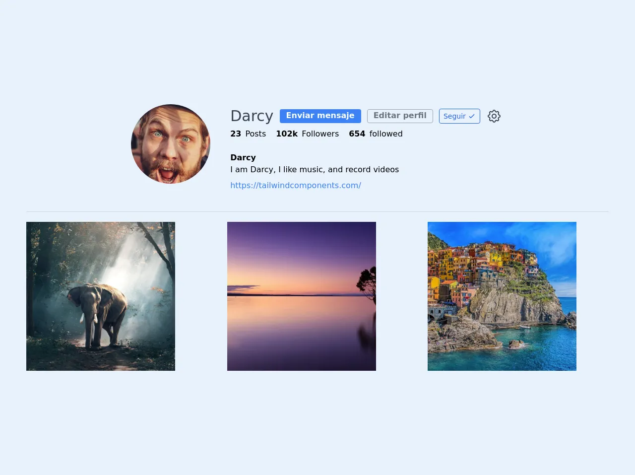
The preview of Example Profile UI component
To create an example profile UI component with Tailwind CSS, we'll use a simple HTML structure and apply Tailwind CSS classes to style the elements. Here's a preview of what the final UI component will look like:
Free download of the Example Profile's source code
The source code of Example Profile UI component
Here's the source code for the example profile UI component using Tailwind CSS:
<!-- This is an example component -->
<div class="w-11/12">
    <div class="flex justify-center pb-10">
            <img src="https://images.pexels.com/photos/3278968/pexels-photo-3278968.jpeg?auto=compress&cs=tinysrgb&h=750&w=1260"
                class="h-40 w-40 rounded-full object-cover"
                alt="username"/>
            <div class="ml-10">
                <div class="flex items-center">
                    <h2 class="block leading-relaxed font-light text-gray-700 text-3xl">Darcy</h2>
                    <a class="cursor-pointer h-7 px-3 ml-3 outline-none border-transparent text-center rounded border bg-blue-500 hover:bg-blue-600 text-white bg-transparent font-semibold">Enviar mensaje</a>
                    <a class="cursor-pointer h-7 px-3 ml-3 focus:outline-none hover:border-transparent text-center rounded border border-gray-400 hover:bg-blue-500 hover:text-white bg-transparent text-gray-500 font-semibold">Editar perfil</a>

                    <button class="flex items-center ml-3 border border-blue-600 hover:bg-blue-600 hover:text-white rounded outline-none focus:outline-none bg-transparent text-blue-600 text-sm py-1 px-2">
                        <span class="block">Seguir</span>
                        <svg class="block h-5 w-5 pl-1" xmlns="http://www.w3.org/2000/svg" fill="none" viewBox="0 0 24 24" stroke="currentColor">
                            <path stroke-linecap="round" stroke-linejoin="round" stroke-width="2" d="M5 13l4 4L19 7" />
                        </svg>
                    </button>
                    <a class="cursor-pointer ml-2 p-1 border-transparent text-gray-700 rounded-full hover:text-blue-600 focus:outline-none focus:text-gray-600"
                    aria-label="Notifications">
                        <svg class="h-8 w-8" fill="none" stroke-linecap="round" stroke-linejoin="round" stroke-width="1.5" stroke="currentColor" viewBox="0 0 24 24">
                            <path d="M10.325 4.317c.426-1.756 2.924-1.756 3.35 0a1.724 1.724 0 002.573 1.066c1.543-.94 3.31.826 2.37 2.37a1.724 1.724 0 001.065 2.572c1.756.426 1.756 2.924 0 3.35a1.724 1.724 0 00-1.066 2.573c.94 1.543-.826 3.31-2.37 2.37a1.724 1.724 0 00-2.572 1.065c-.426 1.756-2.924 1.756-3.35 0a1.724 1.724 0 00-2.573-1.066c-1.543.94-3.31-.826-2.37-2.37a1.724 1.724 0 00-1.065-2.572c-1.756-.426-1.756-2.924 0-3.35a1.724 1.724 0 001.066-2.573c-.94-1.543.826-3.31 2.37-2.37.996.608 2.296.07 2.572-1.065z"/>
                            <path d="M15 12a3 3 0 11-6 0 3 3 0 016 0z" />
                        </svg>
                    </a>
                </div>
                <ul class="flex justify-content-around items-center">
                    <li>
                        <span class="block text-base flex"><span class="font-bold mr-2">23 </span> Posts</span>
                    </li>
                    <li>
                        <span class="cursor-pointer block text-base flex ml-5"><span class="font-bold mr-2">102k </span> Followers</span>
                    </li>
                    <li>
                        <span class="cursor-pointer block text-base flex ml-5"><span class="font-bold mr-2">654 </span> followed</span>
                    </li>
                </ul>
                <br>
                <div class="">
                    <h1 class="text-base font-bold font-light">Darcy</h1>
                    <span class="text-base">I am Darcy, I like music, and record videos</span>
                    <a class="block text-base text-blue-500 mt-2" target="_blank">https://tailwindcomponents.com/</a>
                </div>
            </div>
    </div>
    <div class="border-b border-gray-300"></div>
    <article class="mt-5 grid grid-cols-3 gap-10">
        <div class="cursor-pointer relative" style="width:300px; height:300px">
            <img src="https://images.pexels.com/photos/247431/pexels-photo-247431.jpeg?auto=compress&cs=tinysrgb&h=750&w=1260"
                class="foto w-full h-full object-cover"
                alt="description" />
        </div>
        <div class="cursor-pointer relative" style="width:300px; height:300px">
            <img src="https://images.pexels.com/photos/258109/pexels-photo-258109.jpeg?auto=compress&cs=tinysrgb&h=750&w=1260"
                class="foto w-full h-full object-cover"
                alt="description" />
        </div>
        <div class="cursor-pointer relative" style="width:300px; height:300px">
            <img src="https://images.pexels.com/photos/248771/pexels-photo-248771.jpeg?auto=compress&cs=tinysrgb&h=750&w=1260"
                class="foto w-full h-full object-cover"
                alt="description" />
        </div>
    </article>
</div>
How to create an Example Profile with Tailwind CSS?
Now that we've seen a preview of what the final UI component will look like let's dive into the steps to create it.
Step 1: Set up the HTML structure
We'll start by setting up the HTML structure for the example profile UI component. Here's the HTML code:
<div class="bg-white rounded-lg shadow-lg overflow-hidden">
  <div class="p-4">
    <div class="flex items-center">
      <div class="w-16 h-16 rounded-full overflow-hidden">
        <img src="https://via.placeholder.com/150" alt="Profile picture">
      </div>
      <div class="ml-4">
        <h2 class="text-lg font-bold">John Doe</h2>
        <p class="text-gray-600">Web Developer</p>
      </div>
    </div>
    <div class="mt-4">
      <p class="text-gray-700">Lorem ipsum dolor sit amet, consectetur adipiscing elit. Sed non risus. Suspendisse lectus tortor, dignissim sit amet, adipiscing nec, ultricies sed, dolor.</p>
    </div>
    <div class="mt-4">
      <a href="#" class="text-blue-500 hover:text-blue-700">View Profile</a>
    </div>
  </div>
</div>
In this code, we've created a div element with a bg-white class to set the background color to white. We've also added a rounded-lg class to give it rounded corners and a shadow-lg class to add a shadow effect. Inside this div element, we've added another div element with a p-4 class to add some padding.
Inside this div element, we've added a flex container with two child elements. The first child element is a div element with a w-16 h-16 rounded-full overflow-hidden class to create a circular profile picture. We've also added an img element inside this div element with a placeholder image URL.
The second child element is another div element with a ml-4 class to add some margin to the left. Inside this div element, we've added a h2 element with a text-lg font-bold class to set the font size and weight. We've also added a p element with a text-gray-600 class to set the text color to gray.
Below the name and title, we've added another div element with a mt-4 class to add some margin to the top. Inside this div element, we've added a p element with a text-gray-700 class to set the text color to dark gray.
Finally, we've added another div element with a mt-4 class to add some margin to the top. Inside this div element, we've added an a element with a text-blue-500 hover:text-blue-700 class to set the text color to blue and add a hover effect.
Step 2: Add Tailwind CSS classes
Now that we've set up the HTML structure, we'll add Tailwind CSS classes to style the elements. Here are the Tailwind CSS classes we'll use:
bg-white: Sets the background color to white.rounded-lg: Adds rounded corners to the element.shadow-lg: Adds a shadow effect to the element.p-4: Adds padding to the element.flex: Creates a flex container.items-center: Centers the child elements vertically.w-16 h-16: Sets the width and height of the element to 16 units.rounded-full: Makes the element circular.overflow-hidden: Hides the overflow of the element.ml-4: Adds margin to the left of the element.text-lg: Sets the font size to large.font-bold: Sets the font weight to bold.text-gray-600: Sets the text color to gray.text-gray-700: Sets the text color to dark gray.mt-4: Adds margin to the top of the element.text-blue-500: Sets the text color to blue.hover:text-blue-700: Sets the text color to dark blue on hover.
Step 3: Preview the Example Profile UI component
Once we've added the Tailwind CSS classes, we can preview the example profile UI component in the browser. Here's what it should look like:
Conclusion
In this article, we've explored how to use Tailwind CSS to build an example profile UI component effortlessly. We've seen how Tailwind CSS provides a set of pre-defined CSS classes that can be used to style HTML elements quickly and how it eliminates the need for writing custom CSS styles. We've also seen how to set up the HTML structure and add Tailwind CSS classes to create the example profile UI component. With these easy steps, you can create beautiful, responsive, and functional UI components with Tailwind CSS without even thinking about it.