- Published on
Ultimate Guide: Build A Event Card With Tailwind CSS
- What is Tailwind CSS?
- The description of Event Card UI component
- Why use Tailwind CSS to create an Event Card UI component?
- The preview of Event Card UI component
- The source code of Event Card UI component
- How to create an Event Card with Tailwind CSS?
- Step 1: Set up your HTML structure
- Step 2: Style the Event Card using Tailwind CSS classes
- Step 3: Customize the Event Card to fit your needs
- Conclusion
As a FrontEnd technology blogger, it's essential to keep up with the latest trends and tools in the industry. One of the most popular CSS frameworks today is Tailwind CSS. In this article, we'll show you how to build an Event Card UI component using Tailwind CSS.
What is Tailwind CSS?
Tailwind CSS is a utility-first CSS framework that provides a set of pre-defined CSS classes that you can use to style your HTML elements. It's designed to be highly customizable and easy to use, allowing you to create complex layouts and designs with minimal effort.
The description of Event Card UI component
An Event Card is a UI component that displays information about an event, such as the event name, date, time, location, and a brief description. It's commonly used in event management applications, conference websites, and other similar platforms.
Why use Tailwind CSS to create an Event Card UI component?
Tailwind CSS provides a set of pre-defined CSS classes that you can use to style your HTML elements. This makes it easy to create complex layouts and designs without having to write custom CSS from scratch. Additionally, Tailwind CSS is highly customizable, allowing you to tweak the design to fit your specific needs.
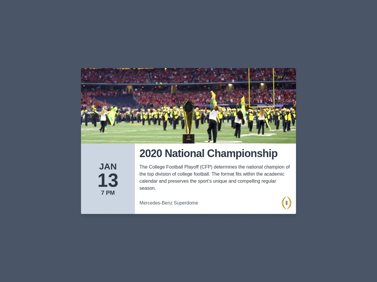
The preview of Event Card UI component
To give you an idea of what the final product will look like, here's a preview of the Event Card UI component we'll be building:
Free download of the Event Card's source code
The source code of Event Card UI component
Before we dive into the code, here's a preview of what the final HTML and CSS will look like:
<div class="mx-auto bg-gray-700 h-screen flex items-center justify-center px-8">
  <div class="flex flex-col w-full bg-white rounded shadow-lg sm:w-3/4 md:w-1/2 lg:w-3/5">
    <div class="w-full h-64 bg-top bg-cover rounded-t" style="background-image: url(https://www.si.com/.image/t_share/MTY4MTkyMjczODM4OTc0ODQ5/cfp-trophy-deitschjpg.jpg)"></div>
    <div class="flex flex-col w-full md:flex-row">
        <div class="flex flex-row justify-around p-4 font-bold leading-none text-gray-800 uppercase bg-gray-400 rounded md:flex-col md:items-center md:justify-center md:w-1/4">
            <div class="md:text-3xl">Jan</div>
            <div class="md:text-6xl">13</div>
            <div class="md:text-xl">7 pm</div>
        </div>
        <div class="p-4 font-normal text-gray-800 md:w-3/4">
            <h1 class="mb-4 text-4xl font-bold leading-none tracking-tight text-gray-800">2020 National Championship</h1>
            <p class="leading-normal">The College Football Playoff (CFP) determines the national champion of the top division of college football. The format fits within the academic calendar and preserves the sport’s unique and compelling regular season.</p>
            <div class="flex flex-row items-center mt-4 text-gray-700">
                <div class="w-1/2">
                    Mercedes-Benz Superdome
                </div>
                <div class="w-1/2 flex justify-end">
                    <img src="https://collegefootballplayoff.com/images/section_logo.png" alt="" class="w-8">
                </div>
            </div>
        </div>
    </div>
</div>
</div>
How to create an Event Card with Tailwind CSS?
Now that we've covered the basics, let's dive into the step-by-step process of creating an Event Card UI component with Tailwind CSS.
Step 1: Set up your HTML structure
The first step is to set up the HTML structure for your Event Card. Here's an example of what it might look like:
<div class="event-card">
  <div class="event-card-header">
    <h2 class="event-card-title">Event Name</h2>
    <p class="event-card-date">Date and Time</p>
  </div>
  <div class="event-card-body">
    <p class="event-card-location">Location</p>
    <p class="event-card-description">Event Description</p>
  </div>
</div>
In this example, we've created a div element with a class of event-card. Inside that, we have two child div elements: event-card-header and event-card-body. The event-card-header contains the event name and date, while the event-card-body contains the location and description.
Step 2: Style the Event Card using Tailwind CSS classes
Now that we have our HTML structure in place, it's time to style the Event Card using Tailwind CSS classes. Here's an example of what the CSS might look like:
.event-card {
  background-color: white;
  border-radius: 0.5rem;
  box-shadow: 0 1px 2px rgba(0, 0, 0, 0.05);
  overflow: hidden;
}

.event-card-header {
  background-color: #f7fafc;
  border-bottom: 1px solid #edf2f7;
  padding: 1rem;
}

.event-card-title {
  font-size: 1.5rem;
  margin: 0;
}

.event-card-date {
  color: #a0aec0;
  font-size: 0.875rem;
  margin: 0;
}

.event-card-body {
  padding: 1rem;
}

.event-card-location {
  color: #a0aec0;
  font-size: 0.875rem;
  margin: 0;
}

.event-card-description {
  margin: 0;
}
In this example, we've used a variety of Tailwind CSS classes to style the Event Card. We've set the background color, border radius, and box shadow for the event-card class. We've also set the background color and border bottom for the event-card-header class, and the font size and margin for the event-card-title and event-card-date classes.
Step 3: Customize the Event Card to fit your needs
Tailwind CSS is highly customizable, so you can tweak the design of the Event Card to fit your specific needs. For example, you could change the font family, font size, and color scheme to match your brand.
Conclusion
In this article, we've shown you how to build an Event Card UI component using Tailwind CSS. We've covered the basics of Tailwind CSS, the description of the Event Card UI component, why you should use Tailwind CSS to create an Event Card UI component, and the step-by-step process of creating an Event Card with Tailwind CSS. With this knowledge, you'll be able to create beautiful and functional UI components for your web applications.