- Published on
Beginners Guide: Make A Email Subscription With Tailwind CSS
- What is Tailwind CSS?
- The description of Email Subscription UI component
- Why use Tailwind CSS to create an Email Subscription UI component?
- The preview of Email Subscription UI component
- The source code of Email Subscription UI component
- How to create an Email Subscription with Tailwind CSS?
- Conclusion
What is Tailwind CSS?
Tailwind CSS is a utility-first CSS framework that provides a set of pre-defined classes to help you quickly build custom user interfaces. It allows you to focus on the design and functionality of your website or application, rather than writing custom CSS from scratch.
The description of Email Subscription UI component
An email subscription UI component is a form that allows users to sign up for a newsletter or other email updates. It typically includes fields for the user's name and email address, as well as a submit button.
Why use Tailwind CSS to create an Email Subscription UI component?
Tailwind CSS makes it easy to create custom UI components like email subscription forms. With its pre-defined classes, you can quickly style and layout your form without having to write custom CSS. This saves time and allows you to focus on the functionality of your form.
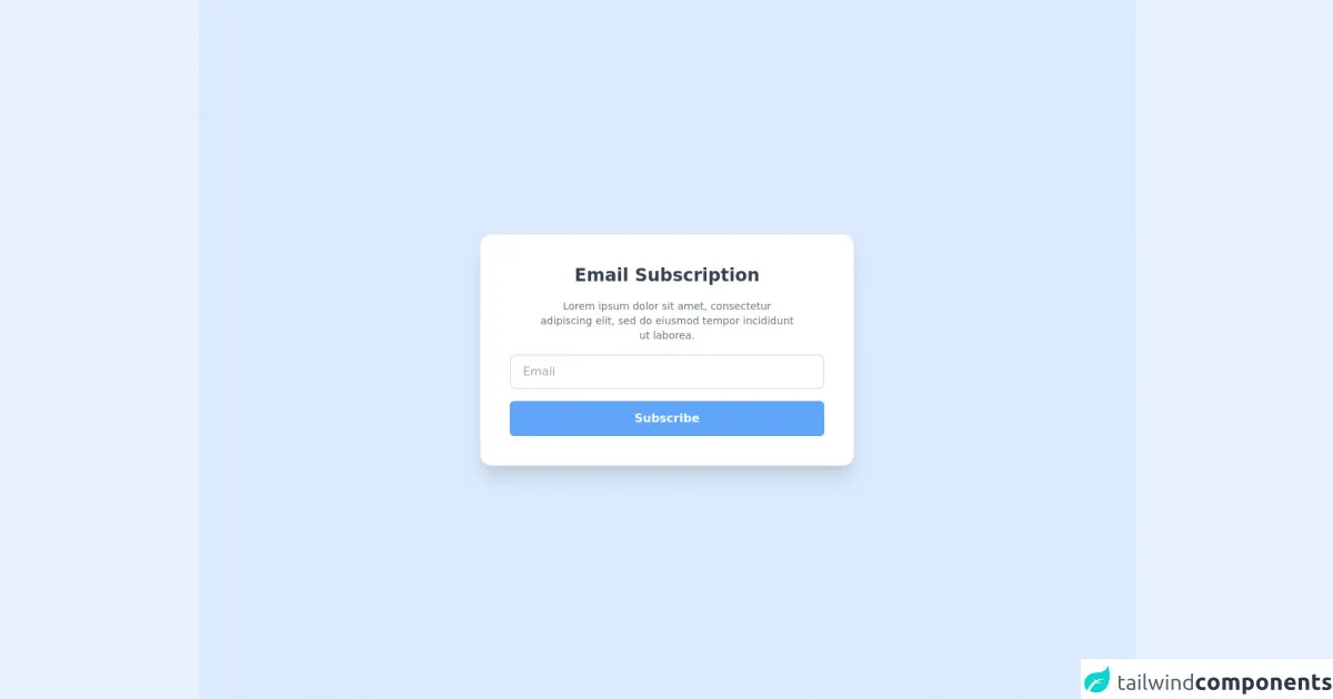
The preview of Email Subscription UI component
To create an email subscription form with Tailwind CSS, we'll use the following classes:
bg-white: sets the background color of the form to whiterounded-md: rounds the corners of the formshadow-md: adds a shadow effect to the formp-6: adds padding to the formtext-gray-700: sets the text color of the form to grayborder-gray-300: sets the border color of the form to light grayfocus:border-blue-500: sets the border color of the form to blue when it is in focusfocus:outline-none: removes the outline when the form is in focusw-full: sets the width of the form to 100%mb-4: adds margin to the bottom of the form elementstext-sm: sets the font size of the form text to smallplaceholder-gray-500: sets the color of the placeholder text to gray
Free download of the Email Subscription's source code
The source code of Email Subscription UI component
To create the email subscription form with Tailwind CSS, we'll use the following HTML and CSS:
<form class="bg-white rounded-md shadow-md p-6">
  <div class="mb-4">
    <label class="block text-gray-700 text-sm font-bold mb-2" for="name">
      Name
    </label>
    <input class="appearance-none border rounded w-full py-2 px-3 text-gray-700 leading-tight focus:outline-none focus:border-blue-500" id="name" type="text" placeholder="John Doe">
  </div>
  <div class="mb-4">
    <label class="block text-gray-700 text-sm font-bold mb-2" for="email">
      Email
    </label>
    <input class="appearance-none border rounded w-full py-2 px-3 text-gray-700 leading-tight focus:outline-none focus:border-blue-500" id="email" type="email" placeholder="[email protected]">
  </div>
  <button class="bg-blue-500 hover:bg-blue-700 text-white font-bold py-2 px-4 rounded focus:outline-none focus:shadow-outline" type="button">
    Sign Up
  </button>
</form>
input:focus {
  outline: none;
}
<div class="flex items-center justify-center h-screen bg-blue-100">

	<div class="bg-white rounded-2xl border shadow-xl p-10 max-w-lg">
    <div class="flex flex-col items-center space-y-4">
	  <h1 class="font-bold text-2xl text-gray-700 w-4/6 text-center">Email Subscription</h1>
    <p class="text-sm text-gray-500 text-center w-5/6">Lorem ipsum dolor sit amet, consectetur adipiscing elit, sed do eiusmod tempor incididunt ut laborea.</p>
    <input type="text" placeholder="Email" class="border-2 rounded-lg w-full h-12 px-4">
    <button class="bg-blue-400 text-white rounded-md font-semibold px-4 py-3 w-full">Subscribe</button>

    </div>

  </div>

  </div>
How to create an Email Subscription with Tailwind CSS?
- First, create a new HTML file and add the following code:
<!DOCTYPE html>
<html lang="en">
<head>
  <meta charset="UTF-8">
  <title>Email Subscription Form</title>
  <link rel="stylesheet" href="https://cdnjs.cloudflare.com/ajax/libs/tailwindcss/2.1.2/tailwind.min.css">
</head>
<body>
  <div class="container mx-auto mt-8">
    <form class="bg-white rounded-md shadow-md p-6">
      <div class="mb-4">
        <label class="block text-gray-700 text-sm font-bold mb-2" for="name">
          Name
        </label>
        <input class="appearance-none border rounded w-full py-2 px-3 text-gray-700 leading-tight focus:outline-none focus:border-blue-500" id="name" type="text" placeholder="John Doe">
      </div>
      <div class="mb-4">
        <label class="block text-gray-700 text-sm font-bold mb-2" for="email">
          Email
        </label>
        <input class="appearance-none border rounded w-full py-2 px-3 text-gray-700 leading-tight focus:outline-none focus:border-blue-500" id="email" type="email" placeholder="[email protected]">
      </div>
      <button class="bg-blue-500 hover:bg-blue-700 text-white font-bold py-2 px-4 rounded focus:outline-none focus:shadow-outline" type="button">
        Sign Up
      </button>
    </form>
  </div>
</body>
</html>
Save the file as
index.htmland open it in your web browser. You should see the email subscription form.To style the form with Tailwind CSS, add the following CSS to the head of your HTML file:
<style>
  input:focus {
    outline: none;
  }
</style>
- Save the file and refresh your web browser. You should see the email subscription form styled with Tailwind CSS.
Conclusion
In this article, we've learned how to create an email subscription form with Tailwind CSS. With its pre-defined classes, Tailwind CSS makes it easy to quickly style and layout custom UI components without having to write custom CSS from scratch. By following the steps outlined in this article, you should now be able to create your own email subscription forms using Tailwind CSS.