- Published on
Imagine You Make A Editable Div Input With Tailwind CSS Like An Expert. Follow These 6 Steps To Get There
- What is Tailwind CSS?
- The description of editable div input ui component
- Why use Tailwind CSS to create an editable div input ui component?
- The preview of editable div input ui component.
- The source code of editable div input ui component.
- How to create a editable div input with Tailwind CSS?
- Step 1: Create a div element
- Step 2: Add Tailwind CSS classes
- Step 3: Add padding and border
- Step 4: Add focus styles
- Step 5: Add placeholder text
- Step 6: Add JavaScript to handle input
- Conclusion
What is Tailwind CSS?
Tailwind CSS is a utility-first CSS framework that helps you quickly build custom designs. It provides a set of pre-defined classes that can be used to style your HTML elements. With Tailwind CSS, you can create responsive and mobile-first designs without writing any custom CSS.
The description of editable div input ui component
An editable div input is a user interface component that allows users to edit text directly on the page. It is similar to an input field, but it is a div element that can be styled and customized to fit your design needs. The editable div input is a popular user interface component that is used in many web applications.
Why use Tailwind CSS to create an editable div input ui component?
Tailwind CSS provides a set of pre-defined classes that can be used to style your HTML elements. This makes it easy to create custom designs without writing any custom CSS. With Tailwind CSS, you can quickly and easily create an editable div input that is responsive and mobile-first.
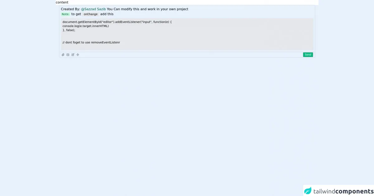
The preview of editable div input ui component.
To create an editable div input with Tailwind CSS, you can use the contenteditable attribute on a div element. This attribute allows users to edit the content of the div element directly on the page. You can style the div element using Tailwind CSS classes to create a custom design.
Free download of the editable div input's source code
The source code of editable div input ui component.
To create an editable div input with Tailwind CSS, you can use the following HTML and CSS code:
<div class="h-screen relative">
<div class="h-[calc(100%-10rem)] bg-white">
  content
</div>
<div class="relative">
<div class="h-[7rem] mx-4 p-2 outline-none border border-gray-300 rounded-t-md focus:border-gray-400 overflow-hidden overflow-y-auto" contenteditable id='editor'>
  Created By: <span class="text-green-800">@Sazzad Sazib</span>
  You Can modify this and work in your own project
  <br/>
<span class="bg-green-100 text-green-800 text-sm py-0.5 px-1 rounded-sm">Note:</span> to get <code class="bg-gray-200 text-sm py-0.5 px-2 rounded-sm">onChange</code> add this
<br/>
<div class="mt-2 text-sm bg-gray-200 whitespace-pre-wrap p-2">document.getElementById("editor").addEventListener("input", function(e) {
console.log(e.target.innerHTML)
}, false);
<br/>
// dont foget to use removeEventListenr
</code>
</div>
</div>
<div class="h-[2rem] flex items-center justify-between mx-4 p-0.5 outline-none border-b border-l border-r border-gray-300 rounded-b-md focus:ring-1 focus:ring-gray-400">
  <div class="flex space-x-2 ml-2 items-center">
    <div class="h-4 w-4 text-gray-500 cursor-pointer">
      <svg xmlns="http://www.w3.org/2000/svg" fill="none" viewBox="0 0 24 24" stroke="currentColor">
      <path stroke-linecap="round" stroke-linejoin="round" stroke-width="2" d="M15.172 7l-6.586 6.586a2 2 0 102.828 2.828l6.414-6.586a4 4 0 00-5.656-5.656l-6.415 6.585a6 6 0 108.486 8.486L20.5 13" />
      </svg>
    </div>
      <div class="h-4 w-4 text-gray-500 cursor-pointer">
      <svg xmlns="http://www.w3.org/2000/svg" fill="none" viewBox="0 0 24 24" stroke="currentColor">
      <path stroke-linecap="round" stroke-linejoin="round" stroke-width="2" d="M4 16l4.586-4.586a2 2 0 012.828 0L16 16m-2-2l1.586-1.586a2 2 0 012.828 0L20 14m-6-6h.01M6 20h12a2 2 0 002-2V6a2 2 0 00-2-2H6a2 2 0 00-2 2v12a2 2 0 002 2z" />
      </svg>
    </div>
      <div class="h-4 w-4 text-gray-500 cursor-pointer">
      <svg xmlns="http://www.w3.org/2000/svg" fill="none" viewBox="0 0 24 24" stroke="currentColor">
      <path stroke-linecap="round" stroke-linejoin="round" stroke-width="2" d="M11 5H6a2 2 0 00-2 2v11a2 2 0 002 2h11a2 2 0 002-2v-5m-1.414-9.414a2 2 0 112.828 2.828L11.828 15H9v-2.828l8.586-8.586z" />
      </svg>
    </div>
      <div class="h-4 w-4 text-gray-500 cursor-pointer">
      <svg xmlns="http://www.w3.org/2000/svg" fill="none" viewBox="0 0 24 24" stroke="currentColor">
      <path stroke-linecap="round" stroke-linejoin="round" stroke-width="2" d="M13 10V3L4 14h7v7l9-11h-7z" />
      </svg>
    </div>
  </div>
  <div class="flex items-center">
    <button class="mr-2 bg-green-500 px-2 text-xs py-0.5 rounded-sm text-white border border-green-700">Send</button>
  </div>
</div>
</div>
</div>
How to create a editable div input with Tailwind CSS?
Follow these 6 steps to create an editable div input with Tailwind CSS:
Step 1: Create a div element
The first step is to create a div element that will be used as the editable div input. You can add the contenteditable attribute to the div element to make it editable.
<div contenteditable></div>
Step 2: Add Tailwind CSS classes
Next, you can add Tailwind CSS classes to the div element to style it. You can use the bg-white class to set the background color of the div element to white.
<div contenteditable class="bg-white"></div>
Step 3: Add padding and border
You can add padding and a border to the div element to make it look like an input field. You can use the p-2 class to add padding to the div element and the border and border-gray-300 classes to add a border.
<div contenteditable class="bg-white p-2 border border-gray-300"></div>
Step 4: Add focus styles
To add focus styles to the editable div input, you can use the focus:outline-none class to remove the default outline and the focus:border-blue-500 class to add a blue border when the div element is in focus.
<div contenteditable class="bg-white p-2 border border-gray-300 focus:outline-none focus:border-blue-500"></div>
Step 5: Add placeholder text
You can add placeholder text to the editable div input by adding a ::before pseudo-element to the div element. You can use the content property to add the placeholder text and the text-gray-500 class to set the color of the text to gray.
<div contenteditable class="bg-white p-2 border border-gray-300 focus:outline-none focus:border-blue-500">
  ::before {
    content: "Enter text here...";
    color: #a0aec0;
  }
</div>
Step 6: Add JavaScript to handle input
Finally, you can add JavaScript code to handle the input from the editable div input. You can use the addEventListener method to listen for the input event on the div element and update the content of the div element.
<div id="editable-div" contenteditable class="bg-white p-2 border border-gray-300 focus:outline-none focus:border-blue-500">
  ::before {
    content: "Enter text here...";
    color: #a0aec0;
  }
</div>

<script>
  const editableDiv = document.getElementById("editable-div");
  editableDiv.addEventListener("input", () => {
    const content = editableDiv.innerHTML;
    console.log(content);
  });
</script>
Conclusion
Creating an editable div input with Tailwind CSS is easy and straightforward. By following these 6 steps, you can create a custom editable div input that is responsive and mobile-first. With Tailwind CSS, you can quickly and easily create custom designs without writing any custom CSS.