- Published on
Learn How To Build A Ecommerce Product Card With Tailwind CSS from the Pros
- What is Tailwind CSS?
- The description of ecommerce product card ui component
- Why use Tailwind CSS to create a ecommerce product card ui component?
- The preview of ecommerce product card ui component.
- The source code of ecommerce product card ui component.
- How to create a ecommerce product card with Tailwind CSS?
- Conclusion
In the world of eCommerce, the product card is one of the most important UI components. It is the first thing that a user sees when they are browsing a product catalog. A well-designed product card can make all the difference in converting a visitor into a customer. In this tutorial, we will learn how to build an eCommerce product card using Tailwind CSS.
What is Tailwind CSS?
Tailwind CSS is a utility-first CSS framework that provides a set of pre-defined CSS classes that can be used to style HTML elements. It allows developers to quickly create custom designs without writing any CSS code. Tailwind CSS provides a large number of utility classes that can be used to create complex layouts and designs.
The description of ecommerce product card ui component
An eCommerce product card is a UI component that displays information about a product. It typically includes an image of the product, the product name, price, and a short description. The product card is used to entice users to click through to the product page and make a purchase.
Why use Tailwind CSS to create a ecommerce product card ui component?
Tailwind CSS provides a large number of utility classes that can be used to create complex layouts and designs. It allows developers to quickly create custom designs without writing any CSS code. Tailwind CSS also provides a responsive design system that makes it easy to create designs that work well on different screen sizes.
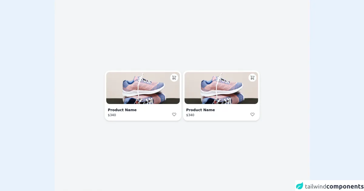
The preview of ecommerce product card ui component.
To create an eCommerce product card using Tailwind CSS, we will use a combination of HTML and CSS. The product card will include an image of the product, the product name, price, and a short description. We will use Tailwind CSS classes to style the product card.
Free download of the ecommerce product card's source code
The source code of ecommerce product card ui component.
To create an eCommerce product card using Tailwind CSS, we will use a combination of HTML and CSS. The product card will include an image of the product, the product name, price, and a short description. We will use Tailwind CSS classes to style the product card.
<!-- UI card from https://uxplanet.org/ultimate-guide-for-designing-ui-cards-59488a91b44f -->
<div class="min-h-screen bg-gray-100 flex flex-col justify-center">
  <div class="relative m-3 flex flex-wrap mx-auto justify-center">

    <div class="relative max-w-sm min-w-[340px] bg-white shadow-md rounded-3xl p-2 mx-1 my-3 cursor-pointer">
      <div class="overflow-x-hidden rounded-2xl relative">
        <img class="h-40 rounded-2xl w-full object-cover" src="https://pixahive.com/wp-content/uploads/2020/10/Gym-shoes-153180-pixahive.jpg">
        <p class="absolute right-2 top-2 bg-white rounded-full p-2 cursor-pointer group">
          <svg xmlns="http://www.w3.org/2000/svg" class="h-6 w-6 group-hover:opacity-50 opacity-70" fill="none" viewBox="0 0 24 24" stroke="black">
            <path stroke-linecap="round" stroke-linejoin="round" stroke-width="1.5" d="M3 3h2l.4 2M7 13h10l4-8H5.4M7 13L5.4 5M7 13l-2.293 2.293c-.63.63-.184 1.707.707 1.707H17m0 0a2 2 0 100 4 2 2 0 000-4zm-8 2a2 2 0 11-4 0 2 2 0 014 0z" />
          </svg>
        </p>
      </div>
      <div class="mt-4 pl-2 mb-2 flex justify-between ">
        <div>
          <p class="text-lg font-semibold text-gray-900 mb-0">Product Name</p>
          <p class="text-md text-gray-800 mt-0">$340</p>
        </div>
        <div class="flex flex-col-reverse mb-1 mr-4 group cursor-pointer">
          <svg xmlns="http://www.w3.org/2000/svg" class="h-6 w-6 group-hover:opacity-70" fill="none" viewBox="0 0 24 24" stroke="gray">
            <path stroke-linecap="round" stroke-linejoin="round" stroke-width="2" d="M4.318 6.318a4.5 4.5 0 000 6.364L12 20.364l7.682-7.682a4.5 4.5 0 00-6.364-6.364L12 7.636l-1.318-1.318a4.5 4.5 0 00-6.364 0z" />
          </svg>
        </div>
      </div>
    </div>

  </div>
</div>
How to create a ecommerce product card with Tailwind CSS?
To create an eCommerce product card using Tailwind CSS, follow these steps:
- Create a new HTML file and add the following code:
<div class="max-w-sm rounded overflow-hidden shadow-lg">
  <img class="w-full" src="product-image.jpg" alt="Product Image">
  <div class="px-6 py-4">
    <div class="font-bold text-xl mb-2">Product Name</div>
    <p class="text-gray-700 text-base">Product Description</p>
    <p class="text-gray-700 text-base">$99.99</p>
  </div>
</div>
- Add the Tailwind CSS CDN to your HTML file:
<link href="https://cdn.jsdelivr.net/npm/tailwindcss@latest/dist/tailwind.min.css" rel="stylesheet">
- Save the file and open it in your web browser.
You should now see a product card with an image, product name, description, and price. The card should be styled using Tailwind CSS classes.
Conclusion
In this tutorial, we learned how to create an eCommerce product card using Tailwind CSS. Tailwind CSS provides a large number of utility classes that can be used to create complex layouts and designs. It allows developers to quickly create custom designs without writing any CSS code. By following the steps outlined in this tutorial, you can create a professional-looking product card for your eCommerce website.