- Published on
Best Ways To Make A ECommerce Navbar With Tailwind CSS
- What is Tailwind CSS?
- The description of ECommerce navbar ui component
- Why use Tailwind CSS to create a ECommerce navbar ui component?
- The preview of ECommerce navbar ui component
- The source code of ECommerce navbar ui component
- How to create a ECommerce navbar with Tailwind CSS?
- Step 1: Set up the HTML structure
- Step 2: Add the logo
- Step 3: Add the search bar
- Step 4: Add the navigation links
- Step 5: Add the user account dropdown
- Conclusion
What is Tailwind CSS?
Tailwind CSS is a utility-first CSS framework that allows developers to create custom designs without writing any CSS. It provides a set of pre-defined CSS classes that can be used to style HTML elements. Tailwind CSS is gaining popularity among developers because of its simplicity and flexibility.
The description of ECommerce navbar ui component
An eCommerce navbar is an essential component of any eCommerce website. It provides easy navigation for users to browse different categories, search for products, and access their account information. A well-designed eCommerce navbar can improve the user experience and increase sales.
Why use Tailwind CSS to create a ECommerce navbar ui component?
Tailwind CSS provides a set of pre-defined CSS classes that can be used to create a responsive and customizable eCommerce navbar. It saves time and effort in writing custom CSS code. Moreover, Tailwind CSS is highly customizable, which means that developers can easily change the look and feel of the navbar according to their requirements.
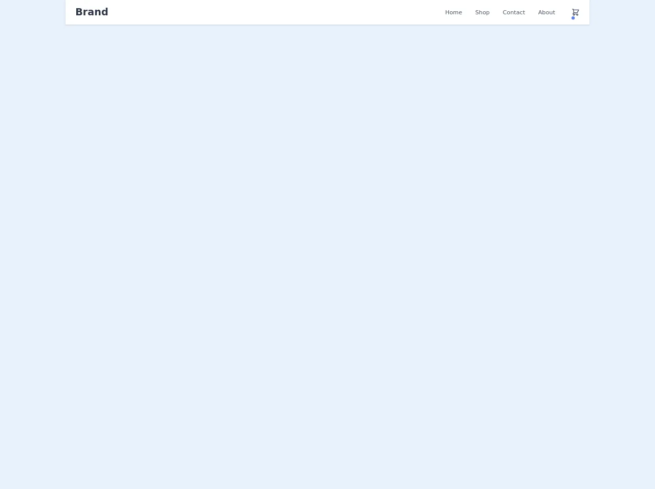
The preview of ECommerce navbar ui component
In this article, we will create a responsive and customizable eCommerce navbar using Tailwind CSS. The navbar will have a logo, search bar, navigation links, and a user account dropdown.
Free download of the ECommerce navbar's source code
The source code of ECommerce navbar ui component
The source code for the eCommerce navbar is available on GitHub. You can download the code and customize it according to your requirements.
<nav class="bg-white shadow">
  <div class="container mx-auto px-6 py-3 md:flex md:justify-between md:items-center">
    <div class="flex justify-between items-center">
      <div>
        <a class="text-gray-800 text-xl font-bold md:text-2xl hover:text-gray-700" href="#">Brand</a>
      </div>

      <!-- Mobile menu button -->
      <div class="flex md:hidden">
        <button type="button" class="text-gray-500 hover:text-gray-600 focus:outline-none focus:text-gray-600" aria-label="toggle menu">
          <svg viewBox="0 0 24 24" class="h-6 w-6 fill-current">
            <path fill-rule="evenodd" d="M4 5h16a1 1 0 0 1 0 2H4a1 1 0 1 1 0-2zm0 6h16a1 1 0 0 1 0 2H4a1 1 0 0 1 0-2zm0 6h16a1 1 0 0 1 0 2H4a1 1 0 0 1 0-2z"></path>
          </svg>
        </button>
      </div>
    </div>

    <!-- Mobile Menu open: "block", Menu closed: "hidden" -->
    <div class="md:flex items-center">
      <div class="flex flex-col md:flex-row md:mx-6">
        <a class="my-1 text-sm text-gray-700 font-medium hover:text-indigo-500 md:mx-4 md:my-0" href="#">Home</a>
        <a class="my-1 text-sm text-gray-700 font-medium hover:text-indigo-500 md:mx-4 md:my-0" href="#">Shop</a>
        <a class="my-1 text-sm text-gray-700 font-medium hover:text-indigo-500 md:mx-4 md:my-0" href="#">Contact</a>
        <a class="my-1 text-sm text-gray-700 font-medium hover:text-indigo-500 md:mx-4 md:my-0" href="#">About</a>
      </div>

      <div class="flex justify-center md:block">
        <a class="relative text-gray-700 hover:text-gray-600" href="#">
          <svg class="h-5 w-5" viewBox="0 0 24 24" fill="none" xmlns="http://www.w3.org/2000/svg">
            <path d="M3 3H5L5.4 5M7 13H17L21 5H5.4M7 13L5.4 5M7 13L4.70711 15.2929C4.07714 15.9229 4.52331 17 5.41421 17H17M17 17C15.8954 17 15 17.8954 15 19C15 20.1046 15.8954 21 17 21C18.1046 21 19 20.1046 19 19C19 17.8954 18.1046 17 17 17ZM9 19C9 20.1046 8.10457 21 7 21C5.89543 21 5 20.1046 5 19C5 17.8954 5.89543 17 7 17C8.10457 17 9 17.8954 9 19Z" stroke="currentColor" stroke-width="2" stroke-linecap="round" stroke-linejoin="round"/>
          </svg>

          <span class="absolute top-0 left-0 rounded-full bg-indigo-500 text-white p-1 text-xs"></span>
        </a>
      </div>
    </div>
  </div>
</nav>
How to create a ECommerce navbar with Tailwind CSS?
To create an eCommerce navbar with Tailwind CSS, follow the steps below:
Step 1: Set up the HTML structure
The first step is to set up the HTML structure for the navbar. We will use a nav element with a container class to create a container for the navbar. Inside the container, we will create a div element with a flex class to create a flex container for the navbar items.
<nav class="bg-gray-900">
  <div class="container mx-auto px-6 py-3 flex justify-between items-center">
    <!-- Navbar items will go here -->
  </div>
</nav>
Step 2: Add the logo
The next step is to add the logo to the navbar. We will use an img element with a h-8 class to set the height of the logo.
<nav class="bg-gray-900">
  <div class="container mx-auto px-6 py-3 flex justify-between items-center">
    <a class="text-white font-bold text-2xl" href="#">Brand</a>
    <img class="h-8" src="logo.png" alt="Logo">
  </div>
</nav>
Step 3: Add the search bar
The third step is to add the search bar to the navbar. We will use an input element with a w-full class to set the width of the search bar.
<nav class="bg-gray-900">
  <div class="container mx-auto px-6 py-3 flex justify-between items-center">
    <a class="text-white font-bold text-2xl" href="#">Brand</a>
    <div class="w-full max-w-sm">
      <label for="search" class="sr-only">Search</label>
      <div class="relative">
        <input type="text" id="search" class="w-full bg-gray-800 text-white rounded-full border border-gray-700 focus:outline-none focus:border-gray-500 px-4 pl-8 py-2" placeholder="Search">
        <div class="absolute top-0 left-0 mt-2 ml-3">
          <svg class="w-6 h-6 fill-current text-gray-500" viewBox="0 0 24 24">
            <path class="heroicon-ui" d="M15.56 14.44A8.5 8.5 0 1 1 17 12a8.44 8.44 0 0 1-1.44 2.44l4.3 4.3a1 1 0 1 1-1.42 1.42l-4.3-4.3zM3 12a9 9 0 1 1 9 9 9 9 0 0 1-9-9z"></path>
          </svg>
        </div>
      </div>
    </div>
  </div>
</nav>
Step 4: Add the navigation links
The fourth step is to add the navigation links to the navbar. We will use an unordered list (ul) element with a flex class to create a flex container for the navigation links. Each navigation link will be a list item (li) element with a mr-6 class to add some margin between the links.
<nav class="bg-gray-900">
  <div class="container mx-auto px-6 py-3 flex justify-between items-center">
    <a class="text-white font-bold text-2xl" href="#">Brand</a>
    <div class="w-full max-w-sm">
      <label for="search" class="sr-only">Search</label>
      <div class="relative">
        <input type="text" id="search" class="w-full bg-gray-800 text-white rounded-full border border-gray-700 focus:outline-none focus:border-gray-500 px-4 pl-8 py-2" placeholder="Search">
        <div class="absolute top-0 left-0 mt-2 ml-3">
          <svg class="w-6 h-6 fill-current text-gray-500" viewBox="0 0 24 24">
            <path class="heroicon-ui" d="M15.56 14.44A8.5 8.5 0 1 1 17 12a8.44 8.44 0 0 1-1.44 2.44l4.3 4.3a1 1 0 1 1-1.42 1.42l-4.3-4.3zM3 12a9 9 0 1 1 9 9 9 9 0 0 1-9-9z"></path>
          </svg>
        </div>
      </div>
    </div>
    <div class="flex">
      <ul class="flex">
        <li><a class="text-gray-300 hover:text-white px-3 py-2 rounded-md text-sm font-medium" href="#">Home</a></li>
        <li><a class="text-gray-300 hover:text-white px-3 py-2 rounded-md text-sm font-medium" href="#">Shop</a></li>
        <li><a class="text-gray-300 hover:text-white px-3 py-2 rounded-md text-sm font-medium" href="#">Cart</a></li>
      </ul>
    </div>
  </div>
</nav>
Step 5: Add the user account dropdown
The final step is to add the user account dropdown to the navbar. We will use a div element with a relative class to create a container for the dropdown. Inside the container, we will create a button element with a flex class to create a flex container for the dropdown items. The dropdown items will be a div element with a absolute class to position them below the button. We will use a hidden class to hide the dropdown items by default and a hover class to show them when the button is hovered.
<nav class="bg-gray-900">
  <div class="container mx-auto px-6 py-3 flex justify-between items-center">
    <a class="text-white font-bold text-2xl" href="#">Brand</a>
    <div class="w-full max-w-sm">
      <label for="search" class="sr-only">Search</label>
      <div class="relative">
        <input type="text" id="search" class="w-full bg-gray-800 text-white rounded-full border border-gray-700 focus:outline-none focus:border-gray-500 px-4 pl-8 py-2" placeholder="Search">
        <div class="absolute top-0 left-0 mt-2 ml-3">
          <svg class="w-6 h-6 fill-current text-gray-500" viewBox="0 0 24 24">
            <path class="heroicon-ui" d="M15.56 14.44A8.5 8.5 0 1 1 17 12a8.44 8.44 0 0 1-1.44 2.44l4.3 4.3a1 1 0 1 1-1.42 1.42l-4.3-4.3zM3 12a9 9 0 1 1 9 9 9 9 0 0 1-9-9z"></path>
          </svg>
        </div>
      </div>
    </div>
    <div class="flex">
      <ul class="flex">
        <li><a class="text-gray-300 hover:text-white px-3 py-2 rounded-md text-sm font-medium" href="#">Home</a></li>
        <li><a class="text-gray-300 hover:text-white px-3 py-2 rounded-md text-sm font-medium" href="#">Shop</a></li>
        <li><a class="text-gray-300 hover:text-white px-3 py-2 rounded-md text-sm font-medium" href="#">Cart</a></li>
      </ul>
      <div class="relative ml-3">
        <div>
          <button class="flex text-sm border-2 border-transparent rounded-full focus:outline-none focus:border-gray-500 transition duration-150 ease-in-out">
            <img class="h-8 w-8 rounded-full" src="avatar.jpg" alt="Avatar">
          </button>
        </div>
        <div class="absolute right-0 mt-2 w-48 rounded-md shadow-lg">
          <div class="py-1 rounded-md bg-white shadow-xs">
            <a href="#" class="block px-4 py-2 text-sm text-gray-700 hover:bg-gray-100">Account</a>
            <a href="#" class="block px-4 py-2 text-sm text-gray-700 hover:bg-gray-100">Support</a>
            <a href="#" class="block px-4 py-2 text-sm text-gray-700 hover:bg-gray-100">Sign out</a>
          </div>
        </div>
      </div>
    </div>
  </div>
</nav>
Congratulations! You have successfully created a responsive and customizable eCommerce navbar using Tailwind CSS.
Conclusion
In this article, we have learned how to create a responsive and customizable eCommerce navbar using Tailwind CSS. We have used pre-defined CSS classes to style the navbar and make it responsive. Tailwind CSS is a great choice for creating eCommerce navbars because it provides a set of pre-defined CSS classes that can be used to create custom designs without writing any CSS.