- Published on
A Complete Guide To Make A E-commerce Checkout Page With Tailwind CSS
- What is Tailwind CSS?
- The description of E-commerce checkout page ui component
- Why use Tailwind CSS to create a E-commerce checkout page ui component?
- The preview of E-commerce checkout page ui component.
- The source code of E-commerce checkout page ui component.
- How to create a E-commerce checkout page with Tailwind CSS?
- Conclusion
What is Tailwind CSS?
Tailwind CSS is a utility-first CSS framework that provides pre-defined classes to create custom designs quickly. It allows developers to create responsive designs with ease and speed, making it a popular choice for front-end web development.
The description of E-commerce checkout page ui component
The e-commerce checkout page is an essential component of any online store. It is the final step in the purchasing process, where customers enter their payment and shipping information to complete their order. The checkout page needs to be user-friendly, easy to navigate, and visually appealing to ensure a smooth and seamless checkout experience.
Why use Tailwind CSS to create a E-commerce checkout page ui component?
Tailwind CSS provides a wide range of pre-defined classes that make it easy to create custom designs quickly. It also offers responsive design options, making it easy to create a checkout page that looks great on any device.
Using Tailwind CSS for an e-commerce checkout page also ensures consistency in design across the entire site. By using the same pre-defined classes, developers can ensure that the checkout page matches the rest of the site's design.
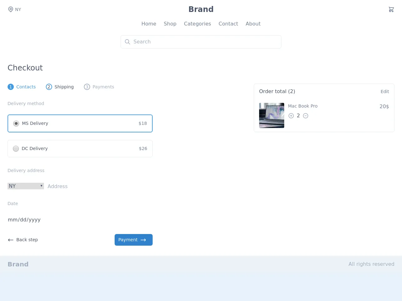
The preview of E-commerce checkout page ui component.
To create an e-commerce checkout page with Tailwind CSS, we will use pre-defined classes to create a clean and modern design. The checkout page will include a form for customers to enter their shipping and payment information, as well as a summary of their order.
Free download of the E-commerce checkout page's source code
The source code of E-commerce checkout page ui component.
To create the e-commerce checkout page, we will use HTML and Tailwind CSS classes. The HTML will include a form with input fields for the customer's name, address, and payment information. We will also use Tailwind CSS classes to style the form and add a summary of the customer's order.
<script src="https://cdn.jsdelivr.net/gh/alpinejs/[email protected]/dist/alpine.min.js" defer></script>

<div x-data="{ cartOpen: false , isOpen: false }" class="bg-white">
    <header>
        <div class="container mx-auto px-6 py-3">
            <div class="flex items-center justify-between">
                <div class="hidden w-full text-gray-600 md:flex md:items-center">
                    <svg class="h-5 w-5" viewBox="0 0 24 24" fill="none" xmlns="http://www.w3.org/2000/svg">
                        <path fill-rule="evenodd" clip-rule="evenodd" d="M16.2721 10.2721C16.2721 12.4813 14.4813 14.2721 12.2721 14.2721C10.063 14.2721 8.27214 12.4813 8.27214 10.2721C8.27214 8.06298 10.063 6.27212 12.2721 6.27212C14.4813 6.27212 16.2721 8.06298 16.2721 10.2721ZM14.2721 10.2721C14.2721 11.3767 13.3767 12.2721 12.2721 12.2721C11.1676 12.2721 10.2721 11.3767 10.2721 10.2721C10.2721 9.16755 11.1676 8.27212 12.2721 8.27212C13.3767 8.27212 14.2721 9.16755 14.2721 10.2721Z" fill="currentColor" /><path fill-rule="evenodd" clip-rule="evenodd" d="M5.79417 16.5183C2.19424 13.0909 2.05438 7.39409 5.48178 3.79417C8.90918 0.194243 14.6059 0.054383 18.2059 3.48178C21.8058 6.90918 21.9457 12.6059 18.5183 16.2059L12.3124 22.7241L5.79417 16.5183ZM17.0698 14.8268L12.243 19.8965L7.17324 15.0698C4.3733 12.404 4.26452 7.97318 6.93028 5.17324C9.59603 2.3733 14.0268 2.26452 16.8268 4.93028C19.6267 7.59603 19.7355 12.0268 17.0698 14.8268Z" fill="currentColor" />
                    </svg>
                    <span class="mx-1 text-sm">NY</span>
                </div>
                <div class="w-full text-gray-700 md:text-center text-2xl font-semibold">
                    Brand
                </div>
                <div class="flex items-center justify-end w-full">
                    <button @click="cartOpen = !cartOpen" class="text-gray-600 focus:outline-none mx-4 sm:mx-0">
                        <svg class="h-5 w-5" fill="none" stroke-linecap="round" stroke-linejoin="round" stroke-width="2" viewBox="0 0 24 24" stroke="currentColor">
                            <path d="M3 3h2l.4 2M7 13h10l4-8H5.4M7 13L5.4 5M7 13l-2.293 2.293c-.63.63-.184 1.707.707 1.707H17m0 0a2 2 0 100 4 2 2 0 000-4zm-8 2a2 2 0 11-4 0 2 2 0 014 0z"></path>
                        </svg>
                    </button>

                    <div class="flex sm:hidden">
                        <button @click="isOpen = !isOpen" type="button" class="text-gray-600 hover:text-gray-500 focus:outline-none focus:text-gray-500" aria-label="toggle menu">
                            <svg viewBox="0 0 24 24" class="h-6 w-6 fill-current">
                                <path fill-rule="evenodd" d="M4 5h16a1 1 0 0 1 0 2H4a1 1 0 1 1 0-2zm0 6h16a1 1 0 0 1 0 2H4a1 1 0 0 1 0-2zm0 6h16a1 1 0 0 1 0 2H4a1 1 0 0 1 0-2z"></path>
                            </svg>
                        </button>
                    </div>
                </div>
            </div>
            <nav :class="isOpen ? '' : 'hidden'" class="sm:flex sm:justify-center sm:items-center mt-4">
                <div class="flex flex-col sm:flex-row">
                    <a class="mt-3 text-gray-600 hover:underline sm:mx-3 sm:mt-0" href="#">Home</a>
                    <a class="mt-3 text-gray-600 hover:underline sm:mx-3 sm:mt-0" href="#">Shop</a>
                    <a class="mt-3 text-gray-600 hover:underline sm:mx-3 sm:mt-0" href="#">Categories</a>
                    <a class="mt-3 text-gray-600 hover:underline sm:mx-3 sm:mt-0" href="#">Contact</a>
                    <a class="mt-3 text-gray-600 hover:underline sm:mx-3 sm:mt-0" href="#">About</a>
                </div>
            </nav>
            <div class="relative mt-6 max-w-lg mx-auto">
            <span class="absolute inset-y-0 left-0 pl-3 flex items-center">
                <svg class="h-5 w-5 text-gray-500" viewBox="0 0 24 24" fill="none">
                    <path d="M21 21L15 15M17 10C17 13.866 13.866 17 10 17C6.13401 17 3 13.866 3 10C3 6.13401 6.13401 3 10 3C13.866 3 17 6.13401 17 10Z" stroke="currentColor" stroke-width="2" stroke-linecap="round" stroke-linejoin="round"/>
                </svg>
            </span>

                <input class="w-full border rounded-md pl-10 pr-4 py-2 focus:border-blue-500 focus:outline-none focus:shadow-outline" type="text" placeholder="Search">
            </div>
        </div>
    </header>
    <div :class="cartOpen ? 'translate-x-0 ease-out' : 'translate-x-full ease-in'" class="fixed right-0 top-0 max-w-xs w-full h-full px-6 py-4 transition duration-300 transform overflow-y-auto bg-white border-l-2 border-gray-300">
        <div class="flex items-center justify-between">
            <h3 class="text-2xl font-medium text-gray-700">Your cart</h3>
            <button @click="cartOpen = !cartOpen" class="text-gray-600 focus:outline-none">
                <svg class="h-5 w-5" fill="none" stroke-linecap="round" stroke-linejoin="round" stroke-width="2" viewBox="0 0 24 24" stroke="currentColor"><path d="M6 18L18 6M6 6l12 12"></path></svg>
            </button>
        </div>
        <hr class="my-3">
        <div class="flex justify-between mt-6">
            <div class="flex">
                <img class="h-20 w-20 object-cover rounded" src="https://images.unsplash.com/photo-1593642632823-8f785ba67e45?ixlib=rb-1.2.1&ixid=eyJhcHBfaWQiOjEyMDd9&auto=format&fit=crop&w=1189&q=80" alt="">
                <div class="mx-3">
                    <h3 class="text-sm text-gray-600">Mac Book Pro</h3>
                    <div class="flex items-center mt-2">
                        <button class="text-gray-500 focus:outline-none focus:text-gray-600">
                            <svg class="h-5 w-5" fill="none" stroke-linecap="round" stroke-linejoin="round" stroke-width="2" viewBox="0 0 24 24" stroke="currentColor"><path d="M12 9v3m0 0v3m0-3h3m-3 0H9m12 0a9 9 0 11-18 0 9 9 0 0118 0z"></path></svg>
                        </button>
                        <span class="text-gray-700 mx-2">2</span>
                        <button class="text-gray-500 focus:outline-none focus:text-gray-600">
                            <svg class="h-5 w-5" fill="none" stroke-linecap="round" stroke-linejoin="round" stroke-width="2" viewBox="0 0 24 24" stroke="currentColor"><path d="M15 12H9m12 0a9 9 0 11-18 0 9 9 0 0118 0z"></path></svg>
                        </button>
                    </div>
                </div>
            </div>
            <span class="text-gray-600">20$</span>
        </div>
        <div class="mt-8">
            <form class="flex items-center justify-center">
                <input class="form-input w-48" type="text" placeholder="Add promocode">
                <button class="ml-3 flex items-center px-3 py-2 bg-blue-600 text-white text-sm uppercase font-medium rounded hover:bg-blue-500 focus:outline-none focus:bg-blue-500">
                    <span>Apply</span>
                </button>
            </form>
        </div>
        <a class="flex items-center justify-center mt-4 px-3 py-2 bg-blue-600 text-white text-sm uppercase font-medium rounded hover:bg-blue-500 focus:outline-none focus:bg-blue-500">
            <span>Chechout</span>
            <svg class="h-5 w-5 mx-2" fill="none" stroke-linecap="round" stroke-linejoin="round" stroke-width="2" viewBox="0 0 24 24" stroke="currentColor"><path d="M17 8l4 4m0 0l-4 4m4-4H3"></path></svg>
        </a>
    </div>
    <main class="my-8">
        <div class="container mx-auto px-6">
            <h3 class="text-gray-700 text-2xl font-medium">Checkout</h3>
            <div class="flex flex-col lg:flex-row mt-8">
                <div class="w-full lg:w-1/2 order-2">
                    <div class="flex items-center">
                        <button class="flex text-sm text-blue-500 focus:outline-none"><span class="flex items-center justify-center text-white bg-blue-500 rounded-full h-5 w-5 mr-2">1</span> Contacts</button>
                        <button class="flex text-sm text-gray-700 ml-8 focus:outline-none"><span class="flex items-center justify-center border-2 border-blue-500 rounded-full h-5 w-5 mr-2">2</span> Shipping</button>
                        <button class="flex text-sm text-gray-500 ml-8 focus:outline-none" disabled><span class="flex items-center justify-center border-2 border-gray-500 rounded-full h-5 w-5 mr-2">3</span> Payments</button>
                    </div>
                    <form class="mt-8 lg:w-3/4">
                        <div>
                            <h4 class="text-sm text-gray-500 font-medium">Delivery method</h4>
                            <div class="mt-6">
                                <button class="flex items-center justify-between w-full bg-white rounded-md border-2 border-blue-500 p-4 focus:outline-none">
                                    <label class="flex items-center">
                                        <input type="radio" class="form-radio h-5 w-5 text-blue-600" checked><span class="ml-2 text-sm text-gray-700">MS Delivery</span>
                                    </label>

                                    <span class="text-gray-600 text-sm">$18</span>
                                </button>
                                <button class="mt-6 flex items-center justify-between w-full bg-white rounded-md border p-4 focus:outline-none">
                                    <label class="flex items-center">
                                        <input type="radio" class="form-radio h-5 w-5 text-blue-600"><span class="ml-2 text-sm text-gray-700">DC Delivery</span>
                                    </label>

                                    <span class="text-gray-600 text-sm">$26</span>
                                </button>
                            </div>
                        </div>
                        <div class="mt-8">
                            <h4 class="text-sm text-gray-500 font-medium">Delivery address</h4>
                            <div class="mt-6 flex">
                                <label class="block w-3/12">
                                    <select class="form-select text-gray-700 mt-1 block w-full">
                                        <option>NY</option>
                                        <option>DC</option>
                                        <option>MH</option>
                                        <option>MD</option>
                                    </select>
                                </label>
                                <label class="block flex-1 ml-3">
                                    <input type="text" class="form-input mt-1 block w-full text-gray-700" placeholder="Address">
                                </label>
                            </div>
                        </div>
                        <div class="mt-8">
                            <h4 class="text-sm text-gray-500 font-medium">Date</h4>
                            <div class="mt-6 flex">
                                <label class="block flex-1">
                                    <input type="date" class="form-input mt-1 block w-full text-gray-700" placeholder="Date">
                                </label>
                            </div>
                        </div>
                        <div class="flex items-center justify-between mt-8">
                            <button class="flex items-center text-gray-700 text-sm font-medium rounded hover:underline focus:outline-none">
                                <svg class="h-5 w-5" fill="none" stroke-linecap="round" stroke-linejoin="round" stroke-width="2" viewBox="0 0 24 24" stroke="currentColor"><path d="M7 16l-4-4m0 0l4-4m-4 4h18"></path></svg>
                                <span class="mx-2">Back step</span>
                            </button>
                            <button class="flex items-center px-3 py-2 bg-blue-600 text-white text-sm font-medium rounded-md hover:bg-blue-500 focus:outline-none focus:bg-blue-500">
                                <span>Payment</span>
                                <svg class="h-5 w-5 mx-2" fill="none" stroke-linecap="round" stroke-linejoin="round" stroke-width="2" viewBox="0 0 24 24" stroke="currentColor"><path d="M17 8l4 4m0 0l-4 4m4-4H3"></path></svg>
                            </button>
                        </div>
                    </form>
                </div>
                <div class="w-full mb-8 flex-shrink-0 order-1 lg:w-1/2 lg:mb-0 lg:order-2">
                    <div class="flex justify-center lg:justify-end">
                        <div class="border rounded-md max-w-md w-full px-4 py-3">
                            <div class="flex items-center justify-between">
                                <h3 class="text-gray-700 font-medium">Order total (2)</h3>
                                <span class="text-gray-600 text-sm">Edit</span>
                            </div>
                            <div class="flex justify-between mt-6">
                                <div class="flex">
                                    <img class="h-20 w-20 object-cover rounded" src="https://images.unsplash.com/photo-1593642632823-8f785ba67e45?ixlib=rb-1.2.1&ixid=eyJhcHBfaWQiOjEyMDd9&auto=format&fit=crop&w=1189&q=80" alt="">
                                    <div class="mx-3">
                                        <h3 class="text-sm text-gray-600">Mac Book Pro</h3>
                                        <div class="flex items-center mt-2">
                                            <button class="text-gray-500 focus:outline-none focus:text-gray-600">
                                                <svg class="h-5 w-5" fill="none" stroke-linecap="round" stroke-linejoin="round" stroke-width="2" viewBox="0 0 24 24" stroke="currentColor"><path d="M12 9v3m0 0v3m0-3h3m-3 0H9m12 0a9 9 0 11-18 0 9 9 0 0118 0z"></path></svg>
                                            </button>
                                            <span class="text-gray-700 mx-2">2</span>
                                            <button class="text-gray-500 focus:outline-none focus:text-gray-600">
                                                <svg class="h-5 w-5" fill="none" stroke-linecap="round" stroke-linejoin="round" stroke-width="2" viewBox="0 0 24 24" stroke="currentColor"><path d="M15 12H9m12 0a9 9 0 11-18 0 9 9 0 0118 0z"></path></svg>
                                            </button>
                                        </div>
                                    </div>
                                </div>
                                <span class="text-gray-600">20$</span>
                            </div>
                        </div>
                    </div>
                </div>
            </div>
        </div>
    </main>

    <footer class="bg-gray-200">
        <div class="container mx-auto px-6 py-3 flex justify-between items-center">
            <a href="#" class="text-xl font-bold text-gray-500 hover:text-gray-400">Brand</a>
            <p class="py-2 text-gray-500 sm:py-0">All rights reserved</p>
        </div>
    </footer>
</div>
How to create a E-commerce checkout page with Tailwind CSS?
To create an e-commerce checkout page with Tailwind CSS, follow these steps:
- Create an HTML file and include the necessary HTML markup for the checkout page form.
- Add the necessary Tailwind CSS classes to style the form and add a summary of the customer's order.
- Use responsive design options to ensure the checkout page looks great on any device.
- Test the checkout page to ensure it functions correctly and looks great.
Conclusion
Creating an e-commerce checkout page with Tailwind CSS is a straightforward process that can save developers time and ensure consistency in design across the entire site. By using pre-defined classes and responsive design options, developers can create a checkout page that is user-friendly, easy to navigate, and visually appealing.