- Published on
Advanced Guide: Make A E Commerce Card Component With Tailwind CSS
- What is Tailwind CSS?
- The description of E commerce Card Component ui component
- Why use Tailwind CSS to create a E commerce Card Component ui component?
- The preview of E commerce Card Component ui component
- The source code of E commerce Card Component ui component
- How to create a E commerce Card Component with Tailwind CSS?
- Step 1: Set up a new HTML file
- Step 2: Add cards to the grid
- Step 3: Style the cards
- Step 4: Make the cards responsive
- Conclusion
What is Tailwind CSS?
Tailwind CSS is a utility-first CSS framework that allows developers to quickly create custom user interfaces. It provides a set of pre-defined classes that can be used to style HTML elements. Tailwind CSS is highly customizable and allows developers to create unique designs without writing custom CSS.
The description of E commerce Card Component ui component
E commerce Card Component is a user interface component that is commonly used in e-commerce websites. It is used to display product information, such as the name, price, and image of a product. The E commerce Card Component is usually displayed in a grid layout, with multiple cards displayed on a single page.
Why use Tailwind CSS to create a E commerce Card Component ui component?
Tailwind CSS is a great choice for creating E commerce Card Component ui components because it provides a set of pre-defined classes that can be used to style the component. This makes it easy to create a consistent design across multiple cards. Additionally, Tailwind CSS is highly customizable, which allows developers to create unique designs without writing custom CSS.
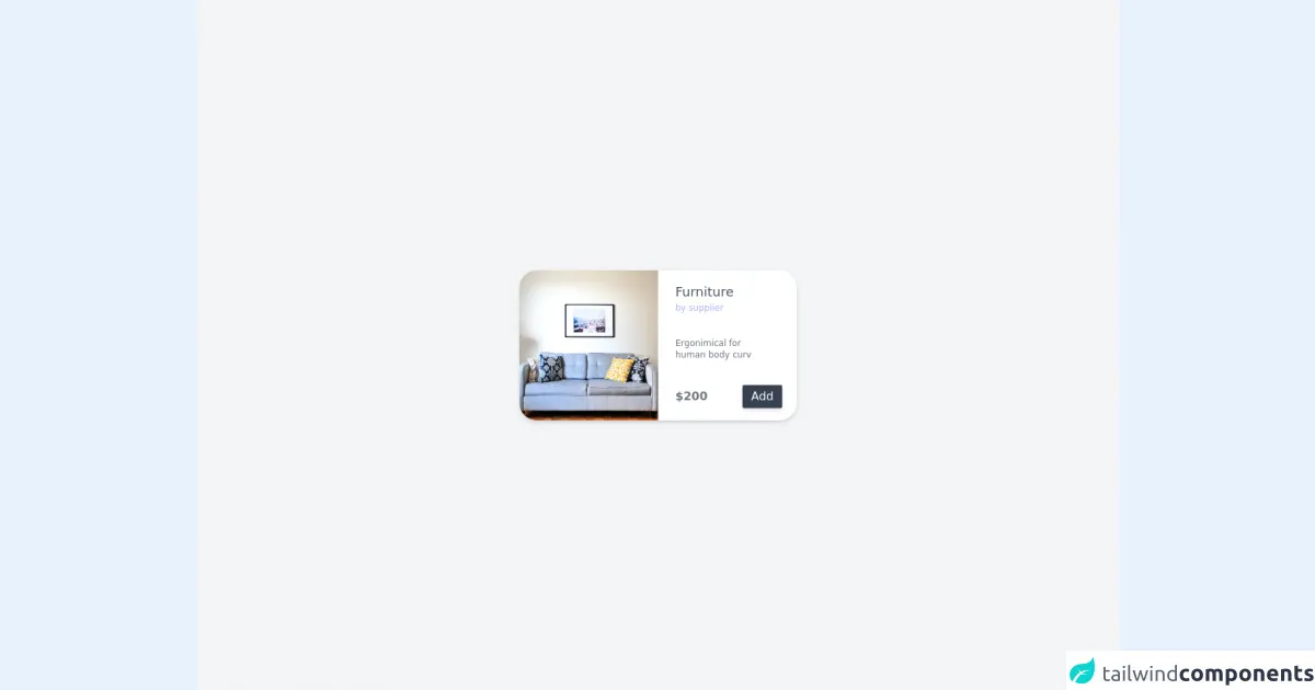
The preview of E commerce Card Component ui component
To create an E commerce Card Component with Tailwind CSS, we will use a grid layout to display multiple cards on a single page. Each card will contain an image, product name, and price. We will use Tailwind CSS classes to style the cards and make them responsive.
Free download of the E commerce Card Component's source code
The source code of E commerce Card Component ui component
To create the E commerce Card Component, we will use HTML and Tailwind CSS classes. The HTML will contain a grid layout with multiple cards. Each card will contain an image, product name, and price. The Tailwind CSS classes will be used to style the cards and make them responsive.
<div class="flex justify-center items-center h-screen bg-gray-100 w-full">
      <div
        class="
          bg-white
          shadow-md
          h-96
          mx-3
          rounded-3xl
          flex flex-col
          justify-around
          items-center
          overflow-hidden
          sm:flex-row sm:h-52 sm:w-3/5
          md:w-96
        "
      >
        <img
          class="h-1/2 w-full sm:h-full sm:w-1/2 object-cover"
          src="https://images.unsplash.com/photo-1484101403633-562f891dc89a?ixid=MnwxMjA3fDB8MHxwaG90by1wYWdlfHx8fGVufDB8fHx8&ixlib=rb-1.2.1&auto=format&fit=crop&w=1053&q=80"
          alt="image"
        />

        <div
          class="
            flex-1
            w-full
            flex flex-col
            items-baseline
            justify-around
            h-1/2
            pl-6
            sm:h-full sm:items-baseline sm:w-1/2
          "
        >
          <div class="flex flex-col justify-start items-baseline">
            <h1 class="text-lg font-normal mb-0 text-gray-600 font-sans">
              Furniture
            </h1>
            <span class="text-xs text-indigo-300 mt-0">by supplier</span>
          </div>
          <p class="text-xs text-gray-500 w-4/5">
            Ergonimical for human body curv
          </p>
          <div class="w-full flex justify-between items-center">
            <h1 class="font-bold text-gray-500">$200</h1>
            <button
              class="bg-gray-700 mr-5 text-white px-3 py-1 rounded-sm shadow-md"
            >
              Add
            </button>
          </div>
        </div>
      </div>
    </div>
How to create a E commerce Card Component with Tailwind CSS?
To create an E commerce Card Component with Tailwind CSS, follow these steps:
Step 1: Set up a new HTML file
Create a new HTML file and add the following code:
<!DOCTYPE html>
<html lang="en">
  <head>
    <meta charset="UTF-8" />
    <meta name="viewport" content="width=device-width, initial-scale=1.0" />
    <title>E commerce Card Component</title>
    <link rel="stylesheet" href="https://cdn.jsdelivr.net/npm/[email protected]/dist/tailwind.min.css" />
  </head>
  <body>
    <div class="container mx-auto">
      <div class="grid grid-cols-1 sm:grid-cols-2 md:grid-cols-3 lg:grid-cols-4 gap-4">
        <!-- Add cards here -->
      </div>
    </div>
  </body>
</html>
This code sets up a basic HTML file with a container and a grid layout.
Step 2: Add cards to the grid
Add the following code to the HTML file to create a card:
<div class="bg-white rounded-lg overflow-hidden shadow-md">
  <img src="https://source.unsplash.com/random/400x400" alt="Product" class="w-full h-48 object-cover" />
  <div class="p-4">
    <h2 class="font-bold text-xl mb-2">Product Name</h2>
    <p class="text-gray-700 font-semibold">$19.99</p>
  </div>
</div>
This code creates a card with an image, product name, and price.
Step 3: Style the cards
Add the following Tailwind CSS classes to the card to style it:
<div class="bg-white rounded-lg overflow-hidden shadow-md">
  <img src="https://source.unsplash.com/random/400x400" alt="Product" class="w-full h-48 object-cover" />
  <div class="p-4">
    <h2 class="font-bold text-xl mb-2">Product Name</h2>
    <p class="text-gray-700 font-semibold">$19.99</p>
  </div>
</div>
This code adds a background color, rounded corners, and a shadow to the card.
Step 4: Make the cards responsive
Add the following Tailwind CSS classes to the grid to make it responsive:
<div class="container mx-auto">
  <div class="grid grid-cols-1 sm:grid-cols-2 md:grid-cols-3 lg:grid-cols-4 gap-4">
    <!-- Add cards here -->
  </div>
</div>
This code makes the grid display one column on small screens, two columns on medium screens, three columns on large screens, and four columns on extra-large screens.
Conclusion
In this article, we learned how to create an E commerce Card Component with Tailwind CSS. We used a grid layout to display multiple cards on a single page. We used Tailwind CSS classes to style the cards and make them responsive. With Tailwind CSS, it is easy to create unique and responsive user interface components.