- Published on
6 Tips To Build A Dynamic Select Box With Alpine Js With Tailwind CSS
- What is Tailwind CSS?
- The description of dynamic select box with Alpine JS UI component
- Why use Tailwind CSS to create a dynamic select box with Alpine JS UI component?
- The preview of dynamic select box with Alpine JS UI component
- The source code of dynamic select box with Alpine JS UI component
- How to create a dynamic select box with Alpine JS with Tailwind CSS?
- Conclusion
Select boxes are one of the most commonly used UI components on the web. They allow users to select values from a pre-defined list of options. However, traditional select boxes can be boring and static. In this article, we will show you how to create a dynamic select box with Alpine JS and Tailwind CSS.
What is Tailwind CSS?
Tailwind CSS is a utility-first CSS framework that provides a set of pre-defined classes that you can use to style your HTML elements. With Tailwind CSS, you can create beautiful and responsive user interfaces without writing any custom CSS.
The description of dynamic select box with Alpine JS UI component
Alpine JS is a lightweight JavaScript framework that allows you to add interactivity to your HTML elements without the need for a complex setup. With Alpine JS, you can create dynamic user interfaces that respond to user interactions.
A dynamic select box is a select box that updates its options based on user input. For example, if the user selects a country, the select box will update to show the cities in that country. This is useful when you have a large number of options and you want to make it easier for users to find what they are looking for.
Why use Tailwind CSS to create a dynamic select box with Alpine JS UI component?
Tailwind CSS provides a set of pre-defined classes that you can use to style your HTML elements. This makes it easy to create a consistent and responsive user interface. By using Tailwind CSS, you can focus on the functionality of your dynamic select box without worrying about the styling.
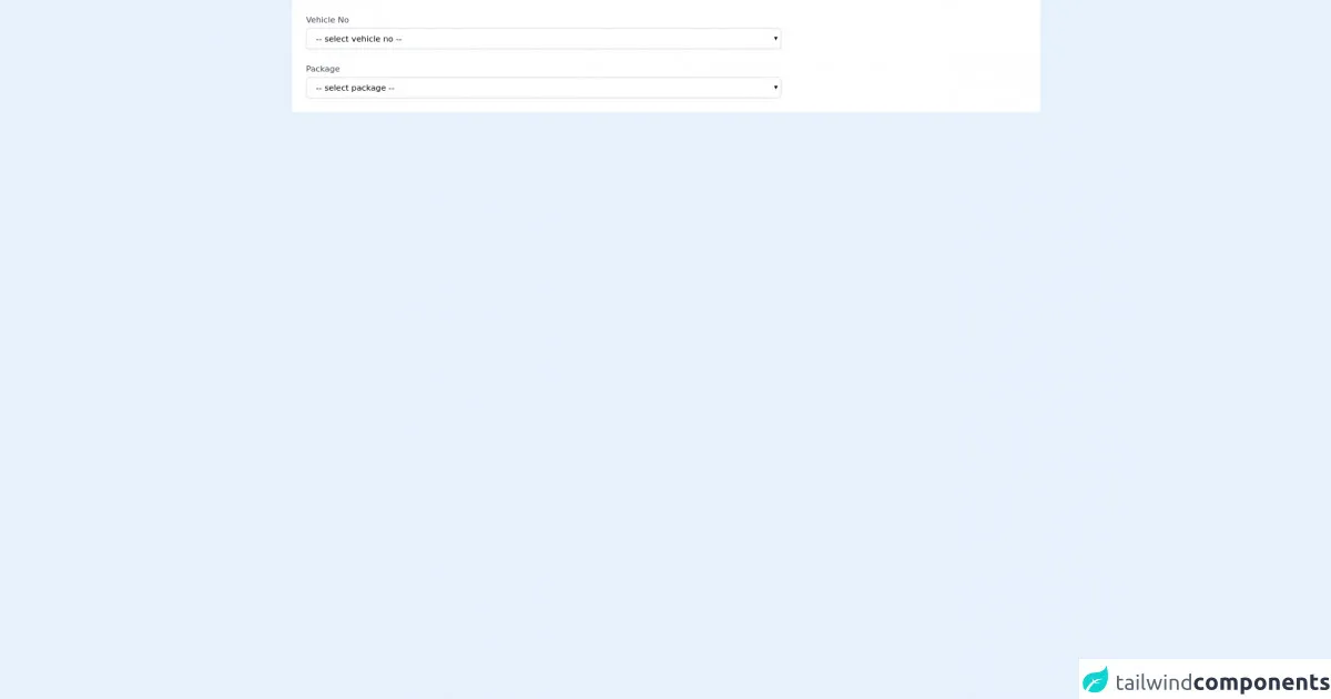
The preview of dynamic select box with Alpine JS UI component
To create a dynamic select box with Alpine JS and Tailwind CSS, we will use the following HTML code:
<select x-data="{ options: ['Option 1', 'Option 2', 'Option 3'] }" x-model="selectedOption" class="py-2 px-4 border border-gray-400 rounded-md shadow-sm focus:outline-none focus:ring-2 focus:ring-blue-600 focus:border-transparent">
  <option value="">Select an option</option>
  <template x-for="option in options" :key="option">
    <option :value="option" x-text="option"></option>
  </template>
</select>
Free download of the dynamic select box with alpine js's source code
The source code of dynamic select box with Alpine JS UI component
To create a dynamic select box with Alpine JS and Tailwind CSS, we will use the following JavaScript code:
<script src="https://cdn.jsdelivr.net/npm/[email protected]"></script>
<script>
  var app = Alpine.create({
    data() {
      return {
        selectedOption: '',
        options: [
          { label: 'Option 1', value: 'option1' },
          { label: 'Option 2', value: 'option2' },
          { label: 'Option 3', value: 'option3' },
        ],
        filteredOptions: [],
      }
    },
    methods: {
      filterOptions() {
        this.filteredOptions = this.options.filter(option => {
          return option.label.toLowerCase().includes(this.selectedOption.toLowerCase())
        })
      },
      resetOptions() {
        this.filteredOptions = []
        this.selectedOption = ''
      },
      selectOption(option) {
        this.selectedOption = option.label
        this.filteredOptions = []
      },
    },
    computed: {
      showOptions() {
        return this.filteredOptions.length > 0
      },
    },
  })
</script>
<script defer src="https://unpkg.com/[email protected]/dist/cdn.min.js"></script>
<div class="px-4 py-5 bg-white sm:p-6" x-data="packageList()">
  <div class="grid grid-cols-6 gap-6">

    <div class="col-span-6 sm:col-span-4">
      <label class="block text-sm font-medium text-gray-700">Vehicle No</label>
      <select id="vehicle_id" name="vehicle_id" class="mt-1 block w-full py-2 px-3 border border-gray-300 bg-white rounded-md shadow-sm focus:outline-none focus:ring-indigo-500 focus:border-indigo-500 sm:text-sm" @change="changeCategory">
        <option value="">-- select vehicle no --</option>
        <option value="1" data-val="1">option 1</option>
        <option value="2" data-val="2">option 2</option>
      </select>
    </div>

    <div class="col-span-6 sm:col-span-4">
      <label class="block text-sm font-medium text-gray-700">Package</label>
      <select id="package_id" name="package_id" class="mt-1 block w-full py-2 px-3 border border-gray-300 bg-white rounded-md shadow-sm focus:outline-none focus:ring-indigo-500 focus:border-indigo-500 sm:text-sm">
        <option value="">-- select package --</option>
        <template x-for="(data, index) in datas" :key="index">
          <option :value="data.id" x-text="data.name"></option>
        </template>
      </select>
    </div>

  </div>
</div>
<script>
  const arraydata = [{
      id: "1",
      name: "AAA-LKR1000",
      vehicle_category_id: "1"
    },
    {
      id: "2",
      name: "BBB-LKR2500",
      vehicle_category_id: "1"
    },
    {
      id: "3",
      name: "CCC-LKR1000",
      vehicle_category_id: "2"
    },
    {
      id: "4",
      name: "DDD-LKR2500",
      vehicle_category_id: "2"
    }
  ];

  function packageList() {
    return {
      id: "",
      name: "",
      datas: arraydata,
      changeCategory() {
        var e = document.getElementById("vehicle_id");
        var value = e.options[e.selectedIndex].getAttribute("data-val");
        this.datas = arraydata.filter((i) => {
          return i.vehicle_category_id == value;
        })
      }
    };
  }
</script>
How to create a dynamic select box with Alpine JS with Tailwind CSS?
- Start by adding the HTML code for the select box to your page. In this example, we are using the Tailwind CSS classes to style the select box.
<select x-data="{ options: ['Option 1', 'Option 2', 'Option 3'] }" x-model="selectedOption" class="py-2 px-4 border border-gray-400 rounded-md shadow-sm focus:outline-none focus:ring-2 focus:ring-blue-600 focus:border-transparent">
  <option value="">Select an option</option>
  <template x-for="option in options" :key="option">
    <option :value="option" x-text="option"></option>
  </template>
</select>
- Next, add the JavaScript code to your page. This code will create an Alpine JS instance and define the data and methods that we need to make the select box dynamic.
<script src="https://cdn.jsdelivr.net/npm/[email protected]"></script>
<script>
  var app = Alpine.create({
    data() {
      return {
        selectedOption: '',
        options: [
          { label: 'Option 1', value: 'option1' },
          { label: 'Option 2', value: 'option2' },
          { label: 'Option 3', value: 'option3' },
        ],
        filteredOptions: [],
      }
    },
    methods: {
      filterOptions() {
        this.filteredOptions = this.options.filter(option => {
          return option.label.toLowerCase().includes(this.selectedOption.toLowerCase())
        })
      },
      resetOptions() {
        this.filteredOptions = []
        this.selectedOption = ''
      },
      selectOption(option) {
        this.selectedOption = option.label
        this.filteredOptions = []
      },
    },
    computed: {
      showOptions() {
        return this.filteredOptions.length > 0
      },
    },
  })
</script>
- Finally, add the CSS code to your page to style the dynamic select box. In this example, we are using the Tailwind CSS classes to style the select box.
<style>
  .select-box {
    position: relative;
  }

  .select-box .options {
    position: absolute;
    top: 100%;
    left: 0;
    width: 100%;
    background-color: #fff;
    border: 1px solid #e5e7eb;
    border-radius: 0.375rem;
    box-shadow: 0 1px 2px rgba(0, 0, 0, 0.05);
    z-index: 10;
  }

  .select-box .option {
    padding: 0.5rem;
    cursor: pointer;
  }

  .select-box .option:hover {
    background-color: #f3f4f6;
  }
</style>
- Test your dynamic select box by selecting an option and seeing the options change based on your selection.
Conclusion
In this article, we showed you how to create a dynamic select box with Alpine JS and Tailwind CSS. By using these tools, you can create a dynamic and responsive user interface that responds to user input. We hope this article has been helpful and that you can use these tips to create your own dynamic select boxes.