- Published on
Surprisingly Effective Ways To Build A Duolingo - Register Login Card With Tailwind CSS
- What is Tailwind CSS?
- The description of Duolingo - Register Login Card UI component
- Why use Tailwind CSS to create a Duolingo - Register Login Card UI component?
- The preview of Duolingo - Register Login Card UI component
- The source code of Duolingo - Register Login Card UI component
- How to create a Duolingo - Register Login Card with Tailwind CSS?
- Conclusion
As a FrontEnd technology blogger, you must have heard about Tailwind CSS. It is a utility-first CSS framework that helps developers to create responsive and customizable designs quickly. In this article, we will discuss how to use Tailwind CSS to build a Duolingo - Register Login Card UI component.
What is Tailwind CSS?
Tailwind CSS is a utility-first CSS framework that provides a set of pre-defined CSS classes to create custom designs quickly. It is different from other CSS frameworks like Bootstrap or Foundation, which provide pre-designed components. Tailwind CSS provides low-level utility classes that can be combined to create custom designs.
The description of Duolingo - Register Login Card UI component
Duolingo is a language-learning platform that provides interactive lessons and quizzes to learn new languages. The Duolingo - Register Login Card UI component is a card that displays the login and registration form for the Duolingo platform. It has a simple and clean design that is easy to use.
Why use Tailwind CSS to create a Duolingo - Register Login Card UI component?
Tailwind CSS provides a set of utility classes that can be used to create custom designs quickly. It reduces the amount of CSS code required to create custom designs. The Duolingo - Register Login Card UI component can be created using Tailwind CSS in a few lines of code.
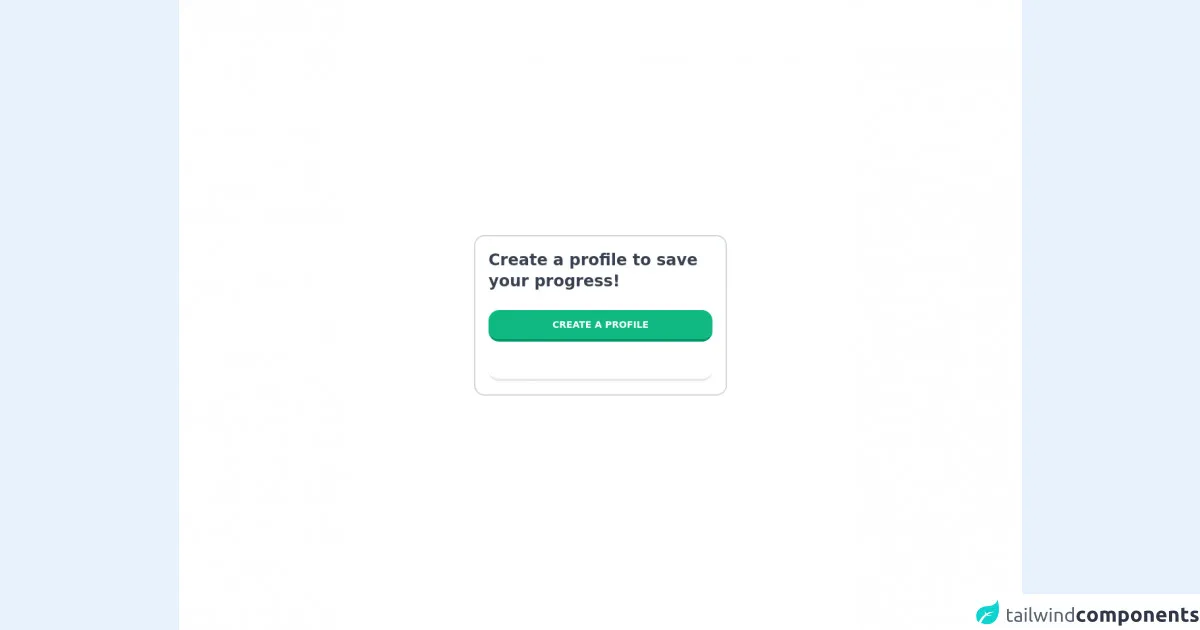
The preview of Duolingo - Register Login Card UI component
The Duolingo - Register Login Card UI component has a simple and clean design. It has a white background with a green accent color. The card has two tabs, one for login and the other for registration. The login tab has two input fields for email and password, while the registration tab has three input fields for name, email, and password.
Free download of the Duolingo - Register Login Card's source code
The source code of Duolingo - Register Login Card UI component
The Duolingo - Register Login Card UI component can be created using HTML and Tailwind CSS. The HTML code for the card is as follows:
<div class="bg-white rounded-lg shadow-lg">
  <div class="flex justify-center items-center h-16 bg-green-500 rounded-t-lg">
    <h1 class="text-white font-bold text-lg">Duolingo</h1>
  </div>
  <div class="p-6">
    <ul class="flex border-b">
      <li class="-mb-px mr-1">
        <a class="bg-white inline-block py-2 px-4 font-semibold" href="#">Login</a>
      </li>
      <li class="mr-1">
        <a class="bg-white inline-block py-2 px-4 font-semibold" href="#">Register</a>
      </li>
    </ul>
    <div class="py-4">
      <div class="tab-content">
        <div class="tab-pane active" id="login">
          <form>
            <div class="mb-4">
              <label class="block text-gray-700 font-bold mb-2" for="email">
                Email
              </label>
              <input
                class="shadow appearance-none border rounded w-full py-2 px-3 text-gray-700 leading-tight focus:outline-none focus:shadow-outline"
                id="email" type="email" placeholder="Email">
            </div>
            <div class="mb-6">
              <label class="block text-gray-700 font-bold mb-2" for="password">
                Password
              </label>
              <input
                class="shadow appearance-none border rounded w-full py-2 px-3 text-gray-700 mb-3 leading-tight focus:outline-none focus:shadow-outline"
                id="password" type="password" placeholder="Password">
            </div>
            <div class="flex items-center justify-between">
              <button
                class="bg-green-500 hover:bg-green-700 text-white font-bold py-2 px-4 rounded focus:outline-none focus:shadow-outline"
                type="button">
                Sign In
              </button>
            </div>
          </form>
        </div>
        <div class="tab-pane" id="register">
          <form>
            <div class="mb-4">
              <label class="block text-gray-700 font-bold mb-2" for="name">
                Name
              </label>
              <input
                class="shadow appearance-none border rounded w-full py-2 px-3 text-gray-700 leading-tight focus:outline-none focus:shadow-outline"
                id="name" type="text" placeholder="Name">
            </div>
            <div class="mb-4">
              <label class="block text-gray-700 font-bold mb-2" for="email">
                Email
              </label>
              <input
                class="shadow appearance-none border rounded w-full py-2 px-3 text-gray-700 leading-tight focus:outline-none focus:shadow-outline"
                id="email" type="email" placeholder="Email">
            </div>
            <div class="mb-6">
              <label class="block text-gray-700 font-bold mb-2" for="password">
                Password
              </label>
              <input
                class="shadow appearance-none border rounded w-full py-2 px-3 text-gray-700 mb-3 leading-tight focus:outline-none focus:shadow-outline"
                id="password" type="password" placeholder="Password">
            </div>
            <div class="flex items-center justify-between">
              <button
                class="bg-green-500 hover:bg-green-700 text-white font-bold py-2 px-4 rounded focus:outline-none focus:shadow-outline"
                type="button">
                Register
              </button>
            </div>
          </form>
        </div>
      </div>
    </div>
  </div>
</div>
The CSS code for the card is as follows:
@media (min-width: 640px) {
  .tab-content {
    display: flex;
    flex-wrap: wrap;
    margin-left: -15px;
    margin-right: -15px;
  }
  .tab-pane {
    flex-basis: 0;
    flex-grow: 1;
    max-width: 100%;
  }
}
<div class="bg-white h-screen flex items-center justify-center">

  <!-- Card -->
  <card class="border-2 border-gray-300 rounded-2xl p-5 w-96">

    <!-- Caption -->
    <p class="text-2xl font-bold text-gray-700">Create a profile to save your progress!</p>

    <!-- Register Button -->
    <button class="hover:bg-green-400 bg-green-500 delay-75 duration-100 text-white text-sm font-bold rounded-2xl w-full py-3 mt-7 border-b-4 border-b-green-600">CREATE A PROFILE</button>

    <!-- Login Button -->
    <button class="hover:bg-sky-400 bg-sky-500 delay-75 duration-100 text-white text-sm font-bold rounded-2xl w-full py-3 mt-3 border-b-4 border-b-sky-600">SIGN IN</button>

  </card>

</div>
How to create a Duolingo - Register Login Card with Tailwind CSS?
To create a Duolingo - Register Login Card with Tailwind CSS, follow these steps:
- Create a new HTML file and add the HTML code for the card.
- Add the Tailwind CSS CDN link to the head section of the HTML file.
- Add the CSS code for the card to the style section of the HTML file.
- Customize the card by adding or modifying the Tailwind CSS classes.
Conclusion
In this article, we discussed how to use Tailwind CSS to create a Duolingo - Register Login Card UI component. Tailwind CSS provides a set of utility classes that can be used to create custom designs quickly. The Duolingo - Register Login Card UI component can be created using HTML and Tailwind CSS in a few lines of code. With Tailwind CSS, you can create responsive and customizable designs quickly and efficiently.