- Published on
6 Incredibly Easy Ways To Make A Dropzone Upload With Tailwind CSS Better While Spending Less
- What is Tailwind CSS?
- The description of Dropzone upload ui component
- Why use Tailwind CSS to create a Dropzone upload ui component?
- The preview of Dropzone upload ui component
- The source code of Dropzone upload ui component
- How to create a Dropzone upload with Tailwind CSS?
- Conclusion
Are you looking for an easy way to create a Dropzone upload with Tailwind CSS? Look no further! In this article, we will walk you through the process of creating a Dropzone upload with Tailwind CSS. We will also provide you with some tips to make your Dropzone upload even better while spending less time and effort.
What is Tailwind CSS?
Tailwind CSS is a utility-first CSS framework that makes it easy to create responsive and customizable UI components. With Tailwind CSS, you can quickly create complex layouts and styles without writing a lot of custom CSS.
The description of Dropzone upload ui component
A Dropzone upload is a UI component that allows users to upload files by dragging and dropping them onto a designated area. It is a popular UI component for file uploads and is used on many websites and applications.
Why use Tailwind CSS to create a Dropzone upload ui component?
Tailwind CSS makes it easy to create a Dropzone upload UI component with minimal CSS code. It provides a set of pre-defined classes that you can use to style your UI component. This means that you don't have to spend a lot of time writing custom CSS code to create your Dropzone upload.
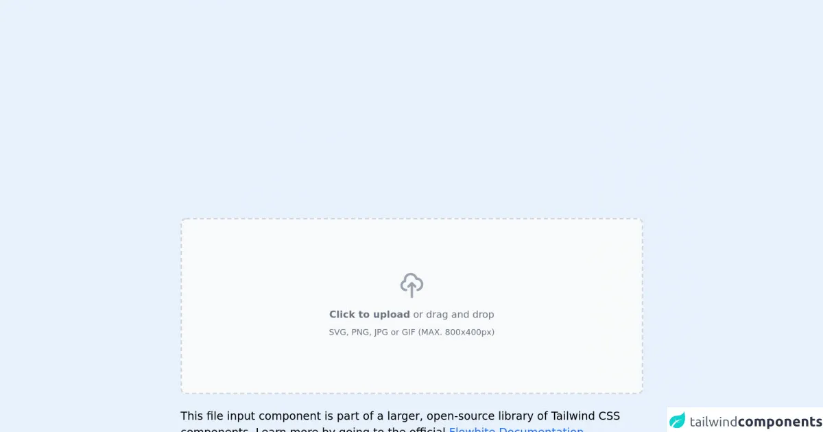
The preview of Dropzone upload ui component
To create a Dropzone upload with Tailwind CSS, you can use the following classes:
bg-gray-100: Sets the background color of the Dropzone upload to gray.border-dashed: Sets the border style of the Dropzone upload to dashed.border-2: Sets the border width of the Dropzone upload to 2 pixels.border-gray-400: Sets the border color of the Dropzone upload to gray.rounded-lg: Rounds the corners of the Dropzone upload.
Free download of the Dropzone upload's source code
The source code of Dropzone upload ui component
To create a Dropzone upload with Tailwind CSS, you can use the following HTML code:
<div class="bg-gray-100 border-dashed border-2 border-gray-400 rounded-lg p-4">
  <div class="text-center">
    <svg class="mx-auto h-12 w-12 text-gray-400" stroke="currentColor" fill="none" viewBox="0 0 48 48" aria-hidden="true">
      <path d="M20 30a4 4 0 110-8 4 4 0 010 8zm8 0a4 4 0 110-8 4 4 0 010 8zm8 0a4 4 0 110-8 4 4 0 010 8z"></path>
      <path d="M34.5 19H13.5a1.5 1.5 0 00-1.5 1.5v16.5a1.5 1.5 0 001.5 1.5h21a1.5 1.5 0 001.5-1.5V20.5a1.5 1.5 0 00-1.5-1.5zm-1.5 16.5H15V22.5h18v13.5z"></path>
    </svg>
    <div class="mt-2 text-sm text-gray-600">
      <label for="file-upload" class="relative cursor-pointer bg-white rounded-md font-medium text-indigo-600 hover:text-indigo-500 focus-within:outline-none focus-within:ring-2 focus-within:ring-offset-2 focus-within:ring-indigo-500">
        <span>Upload a file</span>
        <input id="file-upload" name="file-upload" type="file" class="sr-only">
      </label>
      <p class="pl-1">or drag and drop</p>
    </div>
    <p class="mt-1 text-xs text-gray-500">
      PNG, JPG, GIF up to 10MB
    </p>
  </div>
</div>
<link rel="stylesheet" href="https://unpkg.com/[email protected]/dist/flowbite.min.css" />

<!-- This is an example component -->
<div class="max-w-2xl mx-auto">

	<div class="flex items-center justify-center w-full">
        <label for="dropzone-file" class="flex flex-col items-center justify-center w-full h-64 border-2 border-gray-300 border-dashed rounded-lg cursor-pointer bg-gray-50 dark:hover:bg-bray-800 dark:bg-gray-700 hover:bg-gray-100 dark:border-gray-600 dark:hover:border-gray-500 dark:hover:bg-gray-600">
            <div class="flex flex-col items-center justify-center pt-5 pb-6">
                <svg class="w-10 h-10 mb-3 text-gray-400" fill="none" stroke="currentColor" viewBox="0 0 24 24" xmlns="http://www.w3.org/2000/svg"><path stroke-linecap="round" stroke-linejoin="round" stroke-width="2" d="M7 16a4 4 0 01-.88-7.903A5 5 0 1115.9 6L16 6a5 5 0 011 9.9M15 13l-3-3m0 0l-3 3m3-3v12"></path></svg>
                <p class="mb-2 text-sm text-gray-500 dark:text-gray-400"><span class="font-semibold">Click to upload</span> or drag and drop</p>
                <p class="text-xs text-gray-500 dark:text-gray-400">SVG, PNG, JPG or GIF (MAX. 800x400px)</p>
            </div>
            <input id="dropzone-file" type="file" class="hidden" />
        </label>
    </div>

	<p class="mt-5">This file input component is part of a larger, open-source library of Tailwind CSS components. Learn
		more
		by going to the official <a class="text-blue-600 hover:underline"
			href="https://flowbite.com/docs/getting-started/introduction/" target="_blank">Flowbite Documentation</a>.
	</p>
    <script src="https://unpkg.com/[email protected]/dist/flowbite.js"></script>
</div>
How to create a Dropzone upload with Tailwind CSS?
To create a Dropzone upload with Tailwind CSS, follow these steps:
- Create a new HTML file and add the above HTML code to it.
- Add the Tailwind CSS CDN to your HTML file.
<link rel="stylesheet" href="https://cdn.jsdelivr.net/npm/tailwindcss@latest/dist/tailwind.min.css">
- Save your HTML file and open it in a web browser.
Your Dropzone upload should now be visible on the web page. You can customize the appearance of your Dropzone upload by modifying the Tailwind CSS classes in the HTML code.
Conclusion
Creating a Dropzone upload with Tailwind CSS is easy and can save you a lot of time and effort. By using pre-defined Tailwind CSS classes, you can quickly create a professional-looking UI component without writing a lot of custom CSS code. We hope that this article has helped you create a Dropzone upload with Tailwind CSS.