- Published on
6 Easy Ways To Build A Dropdown With Search Box With Tailwind CSS
- What is Tailwind CSS?
- The description of Dropdown with search box ui component
- Why use Tailwind CSS to create a Dropdown with search box ui component?
- The preview of Dropdown with search box ui component
- The source code of Dropdown with search box ui component
- How to create a Dropdown with search box with Tailwind CSS?
- Step 1: Set up your HTML
- Step 2: Style the dropdown button
- Step 3: Style the list of options
- Step 4: Add the search box functionality
- Conclusion
As a FrontEnd technology blogger, you must have heard of Tailwind CSS, a utility-first CSS framework that helps you quickly build custom designs. In this article, we will explore how to use Tailwind CSS to create a Dropdown with search box ui component. We will cover the description of the component, why use Tailwind CSS to create it, the preview, source code, and how to create it.
What is Tailwind CSS?
Tailwind CSS is a utility-first CSS framework that helps you quickly build custom designs. It provides a set of pre-defined classes that you can use to style your HTML elements. With Tailwind CSS, you don't have to write custom CSS code from scratch, which can save you a lot of time.
The description of Dropdown with search box ui component
A Dropdown with search box ui component is a user interface element that allows users to select an option from a list of options. It consists of a dropdown button and a list of options. When the user clicks on the dropdown button, the list of options appears, and the user can select an option. The search box allows the user to search for a specific option by typing in the search box.
Why use Tailwind CSS to create a Dropdown with search box ui component?
Tailwind CSS provides a set of pre-defined classes that you can use to style your HTML elements. This means that you don't have to write custom CSS code from scratch, which can save you a lot of time. Additionally, Tailwind CSS is highly customizable, which means that you can easily modify the styles to fit your design needs.
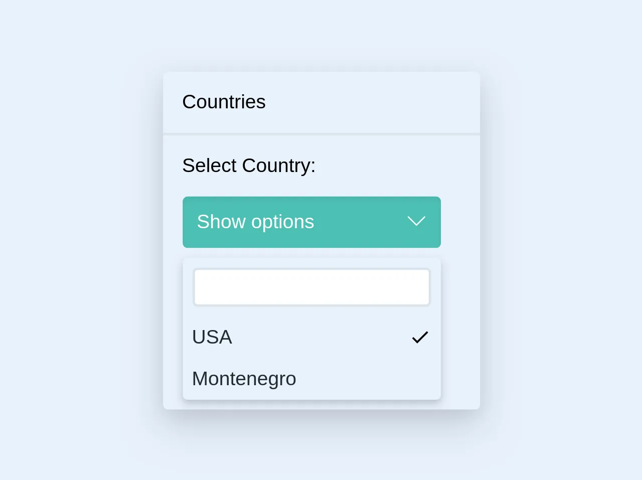
The preview of Dropdown with search box ui component
Free download of the Dropdown with search box's source code
The source code of Dropdown with search box ui component
<div class="max-w-sm rounded overflow-hidden shadow-lg">
        <p class="p-4">Countries</p>
        <div class="border-b-2 m-0"></div>
        <p class="p-4">Select Country: </p>
        <div class="mr-8 ml-4">
          <div class="relative">
              <button class="bg-teal p-3 rounded text-white shadow-inner w-full">
                <span class="float-left">Show options</span>

                <svg class="h-4 float-right fill-current text-white" version="1.1" xmlns="http://www.w3.org/2000/svg" viewBox="0 0 129 129" xmlns:xlink="http://www.w3.org/1999/xlink" enable-background="new 0 0 129 129">
                  <g>
                    <path d="m121.3,34.6c-1.6-1.6-4.2-1.6-5.8,0l-51,51.1-51.1-51.1c-1.6-1.6-4.2-1.6-5.8,0-1.6,1.6-1.6,4.2 0,5.8l53.9,53.9c0.8,0.8 1.8,1.2 2.9,1.2 1,0 2.1-0.4 2.9-1.2l53.9-53.9c1.7-1.6 1.7-4.2 0.1-5.8z"/>
                  </g>
                </svg>
              </button>
              <div class="rounded shadow-md my-2 relative pin-t pin-l">
                  <ul class="list-reset">
                    <li class="p-2"><input class="border-2 rounded h-8 w-full"><br></li>
                    <li><p class="p-2 block text-black hover:bg-grey-light cursor-pointer">
                        USA
                        <svg class="float-right" xmlns="http://www.w3.org/2000/svg" width="18" height="18" viewBox="0 0 18 18"><path d="M6.61 11.89L3.5 8.78 2.44 9.84 6.61 14l8.95-8.95L14.5 4z"/></svg>
                    </p></li>
                    <li><p class="p-2 block text-black hover:bg-grey-light cursor-pointer">Montenegro</p></li>
                  </ul>
              </div>
          </div>
        </div>
    </div>
How to create a Dropdown with search box with Tailwind CSS?
Now, let's dive into how to create a Dropdown with search box with Tailwind CSS.
Step 1: Set up your HTML
The first step is to set up your HTML. You will need to create a dropdown button and a list of options. Additionally, you will need to add a search box to the dropdown button. Here's an example:
<div class="relative">
  <div>
    <button class="relative z-10 block rounded-md bg-white p-2 text-gray-700 w-full">
      <span class="flex items-center">
        <span class="ml-3 block truncate">Select an option</span>
      </span>
      <span class="absolute inset-y-0 right-0 flex items-center pr-2 pointer-events-none">
        <svg class="h-5 w-5 text-gray-400" viewBox="0 0 20 20" fill="none" stroke="currentColor">
          <path d="M10 12a2 2 0 100-4 2 2 0 000 4z" />
          <path fill-rule="evenodd" clip-rule="evenodd" d="M2 6a2 2 0 012-2h12a2 2 0 012 2v8a2 2 0 01-2 2H4a2 2 0 01-2-2V6zm2-2a2 2 0 00-2 2v8a2 2 0 002 2h12a2 2 0 002-2V6a2 2 0 00-2-2H4z" fill="currentColor" />
        </svg>
      </span>
    </button>
  </div>
  <div class="absolute z-20 mt-1 bg-white rounded-md shadow-lg">
    <ul class="max-h-56 overflow-y-auto">
      <li class="cursor-pointer px-3 py-2 hover:bg-gray-100">Option 1</li>
      <li class="cursor-pointer px-3 py-2 hover:bg-gray-100">Option 2</li>
      <li class="cursor-pointer px-3 py-2 hover:bg-gray-100">Option 3</li>
      <li class="cursor-pointer px-3 py-2 hover:bg-gray-100">Option 4</li>
      <li class="cursor-pointer px-3 py-2 hover:bg-gray-100">Option 5</li>
      <li class="cursor-pointer px-3 py-2 hover:bg-gray-100">Option 6</li>
      <li class="cursor-pointer px-3 py-2 hover:bg-gray-100">Option 7</li>
      <li class="cursor-pointer px-3 py-2 hover:bg-gray-100">Option 8</li>
      <li class="cursor-pointer px-3 py-2 hover:bg-gray-100">Option 9</li>
      <li class="cursor-pointer px-3 py-2 hover:bg-gray-100">Option 10</li>
    </ul>
  </div>
</div>
Step 2: Style the dropdown button
The next step is to style the dropdown button. You can use Tailwind CSS classes to style the button. Here's an example:
.relative {
  position: relative;
}

.z-10 {
  z-index: 10;
}

.block {
  display: block;
}

.rounded-md {
  border-radius: 0.375rem;
}

.bg-white {
  background-color: #fff;
}

.p-2 {
  padding: 0.5rem;
}

.text-gray-700 {
  color: #4a5568;
}

.w-full {
  width: 100%;
}

.flex {
  display: flex;
}

.items-center {
  align-items: center;
}

.ml-3 {
  margin-left: 0.75rem;
}

.truncate {
  overflow: hidden;
  text-overflow: ellipsis;
  white-space: nowrap;
}

.absolute {
  position: absolute;
}

.inset-y-0 {
  top: 0;
  bottom: 0;
}

.right-0 {
  right: 0;
}

.pr-2 {
  padding-right: 0.5rem;
}

.pointer-events-none {
  pointer-events: none;
}
Step 3: Style the list of options
The next step is to style the list of options. You can use Tailwind CSS classes to style the list. Here's an example:
.mt-1 {
  margin-top: 0.25rem;
}

.shadow-lg {
  box-shadow: 0 10px 15px -3px rgba(0, 0, 0, 0.1), 0 4px 6px -2px rgba(0, 0, 0, 0.05);
}

.max-h-56 {
  max-height: 14rem;
}

.overflow-y-auto {
  overflow-y: auto;
}

.cursor-pointer {
  cursor: pointer;
}

.px-3 {
  padding-left: 0.75rem;
  padding-right: 0.75rem;
}

.py-2 {
  padding-top: 0.5rem;
  padding-bottom: 0.5rem;
}

.hover\:bg-gray-100:hover {
  background-color: #f7fafc;
}
Step 4: Add the search box functionality
The final step is to add the search box functionality. You can use JavaScript to add the search box functionality. Here's an example:
const dropdownButton = document.querySelector('.dropdown-button');
const dropdownList = document.querySelector('.dropdown-list');
const dropdownOptions = document.querySelectorAll('.dropdown-option');

dropdownButton.addEventListener('click', () => {
  dropdownList.classList.toggle('hidden');
});

const searchBox = document.querySelector('.search-box');

searchBox.addEventListener('input', () => {
  const searchText = searchBox.value.toLowerCase();

  dropdownOptions.forEach(option => {
    const optionText = option.textContent.toLowerCase();

    if (optionText.includes(searchText)) {
      option.classList.remove('hidden');
    } else {
      option.classList.add('hidden');
    }
  });
});
Conclusion
In conclusion, creating a Dropdown with search box ui component with Tailwind CSS is easy and straightforward. By using Tailwind CSS, you can save a lot of time and easily customize the styles to fit your design needs. With the steps outlined in this article, you should be able to create a Dropdown with search box ui component in no time.