- Published on
How To Make A Dropdown Shopping Cart With Tailwind CSS In 6 Easy Steps?
- What is Tailwind CSS?
- The description of Dropdown shopping cart ui component
- Why use Tailwind CSS to create a Dropdown shopping cart ui component?
- The preview of Dropdown shopping cart ui component
- The source code of Dropdown shopping cart ui component
- How to create a Dropdown shopping cart with Tailwind CSS?
- Step 1: Set up the HTML structure
- Step 2: Add Tailwind CSS classes
- Step 3: Add hover and focus styles
- Step 4: Add cart items
- Step 5: Add animation
- Step 6: Add JavaScript
- Conclusion
What is Tailwind CSS?
Tailwind CSS is a utility-first CSS framework that provides a set of pre-defined classes to create custom designs quickly. It is a popular choice among developers and designers because it allows them to create designs without writing custom CSS code.
The description of Dropdown shopping cart ui component
A dropdown shopping cart is a user interface component that allows users to view their shopping cart items in a dropdown menu. It is a convenient way for users to keep track of their purchases and make changes to their orders.
Why use Tailwind CSS to create a Dropdown shopping cart ui component?
Tailwind CSS provides a set of pre-defined classes that can be used to create a dropdown shopping cart quickly. It also allows developers to customize the design easily without writing custom CSS code. This makes it an ideal choice for creating user interface components like dropdown shopping carts.
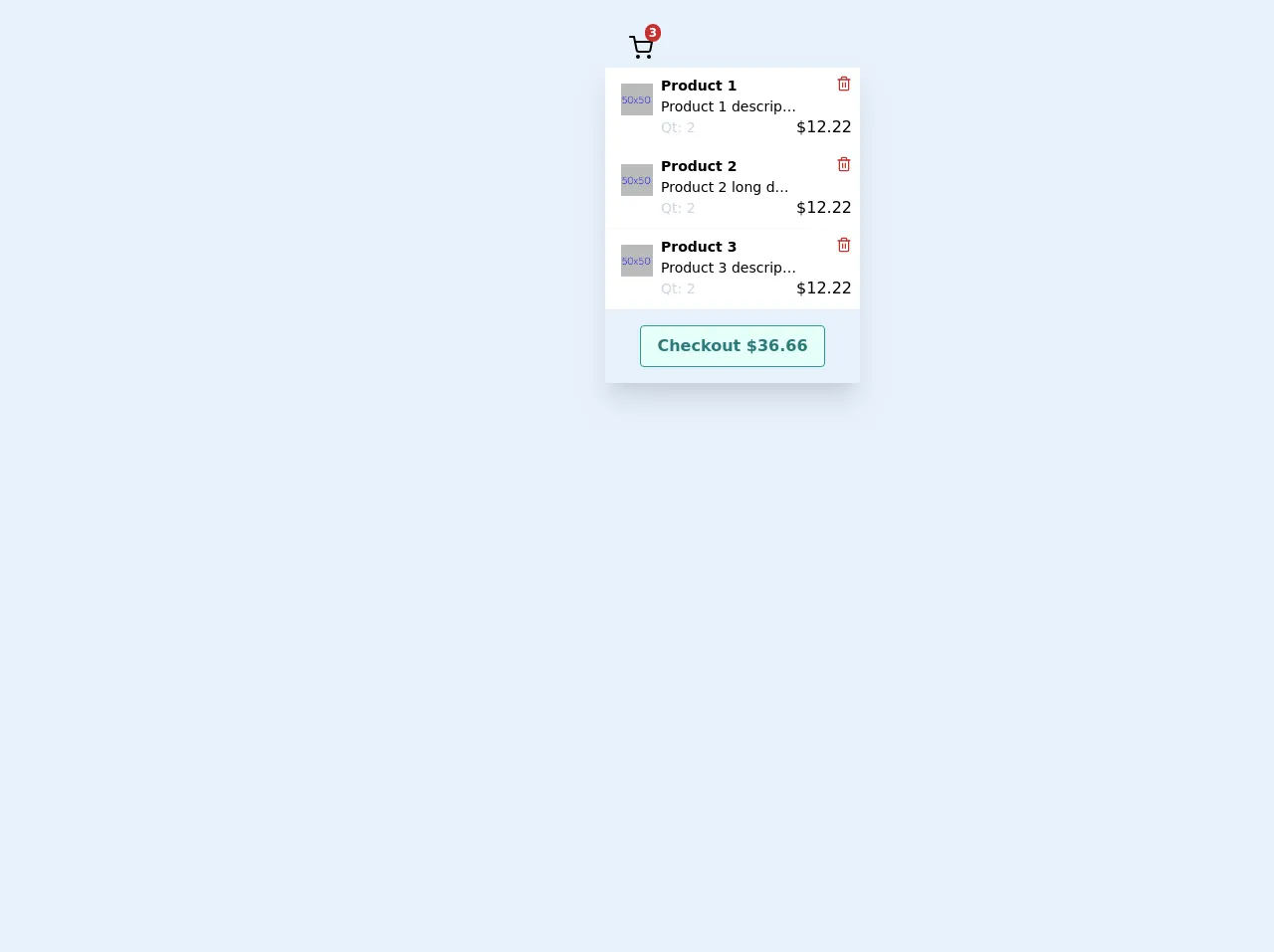
The preview of Dropdown shopping cart ui component
To create a dropdown shopping cart with Tailwind CSS, we will use a combination of HTML and CSS code. The end result will be a dropdown menu that displays the items in the user's shopping cart.
Free download of the Dropdown shopping cart's source code
The source code of Dropdown shopping cart ui component
To create a dropdown shopping cart with Tailwind CSS, we will use a combination of HTML and CSS code. The HTML code will define the structure of the dropdown menu, while the CSS code will define the styles and animations.
<div class="p-5">
<div class="flex h-64 justify-center">
<div class="relative ">
<div class="flex flex-row cursor-pointer truncate p-2 px-4 rounded">
<div></div>
<div class="flex flex-row-reverse ml-2 w-full">
<div slot="icon" class="relative">
<div class="absolute text-xs rounded-full -mt-1 -mr-2 px-1 font-bold top-0 right-0 bg-red-700 text-white">3</div>
<svg xmlns="http://www.w3.org/2000/svg" width="100%" height="100%" fill="none" viewBox="0 0 24 24" stroke="currentColor" stroke-width="2" stroke-linecap="round" stroke-linejoin="round" class="feather feather-shopping-cart w-6 h-6 mt-2">
<circle cx="9" cy="21" r="1"></circle>
<circle cx="20" cy="21" r="1"></circle>
<path d="M1 1h4l2.68 13.39a2 2 0 0 0 2 1.61h9.72a2 2 0 0 0 2-1.61L23 6H6"></path>
</svg>
</div>
</div>
</div>
<div class="absolute w-full rounded-b border-t-0 z-10">
<div class="shadow-xl w-64">
<div class="p-2 flex bg-white hover:bg-gray-100 cursor-pointer border-b border-gray-100" style="">
<div class="p-2 w-12"><img src="https://dummyimage.com/50x50/bababa/0011ff&text=50x50" alt="img product"></div>
<div class="flex-auto text-sm w-32">
<div class="font-bold">Product 1</div>
<div class="truncate">Product 1 description</div>
<div class="text-gray-400">Qt: 2</div>
</div>
<div class="flex flex-col w-18 font-medium items-end">
<div class="w-4 h-4 mb-6 hover:bg-red-200 rounded-full cursor-pointer text-red-700">
<svg xmlns="http://www.w3.org/2000/svg" width="100%" height="100%" fill="none" viewBox="0 0 24 24" stroke="currentColor" stroke-width="2" stroke-linecap="round" stroke-linejoin="round" class="feather feather-trash-2 ">
<polyline points="3 6 5 6 21 6"></polyline>
<path d="M19 6v14a2 2 0 0 1-2 2H7a2 2 0 0 1-2-2V6m3 0V4a2 2 0 0 1 2-2h4a2 2 0 0 1 2 2v2"></path>
<line x1="10" y1="11" x2="10" y2="17"></line>
<line x1="14" y1="11" x2="14" y2="17"></line>
</svg>
</div>
$12.22</div>
</div>
<div class="p-2 flex bg-white hover:bg-gray-100 cursor-pointer border-b border-gray-100" style="">
<div class="p-2 w-12"><img src="https://dummyimage.com/50x50/bababa/0011ff&text=50x50" alt="img product"></div>
<div class="flex-auto text-sm w-32">
<div class="font-bold">Product 2</div>
<div class="truncate">Product 2 long description</div>
<div class="text-gray-400">Qt: 2</div>
</div>
<div class="flex flex-col w-18 font-medium items-end">
<div class="w-4 h-4 mb-6 hover:bg-red-200 rounded-full cursor-pointer text-red-700">
<svg xmlns="http://www.w3.org/2000/svg" width="100%" height="100%" fill="none" viewBox="0 0 24 24" stroke="currentColor" stroke-width="2" stroke-linecap="round" stroke-linejoin="round" class="feather feather-trash-2 ">
<polyline points="3 6 5 6 21 6"></polyline>
<path d="M19 6v14a2 2 0 0 1-2 2H7a2 2 0 0 1-2-2V6m3 0V4a2 2 0 0 1 2-2h4a2 2 0 0 1 2 2v2"></path>
<line x1="10" y1="11" x2="10" y2="17"></line>
<line x1="14" y1="11" x2="14" y2="17"></line>
</svg>
</div>
$12.22</div>
</div>
<div class="p-2 flex bg-white hover:bg-gray-100 cursor-pointer border-b border-gray-100" style="">
<div class="p-2 w-12"><img src="https://dummyimage.com/50x50/bababa/0011ff&text=50x50" alt="img product"></div>
<div class="flex-auto text-sm w-32">
<div class="font-bold">Product 3</div>
<div class="truncate">Product 3 description</div>
<div class="text-gray-400">Qt: 2</div>
</div>
<div class="flex flex-col w-18 font-medium items-end">
<div class="w-4 h-4 mb-6 hover:bg-red-200 rounded-full cursor-pointer text-red-700">
<svg xmlns="http://www.w3.org/2000/svg" width="100%" height="100%" fill="none" viewBox="0 0 24 24" stroke="currentColor" stroke-width="2" stroke-linecap="round" stroke-linejoin="round" class="feather feather-trash-2 ">
<polyline points="3 6 5 6 21 6"></polyline>
<path d="M19 6v14a2 2 0 0 1-2 2H7a2 2 0 0 1-2-2V6m3 0V4a2 2 0 0 1 2-2h4a2 2 0 0 1 2 2v2"></path>
<line x1="10" y1="11" x2="10" y2="17"></line>
<line x1="14" y1="11" x2="14" y2="17"></line>
</svg>
</div>
$12.22</div>
</div>
<div class="p-4 justify-center flex">
<button class="text-base undefined hover:scale-110 focus:outline-none flex justify-center px-4 py-2 rounded font-bold cursor-pointer
hover:bg-teal-700 hover:text-teal-100
bg-teal-100
text-teal-700
border duration-200 ease-in-out
border-teal-600 transition">Checkout $36.66</button>
</div>
</div>
</div>
</div>
</div>
<div class="h-32"></div>
</div>
How to create a Dropdown shopping cart with Tailwind CSS?
Here are the six easy steps to create a dropdown shopping cart with Tailwind CSS:
Step 1: Set up the HTML structure
The first step is to set up the HTML structure of the dropdown menu. We will use a div element to wrap the entire dropdown menu, and a button element to trigger the dropdown menu. Inside the div element, we will create a ul element to display the items in the shopping cart.
<div class="relative">
  <button class="flex items-center">
    <svg class="w-6 h-6 fill-current mr-2" viewBox="0 0 24 24">
      <path d="M5.293 7.293a1 1 0 011.414 0L12 12.586l5.293-5.293a1 1 0 111.414 1.414l-6 6a1 1 0 01-1.414 0l-6-6a1 1 0 010-1.414z"/>
    </svg>
    <span class="text-sm font-medium">Cart</span>
    <span class="ml-1 text-sm font-medium text-gray-500">(0)</span>
  </button>
  <ul class="absolute right-0 w-56 mt-2 bg-white rounded-md shadow-lg">
    <!-- Cart items will be displayed here -->
  </ul>
</div>
Step 2: Add Tailwind CSS classes
Next, we will add Tailwind CSS classes to the HTML elements to style the dropdown menu. We will use the relative and absolute classes to position the dropdown menu, the bg-white and rounded-md classes to style the background and border radius, and the shadow-lg class to add a drop shadow.
<div class="relative">
  <button class="flex items-center">
    <svg class="w-6 h-6 fill-current mr-2" viewBox="0 0 24 24">
      <path d="M5.293 7.293a1 1 0 011.414 0L12 12.586l5.293-5.293a1 1 0 111.414 1.414l-6 6a1 1 0 01-1.414 0l-6-6a1 1 0 010-1.414z"/>
    </svg>
    <span class="text-sm font-medium">Cart</span>
    <span class="ml-1 text-sm font-medium text-gray-500">(0)</span>
  </button>
  <ul class="absolute right-0 w-56 mt-2 bg-white rounded-md shadow-lg">
    <!-- Cart items will be displayed here -->
  </ul>
</div>
Step 3: Add hover and focus styles
We will add hover and focus styles to the button element to indicate to users that it is clickable. We will use the hover:bg-gray-100 and focus:outline-none classes to add a light gray background and remove the focus outline.
<div class="relative">
  <button class="flex items-center px-3 py-2 bg-white rounded-md shadow-lg hover:bg-gray-100 focus:outline-none">
    <svg class="w-6 h-6 fill-current mr-2" viewBox="0 0 24 24">
      <path d="M5.293 7.293a1 1 0 011.414 0L12 12.586l5.293-5.293a1 1 0 111.414 1.414l-6 6a1 1 0 01-1.414 0l-6-6a1 1 0 010-1.414z"/>
    </svg>
    <span class="text-sm font-medium">Cart</span>
    <span class="ml-1 text-sm font-medium text-gray-500">(0)</span>
  </button>
  <ul class="absolute right-0 w-56 mt-2 bg-white rounded-md shadow-lg">
    <!-- Cart items will be displayed here -->
  </ul>
</div>
Step 4: Add cart items
We will add some sample cart items to the ul element to test the dropdown menu. We will use the py-1 class to add some padding to the list items, and the border-b class to add a bottom border to each item.
<div class="relative">
  <button class="flex items-center px-3 py-2 bg-white rounded-md shadow-lg hover:bg-gray-100 focus:outline-none">
    <svg class="w-6 h-6 fill-current mr-2" viewBox="0 0 24 24">
      <path d="M5.293 7.293a1 1 0 011.414 0L12 12.586l5.293-5.293a1 1 0 111.414 1.414l-6 6a1 1 0 01-1.414 0l-6-6a1 1 0 010-1.414z"/>
    </svg>
    <span class="text-sm font-medium">Cart</span>
    <span class="ml-1 text-sm font-medium text-gray-500">(3)</span>
  </button>
  <ul class="absolute right-0 w-56 mt-2 bg-white rounded-md shadow-lg">
    <li class="py-1 border-b">Item 1</li>
    <li class="py-1 border-b">Item 2</li>
    <li class="py-1">Item 3</li>
  </ul>
</div>
Step 5: Add animation
We will add a slide-down animation to the dropdown menu to make it more visually appealing. We will use the transition and transform properties to animate the ul element.
<div class="relative">
  <button class="flex items-center px-3 py-2 bg-white rounded-md shadow-lg hover:bg-gray-100 focus:outline-none">
    <svg class="w-6 h-6 fill-current mr-2" viewBox="0 0 24 24">
      <path d="M5.293 7.293a1 1 0 011.414 0L12 12.586l5.293-5.293a1 1 0 111.414 1.414l-6 6a1 1 0 01-1.414 0l-6-6a1 1 0 010-1.414z"/>
    </svg>
    <span class="text-sm font-medium">Cart</span>
    <span class="ml-1 text-sm font-medium text-gray-500">(3)</span>
  </button>
  <ul class="absolute right-0 w-56 mt-2 bg-white rounded-md shadow-lg transform scale-0 origin-top transition duration-200 ease-out">
    <li class="py-1 border-b">Item 1</li>
    <li class="py-1 border-b">Item 2</li>
    <li class="py-1">Item 3</li>
  </ul>
</div>
Step 6: Add JavaScript
Finally, we will add some JavaScript code to toggle the visibility of the dropdown menu when the user clicks on the button element. We will use the classList property to add and remove the scale-0 and scale-100 classes.
<script>
  const button = document.querySelector('button');
  const menu = document.querySelector('ul');

  button.addEventListener('click', () => {
    menu.classList.toggle('scale-0');
    menu.classList.toggle('scale-100');
  });
</script>
Conclusion
In this article, we have learned how to create a dropdown shopping cart with Tailwind CSS in six easy steps. We have used a combination of HTML, CSS, and JavaScript code to create a user interface component that is both visually appealing and functional. With Tailwind CSS, developers can create custom designs quickly and easily, without writing custom CSS code.