- Published on
How To Create A Dropdown With Tailwind CSS In 5 Easy Steps
- What is Tailwind CSS?
- The description of Dropdown ui component
- Why use Tailwind CSS to create a Dropdown ui component?
- The preview of Dropdown ui component
- The source code of Dropdown ui component
- How to create a Dropdown with Tailwind CSS?
- Step 1: Set up a new HTML file
- Step 2: Add the Dropdown HTML
- Step 3: Add the Dropdown CSS
- Step 4: Add the JavaScript
- Step 5: Test the Dropdown
- Conclusion
As a FrontEnd technology blogger, it is important to stay up-to-date with the latest trends and tools in the industry. One such tool that has gained popularity in recent years is Tailwind CSS. In this article, we will explore how to create a Dropdown ui component with Tailwind CSS in just 5 easy steps.
What is Tailwind CSS?
Tailwind CSS is a utility-first CSS framework that allows developers to quickly build custom user interfaces. It provides a set of pre-defined classes that can be used to style HTML elements without having to write custom CSS. Tailwind CSS is highly customizable and can be used with any JavaScript framework or library.
The description of Dropdown ui component
A Dropdown ui component is a user interface element that allows users to select one option from a list of options. When the user clicks on the Dropdown, a list of options is displayed, and the user can select one option from the list.
Why use Tailwind CSS to create a Dropdown ui component?
Tailwind CSS provides a set of pre-defined classes that can be used to style a Dropdown ui component. This makes it easy to create a Dropdown that looks great and is easy to use. Additionally, Tailwind CSS is highly customizable, which means that you can easily modify the styles to match the design of your application.
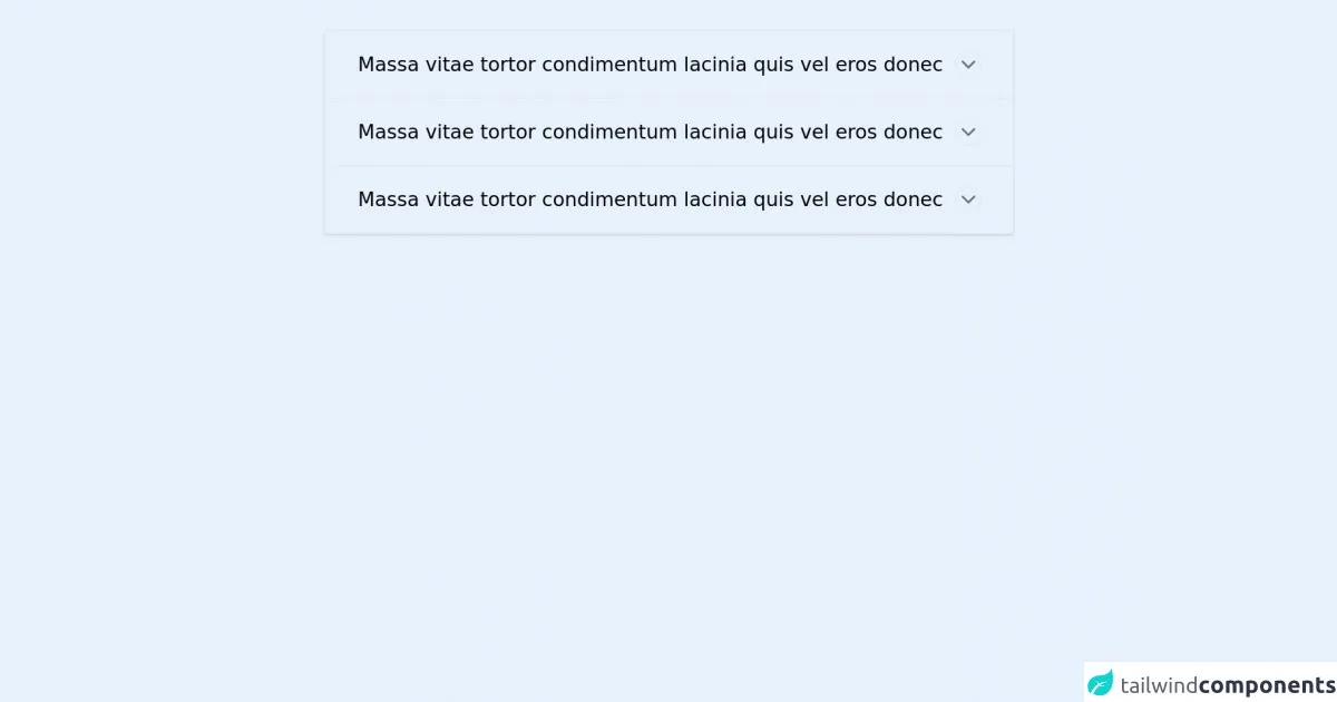
The preview of Dropdown ui component
To create a Dropdown ui component with Tailwind CSS, we will use a combination of HTML and CSS. The result will be a Dropdown that looks like this:
Free download of the Dropdown's source code
The source code of Dropdown ui component
To create the Dropdown ui component, we will use the following HTML and CSS:
<style>
            .tab {
            overflow: hidden;
            }
            .tab-content {
            max-height: 0;
            transition: all 0.5s;
            }
            input:checked + .tab-label .test {
                background-color: #000;
            }
            input:checked + .tab-label .test svg {
                transform: rotate(180deg);
                stroke: #fff;
            }
            input:checked + .tab-label::after {
            transform: rotate(90deg);
            }
            input:checked ~ .tab-content {
            max-height: 100vh;
            }
        </style>

<main class="w-3/5 p-8 mx-auto">
            <section class="shadow row">
                <div class="tabs">
                    <div class="border-b tab">
                        <div class="border-l-2 border-transparent relative">
                            <input class="w-full absolute z-10 cursor-pointer opacity-0 h-5 top-6" type="checkbox" id="chck1">
                            <header class="flex justify-between items-center p-5 pl-8 pr-8 cursor-pointer select-none tab-label" for="chck1">
                                <span class="text-grey-darkest font-thin text-xl">
                                    Massa vitae tortor condimentum lacinia quis vel eros donec
                                </span>
                                <div class="rounded-full border border-grey w-7 h-7 flex items-center justify-center test">
                                    <!-- icon by feathericons.com -->
                                    <svg aria-hidden="true" class="" data-reactid="266" fill="none" height="24" stroke="#606F7B" stroke-linecap="round" stroke-linejoin="round" stroke-width="2" viewbox="0 0 24 24" width="24" xmlns="http://www.w3.org/2000/svg">
                                        <polyline points="6 9 12 15 18 9">
                                        </polyline>
                                    </svg>
                                </div>
                            </header>
                            <div class="tab-content">
                                <div class="pl-8 pr-8 pb-5 text-grey-darkest">
                                    <ul class="pl-4">
                                        <li class="pb-2">
                                            consectetur adipiscing elit
                                        </li>
                                        <li class="pb-2">
                                            sed do eiusmod tempor incididunt ut labore et dolore magna aliqua
                                        </li>
                                        <li class="pb-2">
                                            Viverra orci sagittis eu volutpat odio facilisis mauris
                                        </li>
                                    </ul>
                                </div>
                            </div>
                        </div>
                    </div>
                    <div class="border-b tab">
                        <div class="border-l-2 border-transparent relative">
                            <input class="w-full absolute z-10 cursor-pointer opacity-0 h-5 top-6" type="checkbox" id="chck2">
                            <header class="flex justify-between items-center p-5 pl-8 pr-8 cursor-pointer select-none tab-label" for="chck2">
                                <span class="text-grey-darkest font-thin text-xl">
                                    Massa vitae tortor condimentum lacinia quis vel eros donec
                                </span>
                                <div class="rounded-full border border-grey w-7 h-7 flex items-center justify-center test">
                                    <!-- icon by feathericons.com -->
                                    <svg aria-hidden="true" class="" data-reactid="266" fill="none" height="24" stroke="#606F7B" stroke-linecap="round" stroke-linejoin="round" stroke-width="2" viewbox="0 0 24 24" width="24" xmlns="http://www.w3.org/2000/svg">
                                        <polyline points="6 9 12 15 18 9">
                                        </polyline>
                                    </svg>
                                </div>
                            </header>
                            <div class="tab-content">
                                <div class="pl-8 pr-8 pb-5 text-grey-darkest">
                                    <ul class="pl-4">
                                        <li class="pb-2">
                                            consectetur adipiscing elit
                                        </li>
                                        <li class="pb-2">
                                            sed do eiusmod tempor incididunt ut labore et dolore magna aliqua
                                        </li>
                                        <li class="pb-2">
                                            Viverra orci sagittis eu volutpat odio facilisis mauris
                                        </li>
                                    </ul>
                                </div>
                            </div>
                        </div>
                    </div>
                    <div class="border-b tab">
                        <div class="border-l-2 border-transparent relative">
                            <input class="w-full absolute z-10 cursor-pointer opacity-0 h-5 top-6" type="checkbox" id="chck3">
                            <header class="flex justify-between items-center p-5 pl-8 pr-8 cursor-pointer select-none tab-label" for="chck3">
                                <span class="text-grey-darkest font-thin text-xl">
                                    Massa vitae tortor condimentum lacinia quis vel eros donec
                                </span>
                                <div class="rounded-full border border-grey w-7 h-7 flex items-center justify-center test">
                                    <!-- icon by feathericons.com -->
                                    <svg aria-hidden="true" class="" data-reactid="266" fill="none" height="24" stroke="#606F7B" stroke-linecap="round" stroke-linejoin="round" stroke-width="2" viewbox="0 0 24 24" width="24" xmlns="http://www.w3.org/2000/svg">
                                        <polyline points="6 9 12 15 18 9">
                                        </polyline>
                                    </svg>
                                </div>
                            </header>
                            <div class="tab-content">
                                <div class="pl-8 pr-8 pb-5 text-grey-darkest">
                                    <ul class="pl-4">
                                        <li class="pb-2">
                                            consectetur adipiscing elit
                                        </li>
                                        <li class="pb-2">
                                            sed do eiusmod tempor incididunt ut labore et dolore magna aliqua
                                        </li>
                                        <li class="pb-2">
                                            Viverra orci sagittis eu volutpat odio facilisis mauris
                                        </li>
                                    </ul>
                                </div>
                            </div>
                        </div>
                    </div>
                </div>
            </section>
        </main>
How to create a Dropdown with Tailwind CSS?
Now that we have an understanding of what Tailwind CSS is and why it is a great choice for creating a Dropdown ui component, let's dive into the steps to create one.
Step 1: Set up a new HTML file
First, create a new HTML file and add the following code:
<!DOCTYPE html>
<html lang="en">
<head>
  <meta charset="UTF-8">
  <title>Dropdown with Tailwind CSS</title>
  <link rel="stylesheet" href="https://cdn.jsdelivr.net/npm/[email protected]/dist/tailwind.min.css">
</head>
<body>

</body>
</html>
This code sets up a basic HTML file and includes the Tailwind CSS stylesheet.
Step 2: Add the Dropdown HTML
Next, add the HTML for the Dropdown:
<div class="relative inline-block text-left">
  <div>
    <button type="button" class="inline-flex justify-center w-full rounded-md border border-gray-300 shadow-sm px-4 py-2 bg-white text-sm font-medium text-gray-700 hover:bg-gray-50 focus:outline-none focus:ring-2 focus:ring-offset-2 focus:ring-indigo-500" id="options-menu" aria-haspopup="true" aria-expanded="true">
      Options
      <!-- Heroicon name: chevron-down -->
      <svg class="-mr-1 ml-2 h-5 w-5" xmlns="http://www.w3.org/2000/svg" viewBox="0 0 20 20" fill="currentColor" aria-hidden="true">
        <path fill-rule="evenodd" d="M5.293 7.293a1 1 0 011.414 0L10 10.586l3.293-3.293a1 1 0 011.414 1.414l-4 4a1 1 0 01-1.414 0l-4-4a1 1 0 010-1.414z" clip-rule="evenodd" />
      </svg>
    </button>
  </div>

  <div class="origin-top-right absolute right-0 mt-2 w-56 rounded-md shadow-lg bg-white ring-1 ring-black ring-opacity-5" role="menu" aria-orientation="vertical" aria-labelledby="options-menu">
    <div class="py-1" role="none">
      <a href="#" class="block px-4 py-2 text-sm text-gray-700 hover:bg-gray-100 hover:text-gray-900" role="menuitem">Edit</a>
      <a href="#" class="block px-4 py-2 text-sm text-gray-700 hover:bg-gray-100 hover:text-gray-900" role="menuitem">Duplicate</a>
      <a href="#" class="block px-4 py-2 text-sm text-gray-700 hover:bg-gray-100 hover:text-gray-900" role="menuitem">Archive</a>
    </div>
  </div>
</div>
This code creates a Dropdown with three options: Edit, Duplicate, and Archive.
Step 3: Add the Dropdown CSS
Next, add the CSS for the Dropdown:
/* Dropdown */
.dropdown {
  position: relative;
  display: inline-block;
}

.dropdown button {
  display: inline-flex;
  justify-content: center;
  align-items: center;
  width: 100%;
  height: 2.5rem;
  padding: 0.5rem 1rem;
  font-size: 1rem;
  font-weight: 400;
  line-height: 1.5;
  color: #374151;
  background-color: #fff;
  border: 1px solid #e5e7eb;
  border-radius: 0.375rem;
  box-shadow: 0 1px 2px 0 rgba(0, 0, 0, 0.05);
  transition: border-color 0.15s ease-in-out, box-shadow 0.15s ease-in-out;
}

.dropdown button:hover,
.dropdown button:focus {
  border-color: #9ca3af;
  outline: none;
}

.dropdown button:focus {
  box-shadow: 0 0 0 3px rgba(66, 153, 225, 0.5);
}

.dropdown button svg {
  margin-left: 0.5rem;
  width: 1rem;
  height: 1rem;
  fill: none;
  stroke: currentColor;
  stroke-width: 2;
  transition: transform 0.2s ease-in-out;
}

.dropdown button[aria-expanded="true"] svg {
  transform: rotate(-180deg);
}

.dropdown-menu {
  position: absolute;
  top: 100%;
  left: 0;
  z-index: 1000;
  display: none;
  float: left;
  min-width: 10rem;
  padding: 0.5rem 0;
  margin: 0.125rem 0 0;
  font-size: 1rem;
  color: #374151;
  text-align: left;
  list-style: none;
  background-color: #fff;
  background-clip: padding-box;
  border: 1px solid #e5e7eb;
  border-radius: 0.375rem;
  box-shadow: 0 1px 2px 0 rgba(0, 0, 0, 0.05);
}

.dropdown-menu .dropdown-item {
  display: block;
  width: 100%;
  padding: 0.25rem 1rem;
  clear: both;
  font-weight: 400;
  color: #374151;
  text-align: inherit;
  white-space: nowrap;
  background-color: transparent;
  border: 0;
}

.dropdown-menu .dropdown-item:hover,
.dropdown-menu .dropdown-item:focus {
  color: #161e2e;
  text-decoration: none;
  background-color: #f5f5f5;
}

.dropdown-menu .dropdown-item.active,
.dropdown-menu .dropdown-item:active {
  color: #fff;
  text-decoration: none;
  background-color: #3490dc;
}

.dropdown-menu .dropdown-item.disabled,
.dropdown-menu .dropdown-item:disabled {
  color: #9ca3af;
  background-color: transparent;
}

.dropdown-menu .dropdown-divider {
  height: 0;
  margin: 0.5rem 0;
  overflow: hidden;
  border-top: 1px solid #e5e7eb;
}

.dropdown-menu .dropdown-header {
  display: block;
  padding: 0.5rem 1rem;
  margin-bottom: 0;
  font-size: 0.875rem;
  color: #9ca3af;
  white-space: nowrap;
}

.dropdown-menu .dropdown-item-text {
  display: block;
  padding: 0.25rem 1rem;
  color: #374151;
}

.dropdown-menu-right {
  right: 0;
  left: auto;
}

@media (min-width: 576px) {
  .dropdown-menu-sm-right {
    right: 0;
    left: auto;
  }
}

@media (min-width: 768px) {
  .dropdown-menu-md-right {
    right: 0;
    left: auto;
  }
}

@media (min-width: 992px) {
  .dropdown-menu-lg-right {
    right: 0;
    left: auto;
  }
}

@media (min-width: 1200px) {
  .dropdown-menu-xl-right {
    right: 0;
    left: auto;
  }
}

.dropdown-menu.show {
  display: block;
}
This code styles the Dropdown using Tailwind CSS classes.
Step 4: Add the JavaScript
Finally, add the JavaScript to toggle the Dropdown:
const dropdown = document.querySelector('.dropdown');
const dropdownToggle = dropdown.querySelector('button');
const dropdownMenu = dropdown.querySelector('.dropdown-menu');

dropdownToggle.addEventListener('click', function() {
  dropdownMenu.classList.toggle('show');
  dropdownToggle.setAttribute('aria-expanded', dropdownMenu.classList.contains('show'));
});

document.addEventListener('click', function(event) {
  if (!dropdown.contains(event.target)) {
    dropdownMenu.classList.remove('show');
    dropdownToggle.setAttribute('aria-expanded', 'false');
  }
});
This code adds event listeners to toggle the Dropdown when the user clicks on it.
Step 5: Test the Dropdown
That's it! You can now test the Dropdown by opening the HTML file in your web browser. Click on the Dropdown to see the options.
Conclusion
In this article, we have learned how to create a Dropdown ui component with Tailwind CSS in just 5 easy steps. Tailwind CSS provides a set of pre-defined classes that can be used to style a Dropdown ui component, making it easy to create a Dropdown that looks great and is easy to use. By following the steps outlined in this article, you can create your own Dropdown ui component with Tailwind CSS.