- Published on
Build A Dropdown With Tailwind CSS Like A Pro With The Help Of These 6 Tips
- What is Tailwind CSS?
- The description of Dropdown ui component
- Why use Tailwind CSS to create a Dropdown ui component?
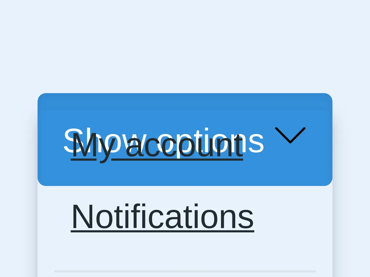
- The preview of Dropdown ui component.
- The source code of Dropdown ui component.
- How to create a Dropdown with Tailwind CSS?
- 1. Use the relative class to set the position of the Dropdown to relative.
- 2. Use the inline-block class to set the display property of the Dropdown to inline-block.
- 3. Use the text-left class to set the text alignment of the Dropdown to left.
- 4. Use the bg-white class to set the background color of the Dropdown to white.
- 5. Use the border and rounded classes to set the border and border-radius of the Dropdown.
- 6. Use the py-2 and px-4 classes to set the padding of the Dropdown on the y-axis and x-axis.
- Conclusion
As a FrontEnd technology blogger, you might have heard about Tailwind CSS. It is a utility-first CSS framework that helps you to create responsive and customizable user interfaces. In this article, we will discuss how to build a Dropdown with Tailwind CSS like a pro with the help of these 6 tips.
What is Tailwind CSS?
Tailwind CSS is a utility-first CSS framework that provides you with a set of pre-defined CSS classes that you can use to create your user interface. It helps you to create responsive and customizable user interfaces without writing any custom CSS code.
The description of Dropdown ui component
A Dropdown is a user interface component that allows users to select one option from a list of options. It is a common user interface component that you can find in many web applications.
Why use Tailwind CSS to create a Dropdown ui component?
Tailwind CSS provides you with a set of pre-defined CSS classes that help you to create a Dropdown ui component quickly and easily. You don't have to write any custom CSS code, which saves you a lot of time and effort.
The preview of Dropdown ui component.
To create a Dropdown ui component with Tailwind CSS, you can use the following classes:
relative: This class sets the position of the Dropdown to relative.inline-block: This class sets the display property of the Dropdown to inline-block.text-left: This class sets the text alignment of the Dropdown to left.bg-white: This class sets the background color of the Dropdown to white.border: This class sets the border of the Dropdown.rounded: This class sets the border-radius of the Dropdown.py-2: This class sets the padding of the Dropdown on the y-axis.px-4: This class sets the padding of the Dropdown on the x-axis.shadow-md: This class adds a shadow effect to the Dropdown.
Free download of the Dropdown's source code
The source code of Dropdown ui component.
To create a Dropdown ui component with Tailwind CSS, you can use the following HTML code:
<div class="relative inline-block text-left">
  <div>
    <button class="bg-white border rounded py-2 px-4 shadow-md">
      Dropdown
    </button>
  </div>
  <div class="absolute right-0 mt-2 w-48 bg-white rounded-md shadow-lg">
    <a href="#" class="block px-4 py-2 text-sm text-gray-700 hover:bg-gray-100">Option 1</a>
    <a href="#" class="block px-4 py-2 text-sm text-gray-700 hover:bg-gray-100">Option 2</a>
    <a href="#" class="block px-4 py-2 text-sm text-gray-700 hover:bg-gray-100">Option 3</a>
  </div>
</div>
<div class="my-8">
  <div class="relative mb-24">
      <button class="bg-blue p-3 rounded text-white shadow-inner">
        <span>Show options</span>

        <svg class="h-4" version="1.1" xmlns="http://www.w3.org/2000/svg" viewBox="0 0 129 129" xmlns:xlink="http://www.w3.org/1999/xlink" enable-background="new 0 0 129 129">
          <g>
            <path d="m121.3,34.6c-1.6-1.6-4.2-1.6-5.8,0l-51,51.1-51.1-51.1c-1.6-1.6-4.2-1.6-5.8,0-1.6,1.6-1.6,4.2 0,5.8l53.9,53.9c0.8,0.8 1.8,1.2 2.9,1.2 1,0 2.1-0.4 2.9-1.2l53.9-53.9c1.7-1.6 1.7-4.2 0.1-5.8z"/>
          </g>
        </svg>
      </button>
      <div class="rounded shadow-md mt-2 absolute mt-12 pin-t pin-l min-w-full" style="margin-top: 50px">
          <ul class="list-reset">
            <li><a href="#" class="px-4 py-2 block text-black hover:bg-grey-light">My account</a></li>
            <li><a href="#" class="px-4 py-2 block text-black hover:bg-grey-light">Notifications</a></li>
            <li><hr class="border-t mx-2 border-grey-light"></li>
            <li><a href="#" class="px-4 py-2 block text-black hover:bg-grey-light">Logout</a></li>
          </ul>
      </div>
  </div>
</div>
How to create a Dropdown with Tailwind CSS?
To create a Dropdown with Tailwind CSS, you can follow these 6 tips:
1. Use the relative class to set the position of the Dropdown to relative.
<div class="relative">
  ...
</div>
2. Use the inline-block class to set the display property of the Dropdown to inline-block.
<div class="relative inline-block">
  ...
</div>
3. Use the text-left class to set the text alignment of the Dropdown to left.
<div class="relative inline-block text-left">
  ...
</div>
4. Use the bg-white class to set the background color of the Dropdown to white.
<div class="relative inline-block text-left bg-white">
  ...
</div>
5. Use the border and rounded classes to set the border and border-radius of the Dropdown.
<div class="relative inline-block text-left bg-white border rounded">
  ...
</div>
6. Use the py-2 and px-4 classes to set the padding of the Dropdown on the y-axis and x-axis.
<div class="relative inline-block text-left bg-white border rounded py-2 px-4">
  ...
</div>
Conclusion
In this article, we discussed how to build a Dropdown with Tailwind CSS like a pro with the help of these 6 tips. We hope that these tips will help you to create a Dropdown ui component quickly and easily. If you have any questions or feedback, please feel free to leave a comment below.