- Published on
The Ultimate Guide To Help You Make A Dismissible Alert With Tailwind CSS
- What is Tailwind CSS?
- The description of Dismissible Alert UI component
- Why use Tailwind CSS to create a Dismissible Alert UI component?
- The preview of Dismissible Alert UI component
- The source code of Dismissible Alert UI component
- How to create a Dismissible Alert with Tailwind CSS?
- Conclusion
As a front-end developer, you know that creating user interfaces that are not only visually appealing but also functional is essential. One of the most common UI components that you will encounter is the alert. Alerts are used to communicate important information to users, such as error messages or success notifications. In this article, we will be discussing how to create a dismissible alert using Tailwind CSS.
What is Tailwind CSS?
Tailwind CSS is a utility-first CSS framework that allows you to rapidly build custom user interfaces. It provides a set of pre-defined classes that you can use to style your HTML elements without having to write custom CSS. Tailwind CSS is highly customizable, and you can configure it to match your project's design system.
The description of Dismissible Alert UI component
A dismissible alert is an alert that can be closed or dismissed by the user. It is a common UI component used to display notifications or messages that require the user's attention. Dismissible alerts are typically displayed at the top of the page and can be closed by clicking on a close button.
Why use Tailwind CSS to create a Dismissible Alert UI component?
Tailwind CSS provides a set of pre-defined classes that you can use to create a dismissible alert without having to write custom CSS. This saves you time and effort and allows you to focus on the functionality of the alert. Additionally, Tailwind CSS is highly customizable, so you can easily modify the alert's appearance to match your project's design system.
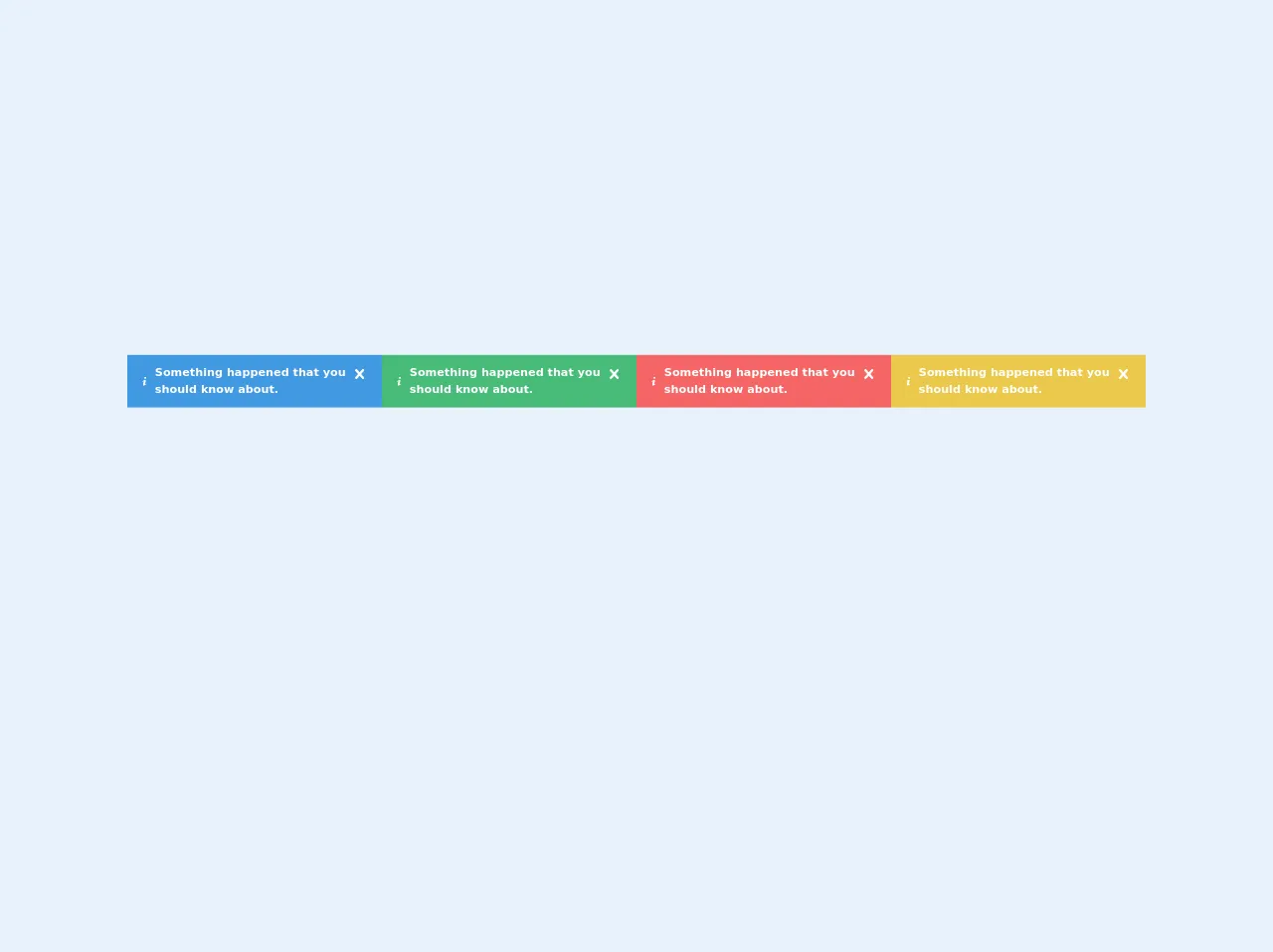
The preview of Dismissible Alert UI component
To create a dismissible alert with Tailwind CSS, you will need to use a combination of HTML and CSS classes. Here is a preview of what the alert will look like:
<div class="bg-blue-100 border-t-4 border-blue-500 rounded-b text-blue-900 px-4 py-3 shadow-md" role="alert">
  <div class="flex">
    <div class="py-1"><svg class="fill-current h-6 w-6 text-blue-500 mr-4" xmlns="http://www.w3.org/2000/svg" viewBox="0 0 20 20"><path d="M10 12a2 2 0 100-4 2 2 0 000 4z"/><path fill-rule="evenodd" d="M18.293 5.293a1 1 0 00-1.414 0L10 12.586 5.707 8.293a1 1 0 00-1.414 1.414l5 5a1 1 0 001.414 0l9-9a1 1 0 000-1.414z" clip-rule="evenodd"/></svg></div>
    <div>
      <p class="font-bold">Success!</p>
      <p class="text-sm">Your profile has been updated.</p>
    </div>
    <div class="ml-auto">
      <div class="cursor-pointer px-2 py-1 bg-blue-500 text-white font-bold rounded hover:bg-blue-700" onclick="this.parentElement.parentElement.style.display='none';">Close</div>
    </div>
  </div>
</div>
Free download of the Dismissible Alert's source code
The source code of Dismissible Alert UI component
To create a dismissible alert with Tailwind CSS, you will need to use a combination of HTML and CSS classes. Here is the source code for the alert:
<div class="bg-blue-100 border-t-4 border-blue-500 rounded-b text-blue-900 px-4 py-3 shadow-md" role="alert">
  <div class="flex">
    <div class="py-1"><svg class="fill-current h-6 w-6 text-blue-500 mr-4" xmlns="http://www.w3.org/2000/svg" viewBox="0 0 20 20"><path d="M10 12a2 2 0 100-4 2 2 0 000 4z"/><path fill-rule="evenodd" d="M18.293 5.293a1 1 0 00-1.414 0L10 12.586 5.707 8.293a1 1 0 00-1.414 1.414l5 5a1 1 0 001.414 0l9-9a1 1 0 000-1.414z" clip-rule="evenodd"/></svg></div>
    <div>
      <p class="font-bold">Success!</p>
      <p class="text-sm">Your profile has been updated.</p>
    </div>
    <div class="ml-auto">
      <div class="cursor-pointer px-2 py-1 bg-blue-500 text-white font-bold rounded hover:bg-blue-700" onclick="this.parentElement.parentElement.style.display='none';">Close</div>
    </div>
  </div>
</div>
<!-- This is an example component -->
	<div class="container" id="alertbox">
		<div class="container bg-blue-500 flex items-center text-white text-sm font-bold px-4 py-3 relative"
			role="alert">
			<svg class="fill-current w-4 h-4 mr-2" xmlns="http://www.w3.org/2000/svg" viewBox="0 0 20 20">
				<path
					d="M12.432 0c1.34 0 2.01.912 2.01 1.957 0 1.305-1.164 2.512-2.679 2.512-1.269 0-2.009-.75-1.974-1.99C9.789 1.436 10.67 0 12.432 0zM8.309 20c-1.058 0-1.833-.652-1.093-3.524l1.214-5.092c.211-.814.246-1.141 0-1.141-.317 0-1.689.562-2.502 1.117l-.528-.88c2.572-2.186 5.531-3.467 6.801-3.467 1.057 0 1.233 1.273.705 3.23l-1.391 5.352c-.246.945-.141 1.271.106 1.271.317 0 1.357-.392 2.379-1.207l.6.814C12.098 19.02 9.365 20 8.309 20z" />
			</svg>
			<p>Something happened that you should know about.</p>

			<span class="absolute top-0 bottom-0 right-0 px-4 py-3 closealertbutton">
				<svg class="fill-current h-6 w-6 text-white" role="button" xmlns="http://www.w3.org/2000/svg"
					viewBox="0 0 20 20">
					<title>Close</title>
					<path
						d="M14.348 14.849a1.2 1.2 0 0 1-1.697 0L10 11.819l-2.651 3.029a1.2 1.2 0 1 1-1.697-1.697l2.758-3.15-2.759-3.152a1.2 1.2 0 1 1 1.697-1.697L10 8.183l2.651-3.031a1.2 1.2 0 1 1 1.697 1.697l-2.758 3.152 2.758 3.15a1.2 1.2 0 0 1 0 1.698z" />
				</svg>
			</span>
		</div>
	</div>

	<div class="container" id="alertbox">
		<div class="container bg-green-500 flex items-center text-white text-sm font-bold px-4 py-3 relative"
			role="alert">
			<svg class="fill-current w-4 h-4 mr-2" xmlns="http://www.w3.org/2000/svg" viewBox="0 0 20 20">
				<path
					d="M12.432 0c1.34 0 2.01.912 2.01 1.957 0 1.305-1.164 2.512-2.679 2.512-1.269 0-2.009-.75-1.974-1.99C9.789 1.436 10.67 0 12.432 0zM8.309 20c-1.058 0-1.833-.652-1.093-3.524l1.214-5.092c.211-.814.246-1.141 0-1.141-.317 0-1.689.562-2.502 1.117l-.528-.88c2.572-2.186 5.531-3.467 6.801-3.467 1.057 0 1.233 1.273.705 3.23l-1.391 5.352c-.246.945-.141 1.271.106 1.271.317 0 1.357-.392 2.379-1.207l.6.814C12.098 19.02 9.365 20 8.309 20z" />
			</svg>
			<p>Something happened that you should know about.</p>

			<span class="absolute top-0 bottom-0 right-0 px-4 py-3 closealertbutton">
				<svg class="fill-current h-6 w-6 text-white" role="button" xmlns="http://www.w3.org/2000/svg"
					viewBox="0 0 20 20">
					<title>Close</title>
					<path
						d="M14.348 14.849a1.2 1.2 0 0 1-1.697 0L10 11.819l-2.651 3.029a1.2 1.2 0 1 1-1.697-1.697l2.758-3.15-2.759-3.152a1.2 1.2 0 1 1 1.697-1.697L10 8.183l2.651-3.031a1.2 1.2 0 1 1 1.697 1.697l-2.758 3.152 2.758 3.15a1.2 1.2 0 0 1 0 1.698z" />
				</svg>
			</span>
		</div>
	</div>

	<div class="container" id="alertbox">
		<div class="container bg-red-500 flex items-center text-white text-sm font-bold px-4 py-3 relative" role="alert">
			<svg class="fill-current w-4 h-4 mr-2" xmlns="http://www.w3.org/2000/svg" viewBox="0 0 20 20">
				<path
					d="M12.432 0c1.34 0 2.01.912 2.01 1.957 0 1.305-1.164 2.512-2.679 2.512-1.269 0-2.009-.75-1.974-1.99C9.789 1.436 10.67 0 12.432 0zM8.309 20c-1.058 0-1.833-.652-1.093-3.524l1.214-5.092c.211-.814.246-1.141 0-1.141-.317 0-1.689.562-2.502 1.117l-.528-.88c2.572-2.186 5.531-3.467 6.801-3.467 1.057 0 1.233 1.273.705 3.23l-1.391 5.352c-.246.945-.141 1.271.106 1.271.317 0 1.357-.392 2.379-1.207l.6.814C12.098 19.02 9.365 20 8.309 20z" />
			</svg>
			<p>Something happened that you should know about.</p>

			<span class="absolute top-0 bottom-0 right-0 px-4 py-3 closealertbutton">
				<svg class="fill-current h-6 w-6 text-white" role="button" xmlns="http://www.w3.org/2000/svg"
					viewBox="0 0 20 20">
					<title>Close</title>
					<path
						d="M14.348 14.849a1.2 1.2 0 0 1-1.697 0L10 11.819l-2.651 3.029a1.2 1.2 0 1 1-1.697-1.697l2.758-3.15-2.759-3.152a1.2 1.2 0 1 1 1.697-1.697L10 8.183l2.651-3.031a1.2 1.2 0 1 1 1.697 1.697l-2.758 3.152 2.758 3.15a1.2 1.2 0 0 1 0 1.698z" />
				</svg>
			</span>
		</div>
	</div>

	<div class="container" id="alertbox">
		<div class="container bg-yellow-500 flex items-center text-white text-sm font-bold px-4 py-3 relative"
			role="alert">
			<svg class="fill-current w-4 h-4 mr-2" xmlns="http://www.w3.org/2000/svg" viewBox="0 0 20 20">
				<path
					d="M12.432 0c1.34 0 2.01.912 2.01 1.957 0 1.305-1.164 2.512-2.679 2.512-1.269 0-2.009-.75-1.974-1.99C9.789 1.436 10.67 0 12.432 0zM8.309 20c-1.058 0-1.833-.652-1.093-3.524l1.214-5.092c.211-.814.246-1.141 0-1.141-.317 0-1.689.562-2.502 1.117l-.528-.88c2.572-2.186 5.531-3.467 6.801-3.467 1.057 0 1.233 1.273.705 3.23l-1.391 5.352c-.246.945-.141 1.271.106 1.271.317 0 1.357-.392 2.379-1.207l.6.814C12.098 19.02 9.365 20 8.309 20z" />
			</svg>
			<p>Something happened that you should know about.</p>

			<span class="absolute top-0 bottom-0 right-0 px-4 py-3 closealertbutton">
				<svg class="fill-current h-6 w-6 text-white" role="button" xmlns="http://www.w3.org/2000/svg"
					viewBox="0 0 20 20">
					<title>Close</title>
					<path
						d="M14.348 14.849a1.2 1.2 0 0 1-1.697 0L10 11.819l-2.651 3.029a1.2 1.2 0 1 1-1.697-1.697l2.758-3.15-2.759-3.152a1.2 1.2 0 1 1 1.697-1.697L10 8.183l2.651-3.031a1.2 1.2 0 1 1 1.697 1.697l-2.758 3.152 2.758 3.15a1.2 1.2 0 0 1 0 1.698z" />
				</svg>
			</span>
		</div>
	</div>


<script src="https://cdnjs.cloudflare.com/ajax/libs/jquery/3.5.0/jquery.min.js"
	integrity="sha256-xNzN2a4ltkB44Mc/Jz3pT4iU1cmeR0FkXs4pru/JxaQ=" crossorigin="anonymous">
	</script>

<script>
$(".closealertbutton").click(function (e) {
    // $('.alertbox')[0].hide()
    // e.preventDefault();
    pid = $(this).parent().parent().hide(500)
    console.log(pid)
    // $(".alertbox", this).hide()
})
</script>
How to create a Dismissible Alert with Tailwind CSS?
To create a dismissible alert with Tailwind CSS, follow these steps:
Create a
divelement with thebg-blue-100,border-t-4,border-blue-500,rounded-b,text-blue-900,px-4,py-3, andshadow-mdclasses. These classes will style the alert's background color, border, text color, padding, and shadow.Inside the
divelement, create adivelement with theflexclass. This will create a flex container that will hold the alert's content.Inside the
flexcontainer, create adivelement with thepy-1class. This will create a padding on the left side of the alert.Inside the
py-1container, create an SVG icon using thefill-current,h-6,w-6,text-blue-500, andmr-4classes. This will create an icon that will be displayed on the left side of the alert.Next, create a
divelement inside theflexcontainer. This will hold the alert's title and message.Inside the
divelement, create apelement with thefont-boldclass. This will create a bold title for the alert.Create another
pelement inside thedivelement with thetext-smclass. This will create a smaller message for the alert.Finally, create a
divelement inside theflexcontainer with theml-autoclass. This will push the close button to the right side of the alert.Inside the
ml-autocontainer, create adivelement with thecursor-pointer,px-2,py-1,bg-blue-500,text-white,font-bold, androundedclasses. This will create a button that will close the alert when clicked.Add an
onclickevent to the close button that will hide the alert when clicked. Here is an example of the event:onclick="this.parentElement.parentElement.style.display='none';"
Conclusion
Creating a dismissible alert using Tailwind CSS is a simple and effective way to communicate important information to your users. By using pre-defined classes, you can quickly create a functional and visually appealing alert without having to write custom CSS. With Tailwind CSS's customization options, you can easily modify the alert's appearance to match your project's design system.