- Published on
Best Ways To Create A Digital Ocean - Banner Homepage With Tailwind CSS
- What is Tailwind CSS?
- The description of Digital Ocean - Banner Homepage ui component
- Why use Tailwind CSS to create a Digital Ocean - Banner Homepage ui component?
- The preview of Digital Ocean - Banner Homepage ui component.
- The source code of Digital Ocean - Banner Homepage ui component.
- How to create a Digital Ocean - Banner Homepage with Tailwind CSS?
- Step 1: Set up a new project
- Step 2: Create an HTML file
- Step 3: Create a CSS file
- Step 4: Build the CSS file
- Step 5: Preview the Digital Ocean - Banner Homepage
- Conclusion
In today's digital era, having a visually appealing website is crucial for businesses. A website's homepage is the first thing that visitors see, and it needs to be engaging and informative. Digital Ocean - Banner Homepage is an excellent example of a visually appealing homepage. In this article, we will discuss the best ways to create a Digital Ocean - Banner Homepage using Tailwind CSS.
What is Tailwind CSS?
Tailwind CSS is a utility-first CSS framework that provides a set of pre-defined classes to style HTML elements. It enables developers to create complex layouts quickly and efficiently. Tailwind CSS is gaining popularity among developers due to its flexibility and ease of use.
The description of Digital Ocean - Banner Homepage ui component
Digital Ocean - Banner Homepage is a UI component that showcases a banner on the homepage of Digital Ocean's website. The banner includes a call to action button, a heading, and a subheading. The banner's background is a gradient of blue and purple colors, which creates a visually appealing effect.
Why use Tailwind CSS to create a Digital Ocean - Banner Homepage ui component?
Tailwind CSS provides a set of pre-defined classes that enable developers to create complex layouts quickly and efficiently. It also provides responsive classes that allow the website to be optimized for different screen sizes. Using Tailwind CSS to create a Digital Ocean - Banner Homepage UI component will save time and effort in styling the component.
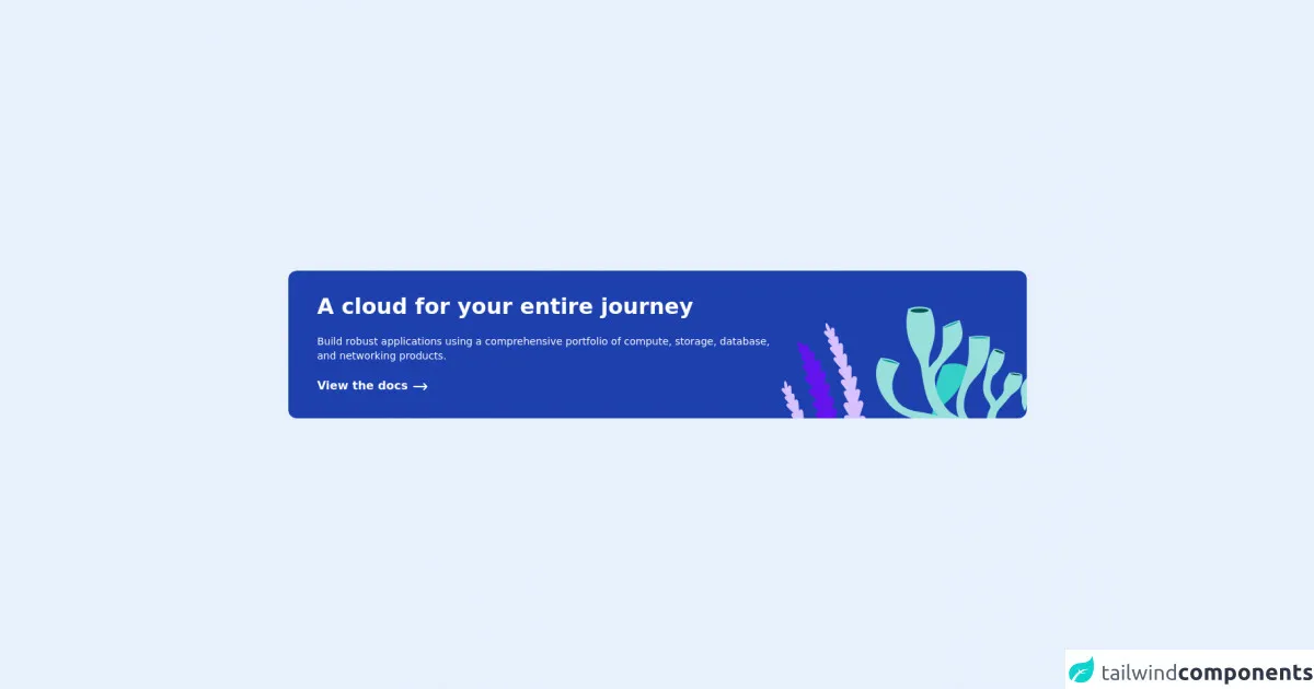
The preview of Digital Ocean - Banner Homepage ui component.
To create a Digital Ocean - Banner Homepage UI component, we will use Tailwind CSS. The component includes a banner with a call to action button, a heading, and a subheading. The banner's background is a gradient of blue and purple colors.
Free download of the Digital Ocean - Banner Homepage's source code
The source code of Digital Ocean - Banner Homepage ui component.
To create a Digital Ocean - Banner Homepage UI component, we will use HTML and Tailwind CSS. The HTML code includes a banner with a call to action button, a heading, and a subheading. The CSS code includes the classes required to style the banner.
<div class="h-screen flex justify-center items-center">

  <card class="grid grid-cols-6 max-w-5xl mx-8 rounded-xl bg-blue-800">

    <div class="col-span-4">

      <h2 class="font-bold text-3xl text-white ml-10 mt-8">
        A cloud for your entire journey
      </h2>

      <p class="font-light text-white text-sm ml-10 mt-5">
        Build robust applications using a comprehensive portfolio of compute, storage, database, and networking products.
      </p>

      <button class="text-white font-semibold ml-10 mt-5 mb-8 group ">
        View the docs
        <svg xmlns="http://www.w3.org/2000/svg" class="inline-block h-6 w-6 group-hover:translate-x-2 transition delay-100 transition-200" fill="none" viewBox="0 0 24 24" stroke="currentColor">
  <path stroke-linecap="round" stroke-linejoin="round" stroke-width="2" d="M17 8l4 4m0 0l-4 4m4-4H3" />
</svg>
      </button>

    </div>

    <div class="col-span-2 relative">
      <img src="https://www.digitalocean.com/_next/static/media/cloudJourneyImage.954519ea.svg"  class="absolute bottom-0 right-0"/>
    </div>

  </card>

</div>
How to create a Digital Ocean - Banner Homepage with Tailwind CSS?
To create a Digital Ocean - Banner Homepage with Tailwind CSS, follow the steps below:
Step 1: Set up a new project
Create a new project folder and initialize it with npm. Install Tailwind CSS and its dependencies.
mkdir digital-ocean-banner
cd digital-ocean-banner
npm init -y
npm install tailwindcss postcss-cli autoprefixer
Step 2: Create an HTML file
Create an HTML file named index.html and add the following code:
<!DOCTYPE html>
<html lang="en">
  <head>
    <meta charset="UTF-8" />
    <meta name="viewport" content="width=device-width, initial-scale=1.0" />
    <title>Digital Ocean - Banner Homepage</title>
    <link rel="stylesheet" href="./css/styles.css" />
  </head>
  <body>
    <div class="bg-gradient-to-r from-blue-500 to-purple-500">
      <div class="max-w-7xl mx-auto py-12 px-4 sm:px-6 lg:px-8">
        <h2 class="text-3xl font-extrabold text-white sm:text-4xl">
          <span class="block">Ready to dive in?</span>
          <span class="block">Create an account today.</span>
        </h2>
        <div class="mt-8 flex justify-center">
          <div class="inline-flex rounded-md shadow">
            <a
              href="#"
              class="inline-flex items-center justify-center px-5 py-3 border border-transparent text-base font-medium rounded-md text-white bg-indigo-600 hover:bg-indigo-700"
              >Get started</a
            >
          </div>
        </div>
      </div>
    </div>
  </body>
</html>
Step 3: Create a CSS file
Create a CSS file named styles.css in the css folder and add the following code:
@tailwind base;
@tailwind components;
@tailwind utilities;

.bg-gradient-to-r {
  background-image: linear-gradient(to right, var(--tw-gradient-stops));
}
Step 4: Build the CSS file
Build the CSS file using postcss-cli.
npx tailwindcss-cli@latest build css/styles.css -o css/output.css
Step 5: Preview the Digital Ocean - Banner Homepage
Open the index.html file in a web browser to preview the Digital Ocean - Banner Homepage.
Conclusion
Creating a visually appealing homepage is crucial for businesses in today's digital era. Digital Ocean - Banner Homepage is an excellent example of a visually appealing UI component. Using Tailwind CSS to create a Digital Ocean - Banner Homepage UI component will save time and effort in styling the component. Follow the steps outlined in this article to create a Digital Ocean - Banner Homepage with Tailwind CSS.