- Published on
How To Build A Dice Animation With Tailwind CSS In 5 Easy Steps
- What is Tailwind CSS?
- The description of Dice Animation ui component
- Why use Tailwind CSS to create a Dice Animation ui component?
- The preview of Dice Animation ui component.
- The source code of Dice Animation ui component.
- How to create a Dice Animation with Tailwind CSS?
- Step 1: Create a container div for the dice
- Step 2: Create the dice face
- Step 3: Add dots to the dice face
- Step 4: Add animation to the dice
- Step 5: Add Tailwind CSS classes to style the dice
- Conclusion
If you are a FrontEnd developer, you must have heard of Tailwind CSS. It is a utility-first CSS framework that allows you to create custom designs without writing any CSS. In this tutorial, we will show you how to build a Dice Animation with Tailwind CSS in 5 easy steps.
What is Tailwind CSS?
Tailwind CSS is a utility-first CSS framework that provides you with a set of pre-defined classes that you can use to style your HTML elements. It is designed to make it easy for developers to create custom designs without having to write any CSS code.
The description of Dice Animation ui component
Dice Animation is a UI component that simulates the rolling of a dice. It is commonly used in games and gambling applications. The Dice Animation consists of a cube with dots on each side, and it rotates randomly to simulate the rolling of a dice.
Why use Tailwind CSS to create a Dice Animation ui component?
Tailwind CSS provides a set of utility classes that make it easy to create animations and transitions. It also provides a set of pre-defined colors and fonts that you can use to style your UI components. Using Tailwind CSS to create a Dice Animation UI component will save you a lot of time and effort.
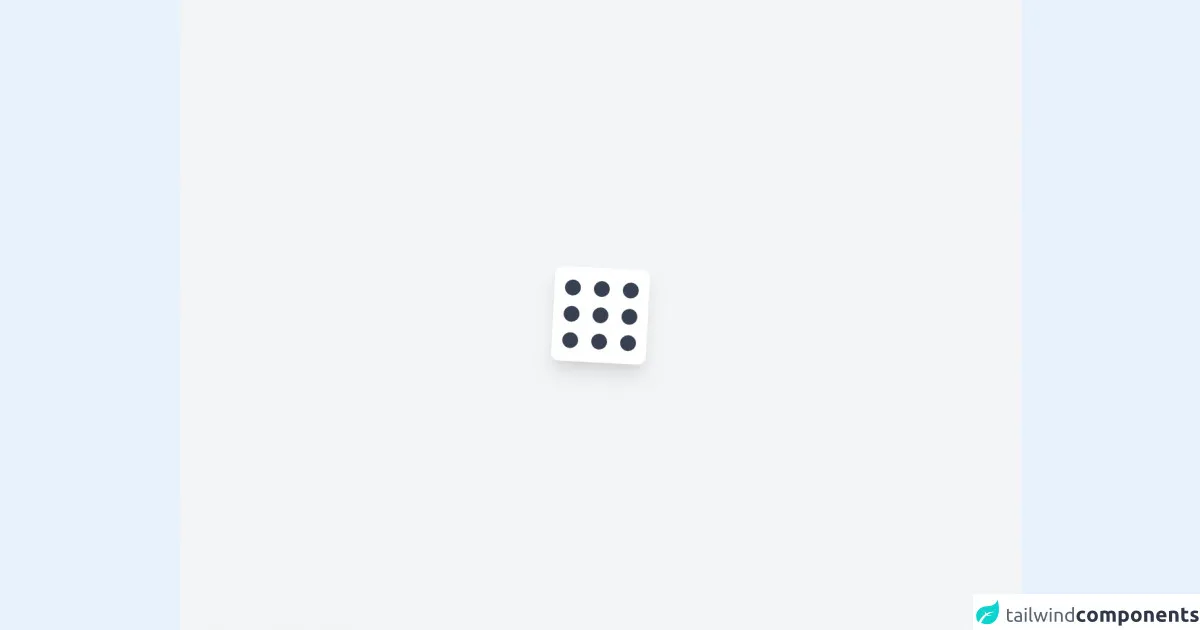
The preview of Dice Animation ui component.
To create a Dice Animation with Tailwind CSS, we will use a combination of CSS classes and JavaScript. The Dice Animation will consist of a cube with dots on each side, and it will rotate randomly to simulate the rolling of a dice.
Free download of the Dice Animation's source code
The source code of Dice Animation ui component.
To create the Dice Animation, we will use HTML, CSS, and JavaScript. We will start by creating a container div for the dice and adding the necessary CSS classes to style it. Then, we will use JavaScript to randomly rotate the dice.
<div class="min-h-screen bg-gray-100 flex items-center justify-center">
  <div class="h-36 w-36 bg-white rounded-xl shadow-xl transform rotate-3 flex justify-between p-4 hover:scale-150 transition duration-700 hover:rotate-45 hover:shadow-2xl">
    <div class="space-y-4 pt-1">
      <div class="w-6 h-6 bg-gray-700 rounded-full"></div>
      <div class="w-6 h-6 bg-gray-700 rounded-full"></div>
      <div class="w-6 h-6 bg-gray-700 rounded-full"></div>
    </div>
    <div class="space-y-4 pt-1">
      <div class="w-6 h-6 bg-gray-700 rounded-full"></div>
      <div class="w-6 h-6 bg-gray-700 rounded-full"></div>
      <div class="w-6 h-6 bg-gray-700 rounded-full"></div>
    </div>
    <div class="space-y-4 pt-1">
      <div class="w-6 h-6 bg-gray-700 rounded-full"></div>
      <div class="w-6 h-6 bg-gray-700 rounded-full"></div>
      <div class="w-6 h-6 bg-gray-700 rounded-full"></div>
    </div>
  </div>
</div>
How to create a Dice Animation with Tailwind CSS?
Now that we have a basic understanding of what Tailwind CSS is and why we should use it to create a Dice Animation UI component, let's dive into the steps to create one.
Step 1: Create a container div for the dice
The first step is to create a container div for the dice. We will use the w-24 and h-24 classes to set the width and height of the container to 24 pixels. We will also use the bg-white class to set the background color to white.
<div class="w-24 h-24 bg-white"></div>
Step 2: Create the dice face
Next, we will create the dice face using a div element. We will use the w-8 and h-8 classes to set the width and height of the dice face to 8 pixels. We will also use the bg-black class to set the background color to black.
<div class="w-8 h-8 bg-black"></div>
Step 3: Add dots to the dice face
To add dots to the dice face, we will create six div elements and position them using the absolute class. We will use the w-2 and h-2 classes to set the width and height of the dots to 2 pixels. We will also use the bg-white class to set the background color to white.
<div class="w-8 h-8 bg-black relative">
  <div class="absolute top-1 left-1 w-2 h-2 bg-white rounded-full"></div>
  <div class="absolute top-1 right-1 w-2 h-2 bg-white rounded-full"></div>
  <div class="absolute bottom-1 left-1 w-2 h-2 bg-white rounded-full"></div>
  <div class="absolute bottom-1 right-1 w-2 h-2 bg-white rounded-full"></div>
  <div class="absolute top-4 left-4 w-2 h-2 bg-white rounded-full"></div>
  <div class="absolute bottom-4 right-4 w-2 h-2 bg-white rounded-full"></div>
</div>
Step 4: Add animation to the dice
To add animation to the dice, we will use JavaScript to randomly rotate the dice. We will use the transform property to rotate the dice by a random number of degrees.
const dice = document.querySelector('.dice');

function rollDice() {
  const randomAngle = Math.floor(Math.random() * 360);
  dice.style.transform = `rotate(${randomAngle}deg)`;
}

setInterval(rollDice, 1000);
Step 5: Add Tailwind CSS classes to style the dice
Finally, we will add some Tailwind CSS classes to style the dice. We will use the rounded-lg class to round the corners of the container div. We will also use the shadow-lg class to add a shadow to the dice.
<div class="w-24 h-24 bg-white rounded-lg shadow-lg">
  <div class="w-8 h-8 bg-black relative">
    <div class="absolute top-1 left-1 w-2 h-2 bg-white rounded-full"></div>
    <div class="absolute top-1 right-1 w-2 h-2 bg-white rounded-full"></div>
    <div class="absolute bottom-1 left-1 w-2 h-2 bg-white rounded-full"></div>
    <div class="absolute bottom-1 right-1 w-2 h-2 bg-white rounded-full"></div>
    <div class="absolute top-4 left-4 w-2 h-2 bg-white rounded-full"></div>
    <div class="absolute bottom-4 right-4 w-2 h-2 bg-white rounded-full"></div>
  </div>
</div>
Conclusion
In this tutorial, we have shown you how to build a Dice Animation with Tailwind CSS in 5 easy steps. We hope that you found this tutorial helpful and that you can use the knowledge you gained to create other UI components using Tailwind CSS. Remember to experiment with different CSS classes and JavaScript to create unique and interesting designs. Happy coding!