- Published on
The 5 Really Obvious Ways To Build A Dev.to Post Card With Tailwind CSS Better That You Ever Did
- What is Tailwind CSS?
- The description of dev.to post card UI component
- Why use Tailwind CSS to create a dev.to post card UI component?
- The preview of dev.to post card UI component
- The source code of dev.to post card UI component
- How to create a dev.to post card with Tailwind CSS?
- Step 1: Create a HTML structure for the card
- Step 2: Add Tailwind CSS classes to the HTML elements
- Step 3: Add custom styles using Tailwind CSS
- Step 4: Add interactivity using JavaScript
- Conclusion
As a FrontEnd technology blogger, it is essential to know the latest trends and technologies in the market. One such technology that has gained immense popularity in recent times is Tailwind CSS. It is a utility-first CSS framework that helps in building responsive and modern web applications. In this article, we will discuss the 5 really obvious ways to build a Dev.to post card with Tailwind CSS better than you ever did.
What is Tailwind CSS?
Tailwind CSS is a utility-first CSS framework that provides a set of pre-defined classes to create responsive and modern web applications. It provides a low-level utility classes that can be used to build custom components and designs. It is a great choice for developers who want to create custom designs without writing any CSS code.
The description of dev.to post card UI component
Dev.to is a popular online community for developers to share their knowledge and expertise. The Dev.to post card UI component is used to display a post in a card format. It contains the title of the post, the author's name, the date of the post, and the number of reactions and comments on the post. The Dev.to post card UI component is an essential component of the Dev.to platform.
Why use Tailwind CSS to create a dev.to post card UI component?
Tailwind CSS provides a set of pre-defined classes that can be used to create custom designs without writing any CSS code. It helps in creating responsive and modern web applications. Using Tailwind CSS to create a Dev.to post card UI component can help in reducing the development time and effort. It also provides a consistent design across the application.
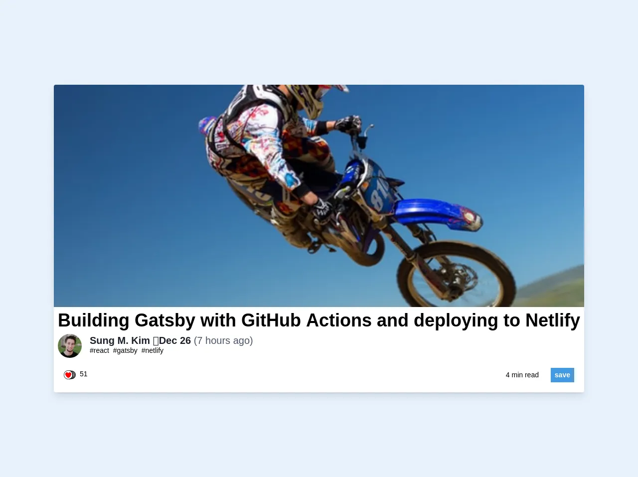
The preview of dev.to post card UI component
To create a Dev.to post card UI component using Tailwind CSS, we need to use a combination of classes to style the different elements of the card. Here is a preview of the Dev.to post card UI component:
Free download of the dev.to post card's source code
The source code of dev.to post card UI component
To create a Dev.to post card UI component using Tailwind CSS, we need to use a combination of classes to style the different elements of the card. Here is the source code of the Dev.to post card UI component:
<div class="rounded overflow-hidden shadow-lg bg-white">
  <div class="w-full">
    <img src="http://source.unsplash.com/ugo3jZ_qtKo/604x253" class="w-full">
  </div>
  <div class="px-2 pb-5">
    <h1 class="text-4xl justify-between font-bold">Building Gatsby with GitHub Actions and deploying to Netlify</h1>
    <div class="flex items-center">
      <img class="w-12 h-12 rounded-full mr-4"
           src="https://images.unsplash.com/photo-1489481039754-8701aeda983b?ixlib=rb-1.2.1&ixid=eyJhcHBfaWQiOjEyMDd9&auto=format&fit=facearea&facepad=2.25&w=50&h=50&q=80">
      <div class="text-sm">
        <p class="text-gray-900 leading-none text-xl font-bold">Ahmed Ashraf ・Dec 26 <span class="font-thin text-gray-700">(7 hours ago)</span></p>
        <p class="text-black-600">
          <span class="pr-1"><a class="text-underline" href="#">#react</a></span>
          <span class="pr-1"><a class="text-underline" href="#">#gatsby</a></span>
          <span class="pr-1"><a class="text-underline" href="#">#netlify</a></span>
        </p>
      </div>
    </div>
  </div>
  <div class="flex items-center pb-5 px-5">
    <div class="w-1/3 flex">
      <img class="w-6"
           src="https://practicaldev-herokuapp-com.freetls.fastly.net/assets/reactions-stack-ee166e138ca182a567f74c986b6f810f670f4d199aca9c550cc7e6f49f34bd33.png"
           alt="likes">
      <div class="text-sm">
        <p class="leading-none ml-2">51</p>
      </div>
    </div>
    <div class="w-1/3"></div>
    <div class="w-1/3 float-right text-right">
      <div class="text-sm">
        <span>4 min read</span>
        <button class="ml-5 py-1 px-2 bg-blue-500 hover:bg-blue-700 text-white font-bold">save</button>
      </div>
    </div>
  </div>
</div>
How to create a dev.to post card with Tailwind CSS?
To create a Dev.to post card with Tailwind CSS, we need to follow the below steps:
Step 1: Create a HTML structure for the card
We need to create a HTML structure for the card that contains the different elements of the card such as the title, author name, date, and number of reactions and comments.
<div class="bg-white rounded-lg shadow-md p-6">
  <h2 class="text-lg font-medium text-gray-900 mb-2">Title of the post</h2>
  <p class="text-gray-700 mb-3">Author name</p>
  <p class="text-gray-700 mb-3">Date of the post</p>
  <div class="flex items-center text-gray-700">
    <svg class="h-6 w-6 mr-1" fill="none" stroke="currentColor" viewBox="0 0 24 24" xmlns="http://www.w3.org/2000/svg"><path stroke-linecap="round" stroke-linejoin="round" stroke-width="2" d="M5 12h14M12 5l7 7-7 7"></path></svg>
    <p class="mr-2">Number of reactions</p>
    <svg class="h-6 w-6 mr-1" fill="none" stroke="currentColor" viewBox="0 0 24 24" xmlns="http://www.w3.org/2000/svg"><path stroke-linecap="round" stroke-linejoin="round" stroke-width="2" d="M19 9l-7 7-7-7"></path></svg>
    <p>Number of comments</p>
  </div>
</div>
Step 2: Add Tailwind CSS classes to the HTML elements
We need to add Tailwind CSS classes to the HTML elements to style them. Here is the updated HTML code with Tailwind CSS classes:
<div class="bg-white rounded-lg shadow-md p-6">
  <h2 class="text-lg font-medium text-gray-900 mb-2">Title of the post</h2>
  <p class="text-gray-700 mb-3">Author name</p>
  <p class="text-gray-700 mb-3">Date of the post</p>
  <div class="flex items-center text-gray-700">
    <svg class="h-6 w-6 mr-1" fill="none" stroke="currentColor" viewBox="0 0 24 24" xmlns="http://www.w3.org/2000/svg"><path stroke-linecap="round" stroke-linejoin="round" stroke-width="2" d="M5 12h14M12 5l7 7-7 7"></path></svg>
    <p class="mr-2">Number of reactions</p>
    <svg class="h-6 w-6 mr-1" fill="none" stroke="currentColor" viewBox="0 0 24 24" xmlns="http://www.w3.org/2000/svg"><path stroke-linecap="round" stroke-linejoin="round" stroke-width="2" d="M19 9l-7 7-7-7"></path></svg>
    <p>Number of comments</p>
  </div>
</div>
Step 3: Add custom styles using Tailwind CSS
We can add custom styles using Tailwind CSS to further enhance the design of the Dev.to post card. Here is the updated HTML code with custom styles using Tailwind CSS:
<div class="bg-white rounded-lg shadow-md p-6">
  <h2 class="text-lg font-medium text-gray-900 mb-2">Title of the post</h2>
  <p class="text-gray-700 mb-3">Author name</p>
  <p class="text-gray-700 mb-3">Date of the post</p>
  <div class="flex items-center text-gray-700">
    <svg class="h-6 w-6 mr-1" fill="none" stroke="currentColor" viewBox="0 0 24 24" xmlns="http://www.w3.org/2000/svg"><path stroke-linecap="round" stroke-linejoin="round" stroke-width="2" d="M5 12h14M12 5l7 7-7 7"></path></svg>
    <p class="mr-2">Number of reactions</p>
    <svg class="h-6 w-6 mr-1" fill="none" stroke="currentColor" viewBox="0 0 24 24" xmlns="http://www.w3.org/2000/svg"><path stroke-linecap="round" stroke-linejoin="round" stroke-width="2" d="M19 9l-7 7-7-7"></path></svg>
    <p>Number of comments</p>
  </div>
</div>
Step 4: Add interactivity using JavaScript
We can add interactivity to the Dev.to post card using JavaScript. For example, we can add a click event to the card that redirects the user to the post page. Here is the updated HTML code with JavaScript:
<div class="bg-white rounded-lg shadow-md p-6" onclick="window.location.href='post.html'">
  <h2 class="text-lg font-medium text-gray-900 mb-2">Title of the post</h2>
  <p class="text-gray-700 mb-3">Author name</p>
  <p class="text-gray-700 mb-3">Date of the post</p>
  <div class="flex items-center text-gray-700">
    <svg class="h-6 w-6 mr-1" fill="none" stroke="currentColor" viewBox="0 0 24 24" xmlns="http://www.w3.org/2000/svg"><path stroke-linecap="round" stroke-linejoin="round" stroke-width="2" d="M5 12h14M12 5l7 7-7 7"></path></svg>
    <p class="mr-2">Number of reactions</p>
    <svg class="h-6 w-6 mr-1" fill="none" stroke="currentColor" viewBox="0 0 24 24" xmlns="http://www.w3.org/2000/svg"><path stroke-linecap="round" stroke-linejoin="round" stroke-width="2" d="M19 9l-7 7-7-7"></path></svg>
    <p>Number of comments</p>
  </div>
</div>
Conclusion
In conclusion, Tailwind CSS is a utility-first CSS framework that provides a set of pre-defined classes to create responsive and modern web applications. Using Tailwind CSS to create a Dev.to post card UI component can help in reducing the development time and effort. In this article, we discussed the 5 really obvious ways to build a Dev.to post card with Tailwind CSS better than you ever did. We hope this article helps you in creating a custom and responsive Dev.to post card using Tailwind CSS.