- Published on
3 Things You Must Know To Create A Desktop Stats Preview With Tailwind CSS
- What is Tailwind CSS?
- The description of Desktop Stats Preview ui component
- Why use Tailwind CSS to create a Desktop Stats Preview ui component?
- The preview of Desktop Stats Preview ui component
- The source code of Desktop Stats Preview ui component
- How to create a Desktop Stats Preview with Tailwind CSS?
- Conclusion
What is Tailwind CSS?
Tailwind CSS is a popular utility-first CSS framework that provides a set of pre-defined classes to help you quickly build custom user interfaces. It allows you to create complex designs with minimal effort, and it's perfect for developers who want to focus on functionality rather than design.
Tailwind CSS is highly customizable and can be used with any JavaScript framework or library. It also has a large community of developers who contribute to its development and provide support to other users.
The description of Desktop Stats Preview ui component
The Desktop Stats Preview is a UI component that displays various statistics in a visually appealing way. It's commonly used in dashboards, admin panels, and other data-heavy applications.
The component typically consists of a set of cards, each displaying a different statistic, such as the number of users, revenue, or pageviews. The cards are arranged in a grid layout and can be customized to fit the specific needs of the application.
Why use Tailwind CSS to create a Desktop Stats Preview ui component?
Tailwind CSS is an excellent choice for creating a Desktop Stats Preview UI component for several reasons:
Speed up development: Tailwind CSS provides a set of pre-defined classes that can be used to quickly style UI components. This can significantly speed up development time and reduce the amount of custom CSS that needs to be written.
Highly customizable: Tailwind CSS is highly customizable and allows for easy customization of UI components. This means that the Desktop Stats Preview can be easily customized to fit the specific needs of the application.
Large community: Tailwind CSS has a large community of developers who contribute to its development and provide support to other users. This means that there is a wealth of resources available to help developers create custom UI components.
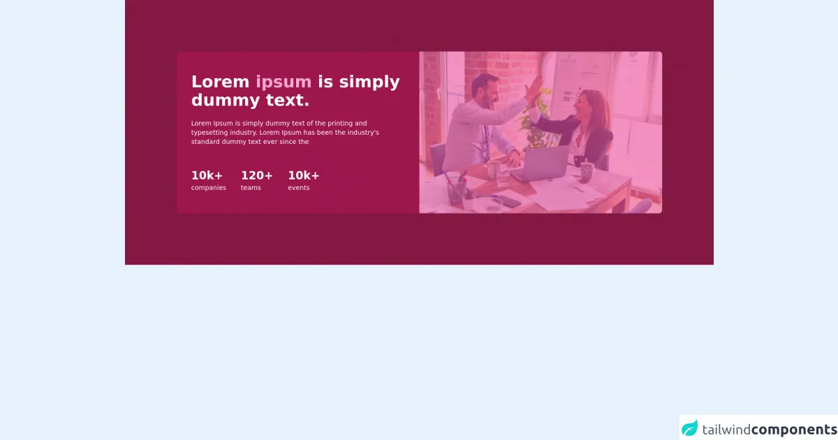
The preview of Desktop Stats Preview ui component
The Desktop Stats Preview UI component typically consists of a set of cards, each displaying a different statistic. The cards are arranged in a grid layout and can be customized to fit the specific needs of the application.
Free download of the Desktop Stats Preview's source code
The source code of Desktop Stats Preview ui component
The source code for the Desktop Stats Preview UI component can be easily created using Tailwind CSS. The component can be broken down into several parts, including the HTML structure and the CSS styling.
<!-- This is an example component -->
<div class="bg-pink-900 p-28">
    <div class='md:flex'>
        <div class="md:w-6/12 text-white bg-pink-800 p-8 sm:rounded-tr-lg md:rounded-tr-none md:rounded-bl-lg rounded-tl-lg flex items-center">
            <div>
                <h1 class="text-4xl mb-5 font-bold">Lorem <span class="text-pink-300">ipsum</span> is simply dummy text.</h1>
                <h2 class="text-sm mb-12">Lorem Ipsum is simply dummy
                    text of the printing and typesetting industry. Lorem Ipsum has been the industry's standard dummy text ever since the </h2>
                <div class="flex">
                    <div class="mr-8">
                        <p class="text-2xl font-bold">10k+</p>
                        <p class="text-sm">companies</p>
                    </div>
                    <div class="mr-8">
                        <p class="text-2xl font-bold">120+</p>
                        <p class="text-sm">teams</p>
                    </div>
                    <div>
                        <p class="text-2xl font-bold">10k+</p>
                        <p class="text-sm">events</p>
                    </div>
                </div>
            </div>
        </div>
        <div class="md:w-6/12 relative">
            <div class="bg-pink-500 w-full h-full opacity-60 absolute sm:rounded-bl-lg md:rounded-bl-none md:rounded-tr-lg rounded-br-lg"></div>
            <img class="h-full w-full object-cover sm:rounded-bl-lg md:rounded-bl-none md:rounded-tr-lg rounded-br-lg" src="https://images.unsplash.com/photo-1600880292203-757bb62b4baf?ixid=MnwxMjA3fDB8MHxwaG90by1wYWdlfHx8fGVufDB8fHx8&ixlib=rb-1.2.1&auto=format&fit=crop&w=550&q=80" alt="Banner Desktop"/>
        </div>
    </div>
</div>
How to create a Desktop Stats Preview with Tailwind CSS?
Creating a Desktop Stats Preview with Tailwind CSS is relatively straightforward. Here are the steps to follow:
Create the HTML structure: The first step is to create the HTML structure for the component. This typically involves creating a set of cards, each displaying a different statistic.
Add Tailwind CSS classes: The next step is to add Tailwind CSS classes to the HTML structure to style the component. This can be done by adding classes such as
bg-white,shadow-md,rounded-lg, andp-6to the cards.Customize the component: The final step is to customize the component to fit the specific needs of the application. This can be done by adding custom CSS or by modifying the Tailwind CSS classes.
Conclusion
Creating a Desktop Stats Preview UI component with Tailwind CSS is a great way to quickly and easily create a visually appealing component for data-heavy applications. Tailwind CSS provides a set of pre-defined classes that can be used to speed up development time and reduce the amount of custom CSS that needs to be written.
By following the steps outlined in this article, you can create a Desktop Stats Preview UI component that is highly customizable and fits the specific needs of your application.