- Published on
6 Easy Ways To Create A Description List Left Align On Card With Tailwind CSS Without Even Thinking About It
- What is Tailwind CSS?
- The description of description list left align on card ui component
- Why use Tailwind CSS to create a description list left align on card ui component?
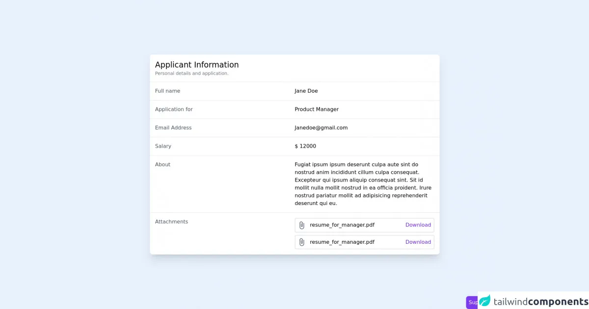
- The preview of description list left align on card ui component.
- The source code of description list left align on card ui component.
- How to create a description list left align on card with Tailwind CSS?
- Conclusion
As a FrontEnd technology blogger, it's important to stay up-to-date with the latest tools and techniques. One such tool that has gained popularity in recent years is Tailwind CSS. Tailwind CSS is a utility-first CSS framework that allows you to quickly and easily create responsive designs. In this article, we will discuss how to create a description list left align on card ui component with Tailwind CSS.
What is Tailwind CSS?
Tailwind CSS is a utility-first CSS framework that provides a set of pre-defined classes that you can use to style your HTML elements. The framework is designed to be highly customizable, allowing you to create unique designs without having to write custom CSS.
The description of description list left align on card ui component
A description list left align on card ui component is a common design pattern used in web development. It is typically used to display information about a product or service in a structured and organized way. The component consists of a card with a title, image, and a list of descriptions.
Why use Tailwind CSS to create a description list left align on card ui component?
Tailwind CSS provides a set of pre-defined classes that make it easy to create a description list left align on card ui component without having to write custom CSS. This saves time and allows you to focus on other aspects of your project.
The preview of description list left align on card ui component.
To create a description list left align on card ui component with Tailwind CSS, you can use the following classes:
<div class="bg-white rounded-lg shadow-lg">
  <div class="p-4">
    <h2 class="text-lg font-medium text-gray-900">Title</h2>
    <img src="image.jpg" alt="Image" class="w-full h-48 object-cover mt-2">
    <dl class="mt-2 border-t border-b border-gray-300 divide-y divide-gray-300">
      <div class="py-3 flex justify-between">
        <dt class="text-sm font-medium text-gray-500">Description 1</dt>
        <dd class="text-sm text-gray-900">Value 1</dd>
      </div>
      <div class="py-3 flex justify-between">
        <dt class="text-sm font-medium text-gray-500">Description 2</dt>
        <dd class="text-sm text-gray-900">Value 2</dd>
      </div>
    </dl>
  </div>
</div>
Free download of the description list left align on card's source code
The source code of description list left align on card ui component.
To create a description list left align on card ui component with Tailwind CSS, you can use the following classes:
<div class="bg-white rounded-lg shadow-lg">
  <div class="p-4">
    <h2 class="text-lg font-medium text-gray-900">Title</h2>
    <img src="image.jpg" alt="Image" class="w-full h-48 object-cover mt-2">
    <dl class="mt-2 border-t border-b border-gray-300 divide-y divide-gray-300">
      <div class="py-3 flex justify-between">
        <dt class="text-sm font-medium text-gray-500">Description 1</dt>
        <dd class="text-sm text-gray-900">Value 1</dd>
      </div>
      <div class="py-3 flex justify-between">
        <dt class="text-sm font-medium text-gray-500">Description 2</dt>
        <dd class="text-sm text-gray-900">Value 2</dd>
      </div>
    </dl>
  </div>
</div>
<!-- This is an example component -->
<div class="min-h-screen flex items-center justify-center px-4">

    <div class="max-w-4xl  bg-white w-full rounded-lg shadow-xl">
        <div class="p-4 border-b">
            <h2 class="text-2xl ">
                Applicant Information
            </h2>
            <p class="text-sm text-gray-500">
                Personal details and application.
            </p>
        </div>
        <div>
            <div class="md:grid md:grid-cols-2 hover:bg-gray-50 md:space-y-0 space-y-1 p-4 border-b">
                <p class="text-gray-600">
                    Full name
                </p>
                <p>
                    Jane Doe
                </p>
            </div>
            <div class="md:grid md:grid-cols-2 hover:bg-gray-50 md:space-y-0 space-y-1 p-4 border-b">
                <p class="text-gray-600">
                    Application for
                </p>
                <p>
                    Product Manager
                </p>
            </div>
            <div class="md:grid md:grid-cols-2 hover:bg-gray-50 md:space-y-0 space-y-1 p-4 border-b">
                <p class="text-gray-600">
                    Email Address
                </p>
                <p>
                    [email protected]
                </p>
            </div>
            <div class="md:grid md:grid-cols-2 hover:bg-gray-50 md:space-y-0 space-y-1 p-4 border-b">
                <p class="text-gray-600">
                    Salary
                </p>
                <p>
                    $ 12000
                </p>
            </div>
            <div class="md:grid md:grid-cols-2 hover:bg-gray-50 md:space-y-0 space-y-1 p-4 border-b">
                <p class="text-gray-600">
                    About
                </p>
                <p>
                    Fugiat ipsum ipsum deserunt culpa aute sint do nostrud anim incididunt cillum culpa consequat. Excepteur qui ipsum aliquip consequat sint. Sit id mollit nulla mollit nostrud in ea officia proident. Irure nostrud pariatur mollit ad adipisicing reprehenderit deserunt qui eu.
                </p>
            </div>
            <div class="md:grid md:grid-cols-2 hover:bg-gray-50 md:space-y-0 space-y-1 p-4">
                <p class="text-gray-600">
                    Attachments
                </p>
                <div class="space-y-2">
                    <div class="border-2 flex items-center p-2 rounded justify-between space-x-2">
                        <div class="space-x-2 truncate">
                            <svg xmlns="http://www.w3.org/2000/svg" class="fill-current inline text-gray-500" width="24" height="24" viewBox="0 0 24 24"><path d="M17 5v12c0 2.757-2.243 5-5 5s-5-2.243-5-5v-12c0-1.654 1.346-3 3-3s3 1.346 3 3v9c0 .551-.449 1-1 1s-1-.449-1-1v-8h-2v8c0 1.657 1.343 3 3 3s3-1.343 3-3v-9c0-2.761-2.239-5-5-5s-5 2.239-5 5v12c0 3.866 3.134 7 7 7s7-3.134 7-7v-12h-2z"/></svg>
                            <span>
                                resume_for_manager.pdf
                            </span>
                        </div>
                        <a href="#" class="text-purple-700 hover:underline">
                            Download
                        </a>
                    </div>
                </div>
            </div>
        </div>
    </div>


    <!-- support me by buying a coffee -->
    <a href="https://www.buymeacoffee.com/danimai" target="_blank" class="bg-purple-600 p-2 rounded-lg text-white fixed right-0 bottom-0">
        Support me
    </a>
</div>
How to create a description list left align on card with Tailwind CSS?
To create a description list left align on card ui component with Tailwind CSS, follow these simple steps:
- Create a div with the class "bg-white rounded-lg shadow-lg" to create a card.
- Inside the card div, create another div with the class "p-4" to add padding to the card.
- Add a heading to the card using the "text-lg font-medium text-gray-900" classes.
- Add an image to the card using the "w-full h-48 object-cover mt-2" classes.
- Create a description list using the "mt-2 border-t border-b border-gray-300 divide-y divide-gray-300" classes.
- Add each description and its corresponding value using the "py-3 flex justify-between", "text-sm font-medium text-gray-500", and "text-sm text-gray-900" classes.
Conclusion
In conclusion, creating a description list left align on card ui component with Tailwind CSS is a simple and easy process. By using pre-defined classes, you can quickly create a professional-looking design without having to write custom CSS. With these six easy steps, you can create a description list left align on card ui component without even thinking about it.