- Published on
How To Create A Description Cards With Tailwind CSS From Scratch
- What is Tailwind CSS?
- The description of Description Cards UI component
- Why use Tailwind CSS to create a Description Cards UI component?
- The preview of Description Cards UI component
- The source code of Description Cards UI component
- How to create a Description Cards with Tailwind CSS?
- Step 1: Set up your HTML
- Step 2: Add Tailwind CSS
- Step 3: Style your HTML
- Conclusion
In the world of web development, creating UI components is a common task. One of the most popular CSS frameworks for this purpose is Tailwind CSS. In this article, we will learn how to create a Description Cards UI component with Tailwind CSS from scratch.
What is Tailwind CSS?
Tailwind CSS is a utility-first CSS framework that allows you to quickly create custom designs without writing any CSS code. It provides a set of pre-defined classes that you can use to style your HTML elements. With Tailwind CSS, you can create responsive designs that work on all devices.
The description of Description Cards UI component
A Description Card is a UI component that displays an image, a title, a short description, and a call-to-action button. It is commonly used in e-commerce websites to showcase products. The Description Card is a simple and effective way to present information in a visually appealing manner.
Why use Tailwind CSS to create a Description Cards UI component?
Tailwind CSS provides a set of pre-defined classes that you can use to style your HTML elements. This means that you don't have to write any CSS code from scratch. With Tailwind CSS, you can create a Description Card UI component quickly and easily.
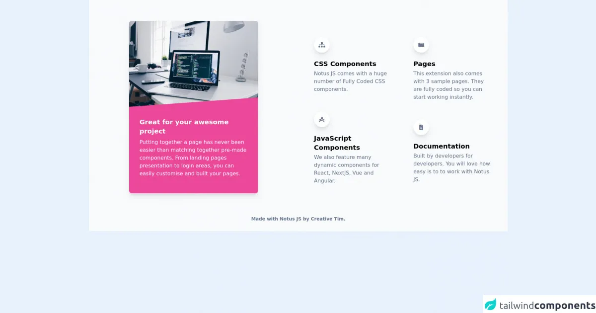
The preview of Description Cards UI component
To create a Description Card UI component, we will use Tailwind CSS. The final product will look something like this:
Free download of the Description Cards's source code
The source code of Description Cards UI component
To create a Description Card UI component, we will use HTML and Tailwind CSS. The source code for the Description Card UI component is as follows:
<link rel="stylesheet" href="https://demos.creative-tim.com/notus-js/assets/styles/tailwind.css">
<link rel="stylesheet" href="https://demos.creative-tim.com/notus-js/assets/vendor/@fortawesome/fontawesome-free/css/all.min.css">
<section class="relative pt-16 bg-blueGray-50">
<div class="container mx-auto">
<div class="flex flex-wrap items-center">
<div class="w-10/12 md:w-6/12 lg:w-4/12 px-12 md:px-4 mr-auto ml-auto -mt-78">
<div class="relative flex flex-col min-w-0 break-words bg-white w-full mb-6 shadow-lg rounded-lg bg-pink-500">
<img alt="..." src="https://images.unsplash.com/photo-1498050108023-c5249f4df085?ixlib=rb-1.2.1&ixid=eyJhcHBfaWQiOjEyMDd9&auto=format&fit=crop&w=700&q=80" class="w-full align-middle rounded-t-lg">
<blockquote class="relative p-8 mb-4">
<svg preserveAspectRatio="none" xmlns="http://www.w3.org/2000/svg" viewBox="0 0 583 95" class="absolute left-0 w-full block h-95-px -top-94-px">
<polygon points="-30,95 583,95 583,65" class="text-pink-500 fill-current"></polygon>
</svg>
<h4 class="text-xl font-bold text-white">
Great for your awesome project
</h4>
<p class="text-md font-light mt-2 text-white">
Putting together a page has never been easier than matching
together pre-made components. From landing pages presentation
to login areas, you can easily customise and built your pages.
</p>
</blockquote>
</div>
</div>
<div class="w-full md:w-6/12 px-4">
<div class="flex flex-wrap">
<div class="w-full md:w-6/12 px-4">
<div class="relative flex flex-col mt-4">
<div class="px-4 py-5 flex-auto">
<div class="text-blueGray-500 p-3 text-center inline-flex items-center justify-center w-12 h-12 mb-5 shadow-lg rounded-full bg-white">
<i class="fas fa-sitemap"></i>
</div>
<h6 class="text-xl mb-1 font-semibold">CSS Components</h6>
<p class="mb-4 text-blueGray-500">
Notus JS comes with a huge number of Fully Coded CSS
components.
</p>
</div>
</div>
<div class="relative flex flex-col min-w-0">
<div class="px-4 py-5 flex-auto">
<div class="text-blueGray-500 p-3 text-center inline-flex items-center justify-center w-12 h-12 mb-5 shadow-lg rounded-full bg-white">
<i class="fas fa-drafting-compass"></i>
</div>
<h6 class="text-xl mb-1 font-semibold">
JavaScript Components
</h6>
<p class="mb-4 text-blueGray-500">
We also feature many dynamic components for React, NextJS,
Vue and Angular.
</p>
</div>
</div>
</div>
<div class="w-full md:w-6/12 px-4">
<div class="relative flex flex-col min-w-0 mt-4">
<div class="px-4 py-5 flex-auto">
<div class="text-blueGray-500 p-3 text-center inline-flex items-center justify-center w-12 h-12 mb-5 shadow-lg rounded-full bg-white">
<i class="fas fa-newspaper"></i>
</div>
<h6 class="text-xl mb-1 font-semibold">Pages</h6>
<p class="mb-4 text-blueGray-500">
This extension also comes with 3 sample pages. They are
fully coded so you can start working instantly.
</p>
</div>
</div>
<div class="relative flex flex-col min-w-0">
<div class="px-4 py-5 flex-auto">
<div class="text-blueGray-500 p-3 text-center inline-flex items-center justify-center w-12 h-12 mb-5 shadow-lg rounded-full bg-white">
<i class="fas fa-file-alt"></i>
</div>
<h6 class="text-xl mb-1 font-semibold">Documentation</h6>
<p class="mb-4 text-blueGray-500">
Built by developers for developers. You will love how easy
is to to work with Notus JS.
</p>
</div>
</div>
</div>
</div>
</div>
</div>
</div>
<footer class="relative bg-blueGray-50 pt-8 pb-6 mt-2">
<div class="container mx-auto px-4">
<div class="flex flex-wrap items-center md:justify-between justify-center">
<div class="w-full md:w-6/12 px-4 mx-auto text-center">
<div class="text-sm text-blueGray-500 font-semibold py-1">
Made with <a href="https://www.creative-tim.com/product/notus-js" class="text-blueGray-500 hover:text-gray-800" target="_blank">Notus JS</a> by <a href="https://www.creative-tim.com" class="text-blueGray-500 hover:text-blueGray-800" target="_blank"> Creative Tim</a>.
</div>
</div>
</div>
</div>
</footer>
</section>
How to create a Description Cards with Tailwind CSS?
To create a Description Card UI component with Tailwind CSS, follow these steps:
Step 1: Set up your HTML
The first step is to set up your HTML. Create a new HTML file and add the following code:
<div class="max-w-sm rounded overflow-hidden shadow-lg">
  <img class="w-full" src="img/card-top.jpg" alt="Sunset in the mountains">
  <div class="px-6 py-4">
    <div class="font-bold text-xl mb-2">The Coldest Sunset</div>
    <p class="text-gray-700 text-base">
      Lorem ipsum dolor sit amet, consectetur adipisicing elit. Voluptatibus quia, nulla! Maiores et perferendis eaque, exercitationem praesentium nihil.
    </p>
  </div>
  <div class="px-6 pt-4 pb-2">
    <button class="bg-blue-500 hover:bg-blue-700 text-white font-bold py-2 px-4 rounded">
      Buy Now
    </button>
  </div>
</div>
In this code, we have created a container div with a maximum width of 640 pixels. Inside this container, we have added an image, a title, a description, and a call-to-action button.
Step 2: Add Tailwind CSS
The next step is to add Tailwind CSS to your HTML file. You can do this by adding the following code to the head section of your HTML file:
<link href="https://cdn.jsdelivr.net/npm/tailwindcss@latest/dist/tailwind.min.css" rel="stylesheet">
This code will link your HTML file to the latest version of Tailwind CSS.
Step 3: Style your HTML
The final step is to style your HTML using Tailwind CSS classes. In the code above, we have used several Tailwind CSS classes to style our HTML. Here is an explanation of each class:
max-w-sm: This class sets the maximum width of the container to 640 pixels.rounded: This class adds rounded corners to the container.overflow-hidden: This class hides any content that overflows the container.shadow-lg: This class adds a shadow to the container.w-full: This class sets the width of the image to 100%.px-6: This class adds padding to the left and right sides of the container.py-4: This class adds padding to the top and bottom of the container.font-bold: This class sets the font weight of the title to bold.text-xl: This class sets the font size of the title to extra large.mb-2: This class adds margin to the bottom of the title.text-gray-700: This class sets the color of the description to gray.text-base: This class sets the font size of the description to base.px-6: This class adds padding to the left and right sides of the container.pt-4: This class adds padding to the top of the container.pb-2: This class adds padding to the bottom of the container.bg-blue-500: This class sets the background color of the button to blue.hover:bg-blue-700: This class sets the background color of the button to dark blue when hovered over.text-white: This class sets the text color of the button to white.font-bold: This class sets the font weight of the button to bold.py-2: This class adds padding to the top and bottom of the button.px-4: This class adds padding to the left and right sides of the button.rounded: This class adds rounded corners to the button.
Conclusion
In this article, we have learned how to create a Description Card UI component with Tailwind CSS from scratch. We have seen how Tailwind CSS can be used to quickly and easily style HTML elements. With Tailwind CSS, you can create responsive designs that work on all devices.