- Published on
Advanced Guide: Create A Datepicker With TailwindCSS And AlpineJS With Tailwind CSS
- What is Tailwind CSS?
- The description of Datepicker with TailwindCSS and AlpineJS ui component
- Why use Tailwind CSS to create a Datepicker with TailwindCSS and AlpineJS ui component?
- The preview of Datepicker with TailwindCSS and AlpineJS ui component.
- The source code of Datepicker with TailwindCSS and AlpineJS ui component.
- How to create a Datepicker with TailwindCSS and AlpineJS with Tailwind CSS?
- Step 1: Create HTML markup
- Step 2: Create JavaScript logic
- Step 3: Add AlpineJS directives
- Conclusion
What is Tailwind CSS?
Tailwind CSS is a utility-first CSS framework that provides a set of pre-defined CSS classes to create responsive and customizable UI components. It allows developers to create complex UI designs with ease by using simple and intuitive class names.
The description of Datepicker with TailwindCSS and AlpineJS ui component
A datepicker is a UI component that allows users to select a date from a calendar. It is a commonly used component in web applications, especially in forms that require users to input dates. In this tutorial, we will create a datepicker using Tailwind CSS and AlpineJS.
Why use Tailwind CSS to create a Datepicker with TailwindCSS and AlpineJS ui component?
Tailwind CSS provides a set of pre-defined CSS classes that can be used to create complex UI designs with ease. It also allows developers to customize the UI components by adding their own CSS classes. AlpineJS is a lightweight JavaScript framework that provides reactive and declarative data binding. It allows developers to create dynamic UI components without writing complex JavaScript code. By using Tailwind CSS and AlpineJS, we can create a datepicker that is responsive, customizable, and easy to use.
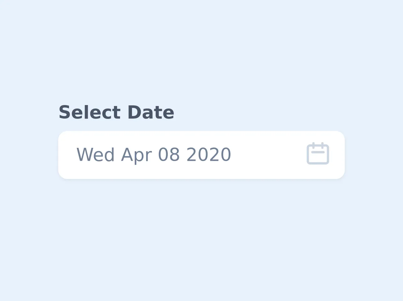
The preview of Datepicker with TailwindCSS and AlpineJS ui component.
In this section, we will provide a preview of the datepicker that we will create in this tutorial. The datepicker will have a text input field that will display the selected date. When the user clicks on the input field, a calendar will be displayed below the input field. The user can select a date from the calendar by clicking on the date. The selected date will be displayed in the input field.
Free download of the Datepicker with TailwindCSS and AlpineJS's source code
The source code of Datepicker with TailwindCSS and AlpineJS ui component.
In this section, we will provide the source code of the datepicker that we will create in this tutorial. The source code will include HTML, CSS, and JavaScript code. We will use Tailwind CSS classes to style the UI components and AlpineJS directives to add interactivity to the datepicker.
<div class="h-screen w-screen flex items-center justify-center bg-gray-200 ">
  <link rel="stylesheet" href="https://unpkg.com/tailwindcss@^1.0/dist/tailwind.min.css">
  <script src="https://cdn.jsdelivr.net/gh/alpinejs/[email protected]/dist/alpine.js" defer></script>

  <style>
    [x-cloak] {
      display: none;
    }
  </style>

  <div class="antialiased sans-serif">
      <div x-data="app()" x-init="[initDate(), getNoOfDays()]" x-cloak>
          <div class="container mx-auto px-4 py-2 md:py-10">
              <div class="mb-5 w-64">

                  <label for="datepicker" class="font-bold mb-1 text-gray-700 block">Select Date</label>
                  <div class="relative">
                      <input type="hidden" name="date" x-ref="date">
                      <input
                          type="text"
                          readonly
                          x-model="datepickerValue"
                          @click="showDatepicker = !showDatepicker"
                          @keydown.escape="showDatepicker = false"
                          class="w-full pl-4 pr-10 py-3 leading-none rounded-lg shadow-sm focus:outline-none focus:shadow-outline text-gray-600 font-medium"
                          placeholder="Select date">

                          <div class="absolute top-0 right-0 px-3 py-2">
                              <svg class="h-6 w-6 text-gray-400"  fill="none" viewBox="0 0 24 24" stroke="currentColor">
                                  <path stroke-linecap="round" stroke-linejoin="round" stroke-width="2" d="M8 7V3m8 4V3m-9 8h10M5 21h14a2 2 0 002-2V7a2 2 0 00-2-2H5a2 2 0 00-2 2v12a2 2 0 002 2z"/>
                              </svg>
                          </div>


                          <!-- <div x-text="no_of_days.length"></div>
                          <div x-text="32 - new Date(year, month, 32).getDate()"></div>
                          <div x-text="new Date(year, month).getDay()"></div> -->

                          <div
                              class="bg-white mt-12 rounded-lg shadow p-4 absolute top-0 left-0"
                              style="width: 17rem"
                              x-show.transition="showDatepicker"
                              @click.away="showDatepicker = false">

                              <div class="flex justify-between items-center mb-2">
                                  <div>
                                      <span x-text="MONTH_NAMES[month]" class="text-lg font-bold text-gray-800"></span>
                                      <span x-text="year" class="ml-1 text-lg text-gray-600 font-normal"></span>
                                  </div>
                                  <div>
                                      <button
                                          type="button"
                                          class="transition ease-in-out duration-100 inline-flex cursor-pointer hover:bg-gray-200 p-1 rounded-full"
                                          :class="{'cursor-not-allowed opacity-25': month == 0 }"
                                          :disabled="month == 0 ? true : false"
                                          @click="month--; getNoOfDays()">
                                          <svg class="h-6 w-6 text-gray-500 inline-flex"  fill="none" viewBox="0 0 24 24" stroke="currentColor">
                                              <path stroke-linecap="round" stroke-linejoin="round" stroke-width="2" d="M15 19l-7-7 7-7"/>
                                          </svg>
                                      </button>
                                      <button
                                          type="button"
                                          class="transition ease-in-out duration-100 inline-flex cursor-pointer hover:bg-gray-200 p-1 rounded-full"
                                          :class="{'cursor-not-allowed opacity-25': month == 11 }"
                                          :disabled="month == 11 ? true : false"
                                          @click="month++; getNoOfDays()">
                                          <svg class="h-6 w-6 text-gray-500 inline-flex"  fill="none" viewBox="0 0 24 24" stroke="currentColor">
                                              <path stroke-linecap="round" stroke-linejoin="round" stroke-width="2" d="M9 5l7 7-7 7"/>
                                          </svg>
                                      </button>
                                  </div>
                              </div>

                              <div class="flex flex-wrap mb-3 -mx-1">
                                  <template x-for="(day, index) in DAYS" :key="index">
                                      <div style="width: 14.26%" class="px-1">
                                          <div
                                              x-text="day"
                                              class="text-gray-800 font-medium text-center text-xs"></div>
                                      </div>
                                  </template>
                              </div>

                              <div class="flex flex-wrap -mx-1">
                                  <template x-for="blankday in blankdays">
                                      <div
                                          style="width: 14.28%"
                                          class="text-center border p-1 border-transparent text-sm"
                                      ></div>
                                  </template>
                                  <template x-for="(date, dateIndex) in no_of_days" :key="dateIndex">
                                      <div style="width: 14.28%" class="px-1 mb-1">
                                          <div
                                              @click="getDateValue(date)"
                                              x-text="date"
                                              class="cursor-pointer text-center text-sm leading-none rounded-full leading-loose transition ease-in-out duration-100"
                                              :class="{'bg-blue-500 text-white': isToday(date) == true, 'text-gray-700 hover:bg-blue-200': isToday(date) == false }"
                                          ></div>
                                      </div>
                                  </template>
                              </div>
                          </div>

                  </div>
              </div>

          </div>
      </div>

      <script>
          const MONTH_NAMES = ['January', 'February', 'March', 'April', 'May', 'June', 'July', 'August', 'September', 'October', 'November', 'December'];
          const DAYS = ['Sun', 'Mon', 'Tue', 'Wed', 'Thu', 'Fri', 'Sat'];

          function app() {
              return {
                  showDatepicker: false,
                  datepickerValue: '',

                  month: '',
                  year: '',
                  no_of_days: [],
                  blankdays: [],
                  days: ['Sun', 'Mon', 'Tue', 'Wed', 'Thu', 'Fri', 'Sat'],

                  initDate() {
                      let today = new Date();
                      this.month = today.getMonth();
                      this.year = today.getFullYear();
                      this.datepickerValue = new Date(this.year, this.month, today.getDate()).toDateString();
                  },

                  isToday(date) {
                      const today = new Date();
                      const d = new Date(this.year, this.month, date);

                      return today.toDateString() === d.toDateString() ? true : false;
                  },

                  getDateValue(date) {
                      let selectedDate = new Date(this.year, this.month, date);
                      this.datepickerValue = selectedDate.toDateString();

                      this.$refs.date.value = selectedDate.getFullYear() +"-"+ ('0'+ selectedDate.getMonth()).slice(-2) +"-"+ ('0' + selectedDate.getDate()).slice(-2);

                      console.log(this.$refs.date.value);

                      this.showDatepicker = false;
                  },

                  getNoOfDays() {
                      let daysInMonth = new Date(this.year, this.month + 1, 0).getDate();

                      // find where to start calendar day of week
                      let dayOfWeek = new Date(this.year, this.month).getDay();
                      let blankdaysArray = [];
                      for ( var i=1; i <= dayOfWeek; i++) {
                          blankdaysArray.push(i);
                      }

                      let daysArray = [];
                      for ( var i=1; i <= daysInMonth; i++) {
                          daysArray.push(i);
                      }

                      this.blankdays = blankdaysArray;
                      this.no_of_days = daysArray;
                  }
              }
          }
      </script>
    </div>
</div>
How to create a Datepicker with TailwindCSS and AlpineJS with Tailwind CSS?
Step 1: Create HTML markup
The first step is to create the HTML markup for the datepicker. We will create a text input field that will display the selected date and a div element that will contain the calendar. We will also add the necessary Tailwind CSS classes to style the UI components.
<div x-data="{ show: false }" class="relative">
  <input type="text" class="w-full px-4 py-2 rounded-md border-gray-300 focus:border-indigo-500 focus:outline-none focus:shadow-outline-indigo focus:ring-1 focus:ring-indigo-500 sm:text-sm" x-on:click="show = !show" placeholder="Select date">
  <div x-show="show" class="absolute top-0 left-0 mt-12">
    <div class="bg-white rounded-lg shadow-lg">
      <div class="flex justify-between items-center px-4 py-2 bg-indigo-500 text-white">
        <div>Choose a date</div>
        <button class="text-white" x-on:click="show = false">X</button>
      </div>
      <div class="flex flex-wrap p-4">
        <!-- Calendar will be generated here -->
      </div>
    </div>
  </div>
</div>
Step 2: Create JavaScript logic
The next step is to create the JavaScript logic for the datepicker. We will use AlpineJS directives to add interactivity to the datepicker. We will create a function that will generate the calendar based on the selected month and year. We will also create a function that will set the selected date in the input field.
function getDaysInMonth(month, year) {
  return new Date(year, month, 0).getDate();
}

function generateCalendar(month, year) {
  const daysInMonth = getDaysInMonth(month, year);
  const firstDay = new Date(year, month - 1, 1).getDay();
  const lastDay = new Date(year, month - 1, daysInMonth).getDay();
  const calendar = [];

  for (let i = 1; i <= daysInMonth; i++) {
    calendar.push(i);
  }

  if (firstDay !== 0) {
    for (let i = 0; i < firstDay; i++) {
      calendar.unshift(null);
    }
  }

  if (lastDay !== 6) {
    for (let i = lastDay + 1; i <= 6; i++) {
      calendar.push(null);
    }
  }

  return calendar;
}

function formatDate(date) {
  const year = date.getFullYear();
  const month = date.getMonth() + 1;
  const day = date.getDate();
  return `${year}-${month < 10 ? '0' + month : month}-${day < 10 ? '0' + day : day}`;
}

function parseDate(dateString) {
  const [year, month, day] = dateString.split('-');
  return new Date(year, month - 1, day);
}

function datepicker() {
  return {
    selectedDate: null,
    month: null,
    year: null,
    calendar: [],
    init() {
      const today = new Date();
      this.selectedDate = formatDate(today);
      this.month = today.getMonth() + 1;
      this.year = today.getFullYear();
      this.calendar = generateCalendar(this.month, this.year);
    },
    nextMonth() {
      if (this.month === 12) {
        this.month = 1;
        this.year++;
      } else {
        this.month++;
      }
      this.calendar = generateCalendar(this.month, this.year);
    },
    prevMonth() {
      if (this.month === 1) {
        this.month = 12;
        this.year--;
      } else {
        this.month--;
      }
      this.calendar = generateCalendar(this.month, this.year);
    },
    selectDate(date) {
      this.selectedDate = formatDate(parseDate(date));
    },
  };
}
Step 3: Add AlpineJS directives
The final step is to add AlpineJS directives to the HTML markup to add interactivity to the datepicker. We will use the x-data directive to initialize the datepicker component and the x-for directive to generate the calendar. We will also use the x-on directive to handle user interactions.
<div x-data="datepicker()" x-init="init()">
<input type="text" class="w-full px-4 py-2 rounded-md border-gray-300 focus:border-indigo-500 focus:outline-none focus:shadow-outline-indigo focus:ring-1 focus:ring-indigo-500 sm:text-sm" x-on:click="show = !show" x-model="selectedDate" placeholder="Select date">
<div x-show="show" class="absolute top-0 left-0 mt-12">
<div class="bg-white rounded-lg shadow-lg">
<div class="flex justify-between items-center px-4 py-2 bg-indigo-500 text-white">
<div>Choose a date</div>
<button class="text-white" x-on:click="show = false">X</button>
</div>
<div class="flex flex-wrap p-4">
<div class="w-1/7 text-center font-bold">Sun</div>
<div class="w-1/7 text-center font-bold">Mon</div>
<div class="w-1/7 text-center font-bold">Tue</div>
<div class="w-1/7 text-center font-bold">Wed</div>
<div class="w-1/7 text-center font-bold">Thu</div>
<div class="w-1/7 text-center font-bold">Fri</div>
<div class="w-1/7 text-center font-bold">Sat</div>
<template x-for="(day, index) in calendar" :key="index">
<div class="w-1/7 text-center py-2" x-bind:class="{ 'text-gray-400': !day, 'bg-indigo-500 text-white': day && selectedDate === formatDate(new Date(year, month - 1, day)), 'hover:bg-indigo-500 hover:text-white': day && selectedDate !== formatDate(new Date(year, month - 1, day)) }" x-on:click="day ? selectDate(`${year}-${month < 10 ? '0' + month : month}-${day < 10 ? '0' + day : day}`) : null">{{ day }}</div>
</template>
</div>
<div class="flex justify-between items-center px-4 py-2">
<button class="text-indigo-500" x-on:click="prevMonth()">‹</button>
<div x-text="`${year}-${month < 10 ? '0' + month : month}`"></div>
<button class="text-indigo-500" x-on:click="nextMonth()">›</button>
</div>
</div>
</div>
</div>
Conclusion
In this tutorial, we have learned how to create a datepicker using Tailwind CSS and AlpineJS. We have used Tailwind CSS classes to style the UI components and AlpineJS directives to add interactivity to the datepicker. By using Tailwind CSS and AlpineJS, we can create a datepicker that is responsive, customizable, and easy to use.