- Published on
6 Ideas To Help You Build A Date Range Picker With Tailwind And Alpine JS With Tailwind CSS Like A Pro
- What is Tailwind CSS?
- The description of Date Range Picker with Tailwind and Alpine JS ui component
- Why use Tailwind CSS to create a Date Range Picker with Tailwind and Alpine JS ui component?
- The preview of Date Range Picker with Tailwind and Alpine JS ui component
- The source code of Date Range Picker with Tailwind and Alpine JS ui component
- How to create a Date Range Picker with Tailwind and Alpine JS with Tailwind CSS?
- 1. Install Tailwind CSS and Alpine JS
- 2. Add the HTML markup
- 3. Add the Alpine JS code
- 4. Style the Date Range Picker with Tailwind CSS
- 5. Add the Flatpickr CSS
- 6. Add the Flatpickr JavaScript
- Conclusion
Are you looking for a way to create a Date Range Picker with Tailwind and Alpine JS with Tailwind CSS? Look no further! In this article, we will give you 6 ideas to help you build a Date Range Picker with Tailwind and Alpine JS like a pro.
What is Tailwind CSS?
Tailwind CSS is a utility-first CSS framework that helps you quickly build custom user interfaces. It provides a set of pre-defined classes that you can use to style your HTML elements. With Tailwind CSS, you can create complex layouts and designs without writing any custom CSS.
The description of Date Range Picker with Tailwind and Alpine JS ui component
A Date Range Picker is a UI component that allows users to select a range of dates. It is commonly used in web applications that require users to select a date range, such as hotel booking websites, flight booking websites, and event management systems.
Why use Tailwind CSS to create a Date Range Picker with Tailwind and Alpine JS ui component?
Tailwind CSS provides a set of pre-defined classes that you can use to style your HTML elements. This makes it easy to create a Date Range Picker with Tailwind and Alpine JS without writing any custom CSS. Additionally, Tailwind CSS is highly customizable, which means you can easily modify the styles to match your application's design.
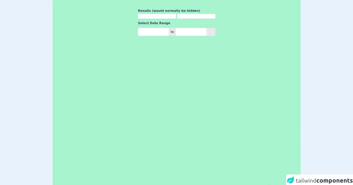
The preview of Date Range Picker with Tailwind and Alpine JS ui component
To create a Date Range Picker with Tailwind and Alpine JS, we will use the flatpickr library. Flatpickr is a lightweight and powerful datepicker library that supports multiple date formats, time selection, and more.
Free download of the Date Range Picker with Tailwind and Alpine JS's source code
The source code of Date Range Picker with Tailwind and Alpine JS ui component
To create a Date Range Picker with Tailwind and Alpine JS, we will use the following HTML and JavaScript code:
<!doctype html>
<html lang="en">
<head>
<meta charset="utf-8">
<meta http-equiv="X-UA-Compatible" content="IE=edge">
<meta name="viewport" content="width=device-width, initial-scale=1">
<link rel="stylesheet" href="https://unpkg.com/tailwindcss@^2/dist/tailwind.min.css">
<script src="https://cdn.jsdelivr.net/gh/alpinejs/[email protected]/dist/alpine.js" defer></script>

<style>
[x-cloak] {
  display: none;
}
</style>

</head>
<body class="h-screen overflow-hidden flex justify-center">
<div class="h-screen w-screen flex justify-center bg-green-200 ">
<div class="antialiased sans-serif">
	<div x-data="app()" x-init="initDate();" x-cloak>
		<div class="container mx-auto px-4 py-2 md:py-10">
			<div>
				<span class="font-bold my-1 text-gray-700 block">Results (would normally be hidden)</span>
				<input type="text" name="date_from" x-model="dateFromYmd">
				<input type="text" name="date_to" x-model="dateToYmd">
				<label for="datepicker" class="font-bold mt-3 mb-1 text-gray-700 block">Select Date Range</label>
				<div class="relative" @keydown.escape="closeDatepicker()" @click.away="closeDatepicker()">
					<div class="flex items-center border rounded-md mt-3 bg-gray-200">
						<input type="text" @click="endToShow = 'from'; initDate(); showDatepicker = true" x-model="dateFromValue" :class="{'font-semibold': endToShow == 'from' }" class="focus:outline-none border-0 p-2 w-40 rounded-l-md border-r border-gray-300"/>
						<div class="inline-block px-2 h-full">to</div>
						<input type="text" @click="endToShow = 'to'; initDate(); showDatepicker = true" x-model="dateToValue" :class="{'font-semibold': endToShow == 'to' }" class="focus:outline-none border-0 p-2 w-40 rounded-r-md border-l border-gray-300"/>
					</div>
					<div
						class="bg-white mt-12 rounded-lg shadow p-4 absolute top-0 left-0"
						style="width: 17rem"
						x-show.transition="showDatepicker"
					>

						<div class="flex justify-between items-center mb-2">
							<div>
								<span x-text="MONTH_NAMES[month]" class="text-lg font-bold text-gray-800"></span>
								<span x-text="year" class="ml-1 text-lg text-gray-600 font-normal"></span>
							</div>
							<div>
								<button
									type="button"
									class="transition ease-in-out duration-100 inline-flex cursor-pointer hover:bg-gray-200 p-1 rounded-full"
									@click="if (month == 0) {year--; month=11;} else {month--;} getNoOfDays()">
									<svg class="h-6 w-6 text-gray-500 inline-flex"  fill="none" viewBox="0 0 24 24" stroke="currentColor">
										<path stroke-linecap="round" stroke-linejoin="round" stroke-width="2" d="M15 19l-7-7 7-7"/>
									</svg>
								</button>
								<button
									type="button"
									class="transition ease-in-out duration-100 inline-flex cursor-pointer hover:bg-gray-200 p-1 rounded-full"
									@click="if (month == 11) {year++; month=0;} else {month++;}; getNoOfDays()">
									<svg class="h-6 w-6 text-gray-500 inline-flex"  fill="none" viewBox="0 0 24 24" stroke="currentColor">
										<path stroke-linecap="round" stroke-linejoin="round" stroke-width="2" d="M9 5l7 7-7 7"/>
									</svg>
								</button>
							</div>
						</div>

						<div class="flex flex-wrap mb-3 -mx-1">
							<template x-for="(day, index) in DAYS" :key="index">
								<div style="width: 14.26%" class="px-1">
									<div
										x-text="day"
										class="text-gray-800 font-medium text-center text-xs"
									></div>
								</div>
							</template>
						</div>

						<div class="flex flex-wrap -mx-1">
							<template x-for="blankday in blankdays">
								<div
									style="width: 14.28%"
									class="text-center border p-1 border-transparent text-sm"
								></div>
							</template>
							<template x-for="(date, dateIndex) in no_of_days" :key="dateIndex">
								<div style="width: 14.28%">
									<div
										@click="getDateValue(date)"
										x-text="date"
										class="p-1 cursor-pointer text-center text-sm leading-none hover:bg-blue-200 leading-loose transition ease-in-out duration-100"
										:class="{'font-bold': isToday(date) == true, 'bg-blue-800 text-white rounded-l-full': isDateFrom(date) == true, 'bg-blue-800 text-white rounded-r-full': isDateTo(date) == true, 'bg-blue-200': isInRange(date) == true, 'cursor-not-allowed opacity-25': isDisabled(date) }"
										:disabled="isDisabled(date) ? true : false"
									></div>
								</div>
							</template>
						</div>
					</div>

				</div>
			</div>

		</div>
	</div>

	<script>
		const MONTH_NAMES = ['January', 'February', 'March', 'April', 'May', 'June', 'July', 'August', 'September', 'October', 'November', 'December'];
		const DAYS = ['Sun', 'Mon', 'Tue', 'Wed', 'Thu', 'Fri', 'Sat'];

		function app() {
			return {
				showDatepicker: false,
				dateFromYmd: '',
				dateToYmd: '',
				dateFromValue: '',
				dateToValue: '',
				currentDate: null,
				dateFrom: null,
				dateTo: null,
				endToShow: '',
				month: '',
				year: '',
				no_of_days: [],
				blankdays: [],

				convertFromYmd(dateYmd) {
					const year = Number(dateYmd.substr(0, 4));
					const month = Number(dateYmd.substr(5, 2)) - 1;
					const date = Number(dateYmd.substr(8, 2));

					return new Date(year, month, date);
				},

				convertToYmd(dateObject) {
					const year = dateObject.getFullYear();
					const month = dateObject.getMonth() + 1;
					const date = dateObject.getDate();

					return year + "-" + ('0' + month).slice(-2) + "-" +  ('0' + date).slice(-2);
				},

				initDate() {
					if ( ! this.dateFrom ) {
						if ( this.dateFromYmd ) {
							this.dateFrom = this.convertFromYmd( this.dateFromYmd );
						//} else if ( this.endToShow ) {
						//	this.dateFrom = new Date();
						}
					}
					if ( ! this.dateTo ) {
						if ( this.dateToYmd ) {
							this.dateTo = this.convertFromYmd( this.dateToYmd );
						//} else if ( this.endToShow ) {
						//	this.dateTo = new Date();
						}
					}
					if ( ! this.dateFrom ) {
						this.dateFrom = this.dateTo;
					}
					if ( ! this.dateTo ) {
						this.dateTo = this.dateFrom;
					}
					if ( this.endToShow === 'from' && this.dateFrom ) {
						this.currentDate = this.dateFrom;
					} else if ( this.endToShow === 'to' && this.dateTo ) {
						this.currentDate = this.dateTo;
					} else {
						this.currentDate = new Date();
					}
					currentMonth = this.currentDate.getMonth();
					currentYear = this.currentDate.getFullYear();
					if ( this.month !== currentMonth || this.year !== currentYear ) {
						this.month = currentMonth;
						this.year = currentYear;
						this.getNoOfDays();
					}
					this.setDateValues();
				},

				isToday(date) {
					const today = new Date();
					const d = new Date(this.year, this.month, date);

					return today.toDateString() === d.toDateString();
				},

				isDateFrom(date) {
					const d = new Date(this.year, this.month, date);

					return d.toDateString() === this.dateFromValue;
				},

				isDateTo(date) {
					const d = new Date(this.year, this.month, date);

					return d.toDateString() === this.dateToValue;
				},

				isInRange(date) {
					const d = new Date(this.year, this.month, date);

					return d > this.dateFrom && d < this.dateTo;
				},

				isDisabled(date) {
					const d = new Date(this.year, this.month, date);

					if ( this.endToShow === 'from' && this.dateTo && d > this.dateTo ) {
						return true;
					}
					if ( this.endToShow === 'to' && this.dateFrom && d < this.dateFrom ) {
						return true;
					}

					return false;
				},

				setDateValues() {
					if (this.dateFrom) {
						this.dateFromValue = this.dateFrom.toDateString();
						this.dateFromYmd = this.convertToYmd(this.dateFrom);
					}
					if (this.dateTo) {
						this.dateToValue = this.dateTo.toDateString();
						this.dateToYmd = this.convertToYmd(this.dateTo);
					}
				},

				getDateValue(date) {
					let selectedDate = new Date(this.year, this.month, date);
					if ( this.endToShow === 'from' && ( ! this.dateTo || selectedDate <= this.dateTo ) ) {
						this.dateFrom = selectedDate;
						if ( ! this.dateTo ) {
							this.dateTo = selectedDate;
						}
					} else if ( this.endToShow === 'to' && ( ! this.dateFrom || selectedDate >= this.dateFrom ) ) {
						this.dateTo = selectedDate;
						if ( ! this.dateFrom ) {
							this.dateFrom = selectedDate;
						}
					}
					this.setDateValues();

					this.closeDatepicker();
				},

				getNoOfDays() {
					let daysInMonth = new Date(this.year, this.month + 1, 0).getDate();

					// find where to start calendar day of week
					let dayOfWeek = new Date(this.year, this.month).getDay();
					let blankdaysArray = [];
					for ( var i=1; i <= dayOfWeek; i++) {
						blankdaysArray.push(i);
					}

					let daysArray = [];
					for ( var i=1; i <= daysInMonth; i++) {
						daysArray.push(i);
					}

					this.blankdays = blankdaysArray;
					this.no_of_days = daysArray;
				},

				closeDatepicker() {
					this.endToShow = '';
					this.showDatepicker = false;
				}
			}
		}
	</script>
</div>
</div>
</body>
</html>
How to create a Date Range Picker with Tailwind and Alpine JS with Tailwind CSS?
Here are 6 ideas to help you build a Date Range Picker with Tailwind and Alpine JS with Tailwind CSS like a pro:
1. Install Tailwind CSS and Alpine JS
To get started, you need to install Tailwind CSS and Alpine JS. You can do this by adding the following CDN links to your HTML file:
<!-- Tailwind CSS -->
<link href="https://cdn.jsdelivr.net/npm/[email protected]/dist/tailwind.min.css" rel="stylesheet">

<!-- Alpine JS -->
<script src="https://cdn.jsdelivr.net/npm/[email protected]/dist/alpine.js"></script>
Alternatively, you can install Tailwind CSS and Alpine JS using npm:
npm install tailwindcss alpinejs
2. Add the HTML markup
Next, you need to add the HTML markup for the Date Range Picker. Here's an example:
<div x-data="{ startDate: null, endDate: null }">
  <input type="text" x-model="startDate" class="w-48 border-gray-300 rounded-md shadow-sm focus:border-indigo-500 focus:ring focus:ring-indigo-200 focus:ring-opacity-50" placeholder="Start date">
  <input type="text" x-model="endDate" class="w-48 border-gray-300 rounded-md shadow-sm focus:border-indigo-500 focus:ring focus:ring-indigo-200 focus:ring-opacity-50" placeholder="End date">

  <div x-show="startDate && endDate" class="mt-2">
    <span x-text="startDate"></span> - <span x-text="endDate"></span>
  </div>
</div>
In this example, we're using the x-data directive to create a new component instance with two properties: startDate and endDate. We're also using the x-model directive to bind the input fields to these properties.
3. Add the Alpine JS code
Next, you need to add the Alpine JS code to handle the datepicker functionality. Here's an example:
<script>
  import flatpickr from 'flatpickr';

  const config = {
    mode: 'range',
    dateFormat: 'Y-m-d',
    onClose: () => {
      const [startDate, endDate] = flatpickrInstance.selectedDates.map(date => date.toLocaleDateString());

      app.$refs.startDate.value = startDate;
      app.$refs.endDate.value = endDate;

      app.startDate = startDate;
      app.endDate = endDate;
    },
  };

  const flatpickrInstance = flatpickr(app.$refs.datepicker, config);

  const app = Alpine.data('datepicker', () => ({
    startDate: null,
    endDate: null,
  }));
</script>
In this example, we're importing the flatpickr library and creating a new instance with a configuration object that specifies the date format and other options. We're also using the onClose callback to update the startDate and endDate properties of the component instance.
4. Style the Date Range Picker with Tailwind CSS
Next, you need to style the Date Range Picker with Tailwind CSS. Here's an example:
/* Input fields */
input[type="text"] {
  padding: 0.5rem;
}

/* Date range container */
.datepicker {
  display: flex;
  flex-wrap: wrap;
  gap: 1rem;
}

/* Date range label */
.datepicker label {
  font-weight: bold;
}

/* Date range input */
.datepicker input {
  width: 10rem;
  border: 1px solid #ccc;
  border-radius: 0.25rem;
  padding: 0.5rem;
}

/* Date range input focus */
.datepicker input:focus {
  border-color: #6366f1;
  outline: none;
  box-shadow: 0 0 0 3px rgba(99, 102, 241, 0.2);
}

/* Date range separator */
.datepicker .separator {
  display: flex;
  align-items: center;
  font-weight: bold;
  margin: 0.5rem 0;
}

/* Date range result */
.datepicker .result {
  margin-top: 1rem;
  font-weight: bold;
}
In this example, we're using Tailwind CSS classes to style the input fields, date range container, label, input, focus, separator, and result.
5. Add the Flatpickr CSS
Next, you need to add the Flatpickr CSS to style the datepicker. Here's an example:
<link rel="stylesheet" href="https://cdn.jsdelivr.net/npm/flatpickr/dist/flatpickr.min.css">
6. Add the Flatpickr JavaScript
Finally, you need to add the Flatpickr JavaScript to initialize the datepicker. Here's an example:
<script src="https://cdn.jsdelivr.net/npm/flatpickr"></script>
Conclusion
In conclusion, creating a Date Range Picker with Tailwind and Alpine JS with Tailwind CSS is easy and straightforward. By following the 6 ideas we've outlined in this article, you can build a professional-looking Date Range Picker in no time. So what are you waiting for? Give it a try today!