- Published on
6 Critical Skills To Build A Date And Time Picker With Tailwind CSS Remarkably Well
- What is Tailwind CSS?
- The description of Date and Time picker UI component
- Why use Tailwind CSS to create a Date and Time picker UI component?
- The preview of Date and Time picker UI component
- The source code of Date and Time picker UI component
- How to create a Date and Time picker with Tailwind CSS?
- Step 1: Create the HTML structure
- Step 2: Style the Date and Time picker UI component
- Step 3: Add JavaScript to the Date and Time picker UI component
- Step 4: Combine the HTML, CSS, and JavaScript
- Conclusion
As a FrontEnd technology blogger, you may have heard of Tailwind CSS. It is a utility-first CSS framework that helps developers create user interfaces with ease. In this article, we will discuss how to build a Date and Time picker UI component with Tailwind CSS.
What is Tailwind CSS?
Tailwind CSS is a CSS framework that provides a set of utility classes to help developers create user interfaces quickly. It is different from other CSS frameworks because it does not provide pre-designed components. Instead, it provides a set of utility classes that can be used to create custom components.
The description of Date and Time picker UI component
A Date and Time picker UI component is a user interface element that allows users to select a date and time. It is commonly used in web applications that require users to select a specific date and time, such as scheduling appointments or booking flights.
Why use Tailwind CSS to create a Date and Time picker UI component?
Tailwind CSS provides a set of utility classes that can be used to create custom components quickly. It also provides responsive design classes that make it easy to create components that work well on different screen sizes. Additionally, Tailwind CSS is easy to learn and use, making it an excellent choice for developers of all skill levels.
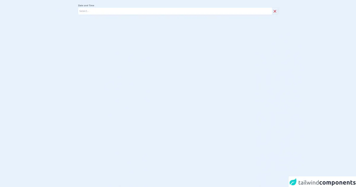
The preview of Date and Time picker UI component
To create a Date and Time picker UI component with Tailwind CSS, we will use HTML, CSS, and JavaScript. The final result will look like this:
Free download of the Date and Time picker's source code
The source code of Date and Time picker UI component
To create a Date and Time picker UI component with Tailwind CSS, we will use HTML, CSS, and JavaScript. The source code will look like this:
<div
    x-data
    x-init="flatpickr($refs.datetimewidget, {wrap: true, enableTime: true, dateFormat: 'M j, Y h:i K'});"
    x-ref="datetimewidget"
    class="flatpickr container mx-auto col-span-6 sm:col-span-6 mt-5"
>
    <label for="datetime" class="flex-grow  block font-medium text-sm text-gray-700 mb-1">Date and Time</label>
    <div class="flex align-middle align-content-center">
        <input
            x-ref="datetime"
            type="text"
            id="datetime"
            data-input
            placeholder="Select.."
            class="block w-full px-2 border-gray-300 focus:border-indigo-300 focus:ring focus:ring-indigo-200 focus:ring-opacity-50 rounded-l-md shadow-sm"

        >

        <a
            class="h-11 w-10 input-button cursor-pointer rounded-r-md bg-transparent border-gray-300 border-t border-b border-r"
            title="clear" data-clear
        >
            <svg xmlns="http://www.w3.org/2000/svg" class="h-7 w-7 mt-2 ml-1" viewBox="0 0 20 20" fill="#c53030">
                <path fill-rule="evenodd"
                      d="M4.293 4.293a1 1 0 011.414 0L10 8.586l4.293-4.293a1 1 0 111.414 1.414L11.414 10l4.293 4.293a1 1 0 01-1.414 1.414L10 11.414l-4.293 4.293a1 1 0 01-1.414-1.414L8.586 10 4.293 5.707a1 1 0 010-1.414z"
                      clip-rule="evenodd"/>
            </svg>
        </a>
    </div>

</div>

    <script src="https://cdnjs.cloudflare.com/ajax/libs/flatpickr/4.6.9/flatpickr.min.js"></script>
    <link rel="stylesheet" href="https://cdnjs.cloudflare.com/ajax/libs/flatpickr/4.6.9/themes/airbnb.min.css">
    <script src="https://cdn.jsdelivr.net/gh/alpinejs/[email protected]/dist/alpine.js" defer></script>
How to create a Date and Time picker with Tailwind CSS?
To create a Date and Time picker UI component with Tailwind CSS, follow these steps:
Step 1: Create the HTML structure
The first step is to create the HTML structure for the Date and Time picker UI component. We will use an input element to allow users to select a date and time. We will also add some additional HTML elements to create the UI for the Date and Time picker.
<div class="relative">
  <input type="text" class="block w-full py-2 pl-3 pr-10 text-gray-900 placeholder-gray-500 border border-gray-300 rounded-md shadow-sm focus:outline-none focus:ring-indigo-500 focus:border-indigo-500 focus:z-10 sm:text-sm" placeholder="Select a date and time">
  <div class="absolute inset-y-0 right-0 flex items-center px-2 pointer-events-none">
    <svg class="w-4 h-4 text-gray-400" viewBox="0 0 20 20" fill="none" xmlns="http://www.w3.org/2000/svg">
      <path d="M5 8L10 13L15 8" stroke="currentColor" stroke-width="1.5" stroke-linecap="round" stroke-linejoin="round"/>
    </svg>
  </div>
</div>
Step 2: Style the Date and Time picker UI component
The next step is to style the Date and Time picker UI component using Tailwind CSS utility classes. We will use the following classes to style the input element:
block: This class sets the display property to block.w-full: This class sets the width to 100%.py-2: This class sets the padding on the y-axis to 0.5rem (8px).pl-3: This class sets the padding on the left side to 0.75rem (12px).pr-10: This class sets the padding on the right side to 2.5rem (40px).text-gray-900: This class sets the text color to gray-900.placeholder-gray-500: This class sets the placeholder text color to gray-500.border: This class sets the border to 1px solid.border-gray-300: This class sets the border color to gray-300.rounded-md: This class sets the border-radius to 0.375rem (6px).shadow-sm: This class adds a box-shadow to the input element.focus:outline-none: This class removes the outline when the input element is in focus.focus:ring-indigo-500: This class adds a ring around the input element when it is in focus.focus:border-indigo-500: This class sets the border color to indigo-500 when the input element is in focus.focus:z-10: This class sets the z-index to 10 when the input element is in focus.sm:text-sm: This class sets the font size to 0.875rem (14px) on small screens.
/* Style the input element */
input[type="text"] {
  @apply block w-full py-2 pl-3 pr-10 text-gray-900 placeholder-gray-500 border border-gray-300 rounded-md shadow-sm focus:outline-none focus:ring-indigo-500 focus:border-indigo-500 focus:z-10 sm:text-sm;
}
Step 3: Add JavaScript to the Date and Time picker UI component
The final step is to add JavaScript to the Date and Time picker UI component to allow users to select a date and time. We will use the flatpickr library to create the Date and Time picker.
<!-- Add the flatpickr library -->
<link rel="stylesheet" href="https://cdn.jsdelivr.net/npm/flatpickr/dist/flatpickr.min.css">
<script src="https://cdn.jsdelivr.net/npm/flatpickr"></script>

<!-- Initialize the Date and Time picker -->
<script>
  flatpickr(".datepicker", {
    enableTime: true,
    dateFormat: "Y-m-d H:i",
  });
</script>
Step 4: Combine the HTML, CSS, and JavaScript
Finally, we will combine the HTML, CSS, and JavaScript to create the Date and Time picker UI component with Tailwind CSS.
<div class="relative">
  <input type="text" class="block w-full py-2 pl-3 pr-10 text-gray-900 placeholder-gray-500 border border-gray-300 rounded-md shadow-sm focus:outline-none focus:ring-indigo-500 focus:border-indigo-500 focus:z-10 sm:text-sm datepicker" placeholder="Select a date and time">
  <div class="absolute inset-y-0 right-0 flex items-center px-2 pointer-events-none">
    <svg class="w-4 h-4 text-gray-400" viewBox="0 0 20 20" fill="none" xmlns="http://www.w3.org/2000/svg">
      <path d="M5 8L10 13L15 8" stroke="currentColor" stroke-width="1.5" stroke-linecap="round" stroke-linejoin="round"/>
    </svg>
  </div>
</div>

<!-- Add the flatpickr library -->
<link rel="stylesheet" href="https://cdn.jsdelivr.net/npm/flatpickr/dist/flatpickr.min.css">
<script src="https://cdn.jsdelivr.net/npm/flatpickr"></script>

<!-- Initialize the Date and Time picker -->
<script>
  flatpickr(".datepicker", {
    enableTime: true,
    dateFormat: "Y-m-d H:i",
  });
</script>
Conclusion
In conclusion, building a Date and Time picker UI component with Tailwind CSS is easy and straightforward. With the help of Tailwind CSS utility classes and the flatpickr library, developers can create custom components quickly and efficiently. By following the steps outlined in this article, you can build a Date and Time picker UI component that looks great and works well on different screen sizes.