- Published on
What You Need To Build A Dashboard Metrics - Default With Tailwind CSS
- What is Tailwind CSS?
- The description of Dashboard Metrics - Default ui component
- Why use Tailwind CSS to create a Dashboard Metrics - Default ui component?
- The preview of Dashboard Metrics - Default ui component.
- The source code of Dashboard Metrics - Default ui component.
- How to create a Dashboard Metrics - Default with Tailwind CSS?
- Conclusion
As a FrontEnd technology blogger, it is important to stay up-to-date with the latest tools and technologies in the industry. One such tool that has gained a lot of popularity in recent times is Tailwind CSS. It is a utility-first CSS framework that helps you quickly design and build user interfaces. In this article, we will explore how to build a Dashboard Metrics - Default ui component using Tailwind CSS.
What is Tailwind CSS?
Tailwind CSS is a utility-first CSS framework that provides a set of pre-defined classes to help you design and build user interfaces quickly. It is designed to be highly customizable and can be used with any JavaScript framework or library. Tailwind CSS provides a set of pre-defined classes that you can use to style your HTML elements. These classes are organized into categories such as layout, typography, colors, and more.
The description of Dashboard Metrics - Default ui component
A Dashboard Metrics - Default ui component is a user interface element that displays important metrics in a dashboard. It is commonly used in web applications to display important data to users in a visually appealing way. The Dashboard Metrics - Default ui component typically consists of a set of cards that display various metrics such as sales, revenue, traffic, and more.
Why use Tailwind CSS to create a Dashboard Metrics - Default ui component?
Tailwind CSS provides a set of pre-defined classes that you can use to quickly style your Dashboard Metrics - Default ui component. This saves you a lot of time and effort that would otherwise be spent writing custom CSS. Additionally, Tailwind CSS is highly customizable, which means that you can easily modify the styles to match your design requirements.
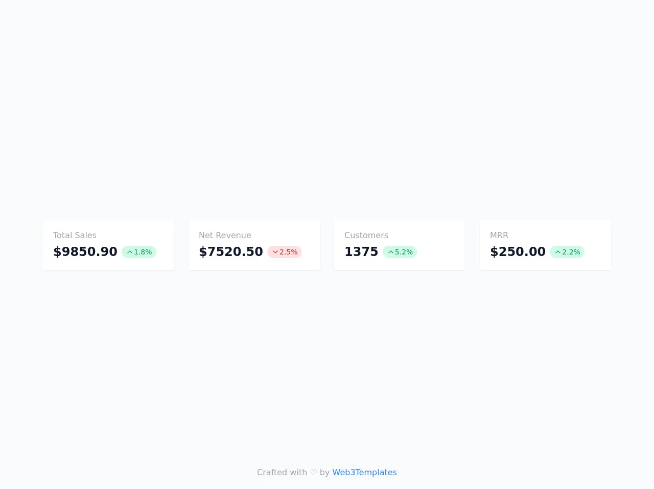
The preview of Dashboard Metrics - Default ui component.
To create a Dashboard Metrics - Default ui component using Tailwind CSS, we will use a set of pre-defined classes to style our HTML elements. The result will be a visually appealing set of cards that display important metrics.
Free download of the Dashboard Metrics - Default's source code
The source code of Dashboard Metrics - Default ui component.
To create a Dashboard Metrics - Default ui component using Tailwind CSS, we will use a set of pre-defined classes to style our HTML elements. The result will be a visually appealing set of cards that display important metrics.
<!--
    =======================================================================
    Name    :   Dashboard Metrics - Default
    Author  :   Surjith S M
    Twitter :   @surjithctly

    Other Variations Available: Stacked, Minimal, with icons

    Get more components here 👉 https://web3templates.com/components

    Copyright © 2021
    =======================================================================
 -->

<div class="flex items-center min-h-screen bg-gray-50 dark:bg-gray-900">
	<div class="container max-w-6xl px-5 mx-auto my-28">
		<div class="grid gap-7 sm:grid-cols-2 lg:grid-cols-4">
			<div class="p-5 bg-white rounded shadow-sm">
				<div class="text-base text-gray-400 ">Total Sales</div>
				<div class="flex items-center pt-1">
					<div class="text-2xl font-bold text-gray-900 ">$9850.90</div>
					<span class="flex items-center px-2 py-0.5 mx-2 text-sm text-green-600 bg-green-100 rounded-full">
                        <svg class="w-4 h-4" viewBox="0 0 24 24" fill="none" xmlns="http://www.w3.org/2000/svg">
                            <path d="M18 15L12 9L6 15" stroke="currentColor" stroke-width="2" stroke-linecap="round" stroke-linejoin="round"></path>
                        </svg>
                        <span>1.8%</span>
					</span>
				</div>
			</div>
			<div class="p-5 bg-white rounded shadow-sm">
				<div class="text-base text-gray-400 ">Net Revenue</div>
				<div class="flex items-center pt-1">
					<div class="text-2xl font-bold text-gray-900 ">$7520.50</div>
					<span class="flex items-center px-2 py-0.5 mx-2 text-sm text-red-600 bg-red-100 rounded-full">
                        <svg class="w-4 h-4" viewBox="0 0 24 24" fill="none" xmlns="http://www.w3.org/2000/svg">
                            <path d="M6 9L12 15L18 9" stroke="currentColor" stroke-width="2" stroke-linecap="round" stroke-linejoin="round"></path>
                        </svg>
                        <span>2.5%</span>
					</span>
				</div>
			</div>
			<div class="p-5 bg-white rounded shadow-sm">
				<div class="text-base text-gray-400 ">Customers</div>
				<div class="flex items-center pt-1">
					<div class="text-2xl font-bold text-gray-900 ">1375</div>
					<span class="flex items-center px-2 py-0.5 mx-2 text-sm text-green-600 bg-green-100 rounded-full">
                        <svg class="w-4 h-4" viewBox="0 0 24 24" fill="none" xmlns="http://www.w3.org/2000/svg">
                            <path d="M18 15L12 9L6 15" stroke="currentColor" stroke-width="2" stroke-linecap="round" stroke-linejoin="round"></path>
                        </svg>
                        <span>5.2%</span>
					</span>
				</div>
			</div>
			<div class="p-5 bg-white rounded shadow-sm">
				<div class="text-base text-gray-400 ">MRR</div>
				<div class="flex items-center pt-1">
					<div class="text-2xl font-bold text-gray-900 ">$250.00</div>
					<span class="flex items-center px-2 py-0.5 mx-2 text-sm text-green-600 bg-green-100 rounded-full">
                        <svg class="w-4 h-4" viewBox="0 0 24 24" fill="none" xmlns="http://www.w3.org/2000/svg">
                            <path d="M18 15L12 9L6 15" stroke="currentColor" stroke-width="2" stroke-linecap="round" stroke-linejoin="round"></path>
                        </svg>
                        <span>2.2%</span>
					</span>
				</div>
			</div>
		</div>
	</div>
</div>

<!-- Footer Mentions -->
<div class="fixed bottom-5 w-full text-center text-gray-400">
	Crafted with ♡ by <a class="text-blue-500" target="_blank" href="https://web3templates.com/components/">Web3Templates</a>
</div>
How to create a Dashboard Metrics - Default with Tailwind CSS?
To create a Dashboard Metrics - Default ui component using Tailwind CSS, follow these steps:
Create a new HTML file and add the necessary HTML elements for the Dashboard Metrics - Default ui component. For example, you can create a set of cards that display various metrics.
Add the necessary Tailwind CSS classes to style your HTML elements. For example, you can use the "bg-white" class to set the background color of your cards to white.
Customize the styles as per your design requirements. For example, you can modify the font size, font family, and padding of your cards.
Add any necessary JavaScript code to make your Dashboard Metrics - Default ui component interactive. For example, you can add event listeners to your cards to display more information when clicked.
Conclusion
In conclusion, Tailwind CSS is a powerful tool that can help you quickly design and build user interfaces. It provides a set of pre-defined classes that you can use to style your HTML elements, which saves you a lot of time and effort. By following the steps outlined in this article, you can easily create a Dashboard Metrics - Default ui component using Tailwind CSS.